Photo by Kelly Sikkema via Unsplash
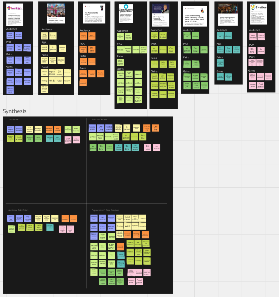
My first week of working consisted mainly of research. I was tasked with getting a deeper understanding into our target audience and how we can best communicate with them as an organization. I started out by looking into organizations in my area that are partnered with InReach, and analyzing the users based off of the services said organization provided. I was able to come up with some consistent trends across the organizations that helped me understand exactly what potential users may be looking for and how best to reach them.

Discovery/Research
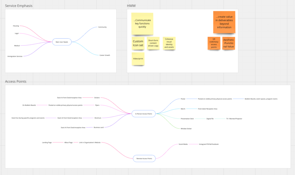
I tried to turn my research insights into actionable design ideas. For example, I noticed that most of the modes of communication we would be using to communicate to potential users leaned heavily on short-form content (i.e Instagram, LinkedIn, Facebook, Posters, and Stickers). These mediums require strong visual hierarchy and a quick message, which is a challenge at InReach because a lot of information needs to be communicated to a user about the different services provided. This led me to the idea of creating a custom icon set for the specific resource types InReach coallates. The custom icon set would work to quickly communicate (as well as communicate across language barriers), different aspects of your life InReach can address. In most forms these icons accompanied with a short title/description of InReach as a whole would quickly and accurately communicate the core functions of InReach. I brought this insight to my team and we decided to expand this idea into creating a whole visual library for InReach that can be used across mediums as well as the icon set.

Insights/Design Directions


