3/31
Journal Entry #16
Tonal Progression:
Formal: A succession of color mixtures proceeding from dark to light. In addition to value change, tonal progression also vary in hue and chromatic intensity.
Informal: A layering effect using color to fade from dark to light.
Shade:
Formal: Shade is the mixture of a color with black, which reduces lightness.
Informal: Mixing a color with black which reduces its lighting.
Tint:
Formal: A tint is the mixture of a color with white, which increases lightness.
Informal: Mixing a color with white which increases its lighting.
Tone:
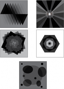
Formal: An artistic context refers to the light and dark values used to render a realistic object, or to create an abstract composition.
Informal: Using light and dark elements to create an abstract composition.
Venn Diagram:
Formal: An illustration of the relationships between and among sets, groups of objects that share something in common.
Informal: A composition that compares objects to show similarities.


These pieces are great representations of transparency and layering because the illustrators used transparency to create the backgrounds. Using this tactic really creates a sense of having the curtains really be there in the first picture and it also creates an atmosphere of actually being in a room and having a conversation.
2/28
2/24
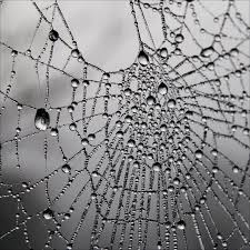
I would use this texture as a background to give a darker feeling in my design.
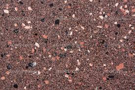
This texture could be used in a design where I want to make realistic scenery, such as mountains or used to give a sense of false reality making a person believe that texture is truly in the design when it really isn’t.
I can use this texture to create a design that resembles a playground and make an advertisement out of it for new parks in an area.
2/14
The best perk I have as a CUNY student is being able to use any CUNY library and have access to the books they have. Having this perk gives me the ability to continue my education without having to pay money for each book. I can just borrow the books at the libraries and study from there.
2/7
Its important to start the design process by using thumbnail sketches because you can use them as drafts. This allows you to create the proper patterns that you can then add onto the final design. It will also lessen the chance of creating the design wrong and to fully understand what you are trying to create.
Visually Enhanced Quotes
CDMG 1111 Digital Media Foundations
PostCards
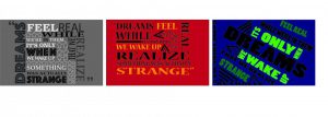
I picked this quote because it felt so true to me and every other person that has dreams. I feel as though many can relate because you want your dreams to be true and you feel that way when you are in them. Then after you wake up it feels strange that it was actually a dream and you feel more encouraged to pursue it.
I used a variety of type faces to give each quotes its own personality, I also used different shapes to give off a different vibe for each.
