Week 1
+ Entry#1 (01/29/2020) – The Beginning
The first week of Internship, in class it was emphasized how important it was to network. The students were instructed to do readings, create a Linkedin account, improve their resume and cover letter.I have applied to 11 internships, none got back to me. Hard to say why I wasn’t accepted because I never got a reply back, so I couldn’t ask for feedback. Something to note that the professor has expressed, which was if you don’t get a response within a certain time (generally a week or two), it’s just better to move onto the next internship search.
Week 2
+ Entry#2 (02/04) – Networking Event#1: Society of Illustrator – Sketch Night
I went to the Society of Illustrator’s Sketch Night and wrote an entry. It was an overall fun experience. I would want to go again to improve my art and social skills.
+ Entry#3 (02/05) – Hunter Rachel is on the Loose
During class, we criticized resumes. Fortunately, I printed my resume and got some feedback. We also researched more websites to snag an Internship. I’m still looking for an internship, and I applied to ten more sprinkled throughout the week. I’ve managed to ask some professors in City Tech, just in case they knew of anyone who needed an intern.
I’ve also sent an e-mail to the Professional Development Center for assistance in finding an internship and improving my resume, cover letter, and interview skills.
+ Entry#4 (02/06) – Networking Event #2: Steven Harris
My other class, Advanced Strategies in Illustration, also emphasized the importance of networking. Professor Wooley is setting up interviews for her students to meet professional artists to get a feel of the industry.
This week, we met comic artist, Steven Harris, I’ve placed all my networking adventures in another section to keep my entries neat.
Week 3
+ Entry#5 (02/09) – Finally!!! A Response!!!
I’ve applied to three internships earlier this week, and I finally got a response from NY Art Center. I’ve also got a response for a summer internship at Sesame Workshop. Professor Simonich has responded to review my resume, cover letter, and portfolio.Thanks to last week’s resume review, I updated my resume; I’ve also sent it out to a couple of professors for another critique
+ Entry#6 (02/13) – Oh GOD!!! AN ACTUAL INTERVIEW!!!!
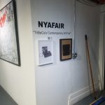
This week there is no class, so I went to the NY Art Center for an interview, and I was extremely nervous. I had no idea what kind of questions to expect for the interview, despite researching common interview questions and about the exhibit. While I was there, I got a tour and learned that they showcase and promote well-established and new artists, as well as some of the responsibilities as an intern.
After the quick tour, I was sat down and waited for my interview. My first interview was by Dwayne, and he asked for experiences I had in Art & Design if I was able to make PDFs, why I wanted to work in the Art Center, and what experience I was looking for after the internship. I definitely fumbled through my internship and kept laughing cause I was so nervous.
Somehow, it ended up prompting a second interview with NYA Fair Director, Meredith. She asked about who I was as a person, to look at my portfolio, and what I was capable of doing, and after clumsily getting past that interview. She asked if I was interested in working in an office setting, where I would be creating emails and promotions. She told me to think about it and that I should email her my availabilities, and that was the end of my interview.
Week#4
+ Entry#7 (02/19) – Networking Event#3: Redefining Heroes
We have an online class meet, so I went to Redefining Heroes with a handful of City Tech students. It was a panel about cartoonists discussing their stance in the world, (i.e. ethnicity, sexuality, etc.)
I’ve sent in my availability to NY Art Center, but I still haven’t gotten a response back.
Week#5
+Entry 8 (02/23) – Disappointed, but Not Surprised
I’ve began sending out more internships just in case I don’t get a call back from NY Art Center Internships
Week#6
+ Entry#9 (03/04) – Where’s Hope?
I continued working on trying to find an internship from Indeed, as well as some internships that Professor Goetz updated onto the blog. I managed to get a couple of responses back, asking for my availability, but when I replied with my schedule, I never got a response back. So, unfortunately, I entered Internship Class without an internship.
Week#7
+ Entry#10 (03/09) – A Savior Appears!! – Internship#1: LGBTQ+ Safe Zone
The day after the Internship class, my friend, T’ahna told me that she managed to convince her boss to let me work along with her! She was interning at Wagner Middle School, and I received my project immediately, which is to recreate a support group for sixth graders in the LGBTQ community.
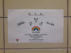
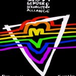
This is the original poster, and I agree that it can be improved greatly.
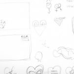
Fortunately, I was given the luxury to work at home and began researching posters and ideas to make the poster. I also created some sketches and roughs on what the poster may look like. These are some of the thumbnails I’ve created once I had found enough information about what a typical LGBTQ support poster looked like.
Work Schedule: Fri – Sat – Sun
This Week’s Hours: 15
Total Hours: 15+ Entry#11 (03/12) – COVID19
The coronavirus is becoming more alarming. At first, I wasn’t too worried about the coronavirus because I saw in an article that China was progressing and the infection rate is dwindling, but I’ve noticed that my lifestyle habits have been changing, such as eating a lot more and washing my hands more often.
Students have received an email that classes are off for this week until 03/19, and will resume online. I was genuinely shocked because I assumed that COVID19 would blow over soon.
Week#8
+ Entry#12 (03/16) – Internship#2: Roughs
I began working on the project last weekend, and these were my roughs.
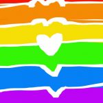
My idea for the project was to create a connection between each color that represents the LGBTQ community, and I thought that adding a heart and having it connect into one, would bring a sense of being together with one another.
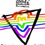
The triangle in the second and third image represents the LGBTQ Safe Zone, and I wanted it to intermingle with the colors as well. I originally began with the white background, but I tried creating the image in a black background, just to give out more options.
I sent this in for critique and I got a better response for the black background, and I’m relieved because I believe that it is the strongest piece. I was also told to add in some more text, such the name of schools and that it was for sixth graders
- Work Schedule: Fri – Sat – Sun
This Week’s Hours: 15
Total Hours: 30
+ Entry#13 (03/19) – Zoom, zoom, zoom
I had my first online class, and it was really nice? After having basically two weeks of no school and because almost everyone is self-quarrenting themselves, it was a bit reassuring to see my classmates and professor again. Although this has nothing to do with Internship, I thought it was good to update.
Having an openlab ready and getting the announcement that we would use Zoom for class meetings was really helpful and pretty fortunate for us.
+ Entry#14 (03/22) – Webinar#1: The Long Distance Illustrator
It was interesting to hear different people’s perspective on their stance as an artist. There were a couple of things that stood out to me, such as drawing “fanart”, unintentionally touching upon a political topic, where their stance/purpose was as an illustrator or their views on connecting an artist’s behavior with their art. Those are some of my biggest concerns and insecurities about posting my art, so hearing their opinion about those topics oddly comforted me.
This particular segment was specifically for those who drew fanart, but I’ve noticed while they were talking about drawing fanart, they agreed that adding fanart to your portfolio was a good idea because it shows that you can replicate the likeness of a character with your style and it’ll shine more brightly because the piece was something that you were passionate about. They also spoke about how there was a sense of shame that came along with the term, and I agree wholeheartedly. I believe that my interest clearly shows in my artwork, but when I compare drawing a class project that I’m not entirely interested in verses creating a fanart that I’m excited about, the latter will be a more successful piece.
Week#9
+ Entry#15 (03/23) – Internship#3: Final Presentation!!
It begins with cleaning up the final project. I’m satisfied with the end product!
The original layout I had felt awkward, so I got criticism from my peers that helped with the light source for the ribbons, and the way the ribbons was laid out with the traingle. For some reason, I couldn’t get the hang of it, but I knew something was off it.
I slapped on my favorite type “Raleway” and sent it out!
First Poster (issue: wanted a 3D feeling, with the ribbons playing witht eh triangle)
Second Poster (issue solved)
Third Poster (added text)
- Work Schedule: Fri – Sat – Sun
This Week’s Hours: 15
Total Hours: 45
Week#10
+ Entry 16 (03/30) – Internship#4: New Projects, New Ideas
I was given the task to create posters for the Manhattan Youth at Wagner Virtual Class to combat the inability to go out to school cause of COVID19!
They requested to create posters that “pop” out for these classes
- Monday: Comic Book Club, Math Team
- Tuesday: Creative Writing, Arts & Crafts
- Wednesday: Fitness, Dance Party
- Thursday: Computer Coding, Origami
- Friday: Dance Party
I immediately began researching and when I thought of something that “pops”, my mind went to neon colors and Pop Art. I’ve always been a fan of highly saturated colors, so I was happy that they requested this.
The downsides of the tasks were that there weren’t a lot of good references for school posters… They felt either felt too childish or the complete opposite, being strict, rigid and formal. I didn’t want that sort of feeling for these posters.
I wasn’t given a lot of information besides adding the Title, Location, and Time, so I stuck with making a more minimalistic illustrative poster. I wanted a more modern feeling to these posters, so the students didn’t feel like it had to be something too serious.
These are a couple of the roughs I made during the weekend. The Comic Book Club was just a simple homage to a comic book page as well as some Pop Art style that I saw through references.
I had a lot of trouble thinking about a poster for the Math Team… and I couldn’t find any good references. I started with memories from school, but it ended up looking a bit childish. Then I tried to think of geometric shapes, and even tried to stray away from it being related to Math at all and just eye-catching. Eventually, I went back to the geometric shapes and trying to rack my brain for old memories of math from my middle school. I added simple symbols from PEMDAS and geometric shapes.
- Math Team Drafts:
a. childish
b. geometric shapes
c. eyecatching
d. final
- Work Schedule: Fri – Sat – Sun
This Week’s Hours: 15
Total Hours: 60
Week#11:
+ Entry 17 (04/06) – Internship#5: Whistle While You Work (except i had trouble whistling)
I kept trying to create more roughs, this time for Creative Writing and Computer Coding. Again, I had difficulty thinking of something unique and eye-catching.
When I tried researching posters for Creative Writing, most of them were light bulbs for erasers ends of the pencil, so I wanted to avoid that at all costs. I tried to create a busy background and drew out four writing utensils to use for repeat, but I was worried that it may be a little bland. I tried to create more posters and used “enthusiasm” with the fist gripping a pencil, but it felt a little cliché. I moved to a simple design of pencil writing on paper, with knocked-out icons, but again I felt that it was bland.
- Creative Writing Drafts:
a. four writing utensils
b. enthusiam
c. simpleFinally I decided to given up and try out the pencil with the light bulb at the end. Then I tried adding a mystic feeling with the “light bulb”, by inserting a mysterious liquid and stars and the moon. When I showed this to my peers, I got great feedback. They either said it felt like an “hourglass” or a “magic wand”, but at the end it was like the top was being used up to “write magic”, so I ended up sticking to this project.
For Computer Coding, I continued having a bit of trouble creating a poster, but not as much as Creative Writing. When researching for Computer Coding poster, it was mostly just connected to a laptop or computer, so I decided to just keep that as the main theme. I tried to tie the “mystic feeling” with this poster, but I was worried that it seemed redundant. I wanted a feeling of togetherness, so I tried making the items inside the screen come out. Eventually, I recalled an old poster I created earlier in my City Tech years, and created a poster with the feeling of a third dimension, by creating a path that “comes out” toward the reader.
Week#12:
+ Entry 18 (04/13) – Intership#6: Finishing up the Drafts
I noticed that some of these projects had either a similar theme or same days, so I decided to finish things up a little quicker by combining them.
I had a relatively easier time with creating these posters because I wanted to try using a previous plan from the Creative Writing poster, which was drawing little utensils of said theme.
I combined the Arts & Craft and Origami because it was taught by the same teacher and the theme felt like they would go hand in hand, so I created small images of art and craft supplies on one side, and some examples of origami pieces. I started to hyper fixate on some parts of the poster, which ate up a lot of time because I wanted to try out different color palettes.
I created the Fitness poster next with little items of health. I was going to try to create little icons of sports and health objects, but I ended up trying for a 3×3 grid with the type in the middle.
Finally, for the Dance Party, I wanted to try creating another three-dimensional feeling poster, and recalled one of the rejected posters for the Math Team and recreated that, but for musical notes.
- Work Schedule: Fri – Sat – Sun
This Week’s Hours: 15
Total Hours: 90
+ Entry#19 (04/16) – App Review: Procreate
Procreate is an app that I use on my iPad Pro.
It is published by Savage Interactive for iOS and iPadOS. It was brought in 2011, but I only heard about it around 2017.
At first, I was incredibly intimidated by my iPad Pro and didn’t use it for about a year because it was such a luxury item, but once I began using it was a breeze.
The Pros:
Unlike a computer tablet, there isn’t much of a learning curve when using one. It feels like a traditional pen and paper, rather than getting used to looking up and not knowing where your mouse is on your computer screen.
Easy access to everything. There is a little bit of searching at first, but as long as the user knows what they’re looking for (i.e. Opacity, Adjustments, Selection Tool) it can be easy find by a quick clicking around. Also, the internet is a great tool to ask questions.
You can add text or animate on Procreate! I haven’t really tried out the text part, but I’m glad that it is an available option! I have tried out the Animation and there are onion skins (which shows the previous or image after in a lower opacity, making animation a lot more fluid) A con for the animation is that you can’t really control how to each frame is (to my knowledge), making each frame the same speed.
The Cons:
Limited Layers – an understandable function because the iPad can only hold so much memory. Although, it can be frustrating when working on a bigger project.
Blending Frustrations – I have trouble blending with the regular brushes and usually ended up coloring on my laptop (but the issue with coloring on my laptop is that the colors are vastly different on other computer screens.) A simple solution is purchasing brushes created by other artists, but may not be so accessible to some artists.
Week#13
+ Entry 20(04/20) – Internship #7: Clean Up Crew
I began finalizing and cleaning up some drafts. I began with cleaning up the Creative Writing because it was the most aesthetically pleasing to me. Not much changes besides the dynamic of how the pencil was laid out.
Then I filled in the icons for the Arts&Craft/Origami poster, which felt very straight forward. Again, I just readjusted some images here are there for a better flow for the reader.
I ended the internship with the Fitness poster, which changed drastically. I ended up only filling in 5 items of sports/health related objects and added an “explosive” background to make the poster feel more dynamic. I decided to make this change rather than the 3×3 grid because I was worried that it was too similar to how busy the Arts&Craft/Origami poster was, so I made this poster less busy, but more dynamic.
- Work Schedule: Fri – Sat – Sun
This Week’s Hours: 15
Total Hours: 105
Week#14:
+ Entry 21(04/27) – Intership#8: Finalizing the Project!
I began with the Math Team and the Computer Coding poster, hardly made any change to the original design.
I moved onto the Dance Party poster and made more dynamic changes with the layout. I wanted a better flow for reading the text and I didn’t like how the original placement of the text was going to be, so I decided to bring up the images and lower the font. This ended up being one of my favorite posters.
- Dance Poster:
a. Original
b. Placement Change
I also made great changes to the Comic Book Club’s Poster to make it feel more like an homage to a comic book page than a Pop Art.
Finally, I brought the images into Indesign and inserted some text. I rotated the text a lot because I liked the feeling that all the typefaces brought together and sent it out.
Final Project:
- Monday
Comic Book Club
Math Team - Tuesday
Creative Writing - Wednesday
Fitness - Wednesday/Thursday
Arts&Craft/Origami - Wednesday/Friday
Dance Team - Thursday
Computer Coding
- Work Schedule: Fri – Sat – Sun
This Week’s Hours: 15
Total Hours: 120

