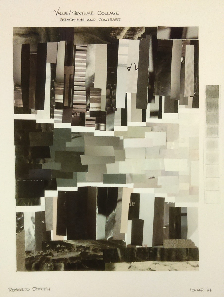
For this assignment we had to search and cut out pieces of various magazines and publications to form a collage that showed Value and Texture. The definition of Value is “The Lightness or Darkness of a color. The Definition of Texture is “The way a surface feels ( actual texture ) or looks ( visual texture).
I showed Value in the middle strip. I arranged the pieces in horizontal rectangles that started from the most dark value to the light. I wanted to give a sort of In-and-out feeling so I made both ends of a larger in height and the middle smaller.
I showed Texture with the Upper and lower portions of the piece. Instead of arranging them similar to the value strips, I placed them vertical to show more of the images on the strips. I picked out various textures such as rope threads, quits, wood, rocks, stairs, water, etc. I made sure not to use repeating patterns because that would be lazy.
A couple things I learned from this assignment was what does “Value” actually mean. Before knowing I always thought “Intensity” and “Value” had the same meaning. It was interesting also from a artistic stand point of what can be achieved with just strips of paper. Although it was time consuming, I had super fun.

