Most modern companies can be identified simply by their logo. In 1943 a radio station by the name of RCA’s Blue network decided to expand their vision into an emerging world of a new media known as television. By April 14th, 1944, they had broken away from their parent company NBC and formed their own television network labeled ABC. They aired their first program on April 19th, and to promote their network they created a logo for the American Broadcasting Company.
Their first logo in 1948 was almost assuredly to infer that the newly found network was inspired by its roots in Radio.
From 1952 to the late 1950’s, ABC showcased a new logo that featured an American Eagle behind a circular disc with their insignia. Probably the least popular of all the iterations, they quickly changed to a large A with the letters centralized.
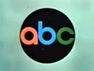
To signify the new age of color TV, in 1962, the lowercase abc letters were presented in a Circle A variant. This new logo style was created and debuted by graphic designer Paul Rand. Although this version saw a few changes, the premise held true until the 1980’s when the logo lost its multicolor.
From the 1980’s to the 2000’s, the logo remained a simple black and white version. Aruagbly the most popular and most recognizable. This would be the logo that became a staple for ABC.
To date, 2007 is the last time ABC has seen an update in its heavily recycled classic logo. The new design simply added contours and shading to infer the age of the HDTV generation. This updated version of the Paul Rand classic is still used to this day.
References
1. https://1000logos.net/abc-logo/
2. https://www.grayflannelsuit.net/blog/abc-logo-television-history
3. https://logos-world.net/abc-logo/
4. https://about.abc.net.au/abc-history/
5. https://www.britannica.com/topic/American-Broadcasting-Company
6. https://www.newworldencyclopedia.org/entry/American_Broadcasting_Company


