Blog #13

Ethical

I have a similar perspective as the reading about copyright over design work. It is essential to have ethics in design, it is more than just about following laws to respect others’ creative work is to respect your creative work. I think copyright builds the basis of this industry. Inspiration can come from others’ works but giving credit and asking for copyright is the right way to show your recognition and respect for what inspiration you. When I am creating my work if I use anything from another’s creative work I would ask for permission and make sure they know because if others used my work I would like them to do the same to me.

In the Fairey Copyright Hope Poster case, Fairley used the AP photo to add his ideas and create a new expression based on the original work. Fairley’s work added significant political value, turning a simple photograph into an iconic symbol of hope and change, and he justified his action because since he added it and the meaning of the photo has changed, it should be considered fair use. I think that Fairley’s use of the photographs is not within the range of fair use and is an infringement of copyright. The poster is a direct and unauthorized derivative work of AP’s copyrighted photograph. Fairley should have been paid for his use of the photo, or at least should have requested a license to use it. There is no doubt that Fairley used the photo for creative purposes, but if everyone could justify their infringement as he did, then everyone would do the same with others’ creative work. Who else would respect copyright and originality?
Blog #12

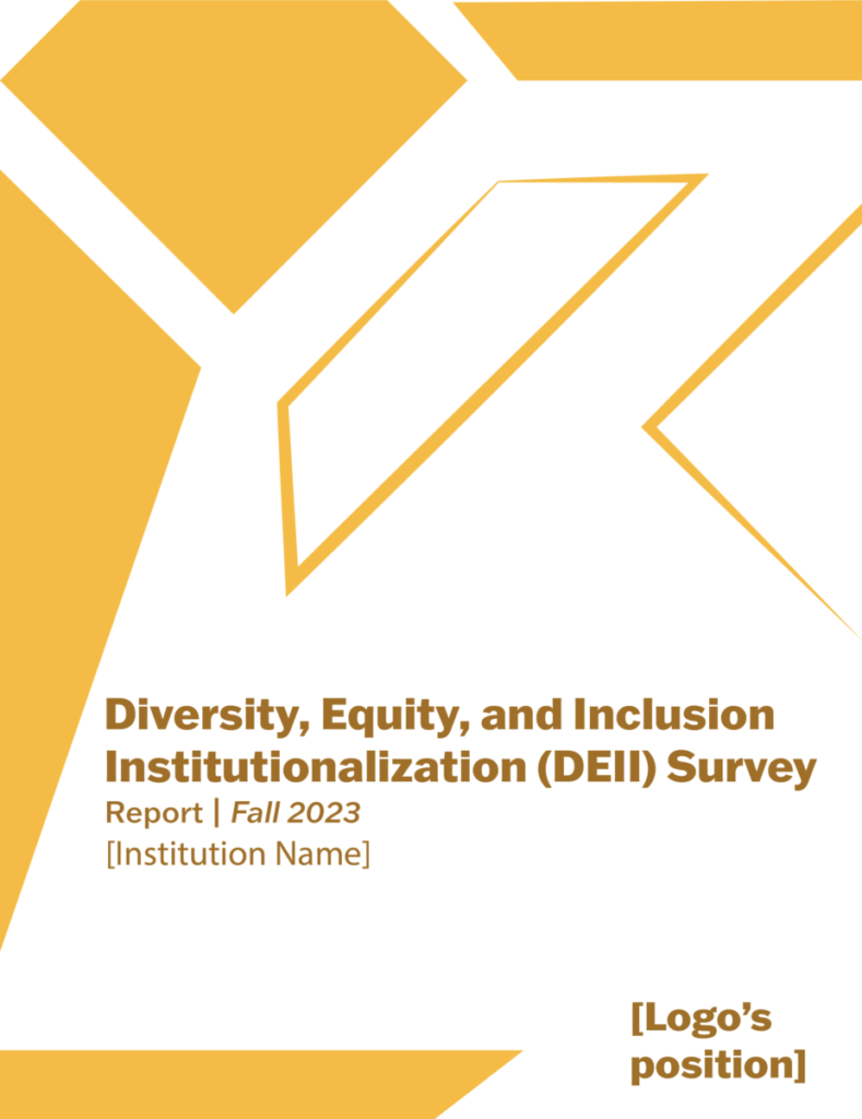
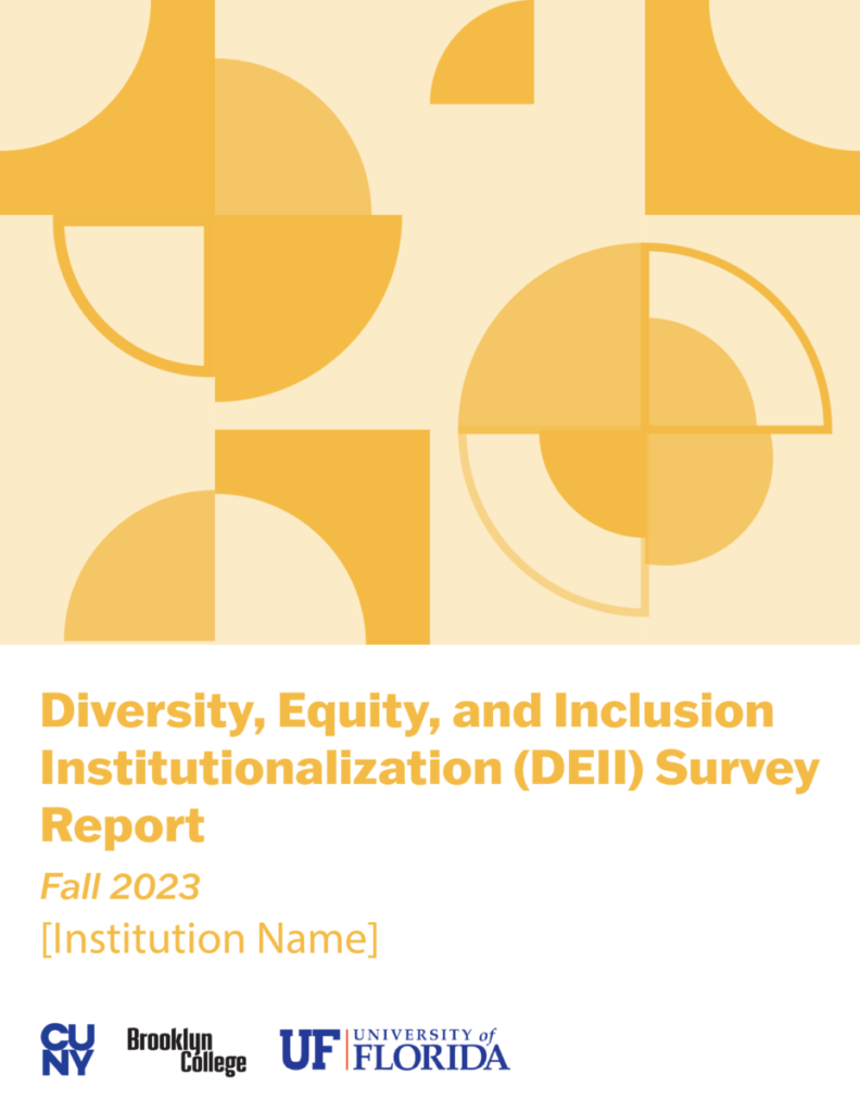
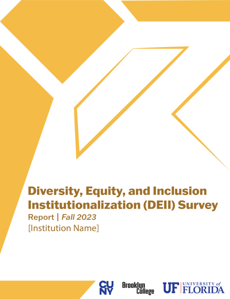
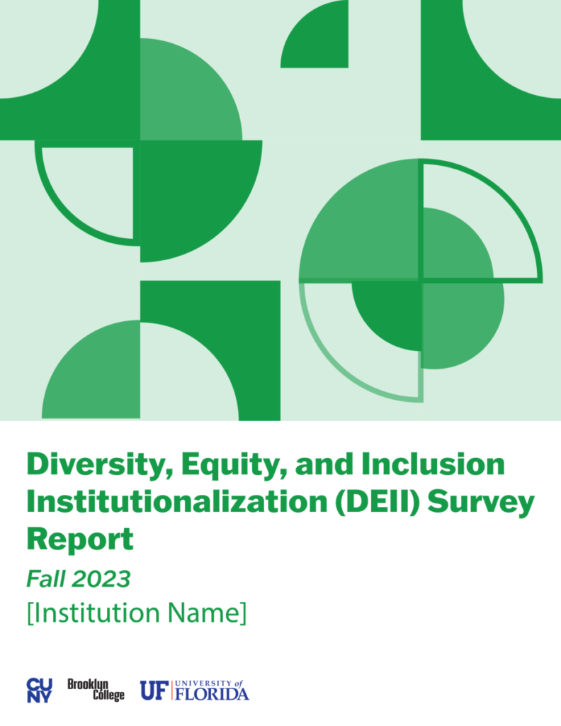
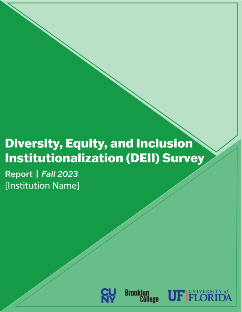
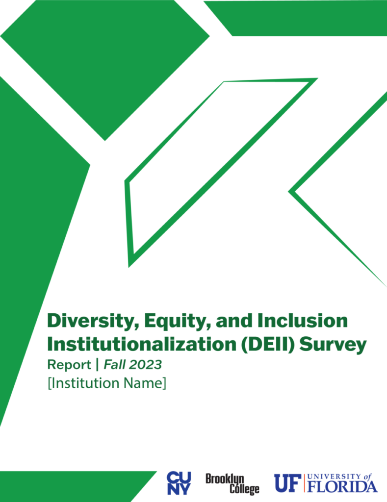
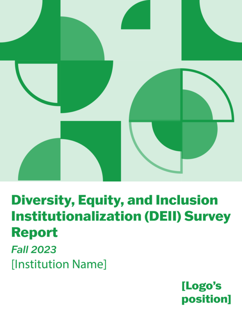
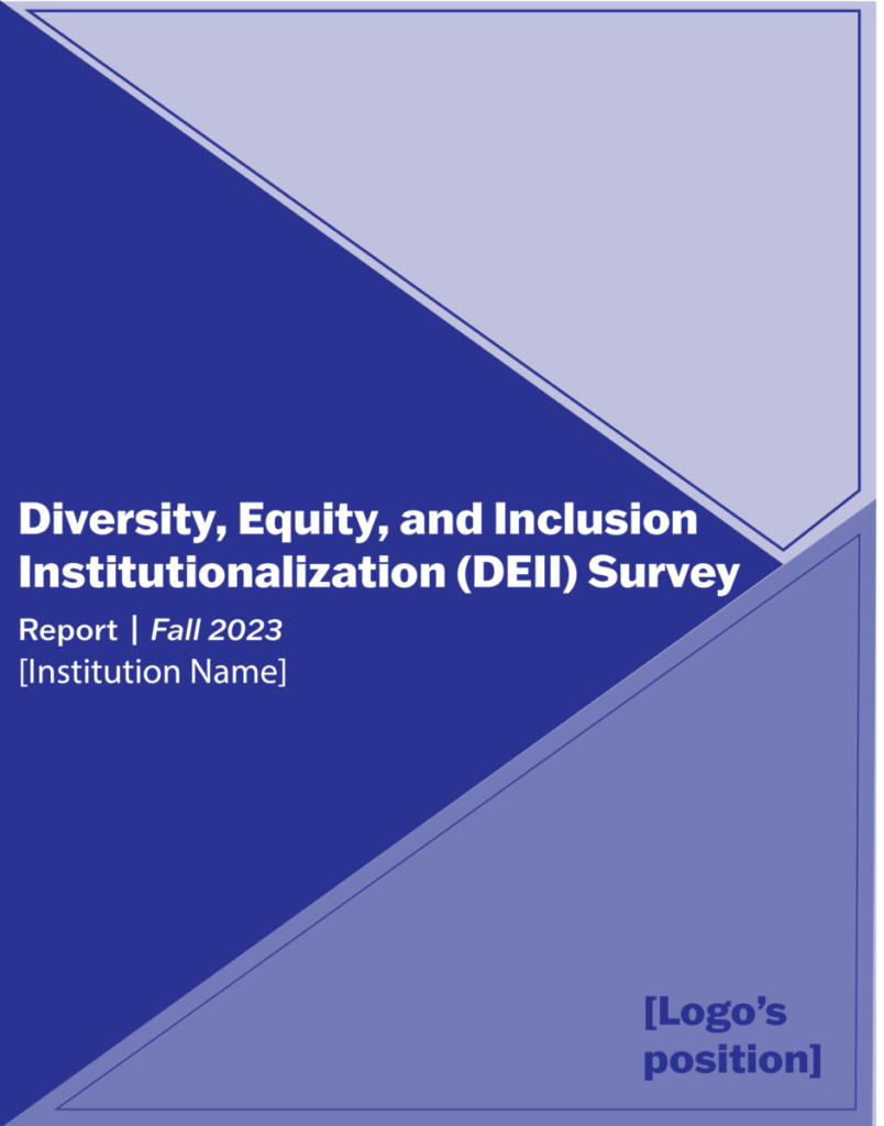
Report cover for DEII

This Tuesday, Isana assigned us a new cover design project via email. This time, the entire intern team is participating. She asked each of us to design at least three different covers, with the following requirements: “Minimalist, lots of variation on one color, geometric. There will be three to four logos that need to be included, so keep that in mind. Logo colors can include maroon, blue, and teal, so keep that in mind as well. I would like variations in blue, green, and yellow.” I was excited to receive a new project so soon. After understanding the requirements, I had a few ideas in mind and couldn’t wait to start designing. Since I wasn’t entirely sure what a minimalist style entailed, I first looked up some examples online and then combined them with my own inspiration to begin designing.

During our weekly progress report meeting, I was the first to be called on to share my screen and present my cover design drafts. I was a bit nervous, but luckily, Isana seemed very interested in my designs. She was pleasantly surprised and said that the covers looked great. She provided some feedback for improvement and reminded me to mark the placeholders for the logos on the cover designs. She also asked me to create versions of all three designs in blue, green, and yellow, then combine them into a PDF and upload them to Google Drive. Since even Isana wasn’t sure which color the client would prefer, this would cover all the color bases that the client may want.

Blog #11

First project – General Education Brief Cover options

This Tuesday, my supervisor Isana assigned us our first project via email: to design two different cover options for the general education brief. The covers need to follow the BC visual guideline colors and fonts, and she provided outdated cover designs as references and placeholder text. Since Dariann and John are still working on the heat map, only Manjie, Tarique, and I were tasked with designing the covers.

When I first looked at the previous cover designs Isana sent us, I felt uninspired. I opened Adobe InDesign and stared at it for a few minutes before deciding to mimic the composition and style of the references as a warm-up. After creating two warm-up covers, I gradually started to get ideas and a feel for the design. I began experimenting with various shapes to design the covers, keeping an open mind and not getting too caught up in the references. I used circles, triangles, and rectangles to see what worked, and decided to add a touch of BC gold to complement the maroon, which felt a bit dull on its own. Ultimately, I designed five different covers, including the warm-ups. Personally, I was most satisfied with the last two covers, which featured triangular designs.

In our weekly Thursday meeting, I presented my cover design drafts to Isana. She wasn’t particularly interested in the first two warm-up covers, only suggesting that I try using only BC maroon play with different opacities, and remove the gold. The third cover was a bit plain with a lot of empty space; she suggested adding more circles. When she saw my last two designs, her voice showed more enthusiasm. She expressed that she really liked these last two covers and pointed out areas that needed improvement. At the end of the meeting, she asked me to upload the revised covers to the Google Drive folder she had previously shared. Below are my revised covers.