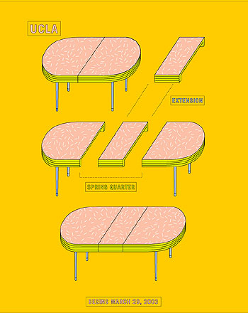

From left to right: We have spring by Woody Pirtle followed by Winter by Douglas Boyd. I love both designs but with Boyd’s piece. The minimal use of typography worked well in my opinion. I feel as though at the time of the piece the world was shifting into its heavy reliance on gadgets. We can see minimalism used extensively through out Pirtle’s piece. I don’t know if the design choice was strictly minimal because of the times but, has perfect dichotomy with the other.


