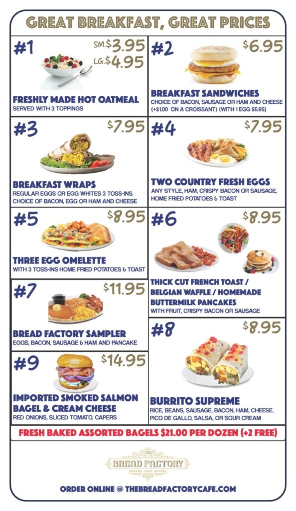
In my second week, after receiving critical feedback from Marla on both my logo design and breakfast menu design, I was quickly tasked with creating and designing a breakfast A-Frame menu sign for a client, the business name, Oxford Cafe.
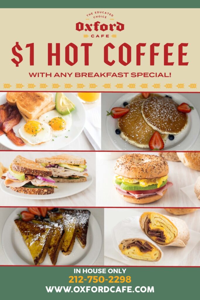
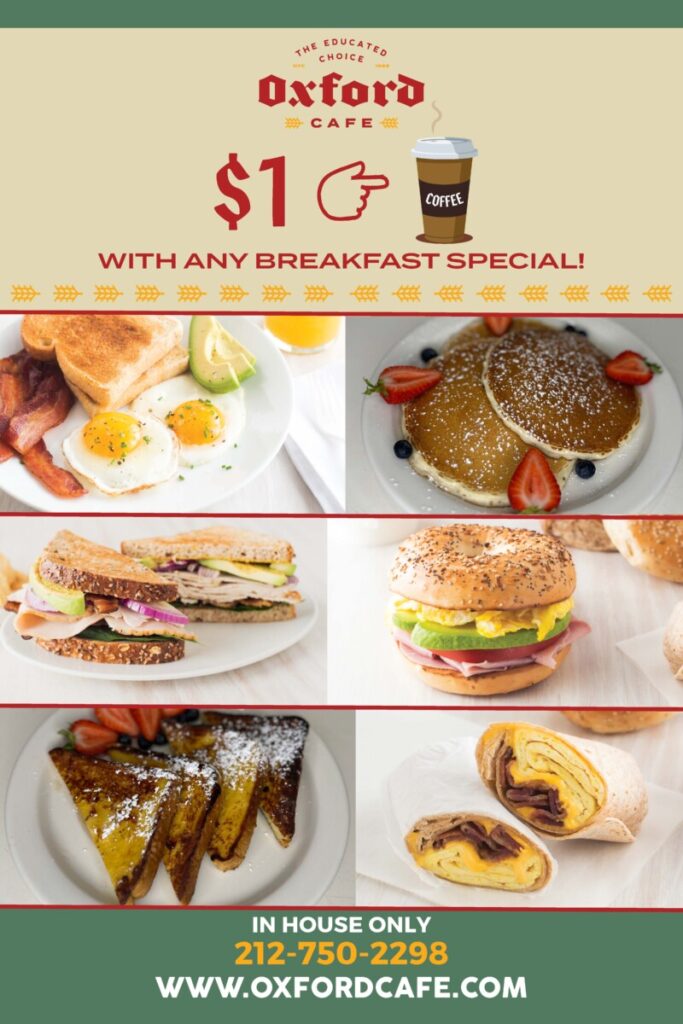
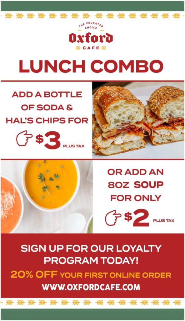
This project had its challenges… When I first sent the rough draft of the Oxford A-Frame, I was told to put a picture of a coffee cup and a drawn-up arrow hand pointing from the $1 to the coffee cup. Yet, images weren’t sitting right with me, so I took to Illustrator to design a vector coffee cup of my own. The problem I had with that was I couldn’t get the coffee cup to look like a coffee cup, it kept looking like a pill bottle, but with the right adjustments to the color, I finally finished it. Next was the drawn-up hand which was easily finished up thanks to the pen tool.
In the end revised product done by Marla, the coffee cup ended up not being used, but I do now have a valuable asset to include in my portfolio. I learned to not spend too much time on the decoration aspect until I have the layout done. I found myself to have spent way too much time on such a project due to me spending so much time on the coffee cup.

