The visual quote I chose to use was from the first stanza of a poem written by Dylan Thomas,
“Do not go gentle into that good night,
Old age should burn and rave at close of day;
Rage, rage against the dying of the light.”
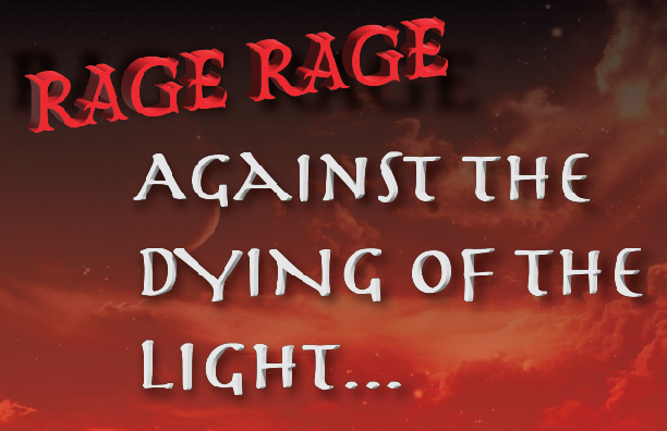
For this first design, I chose a background from google images (https://tinyurl.com/mu87sufa) this background appealed to me and fits perfectly with my quote. For my text “RAGE RAGE” was transformed in 3D to attract the most attention to the words in red, also a slight shadow can be seen without the 3D effect behind it, and my typeface was Mr Darcy Medium. For the text, “AGAINST THE DYING OF THE LIGHT…” the typeface that was used would be Herculanum and just as the “RAGE RAGE” text, effects such as shadow and bevel were applied.
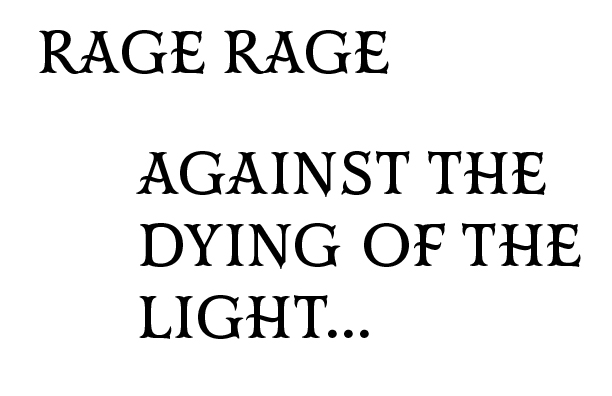
For the second design, I went for a simple white on black route to really emphasize the quote in all its glory. The typeface that was used was once again Mr Darcy Medium and the text is positioned the same as the first design but, “RAGE RAGE” isn’t transformed in 3D. Also, no effects are applied.
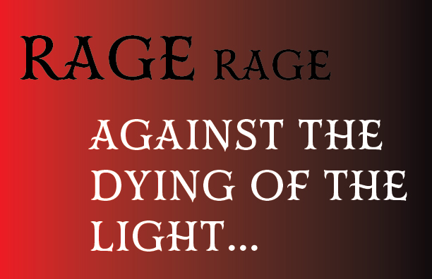
For the third design, I kept that simple aspect, but instead I added a red to black gradient in the background and for the “RAGE RAGE” text the first “RAGE” is noticeably larger than the second “RAGE” and that’s because I wanted the text to lead you into the rest of the quote, kind of like a staircase. The rest of the text, “AGAINST THE DYING OF THE LIGHT…” is a simple white text with no effects applied, once again using the Mr Darcy Medium typeface.


Leave a Reply