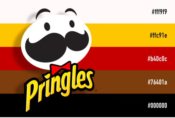
Pringles is an American brand of stackable potato-based crisps. Originally sold by Procter & Gamble (P&G) in 1968 and marketed as “Pringle’s Newfangled Potato Chips”. P&G is an American multinational consumer goods corporation headquartered in Cincinnati, Ohio, founded in 1837 by William Procter and James Gamble. In 1956, Procter & Gamble assigned a task to chemist Fredric J. Baur: to develop a new kind of potato chips to address consumer complaints about broken, greasy, and stale chips, as well as air in the bags. Baur spent 2 years developing saddle-shaped chips from fried dough and selected a tubular can as the chips’ container. The saddle-shape of Pringles chips is mathematically known as a hyperbolic paraboloid. In the mid-1960s another P&G researcher, Alexander Liepa of Montgomery, Ohio, restarted Baur’s work and succeeded in improving the taste. Although Baur designed the shape of the Pringles chip, Liepa’s name is on the patent. Gene Wolfe, a mechanical engineer and author known for science fiction and fantasy novels, helped develop the machine that cooks them. Pringles was then sold to the current owner, Kellogg’s in 2012. Kellogg’s produces cereal and convenience foods, including crackers and toaster pastries, and markets their products by several well-known brands including Corn Flakes, Rice Krispies, Frosted Flakes, Eggo, Cheez-It, and of course Pringles. Kellogg’s mission statement is “Nourishing families so they can flourish and thrive.”
The original Pringles logo was designed by Arch Drummond in New York 1967. It depicts the brand’s main mascot, baker Julius Pringles. His appearance changed several times,
but the image remained recognizable.
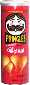
In 1986, Mr. Pringle’s face became rounder, his eyes were more apparent, and his mustache was slightly changed. The apostrophe in “PRINGLE’S” was also dropped. This logo was brought back in 2011 for a series of “Rewind Edition” Pringles cans.
Pringles tweaked its logo almost after a decade. The emblem was positioned diagonally along with receiving a brighter color palette. Mr. Pringles’ rosy cheeks and visible mouth disappeared in late-1996 making the logo look more stylish, neat, and fresh.
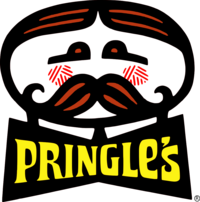
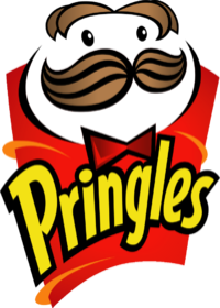
Between January and September 2002, the eyebrows were dropped, and a red bow tie was added which added to the fun vibe of the logo and made him more contemporary, plus a new lowercase wordmark was introduced. Mr. Pringles’ hairstyle was also changed. He also gained a spark in his dotted black eyes. This logo is still used on Snack Stacks containers.
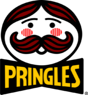
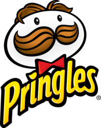
In 2009, a more jazzed up version of Mr. Pringles was launched with an updated wordmark and the “i” now dotted with a chip/crisp. The logo got replaced in the United States, Oceania, and parts of Asia in 2020; in Europe in 2021 and in Latin America in 2022. However, it is still used in Canada and parts of Asia.
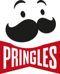
In December 2020, Pringles unveiled a simplified logo in the United States, Mr. Pringles’ design was simplified with his hair removed, his eyebrows were brough back, the white pupils or the “spark” was removed from the eyes, and the bowtie was minimalized and made sharper. The wordmark from 2009 remains, but the proportion has been slightly tweaked. The logo is often seen on a non-white background. This logo has received generally negative feedback from critics and fans.
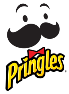
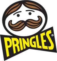
An alternate variant of the US 2020 logo with a wordmark instead based on the first three Pringles logos from 1967, 1986, and 1996 with his bowtie removed. Mr. Pringles’ has remained bald, his eyes are beadier, and his eyebrows are more expressive. Pringles’ new look has been created by design studio Jones Knowles Ritchie. The new Pringles logo includes an updated look and new packaging. Pete Matthews, Pringles’ brand design director, mentions, “The intention with the new look is to simplify and modernize the design, giving the brand’s mascot a bold makeover and highlighting the stack ability of the crisps across the range.” The Pringles logo change, according to Della Lawrence, JKR creative director, was done to bring Mr. Julius Pringle to life.
Pringles today are still a trip essential must have for most people and it seems to have always been given the fact the company is still on going for around 54 years. Throughout those years, time was at the essence of the logo. It experienced seven changes, each change being significantly yet also slightly different. Mr. Pringles lost his hair and that sparkle he had in his black eyes. Makes you question how fast anything can switch up and the reason behind it all.
Works Cited
Wikipedia contributors. “Pringles.” Wikipedia, The Free Encyclopedia. Wikipedia, The Free Encyclopedia, 28 Mar. 2022. Web. 31 Mar. 2022.
https://en.wikipedia.org/wiki/Pringles
Wikipedia contributors. “Procter & Gamble.” Wikipedia, The Free Encyclopedia. Wikipedia, The Free Encyclopedia, 24 Mar. 2022. Web. 31 Mar. 2022.
https://en.wikipedia.org/wiki/Procter_%26_Gamble
Wikipedia contributors. “Kellogg’s.” Wikipedia, The Free Encyclopedia. Wikipedia, The Free Encyclopedia, 29 Mar. 2022. Web. 31 Mar. 2022.
https://en.wikipedia.org/wiki/Kellogg%27s
Wong, Henry. “Mr. P Gets a Haircut in “Simplified” Pringles Rebrand.” Design Week, 22 Sept. 2021.
https://www.designweek.co.uk/issues/20-26-september-2021/pringles-rebrand/
“Pringles.” Logopedia, 2009.
https://logos.fandom.com/wiki/Pringles
Jansen, Mike. Pringles Logo: How Mr. Julius Pringles Evolved over the Years. 10 Nov. 2021.
https://designbro.com/blog/inspiration/pringles-logo-evolution/
Guila, Bryan. “Pringles Logo History.” Prezi.com, 16 June 2013. https://prezi.com/qtgu9bhtofyd/pringles-logo-history/


Leave a Reply