Assignment V - Project 03 Library Reflection
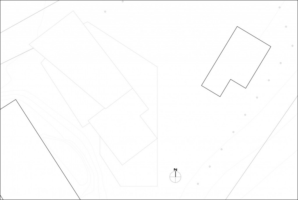
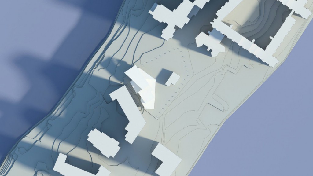
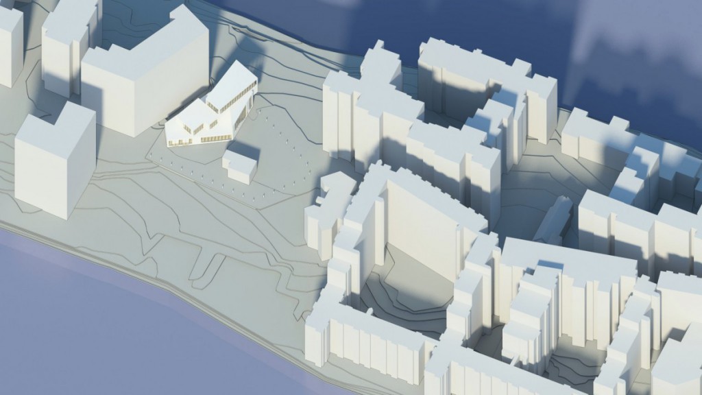
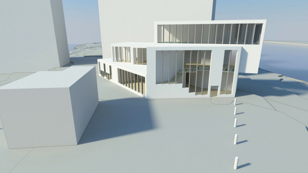
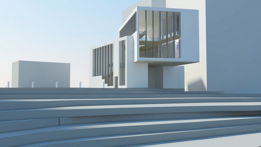
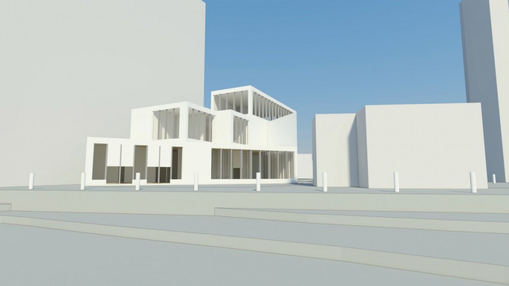
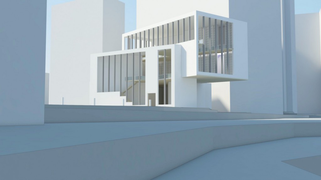
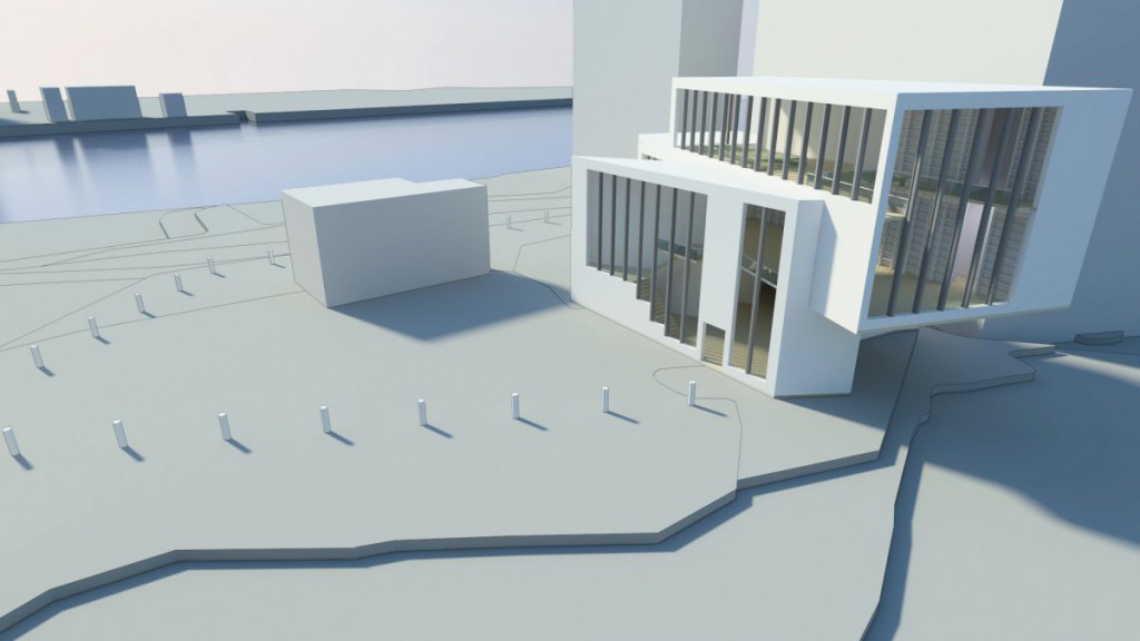
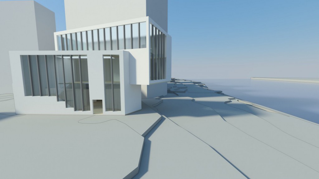
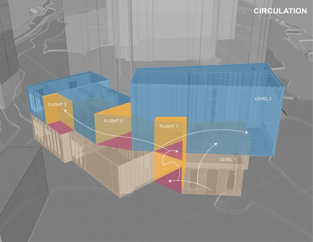
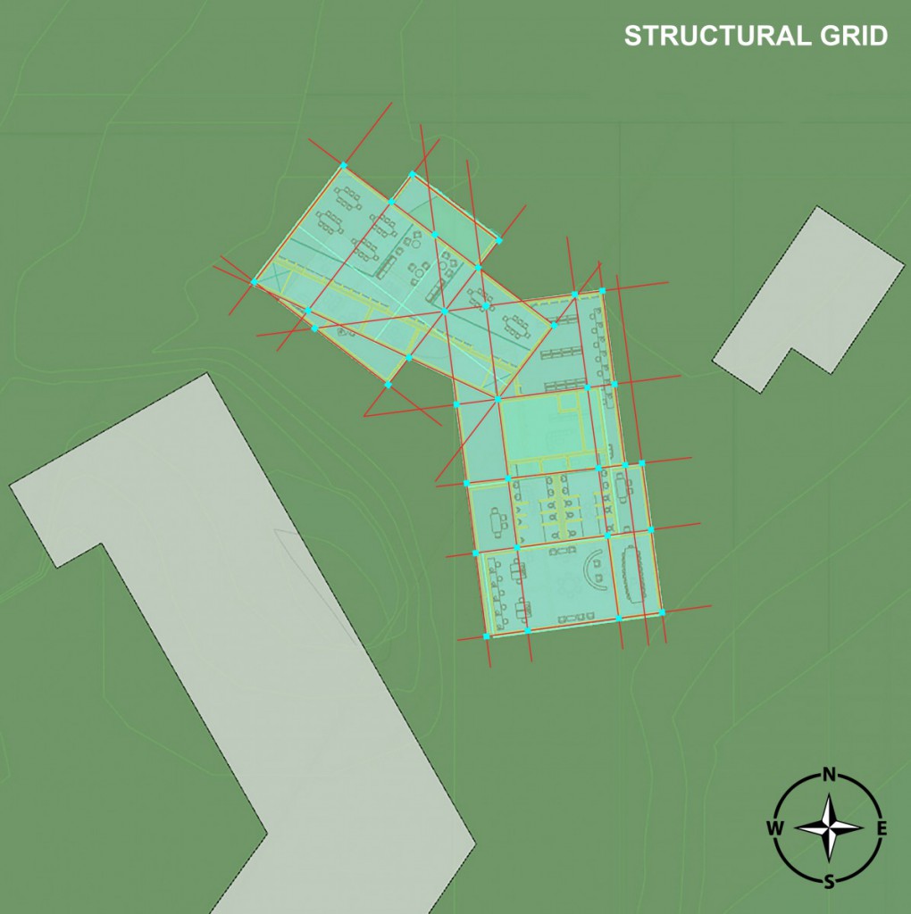
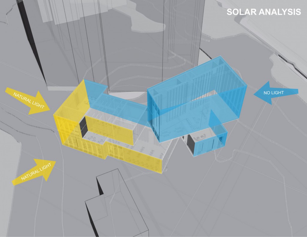
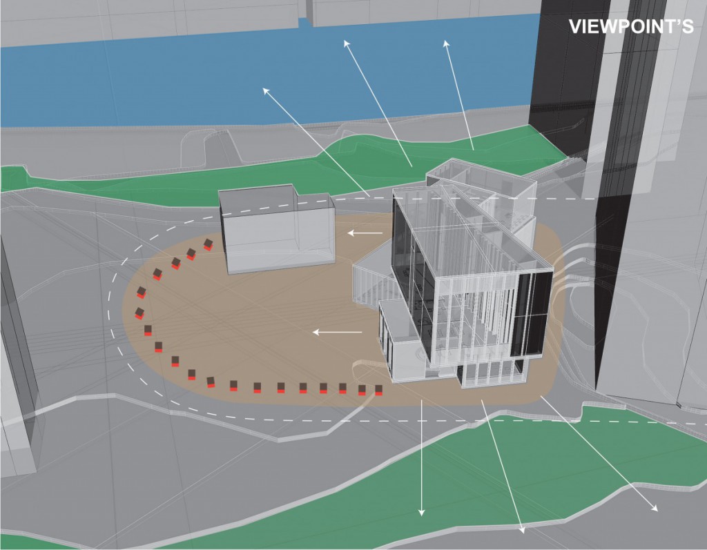
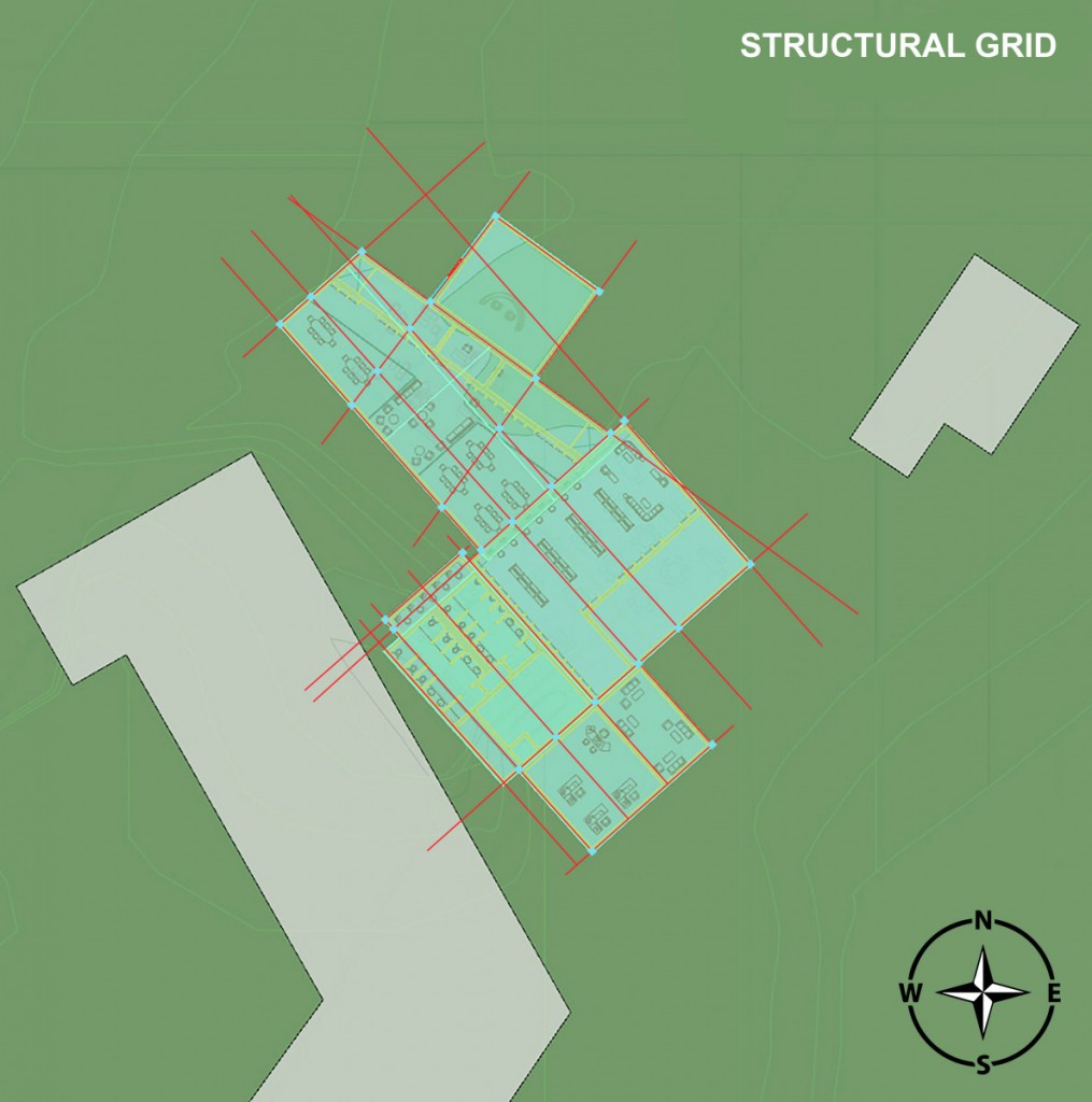
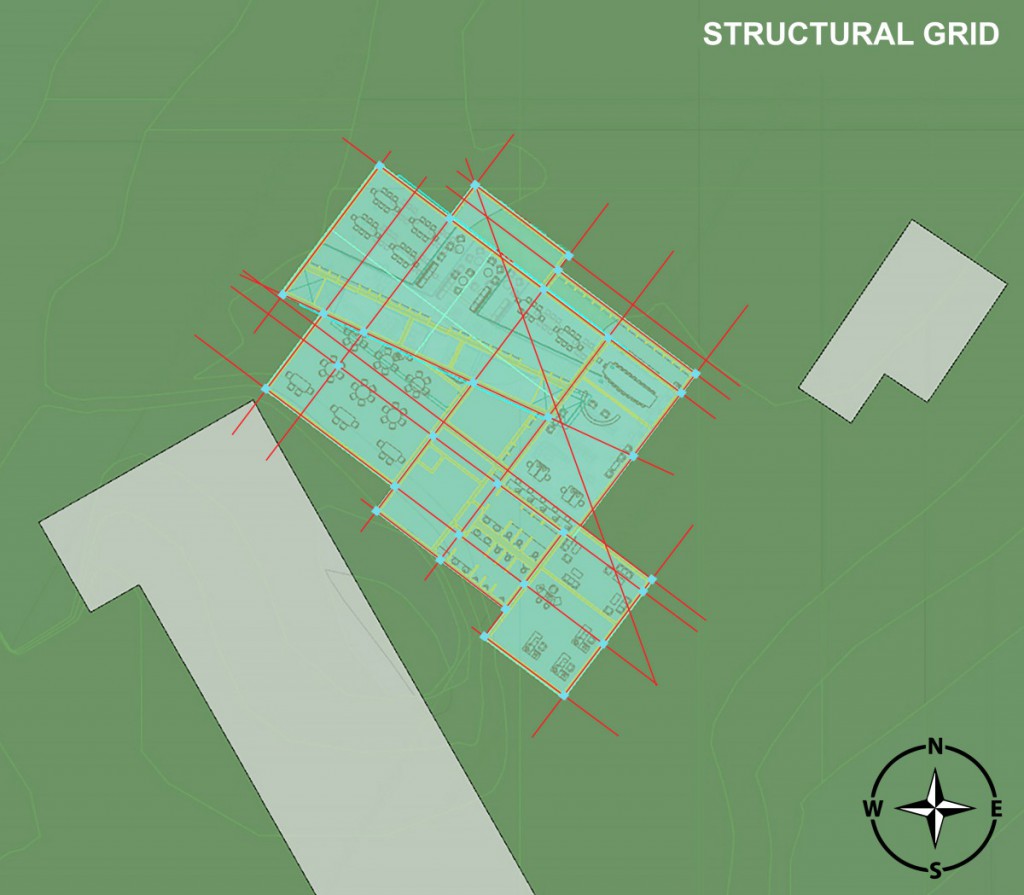
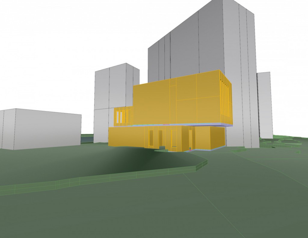
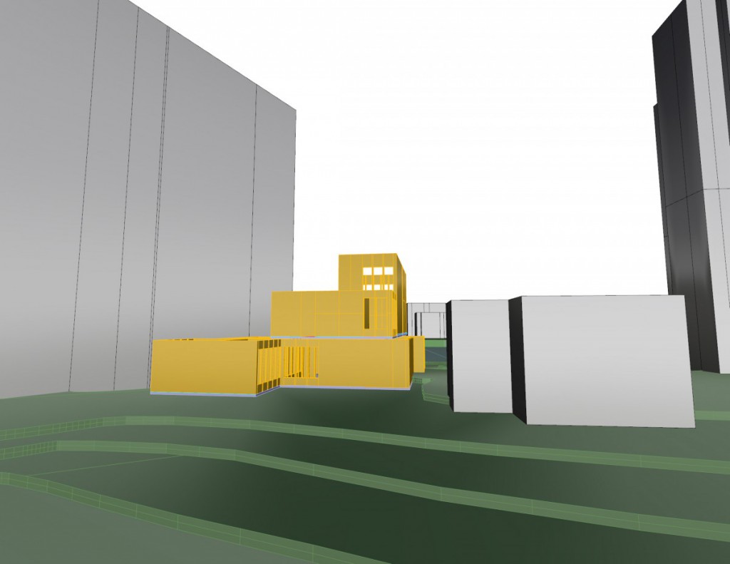
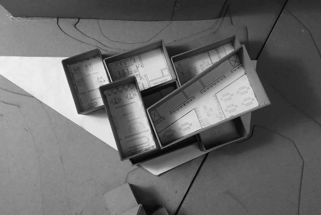
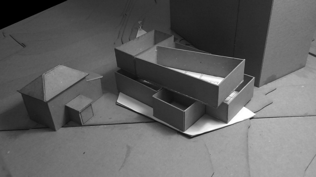
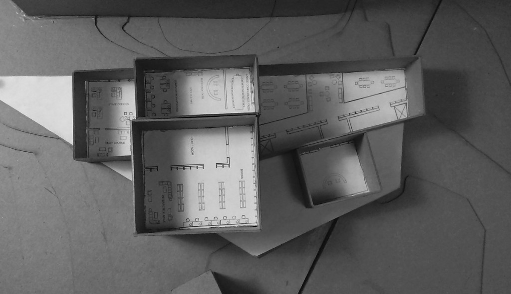
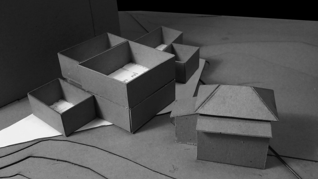
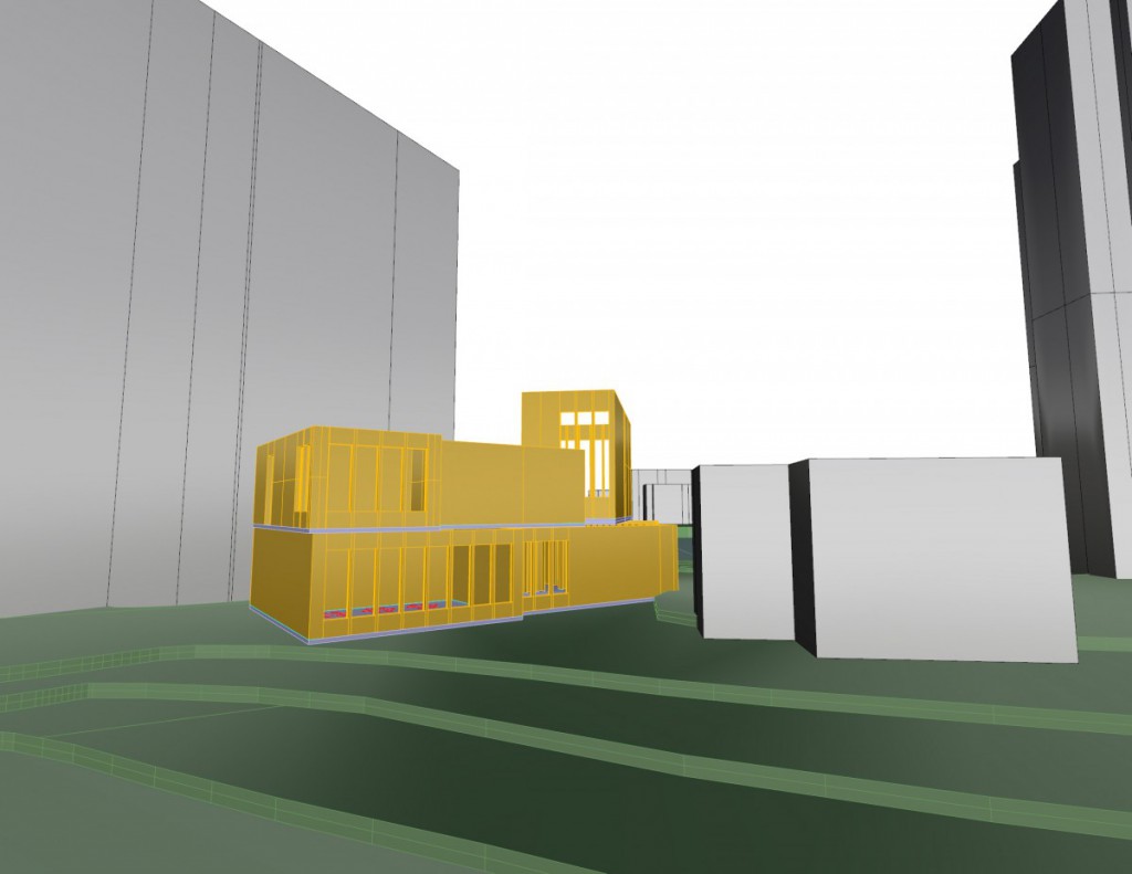
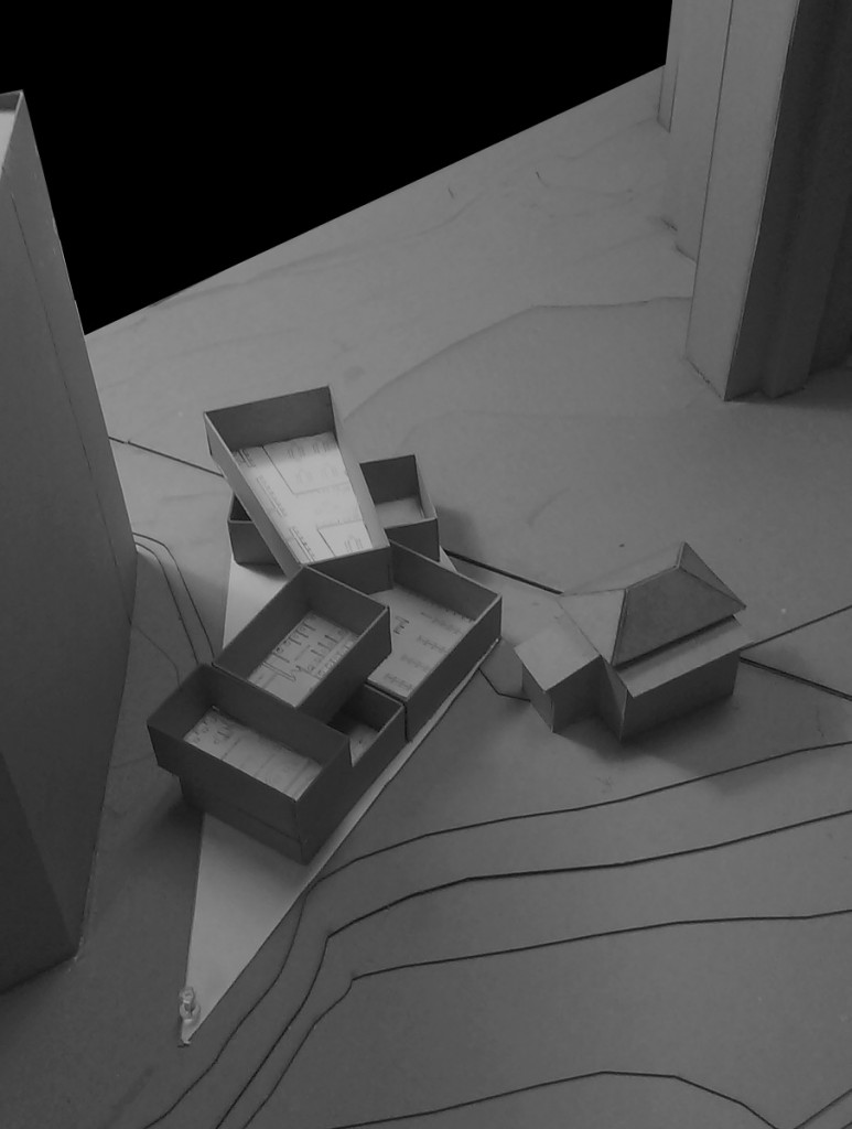
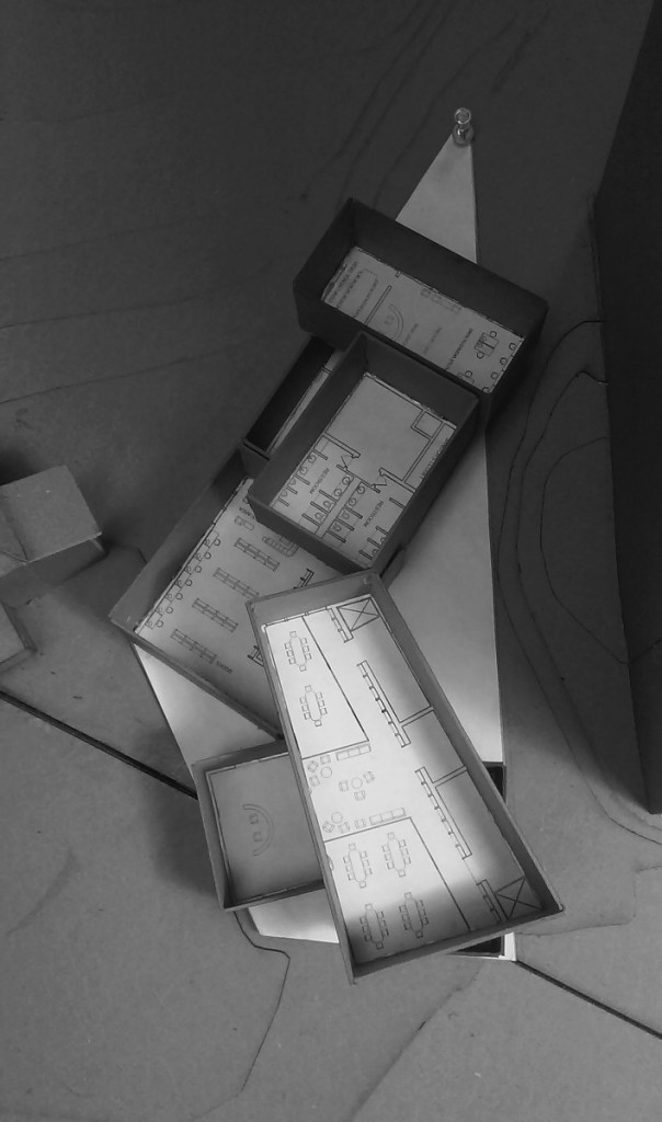
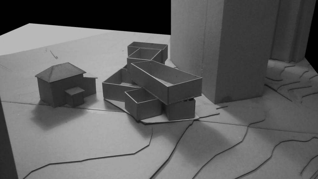
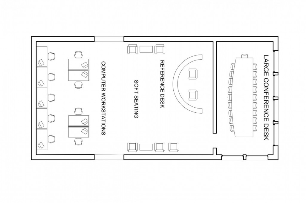
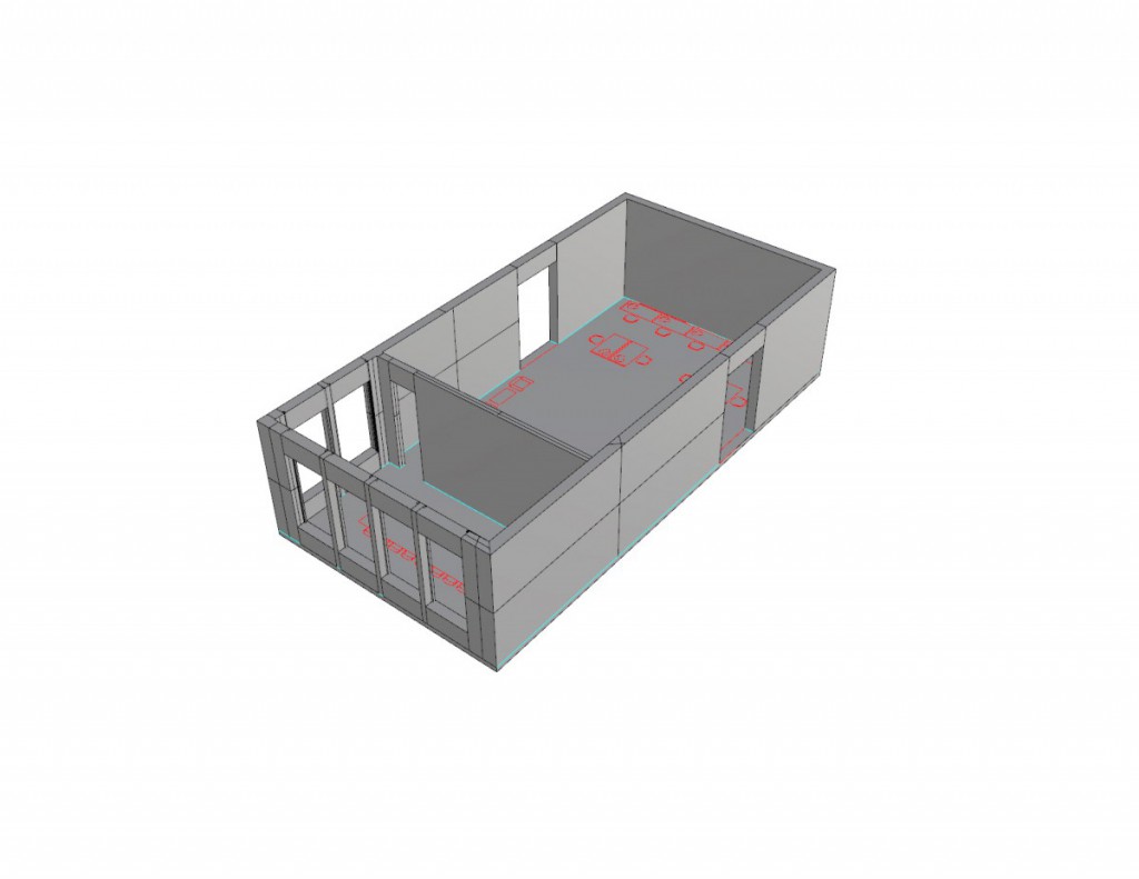
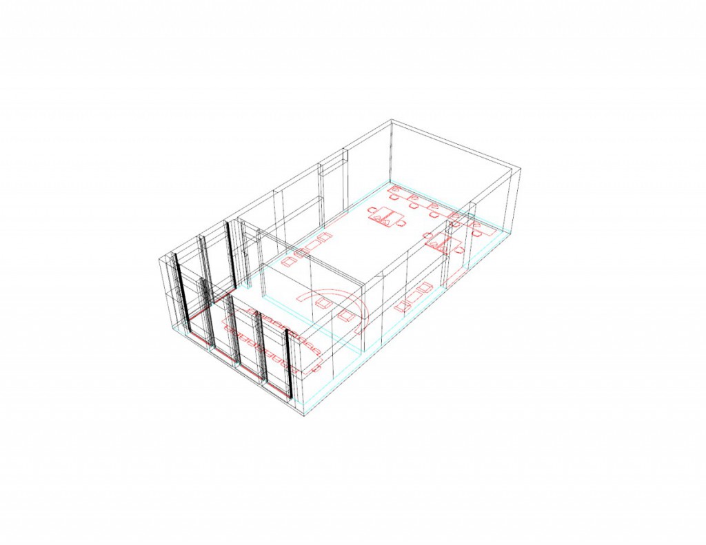
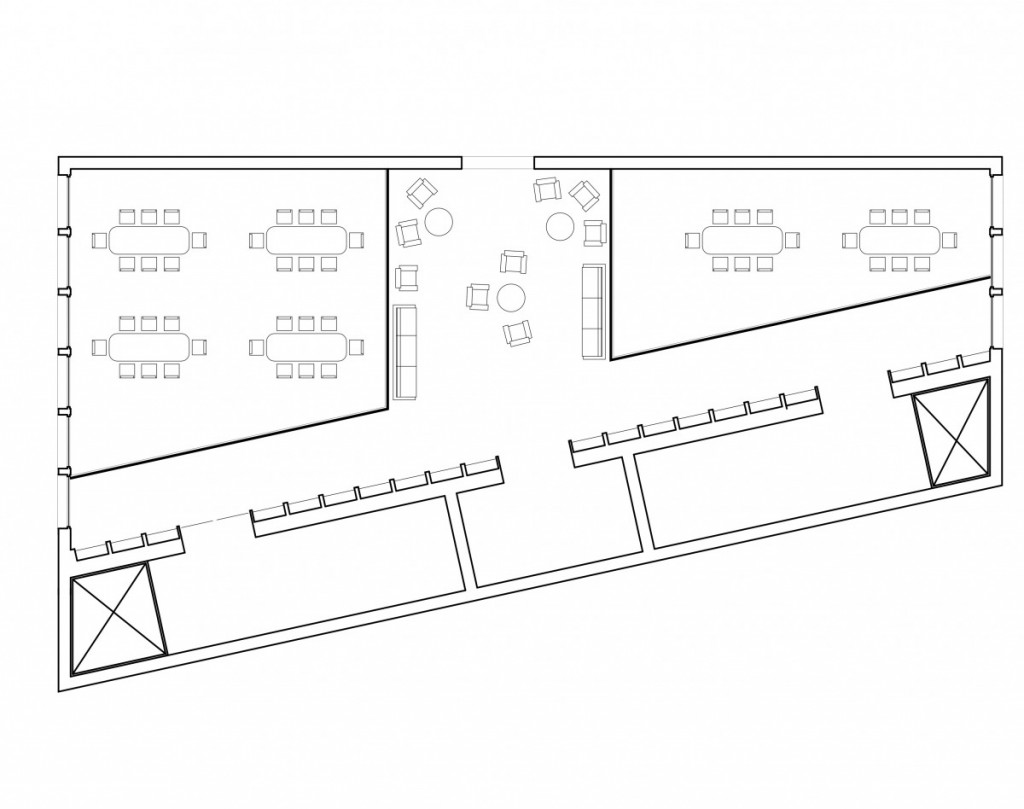
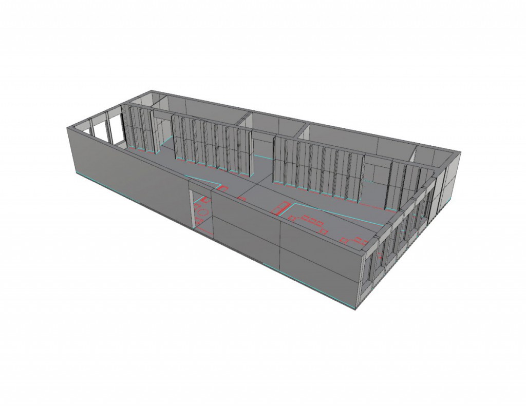
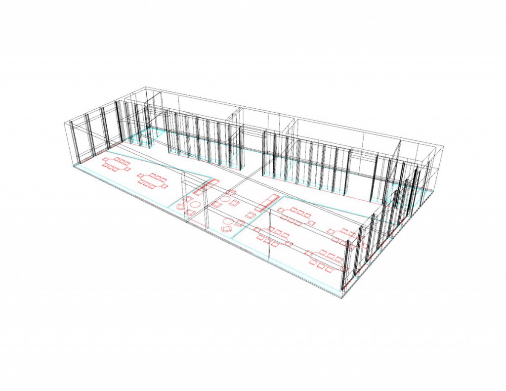
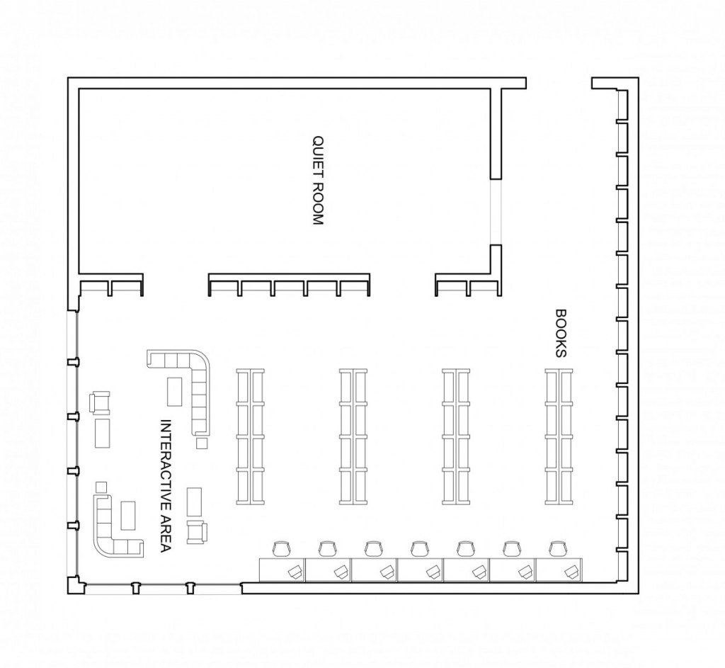
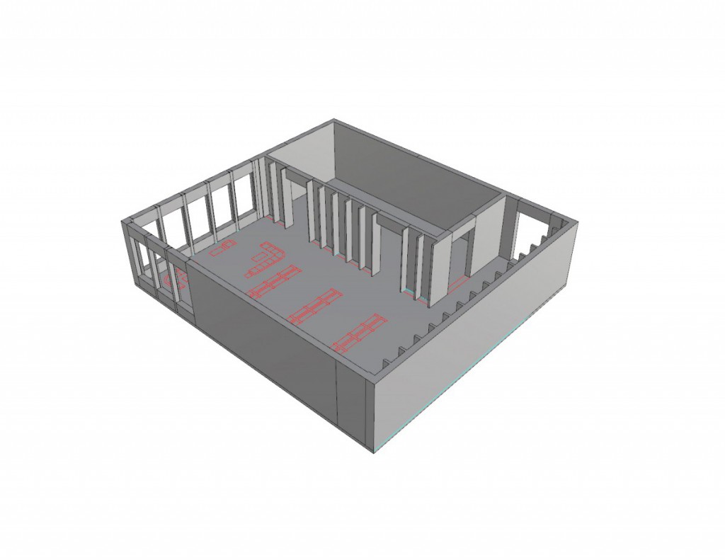
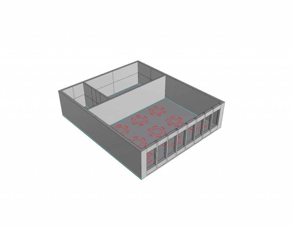
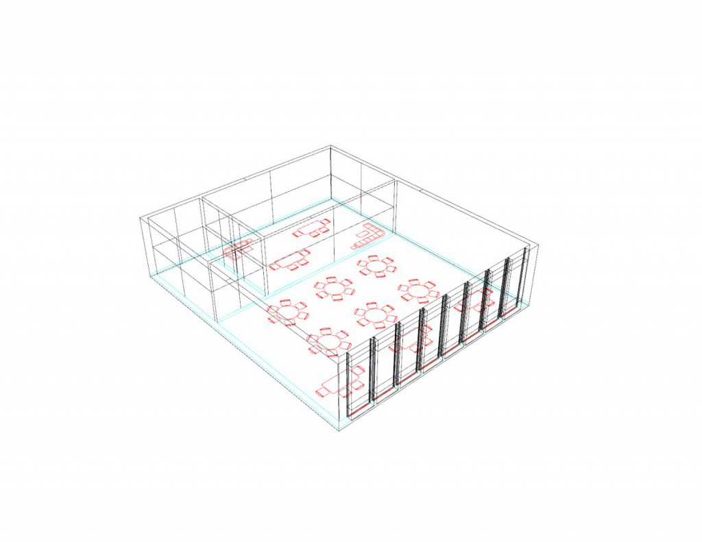
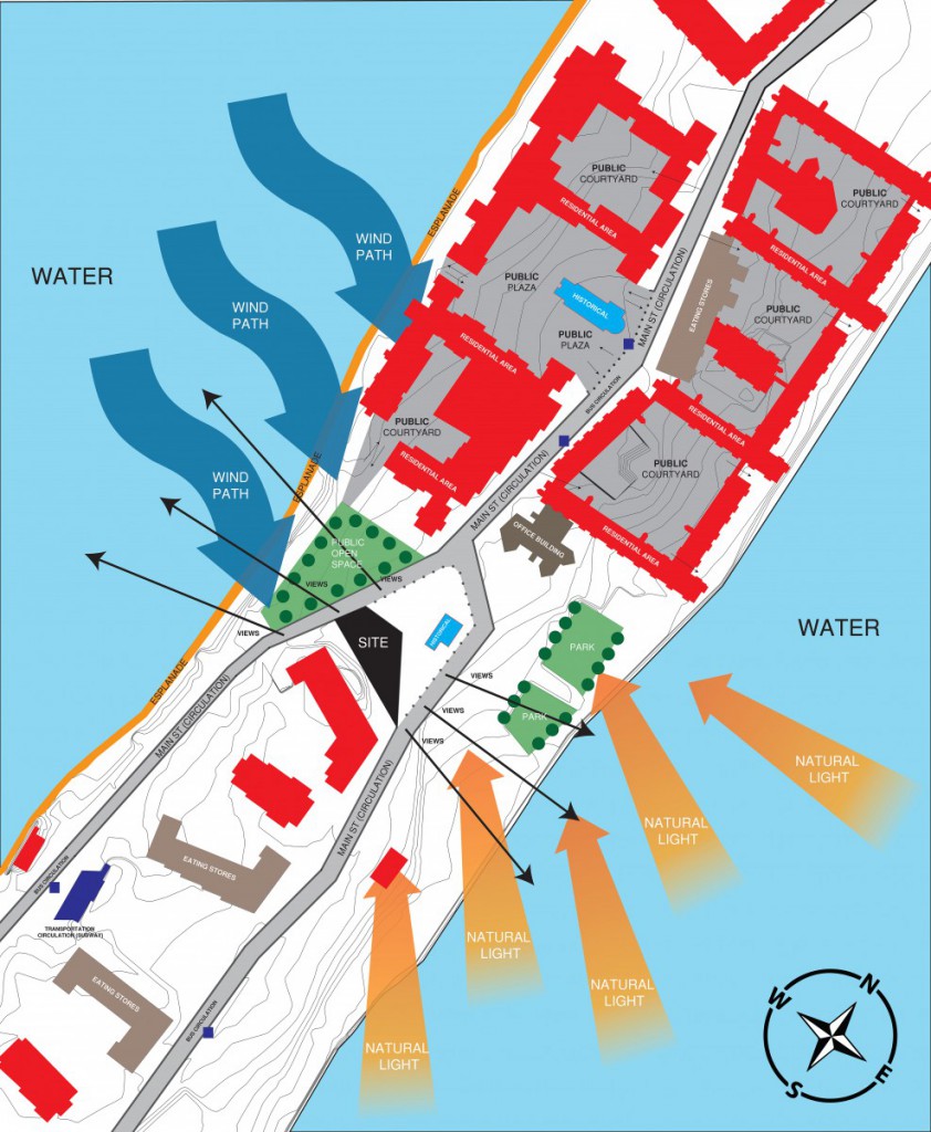
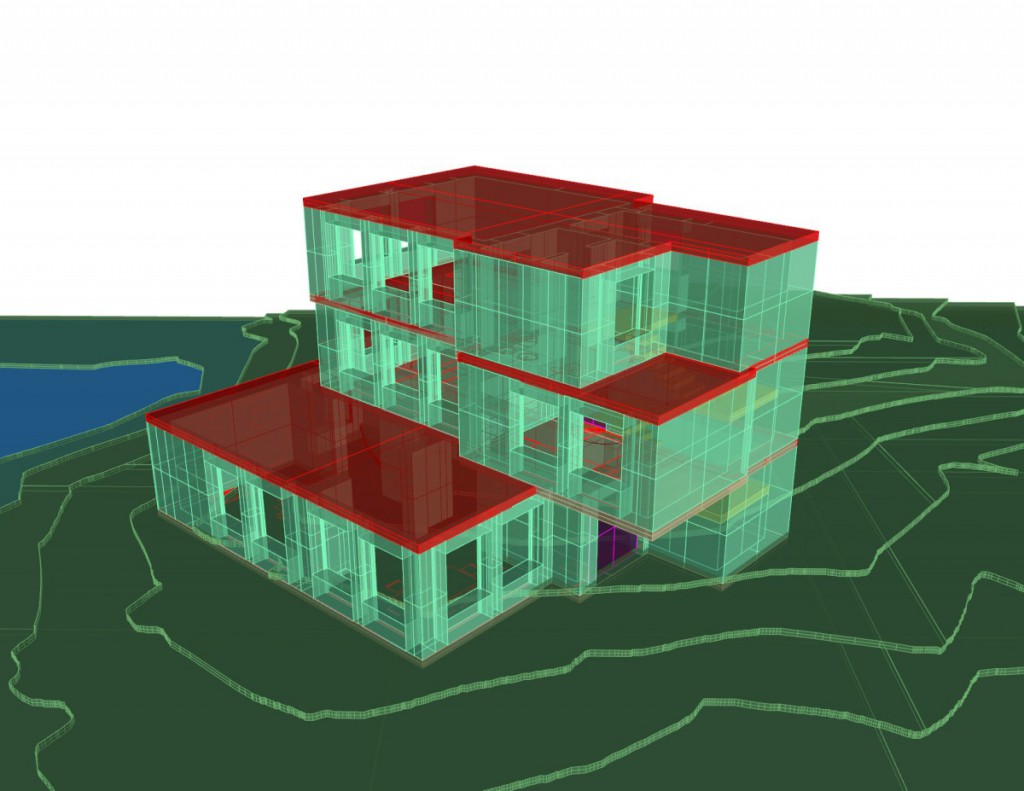
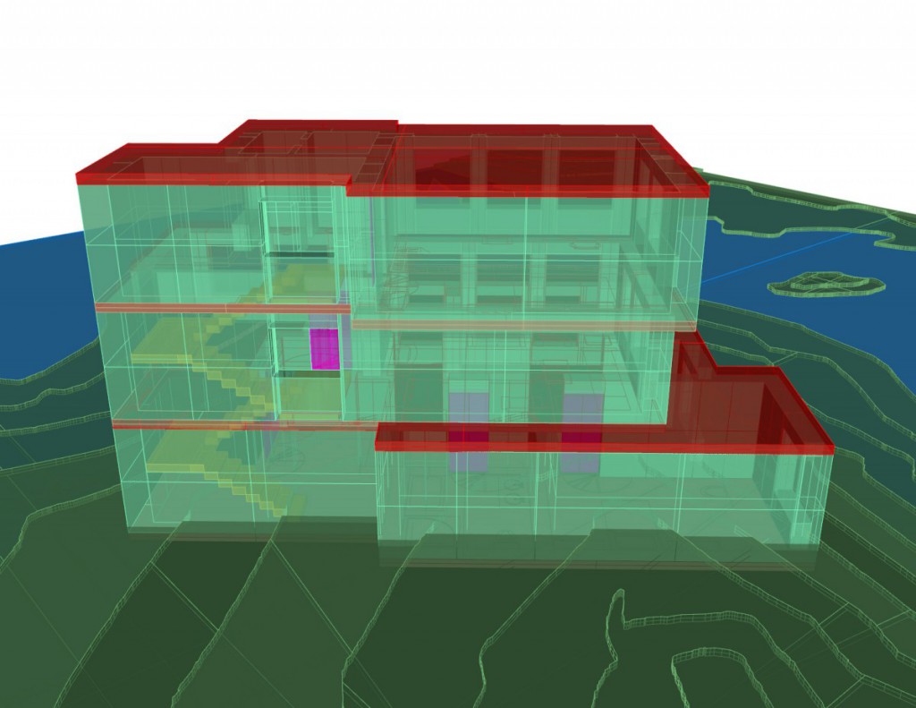
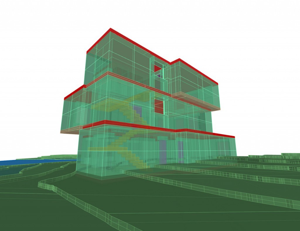
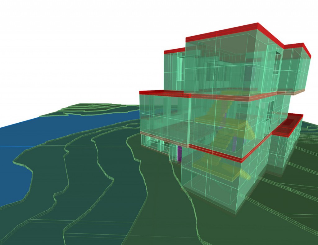
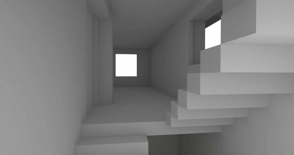
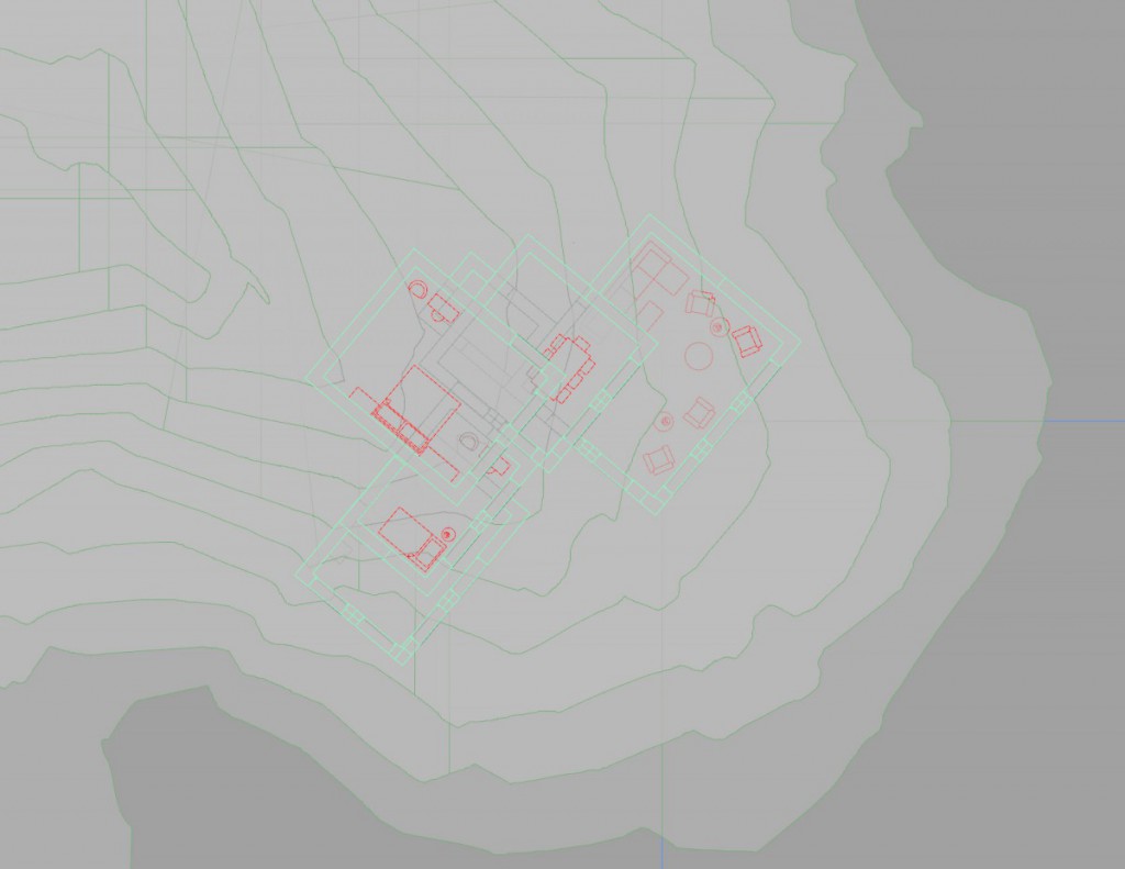
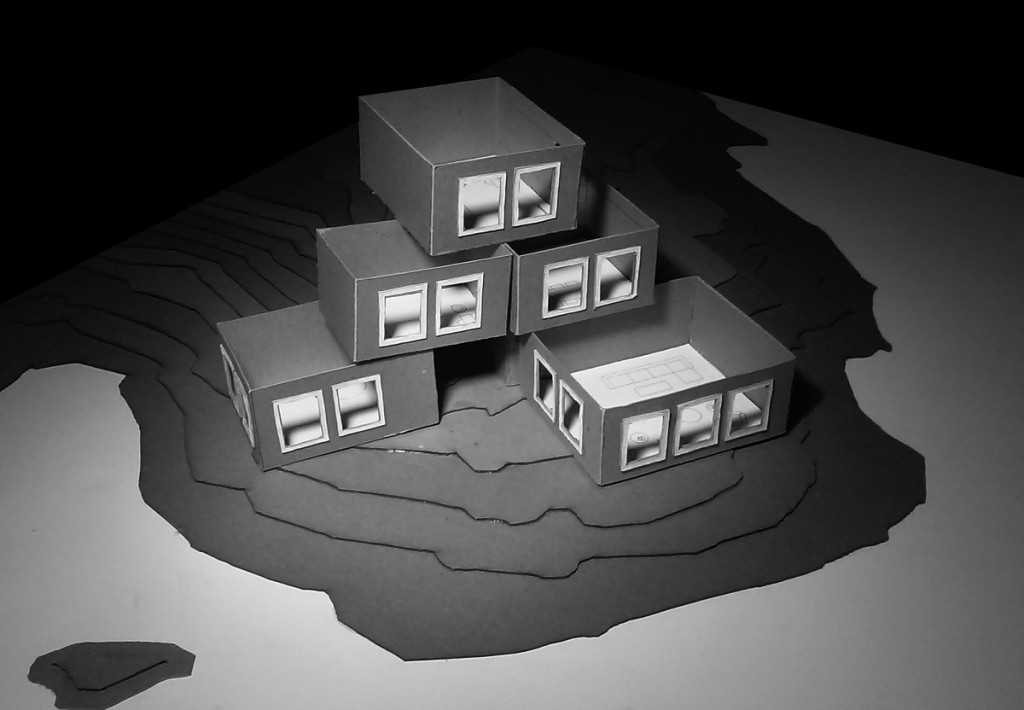
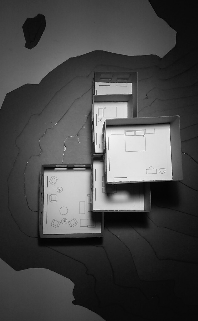
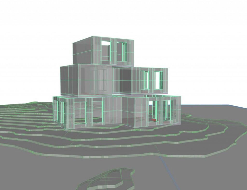
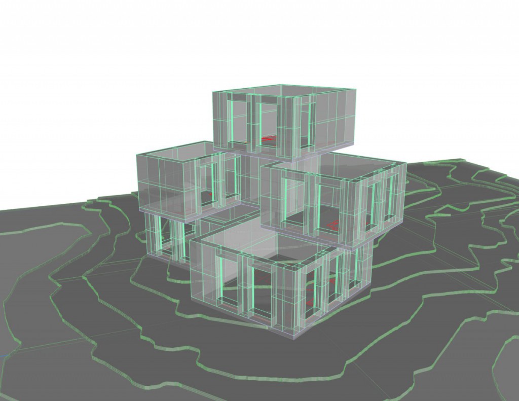
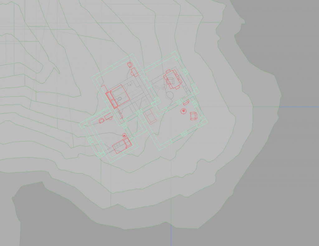
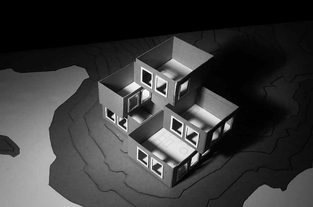
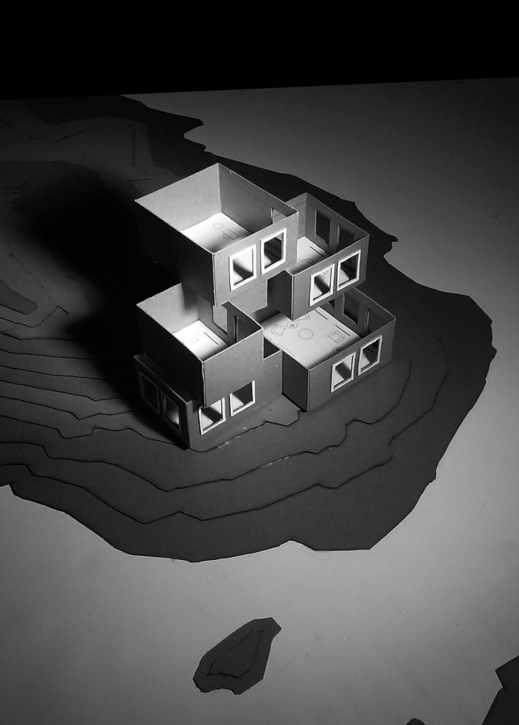
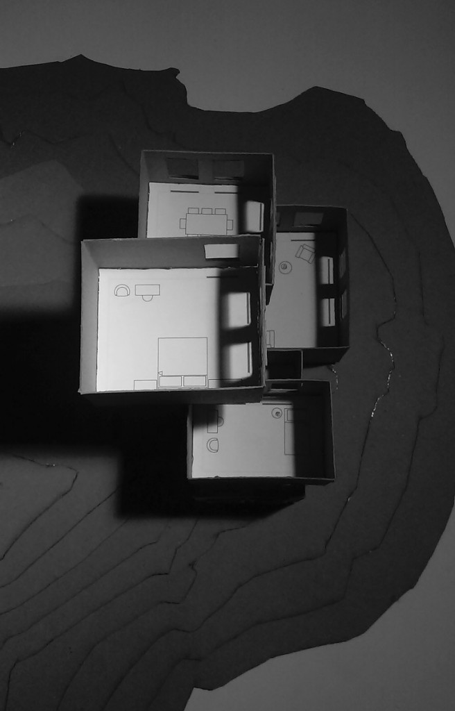
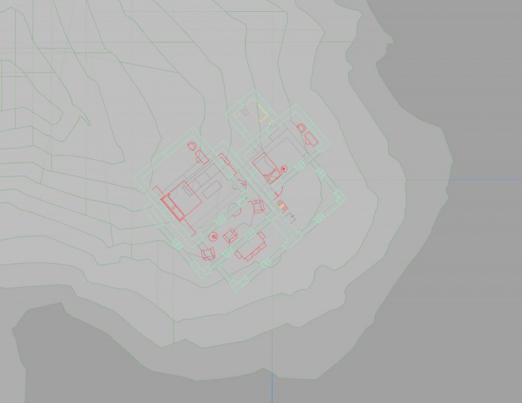
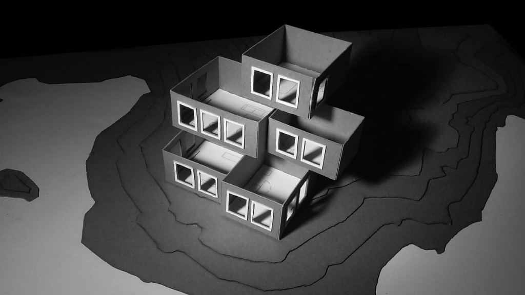
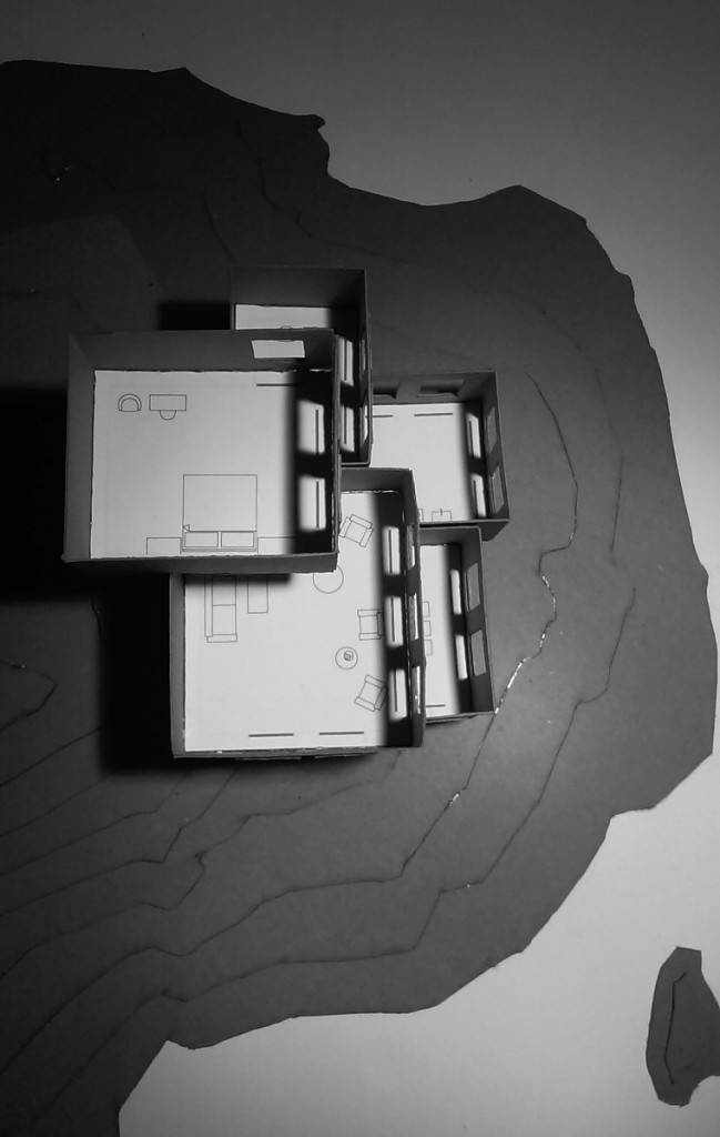
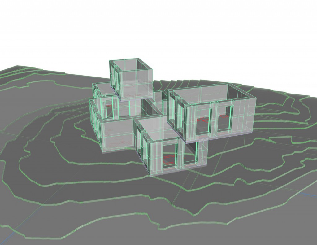
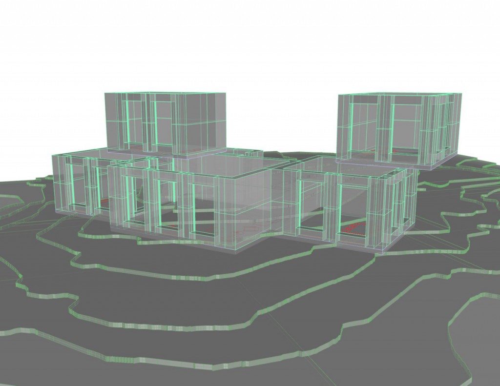
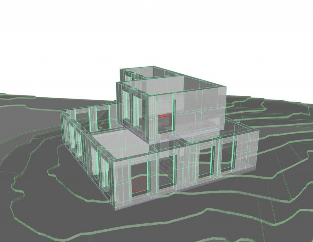
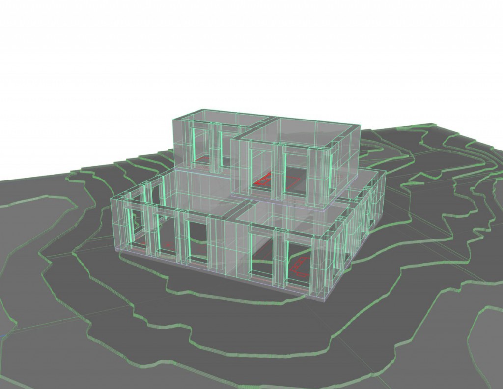
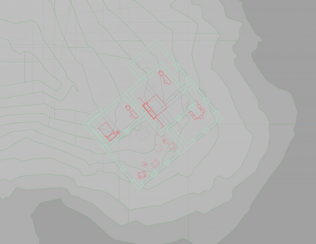
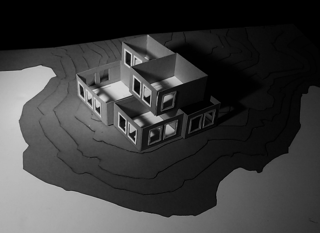
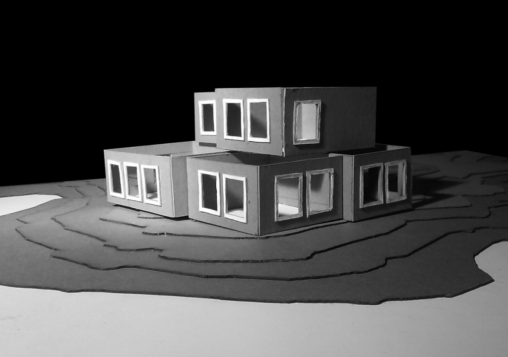
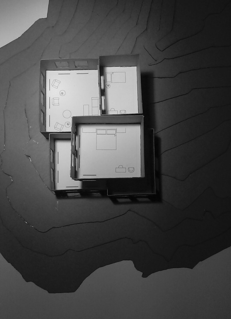
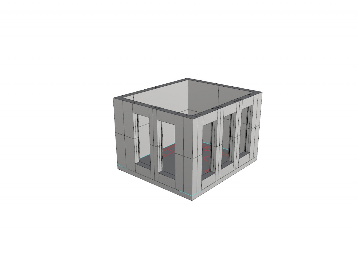
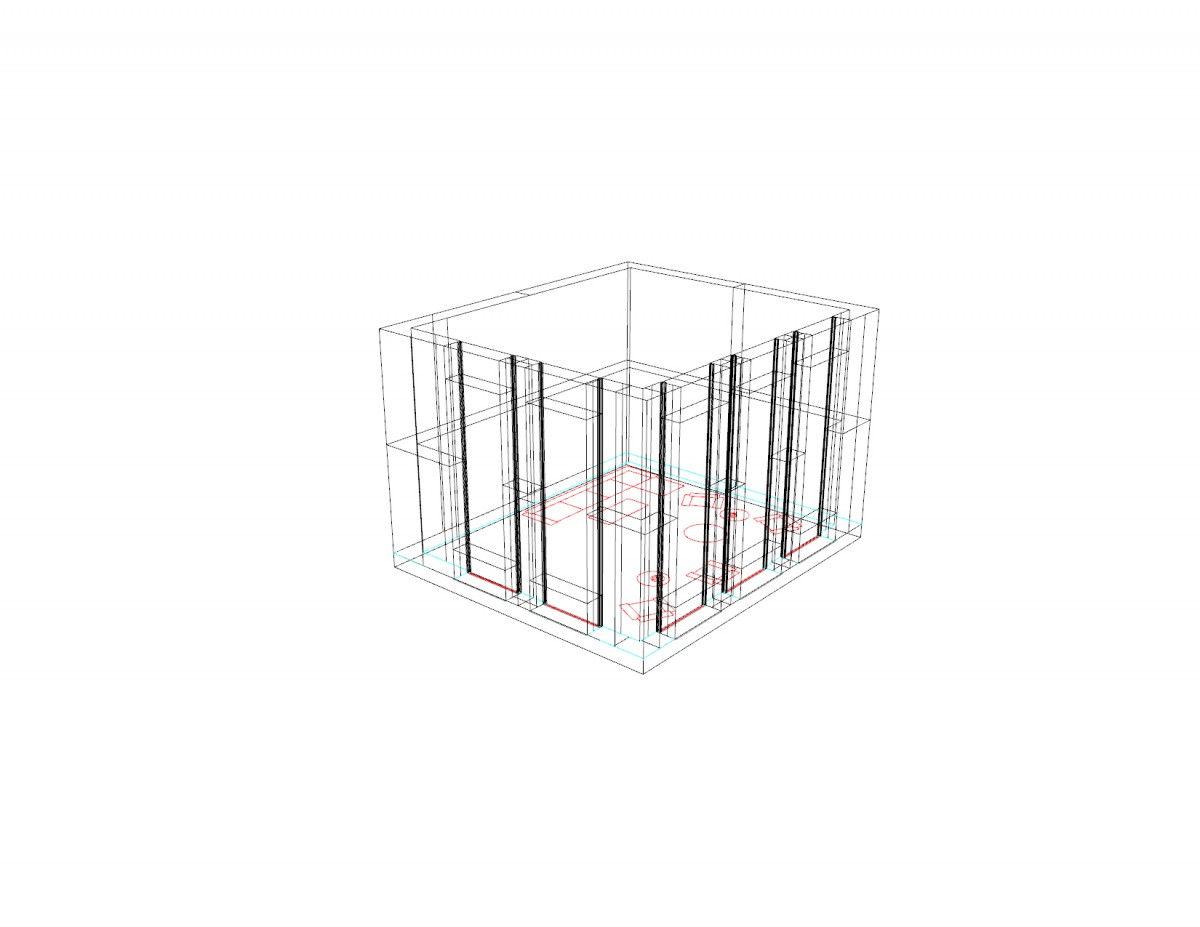
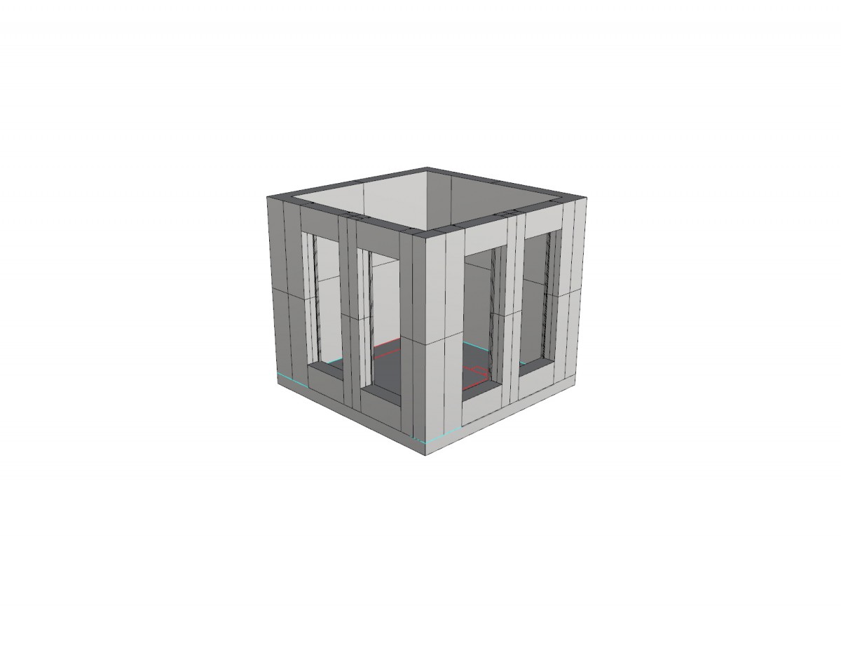
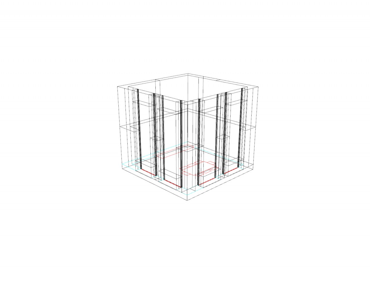
- To start off project 3 we as a class went to study & analyze the site given to us in many ways to incorporate the outside vs inside forces that enforce our design towards the library. While keeping the site in mind I worked with space of the site to give me a reference of how big my indoor spaces need to be. Also with there being a structural grid throughout the project this made the project more challenging for me. Manipulating the grid in a way that can define spaces through the structure gave me more of a understanding of how structural columns can play a role in how slabs connect and reinforce each other. I got very good feedback accompanied by some great advice for most of my future projects which was to never forget about the structural grid and always understand how spaces relate not just to the inside but also to the outside forces of the site. Taking in everything I learned in this project, I will recollect all the advice given to me and continue to apply the design processes I learned this summer semester for future tasks.
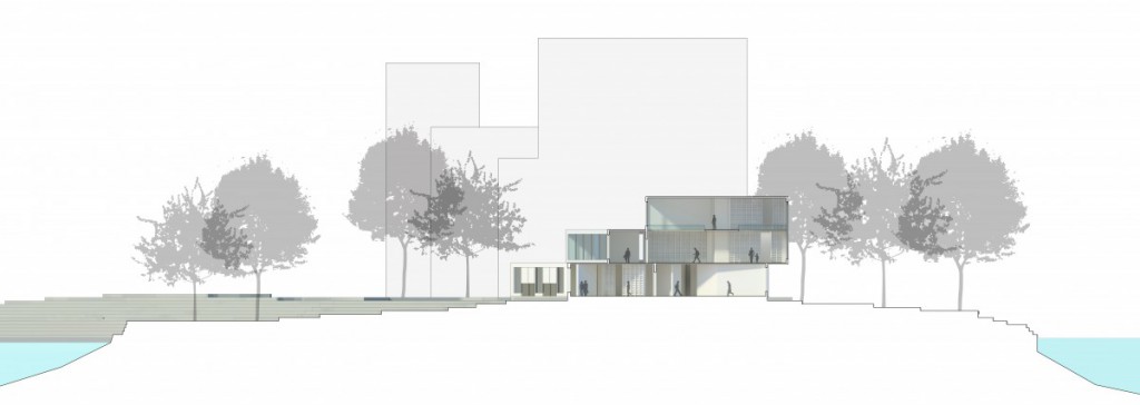
Assignment T - Site Section Drawings
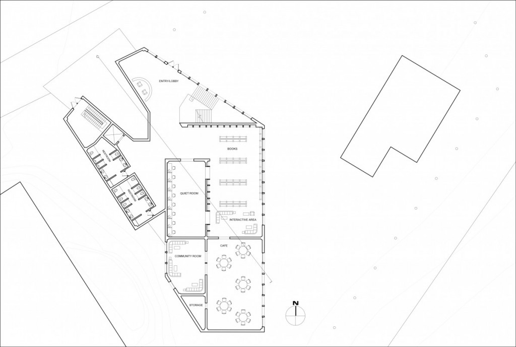
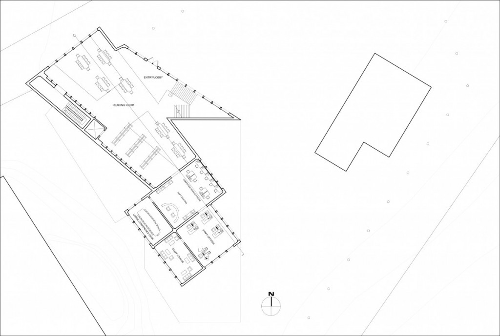
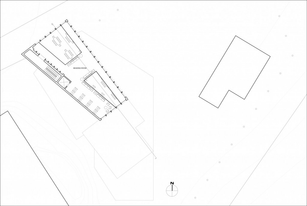
Assignment S - Plan Drawings
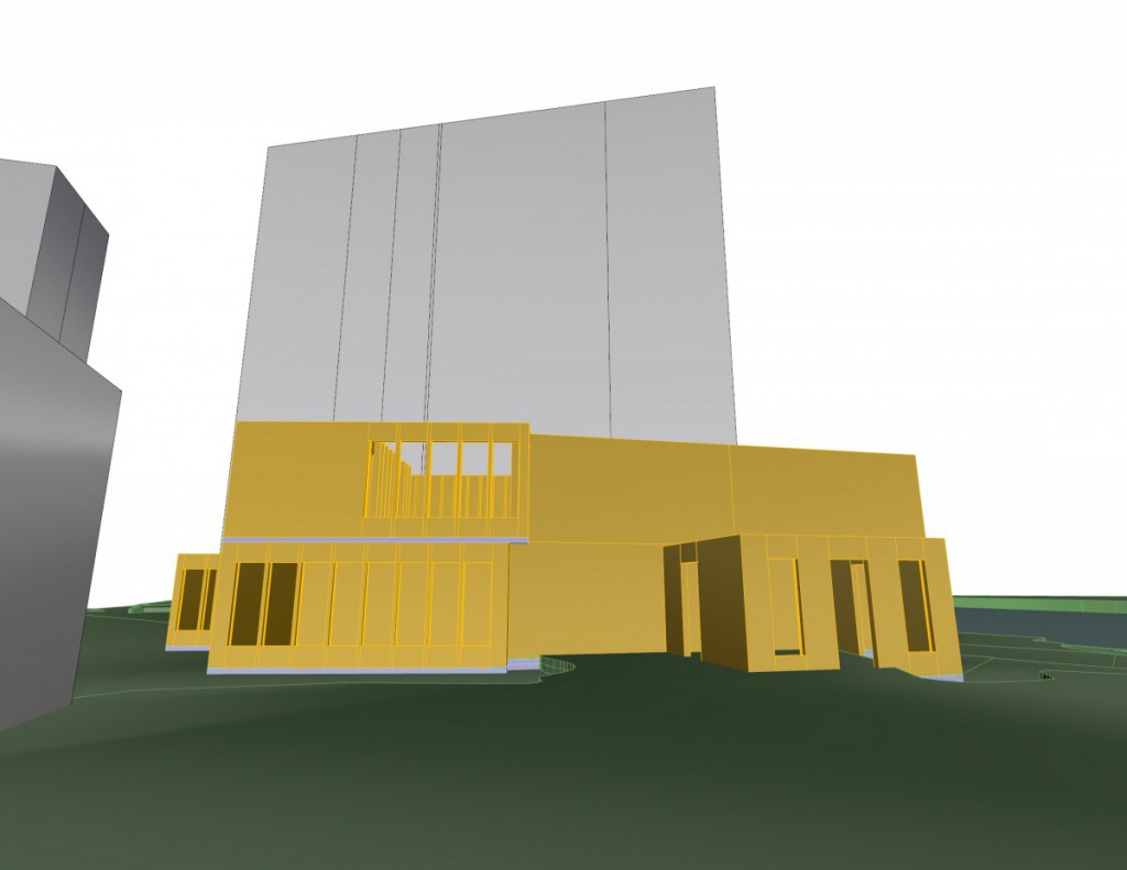
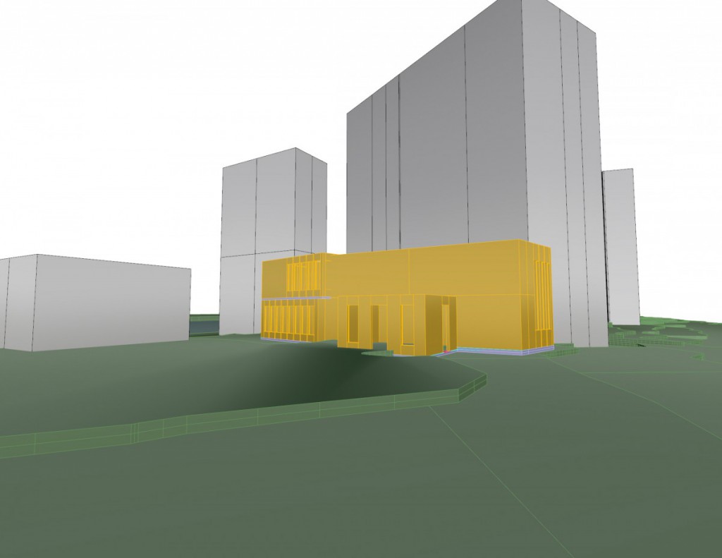
Assignment R - Digital Model Development
Assignment Q - Selected Final Parti
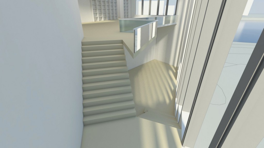
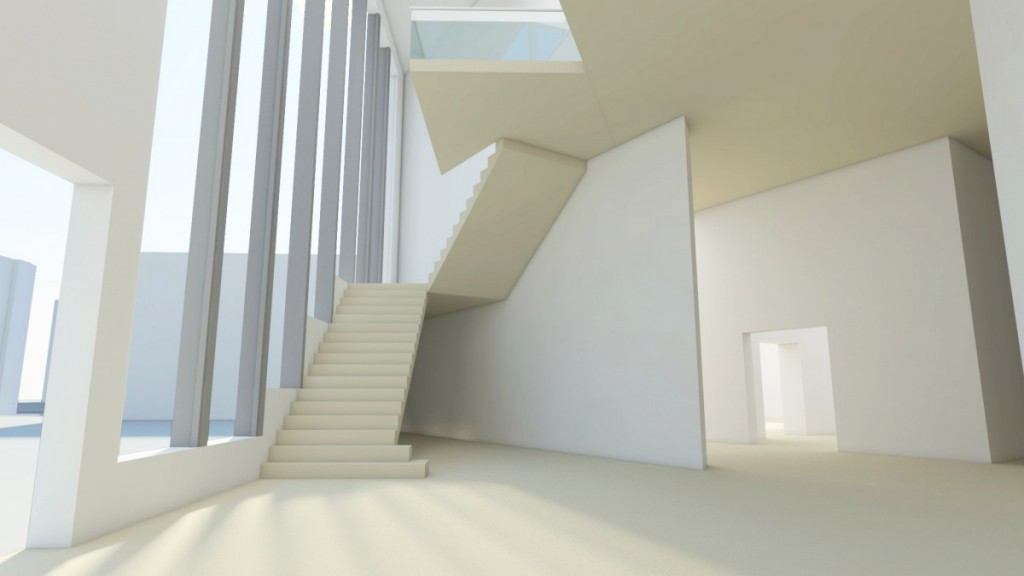
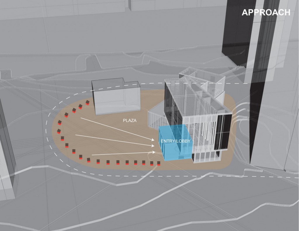
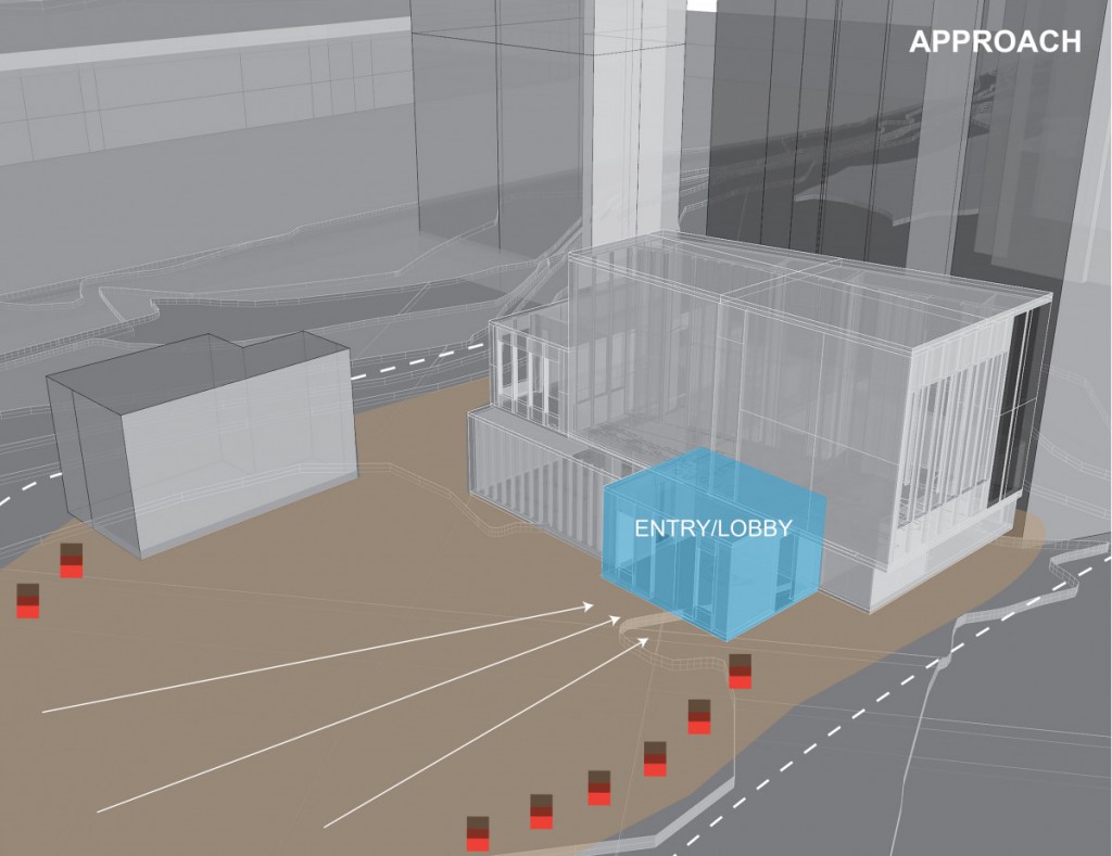
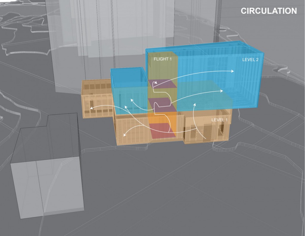
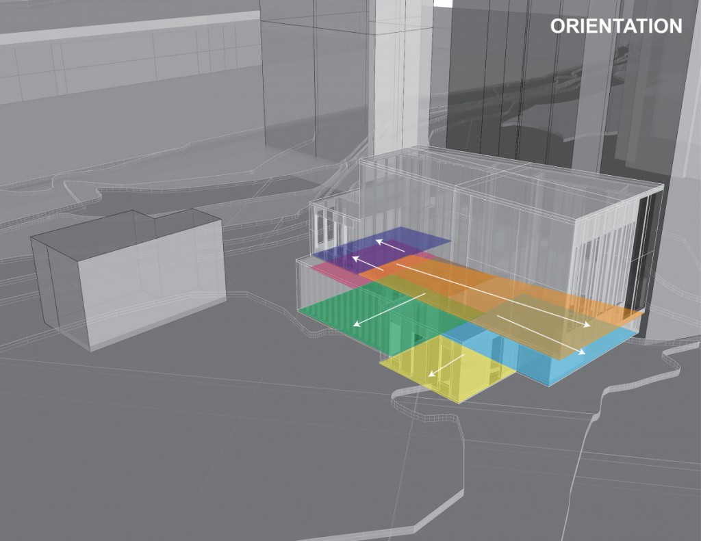
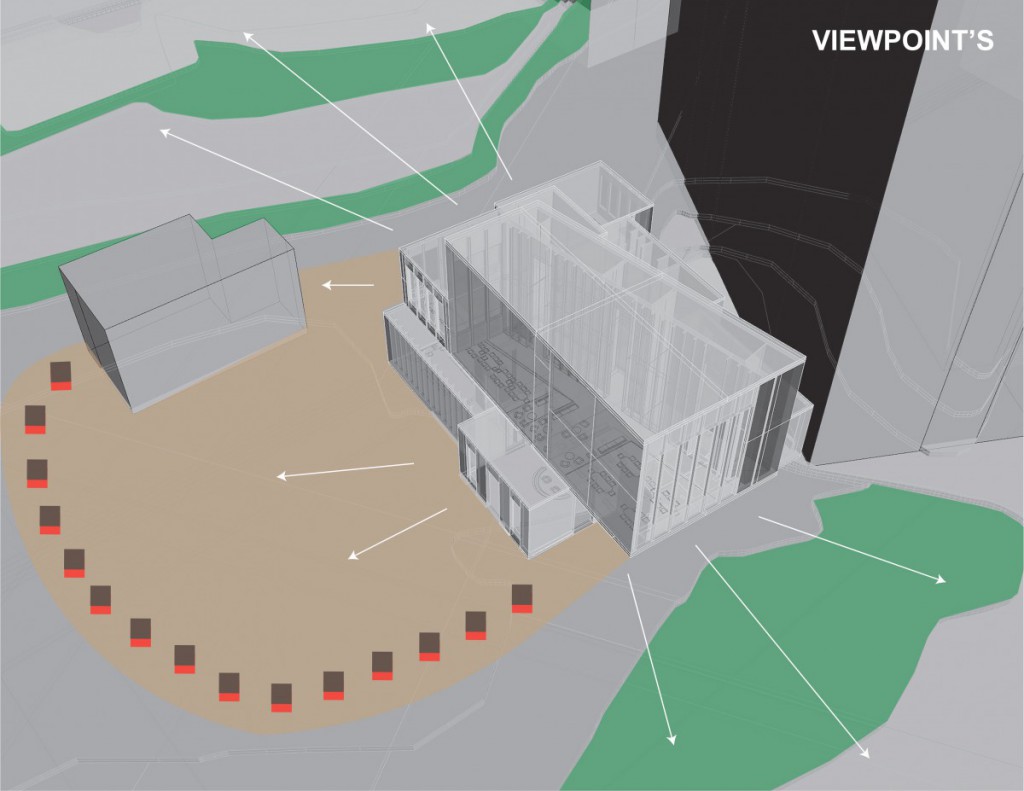
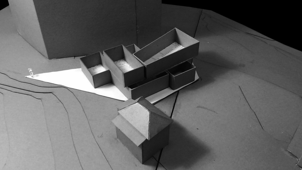
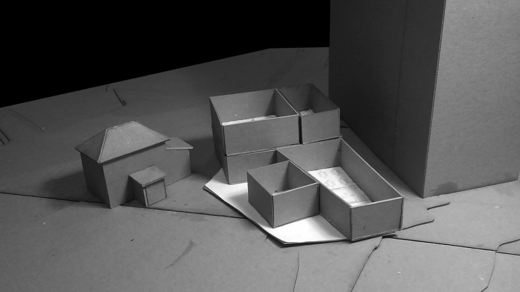
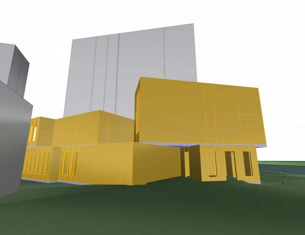
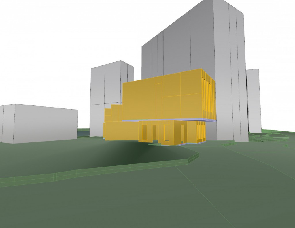
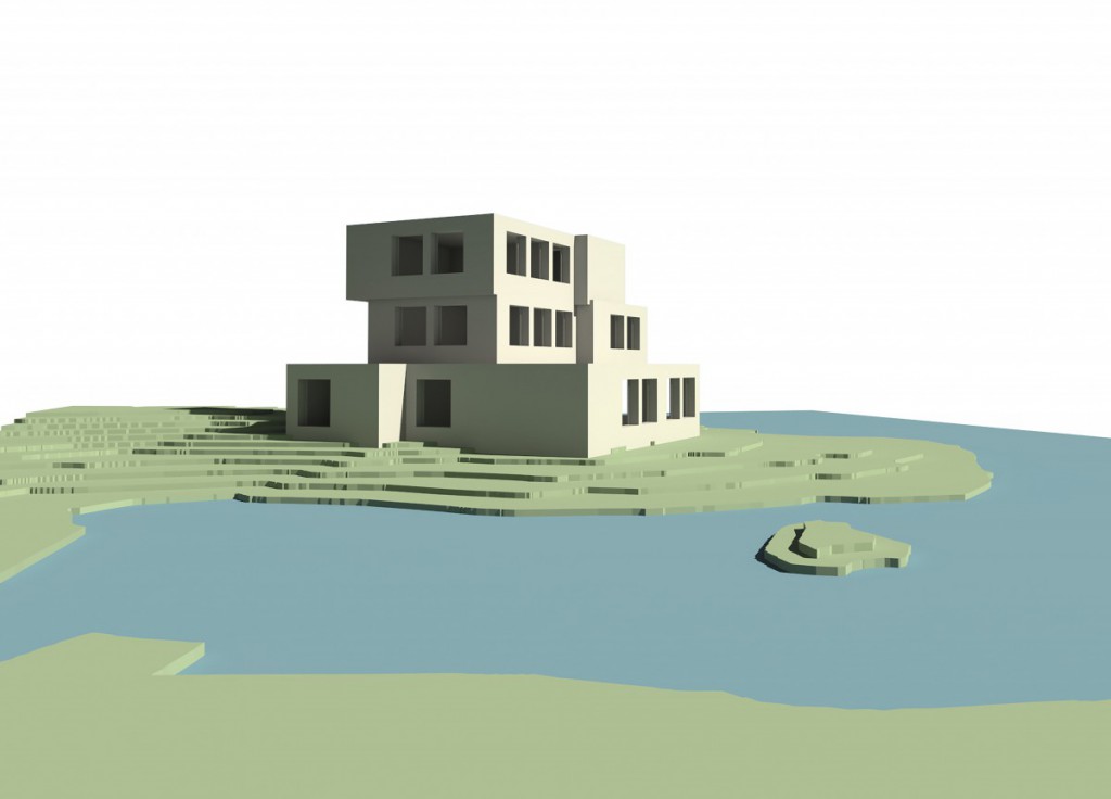
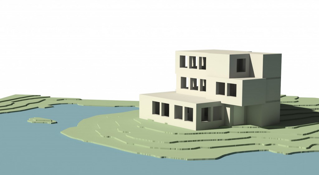
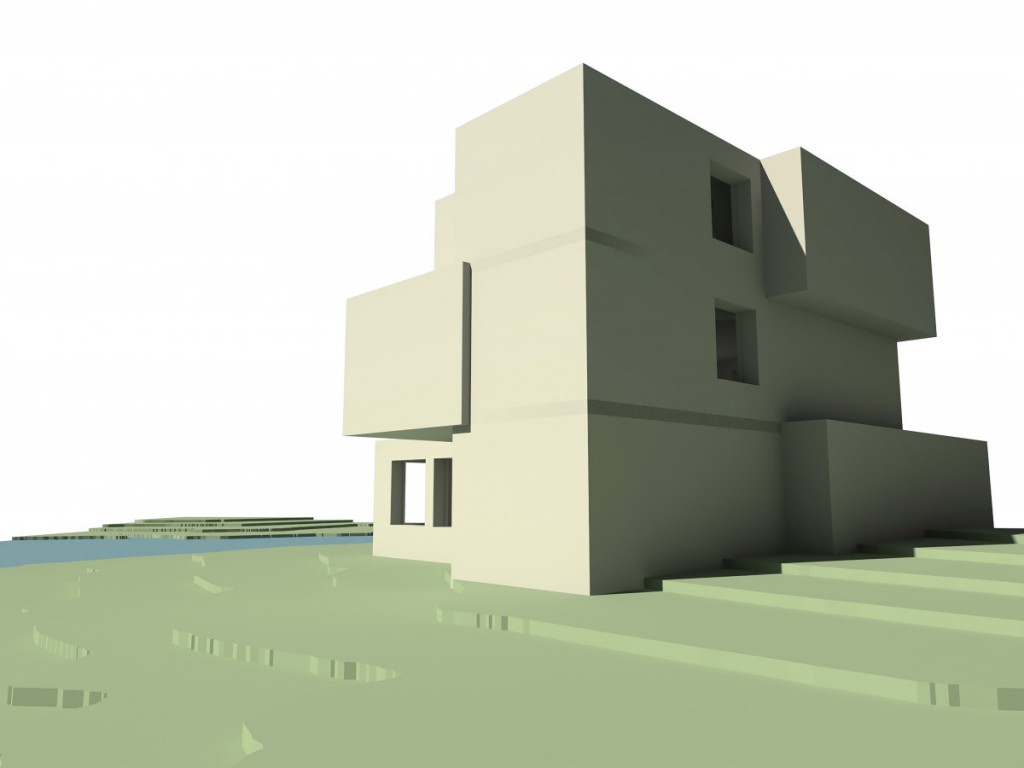
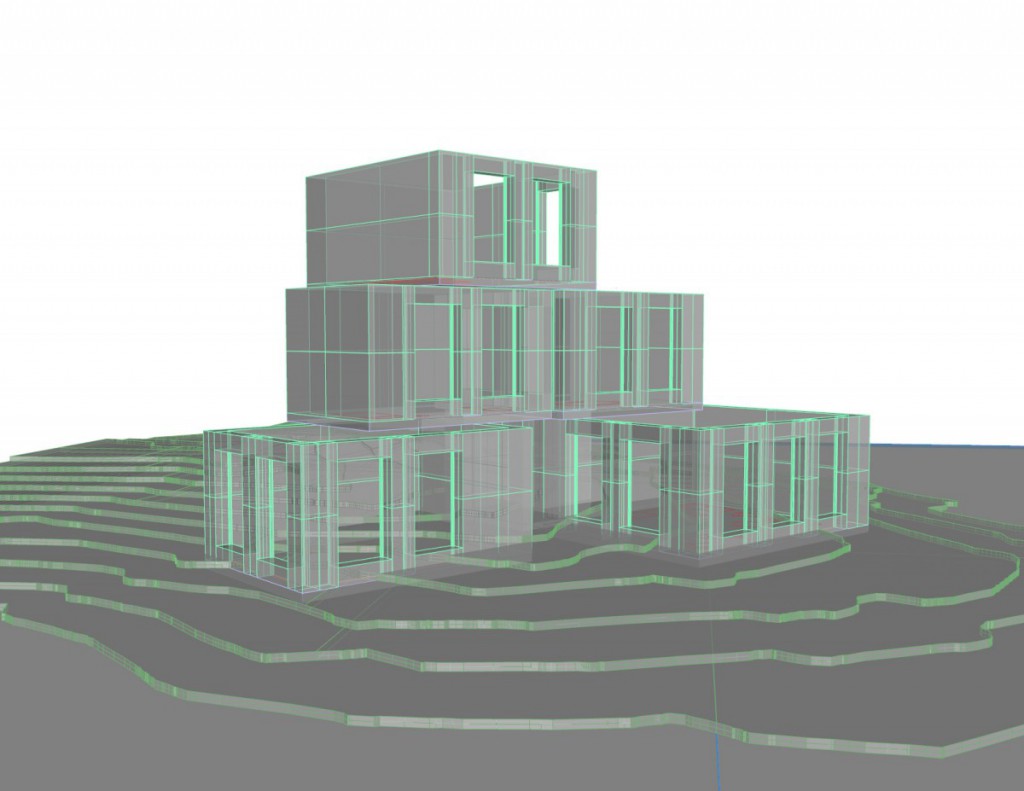
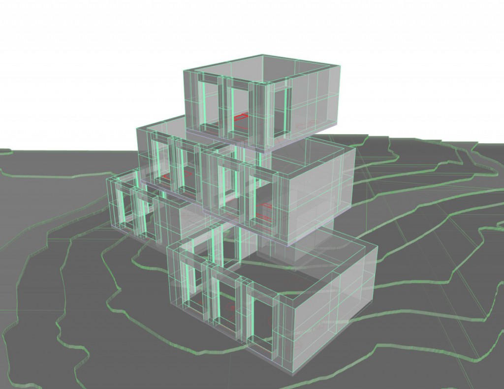
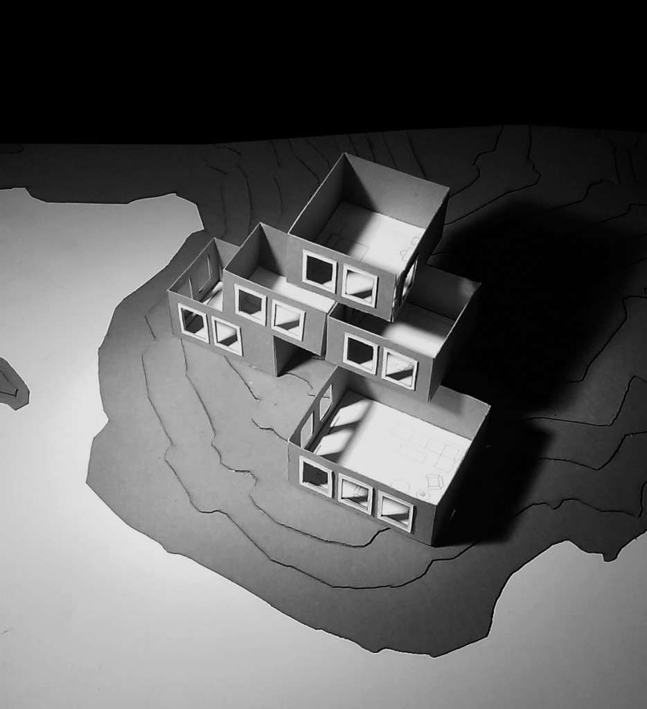
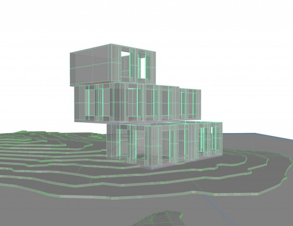
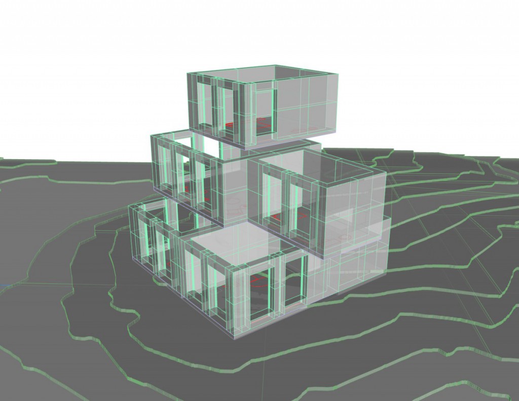
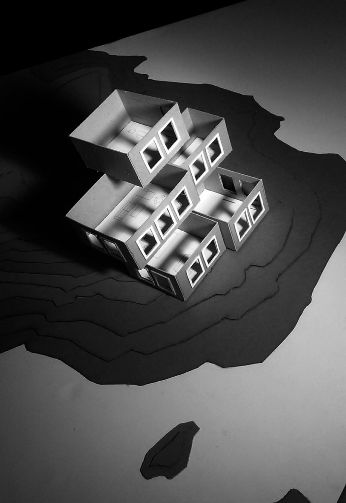
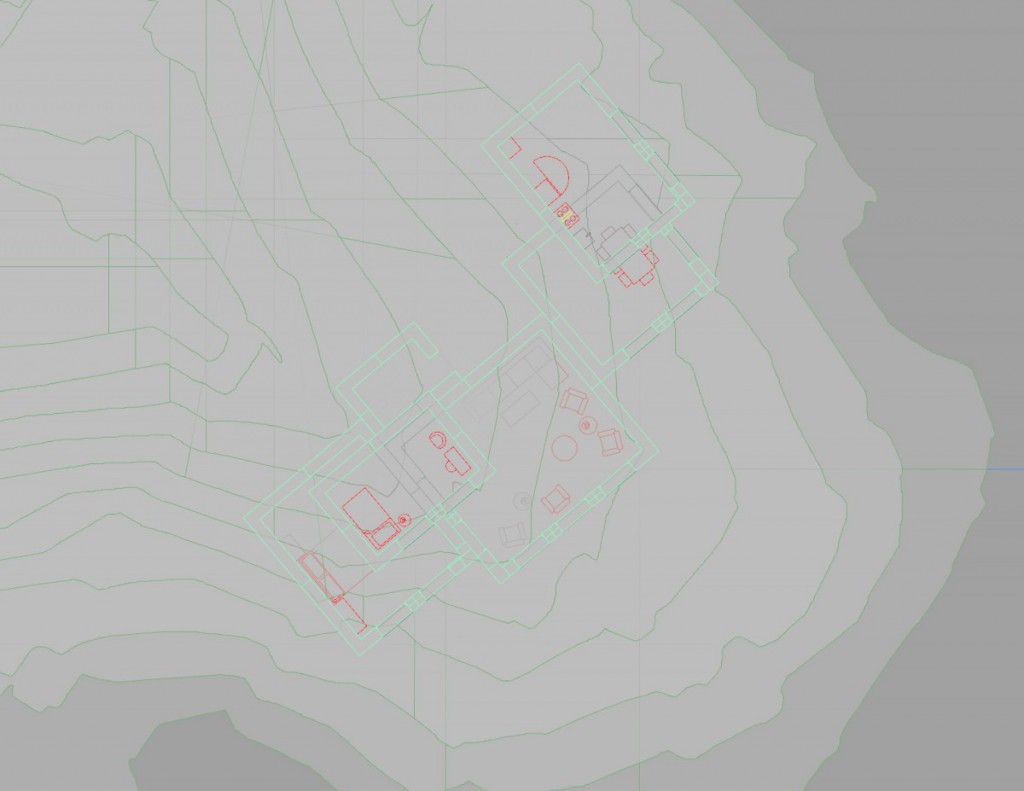
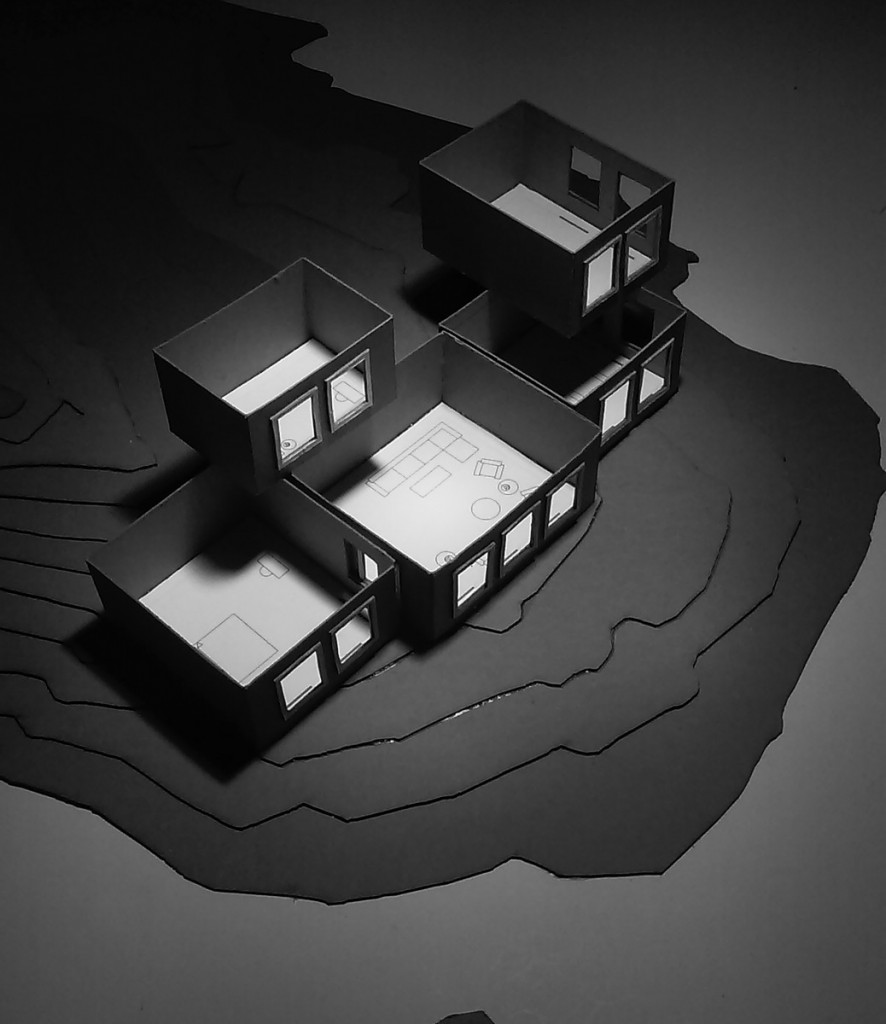
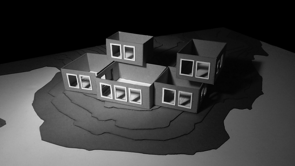
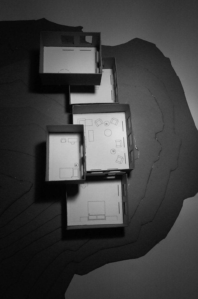
- For my final library composition I selected the first configuration because of the unique placement of spaces that allows me to manipulate the structure as a whole to give me an advantage in many ways. First would have to be the location of the entryway which is visible to the public from a distance while also allowing me to position a main staircase near the area of the lobby. In addition with the rotated reading structure above, it gives the library not just a great perspective view put also gives the people in the interior a better view as well from both west and east sides. Furthermore in the ground floor with the cafe area being a public space, I can work with the plaza outside making the area a great relaxation spacious area from both inside the structure & outside of it.
Assignment P - Parti Diagramming
Configuration 1:
Assignment O - Library Space Model & Views
Configuration 1:
Configuration 2:
Configuration 3:
Assignment N - Library Program Models
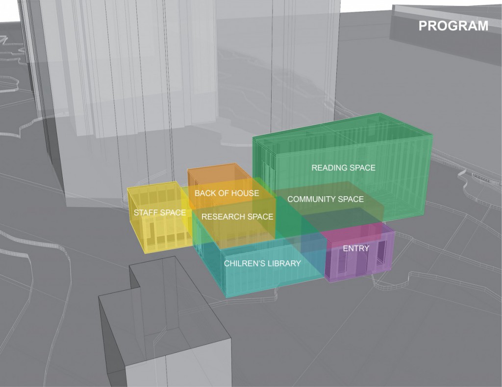
Entry Lobby:
Research Space:
Reading Space:
Children’s Library Space:
Staff Space:
Back of House:
Community Space:
Assignment M - Library Modules + Digital
Entry Lobby:
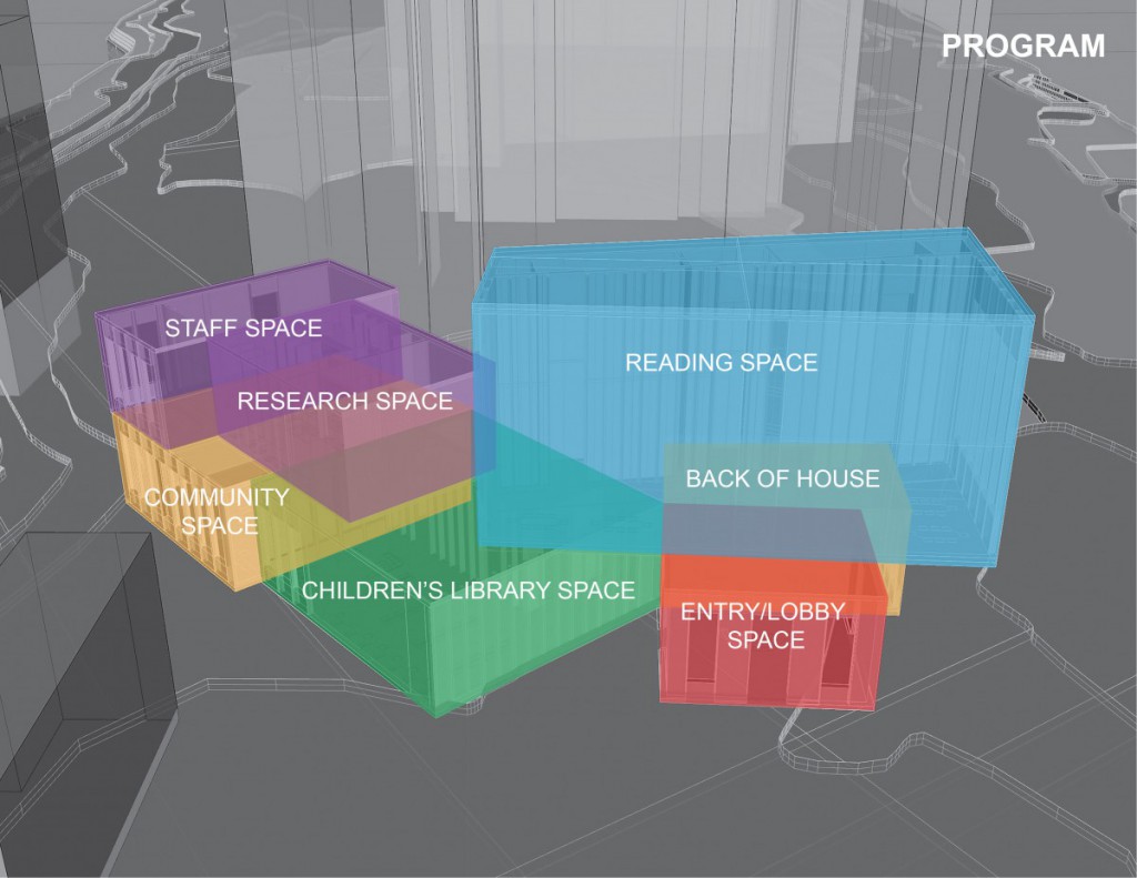
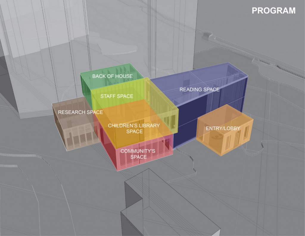
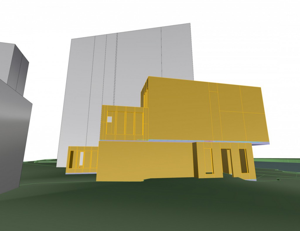
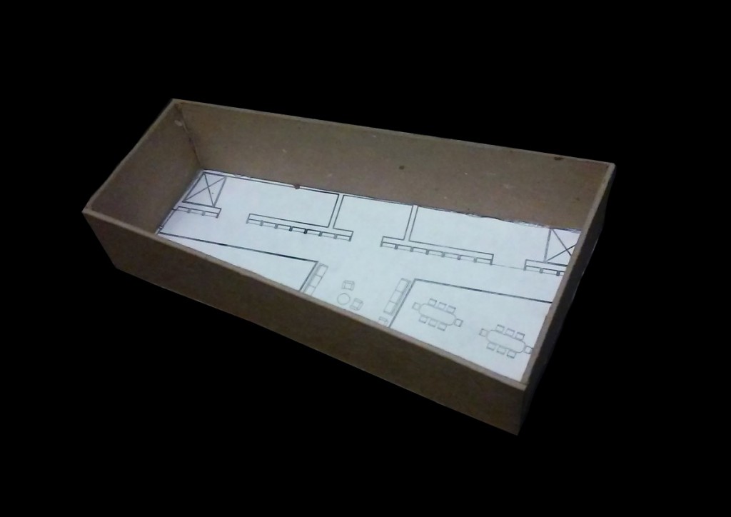
- One of the main spaces were people can ask questions in the front desk and transition to other floors when necessary. Lobby space can also influence a main staircase of circulation among this room. Being that this space is the front there can be a twist of design on the front facade of the structure to allow light inside in a unique way.
Research Space:
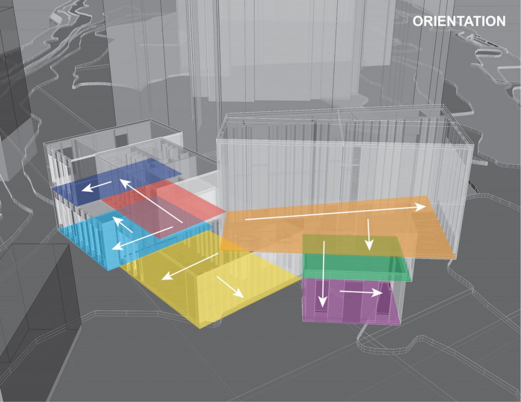
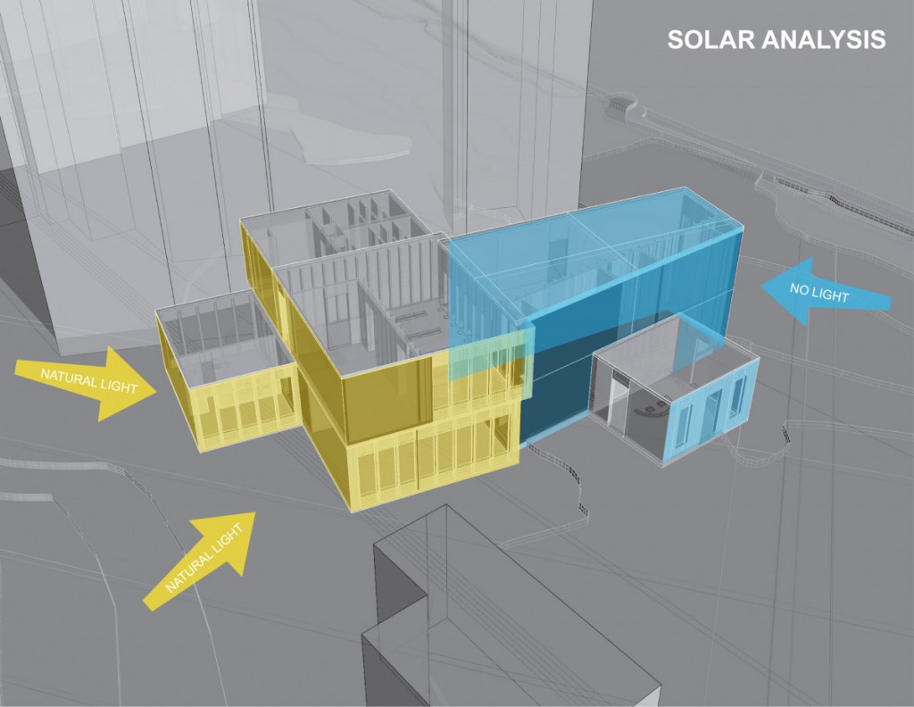
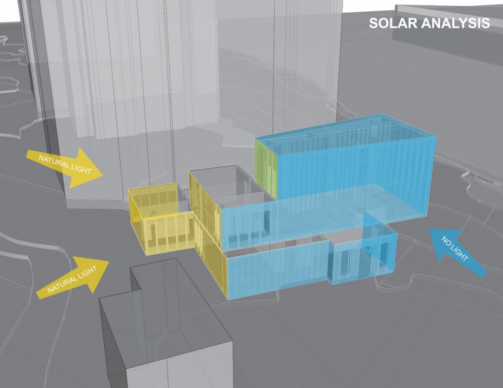
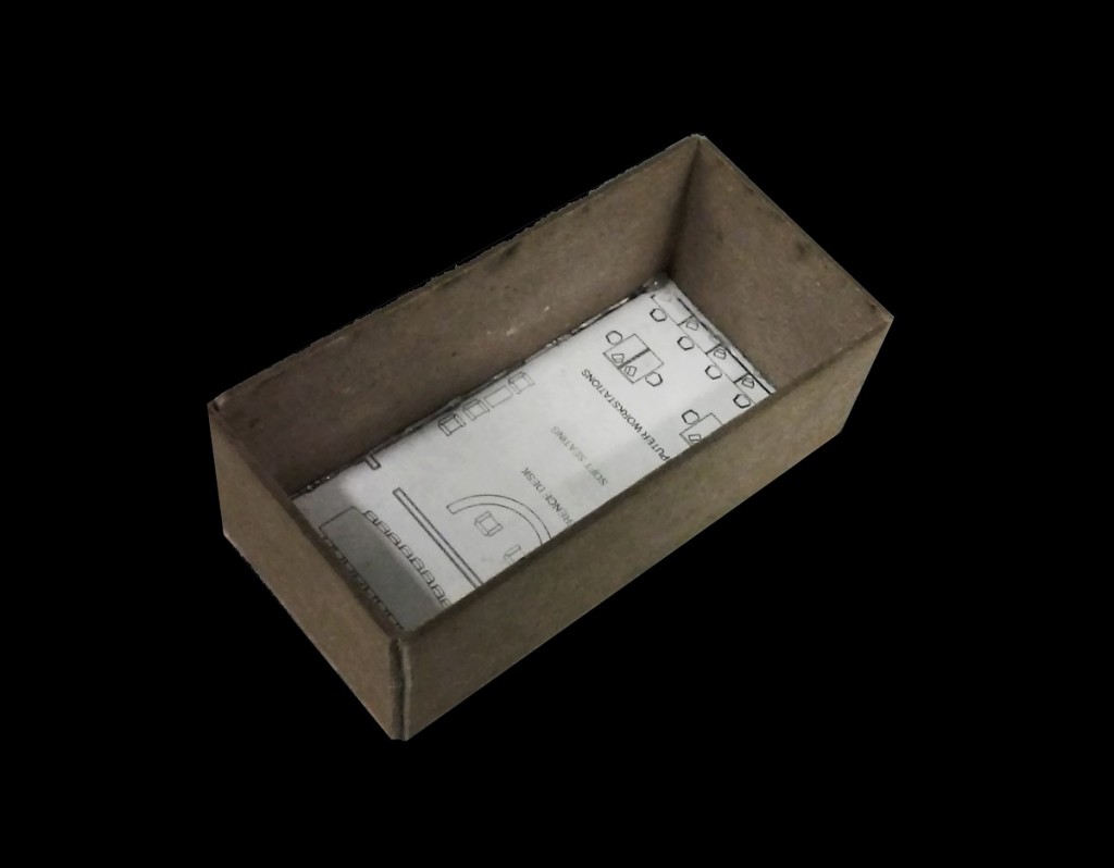
- Research room should be a space that should be associated with the building in a public type of aspect. When people enter the space to me, there should be a way to move them through this space or to captivate the people inside. Meanwhile keeping apertures available when needed depending on solar orientation.
Reading Space:
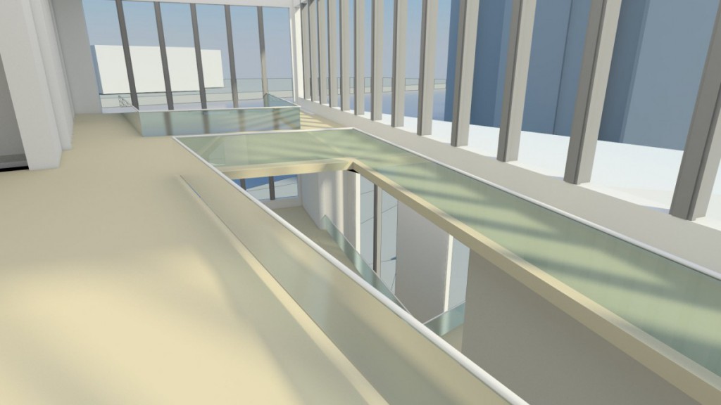
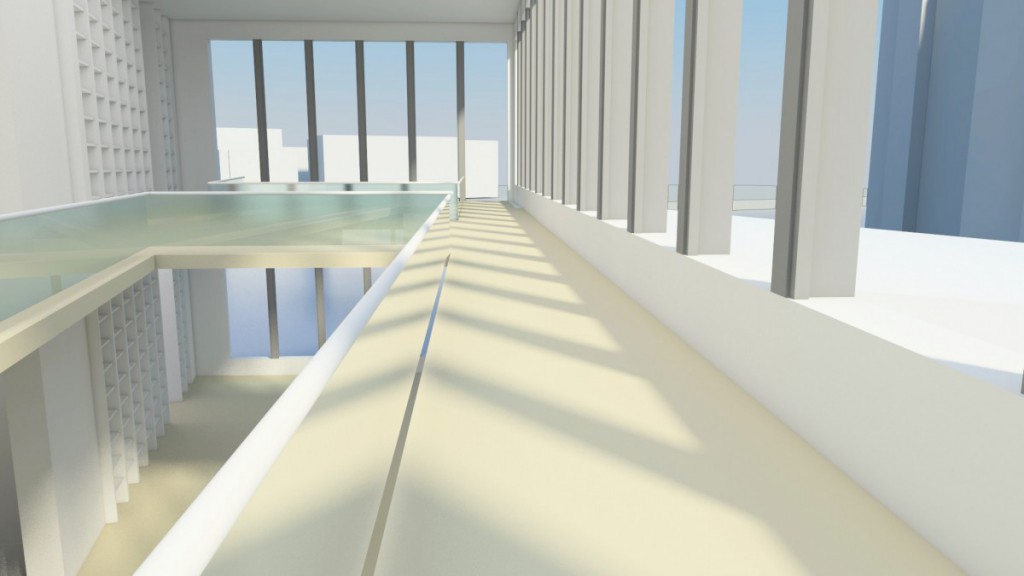
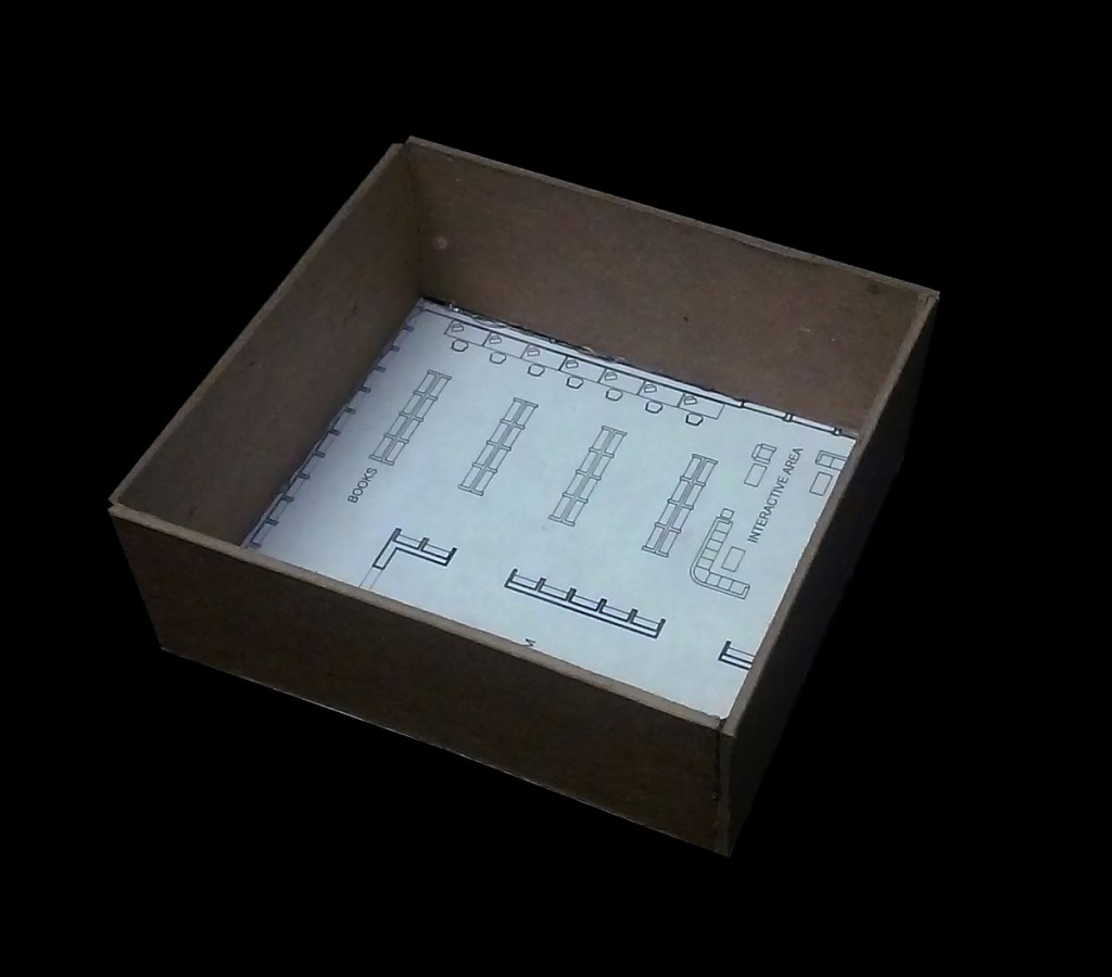
- The main space of a library because of the spacious feel to the room upon entering. Being that this room is enormous, most of the people will be found here when reaching this floor. Having many ways of circulation in this floor will be key to the design of the space. Also designed to give out great views from the east & west with the manipulation of apertures.
Children’s Library Space:
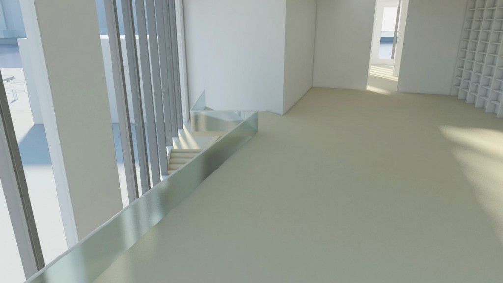
- Almost following the big main reading space the children’s library is more of a calm feeling space that allows for there to be a straight forward means of circulation. Accompanied by the quiet room in the middle to avoid the noise pollution that comes from the outside. Then apertures are put near the area were the children will sit around in groups to avoid the natural light from destroying the books at the bookshelf’s.
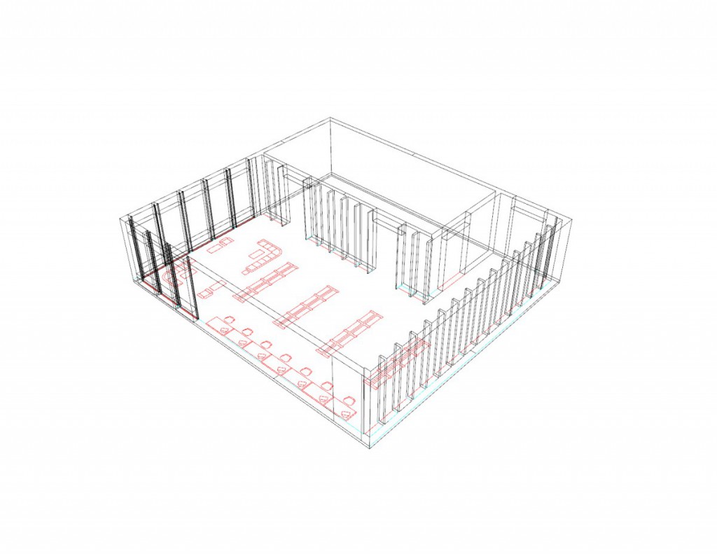
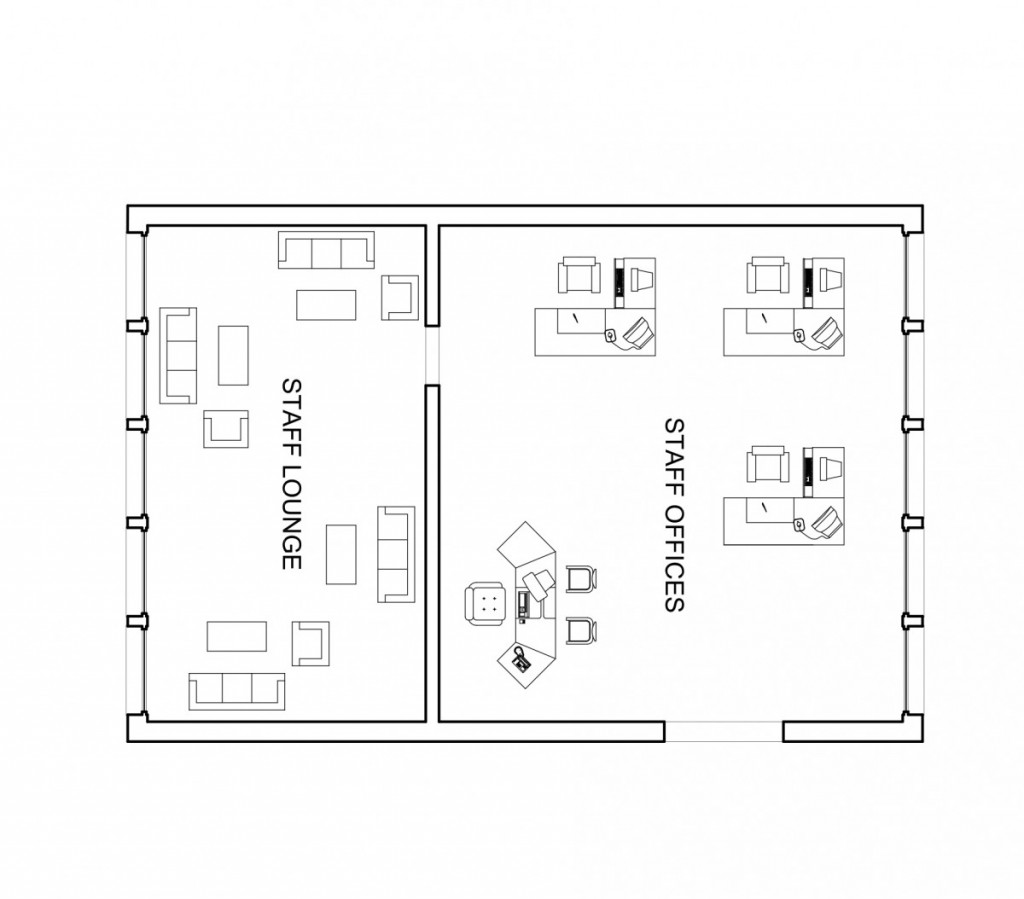
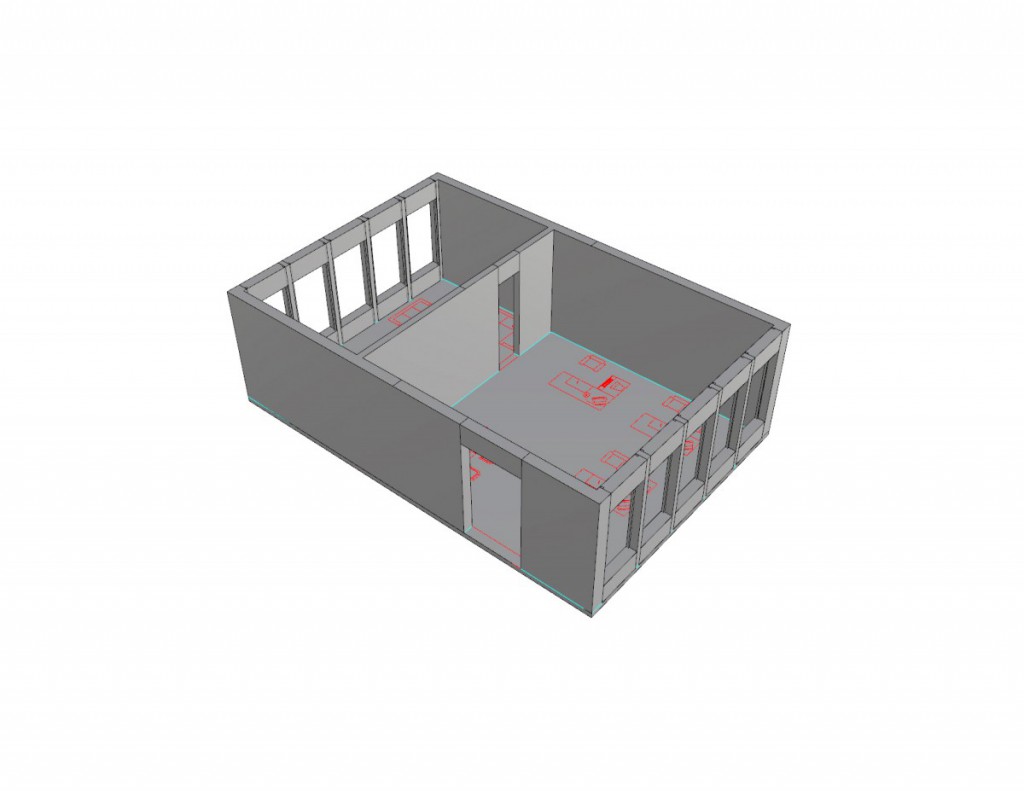
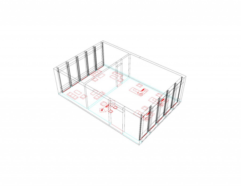
Staff Space:
- This is more of a space were it is a private room excluded from the other areas because of the room function being that mostly the employees around the library will be able to access this area. There should still be apertures of the facade that will need to be open upon analysis.
Back of House:
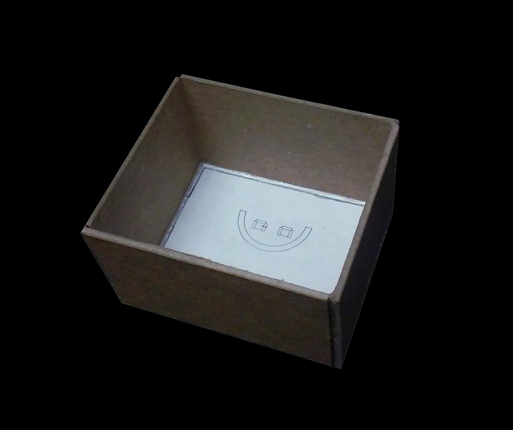
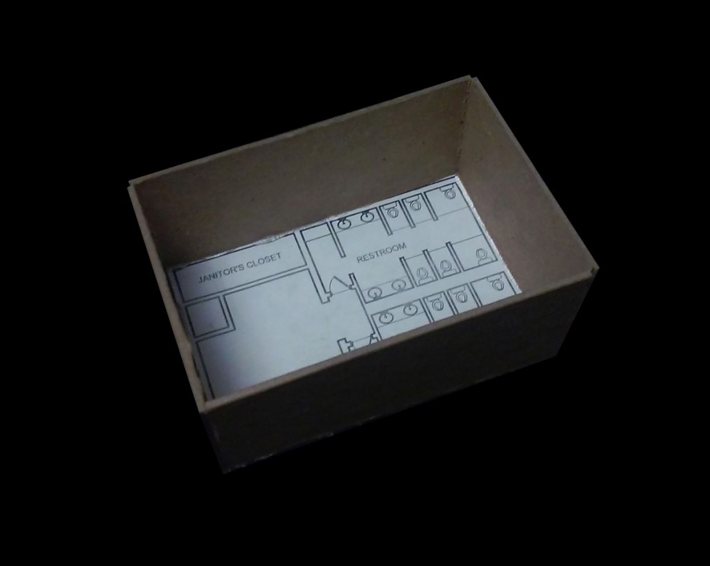
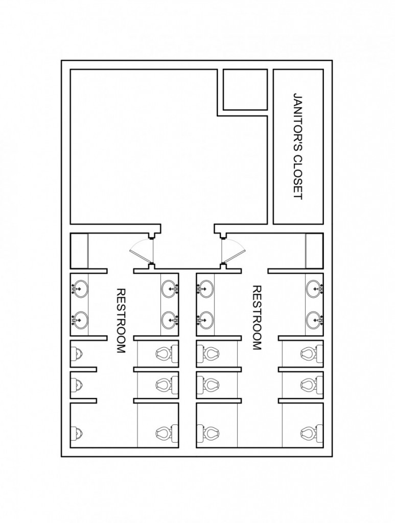
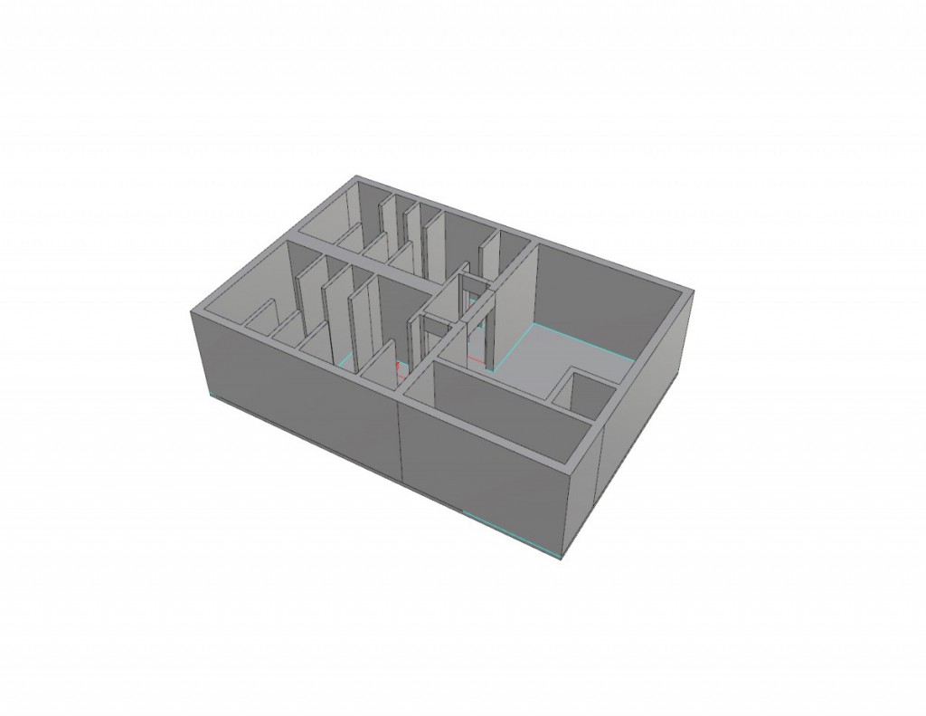
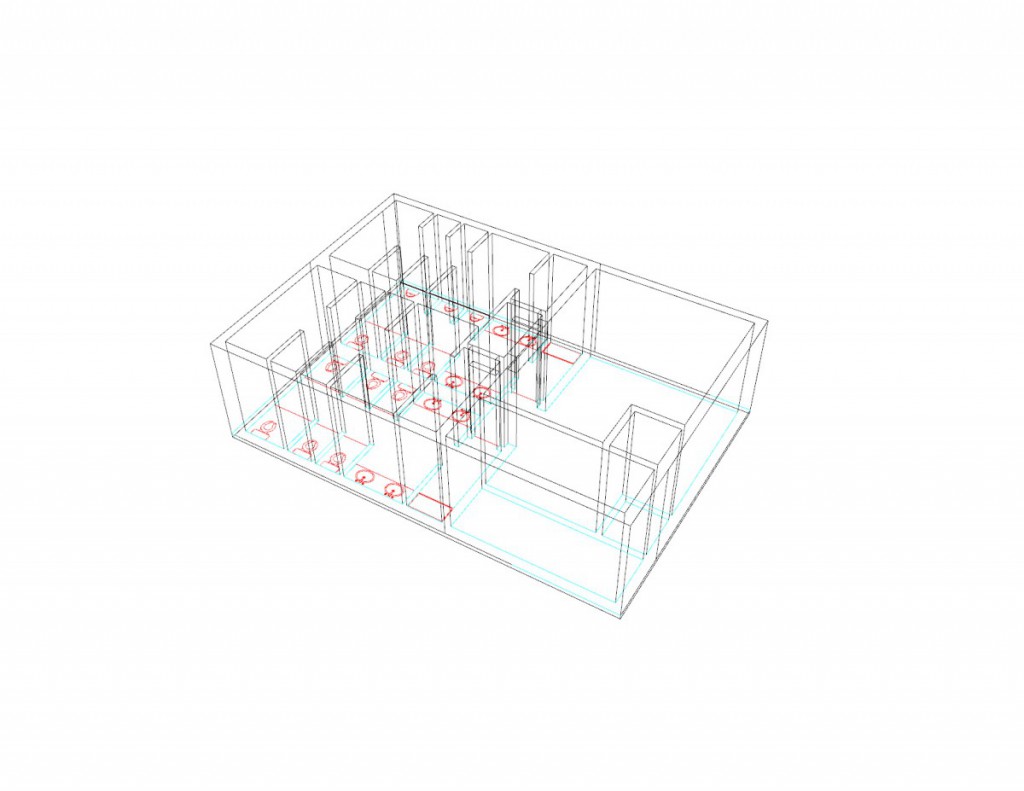
- The back of house should be noticeable to the public and accessible really fast when necessary. Also should be one of the first room on the main floor because if someone wants to just use the bathroom it should be easy to spot upon enter probably on a back area with signs leading to this space.
Community Space:
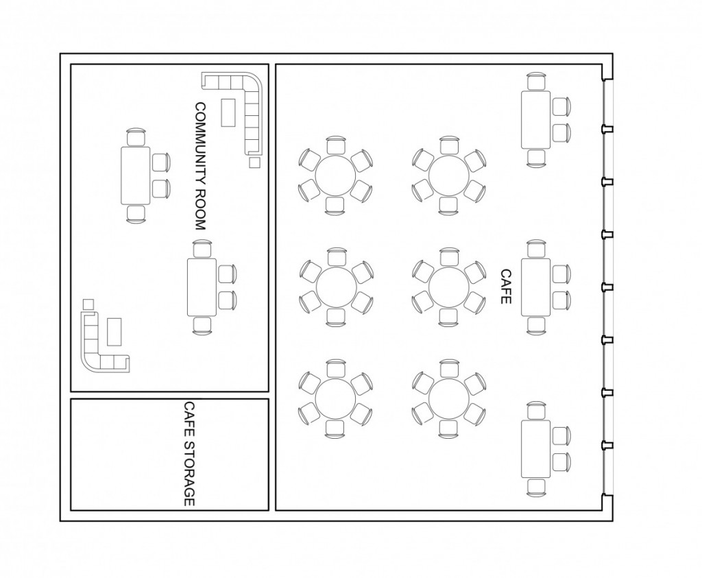
- Still included as one of the main floor which provide a way for people to relax when reaching this space. There should be apertures but alongside that also thresholds leading to the outside to manipulate the plaza that is given to us to utilize.
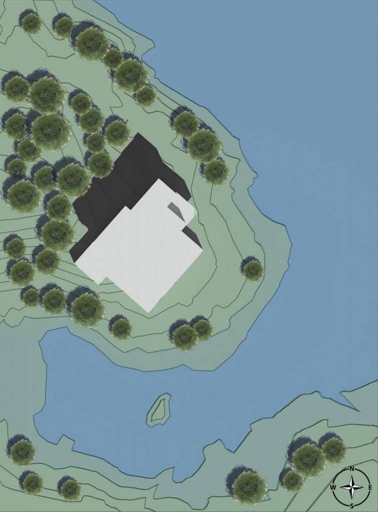
Assignment L – Site Analysis
Assignment K – Project 02 Reflection
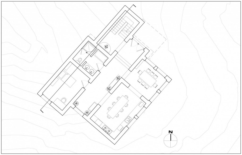
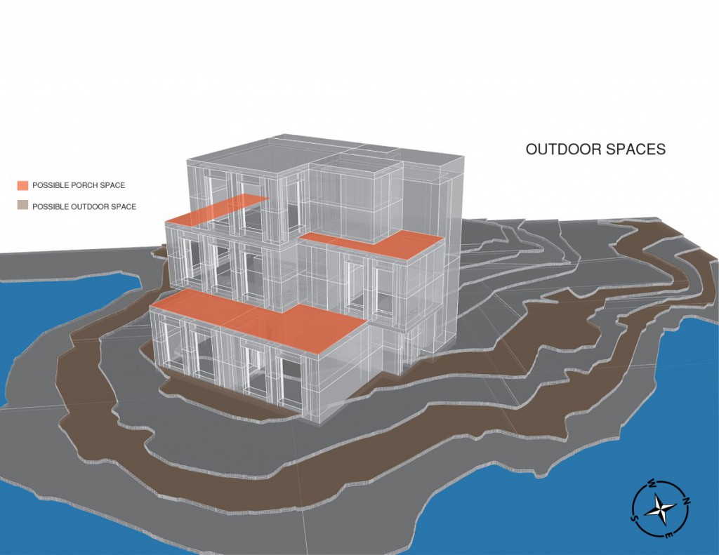
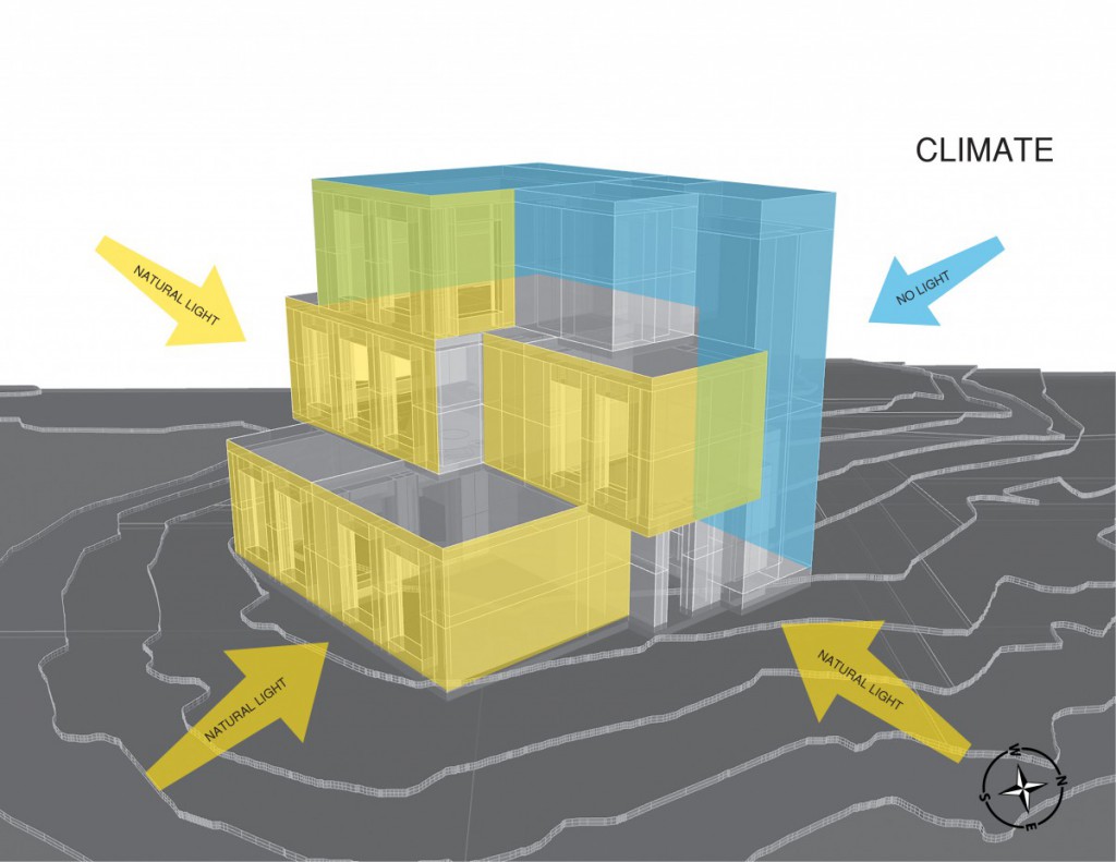
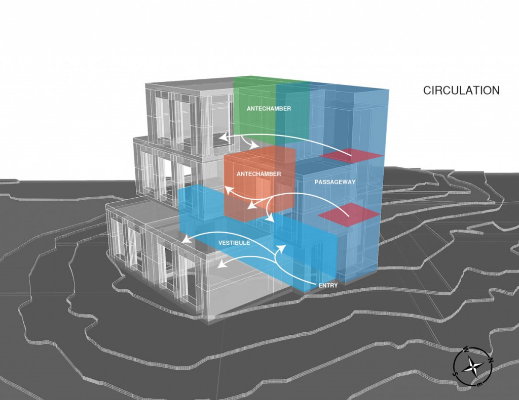
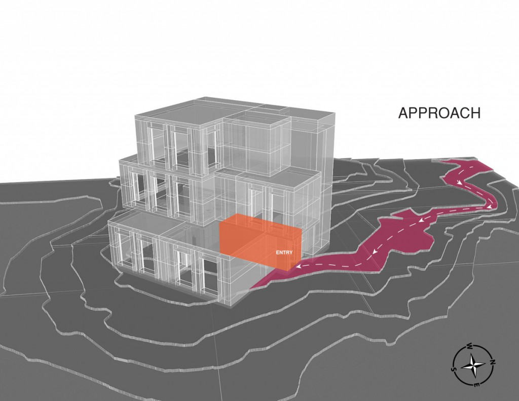
- In this Project 02 final presentation I learned a lot involving many of the aspects with the site. Starting from the diagrammatic analysis really gave me a sense of what will be the reasons surrounding why we position things the way we do. The process including a grid which gave the house more of a meaning and understanding the functionality throughout the house guided me to my final result? While I managed to achieve good comments, the feedback was mostly focused on the site plan which needed to back up your house design by showing a connection to both. Overall what I will do to improve my work is focused on how can my site provide me information to guide me through my design process, with the site & climate analysis it will give me my reasons why things are the way they are. Also having a structural format/grid to give me a path, is something that I will use to benefit my future designs.
Assignment J - Site Section Drawings
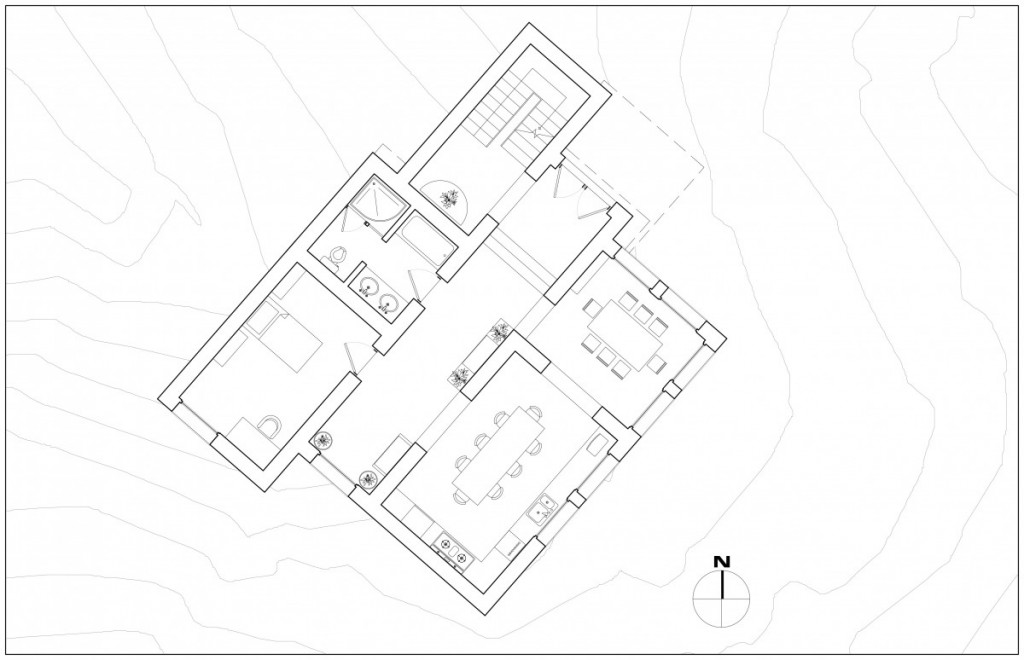
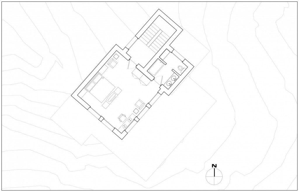
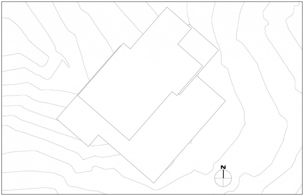
Assignment I - Plan Drawings
Ground Level Floor Plan:
2nd Upper Level Plan:
Upper Level Plan:
Roof Plan:
Assignment H - Digital Model Development
Assignment G - Refined Selected Parti
Assignment F - Reflection
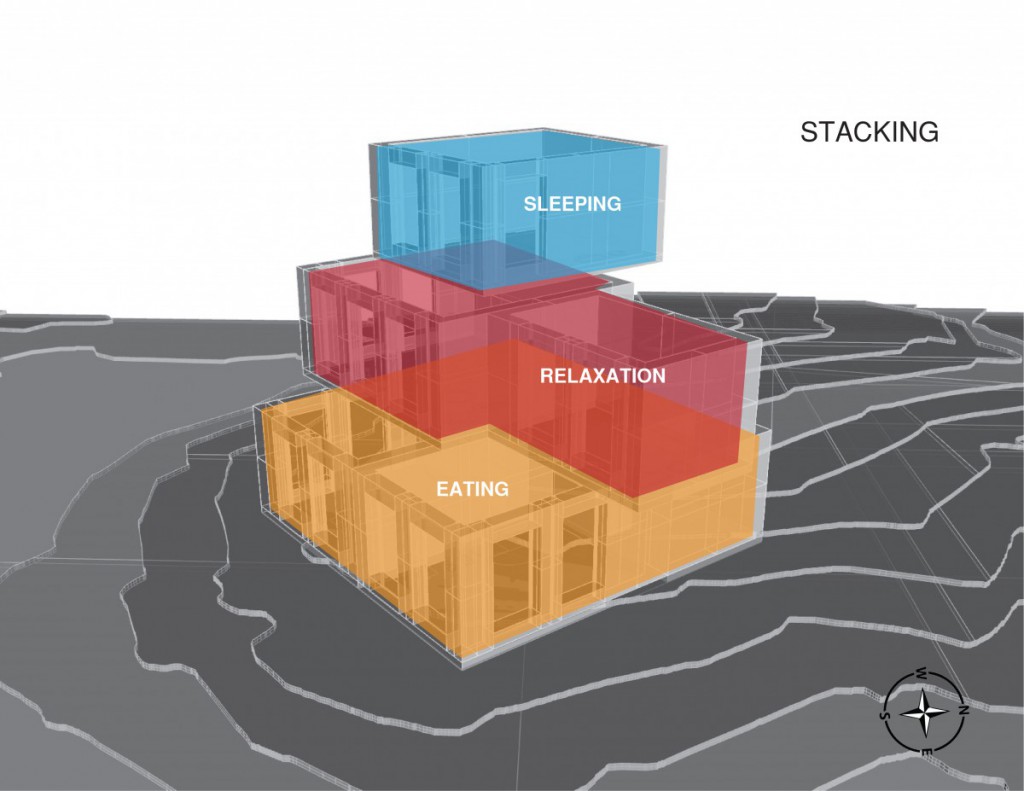
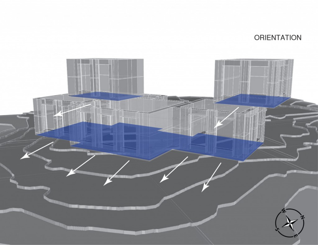
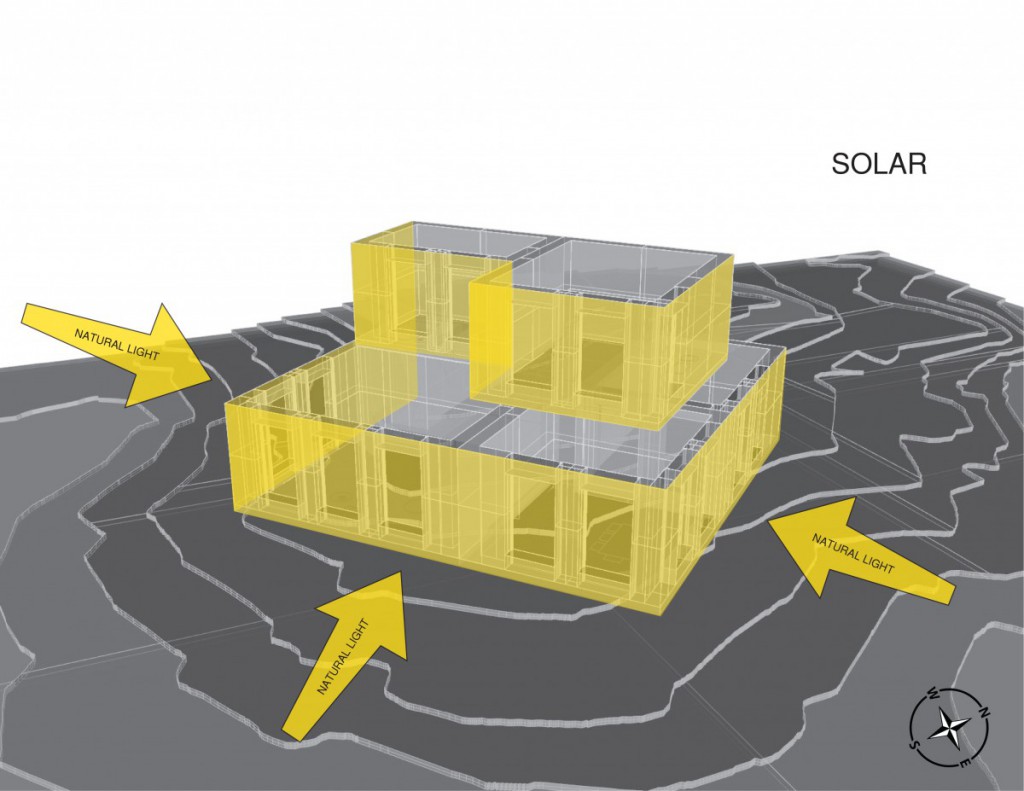
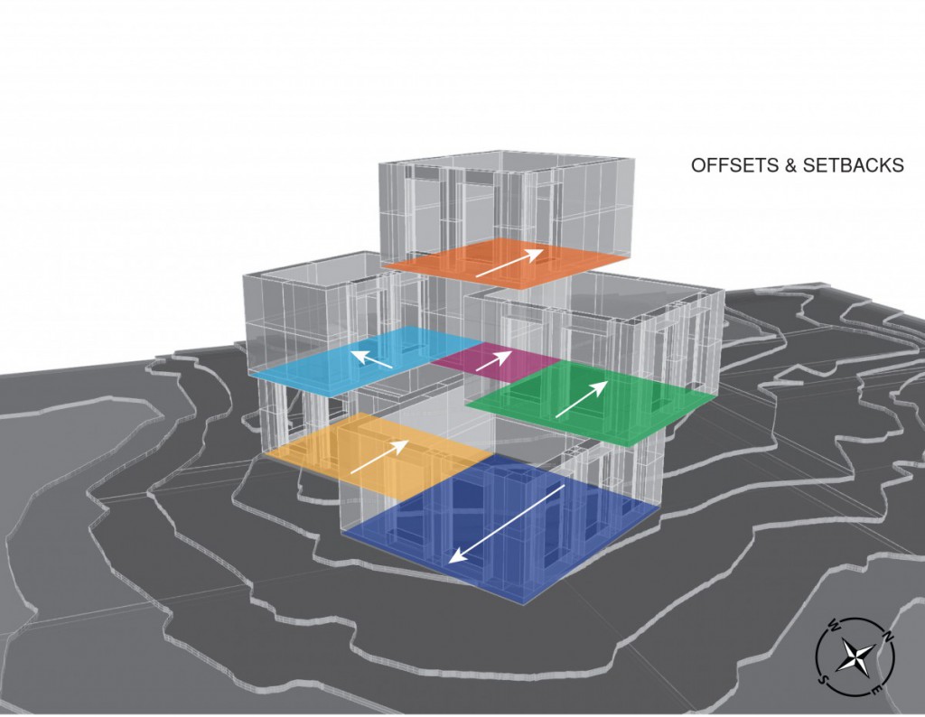
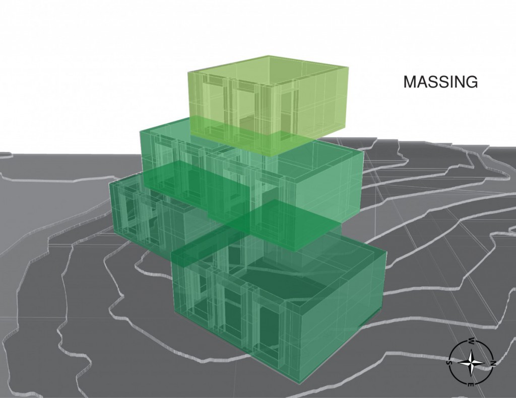
- My presentation went well, got a lot of feedback and comments based on my format and specific diagrams. The good feedback involved my solar diagram being very well articulated to the viewers & having a consistent form of layout in which my viewers can all understand from were I start my analysis and take it from. When the feedback came I got a lot more knowledge on how I can take my diagrams to the next level, like using so & so techniques to improve my diagrams. Also I got comments on how I should be thinking when I diagram like my setbacks in relation to the cold. From my review towards the end I decided to work with my diagram incorporating “Stacking”. With this diagram I will manipulate each level in there own unique way using programmatic functions throughout the structure. This will give me a way to iterate my way through my design & help me understand the fundamentals that go into a structure.
Assignment E - Diagramming
Assignment D - Configuration Strategies
Configuration 5:
Configuration 4:
Configuration 3:
Configuration 2:
Configuration 1:
Assignment C - Climate Strategies
- Windbreak designs with foliage/trees
- Orientation of the floor plates depending on the sun
- Maximize absorption of solar radiation
- Solar radiation warms southeastern views
- Materials such as wood, metal, brick wall should be used, not concrete
- Isolated gain systems which allow more solar radiation the be stored into thermal energy accompanied by a circulating venting system
- Utilizing louver to allow light inside depending on the angle & orientation placed
- Wood, slate, or asphalt shingles into considerations
- South facing windows should be more with more sunlight exposure
- Metal roofs are option but not to elegant
- The height of rooms because of the cold climate to keep hot air on the bottom
- Multiple layer of rigid insulation & double glazed windows to keep frost outside of window sill
- Chimney with a fireplace
Sources:
https://openlab.citytech.cuny.edu/montgomeryarch2310s2016/files/2016/06/Ching_1.pdf
Assignment B - Modules
Relaxation Space:
Cooking Space:
Eating Space:
Sleeping Space (Smaller):
Sleeping Space (Larger):
Grooming Space:
Assignment A - Modules for Living
Relaxation Space:
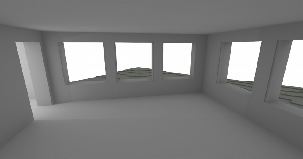
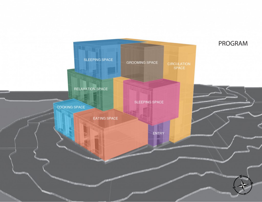
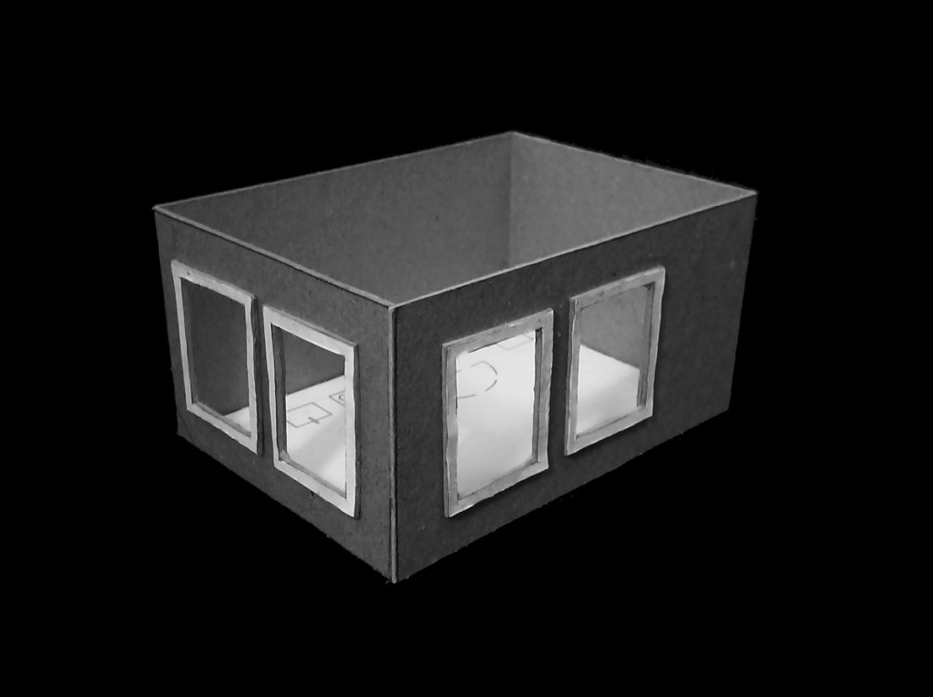
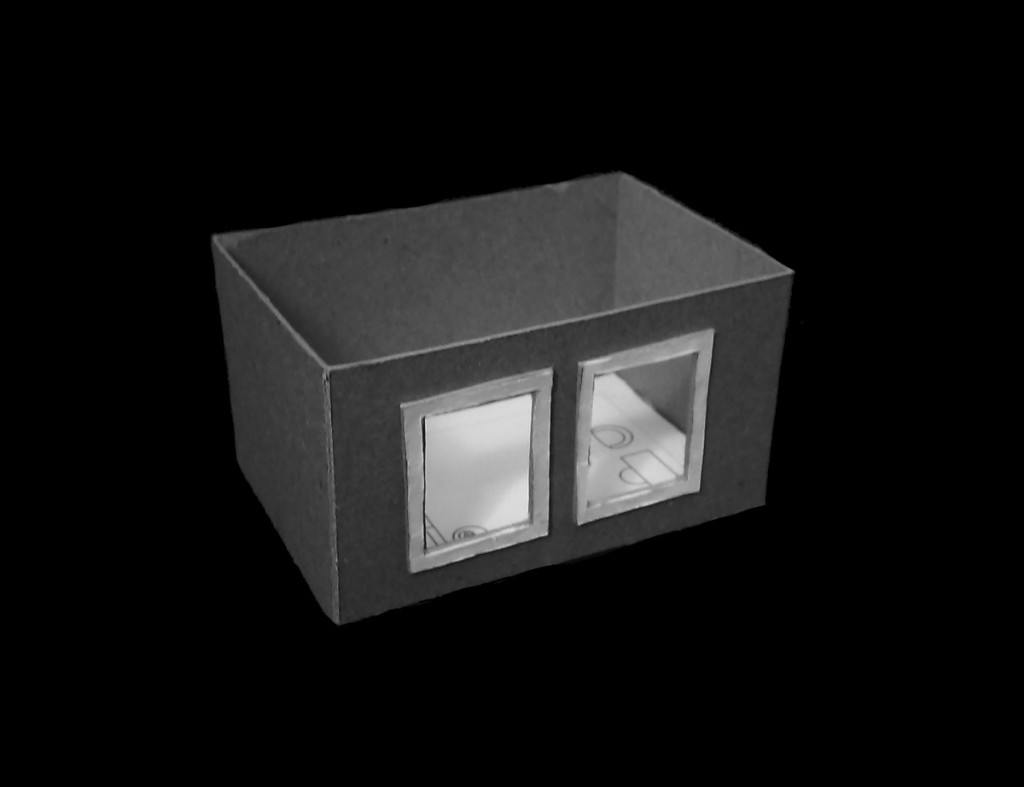
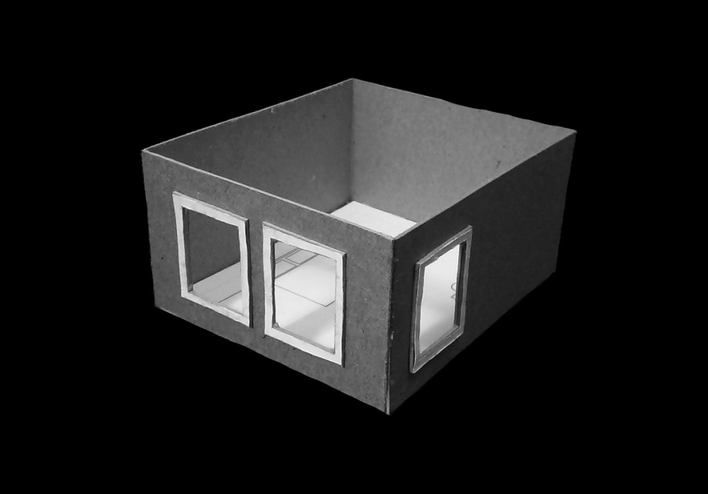
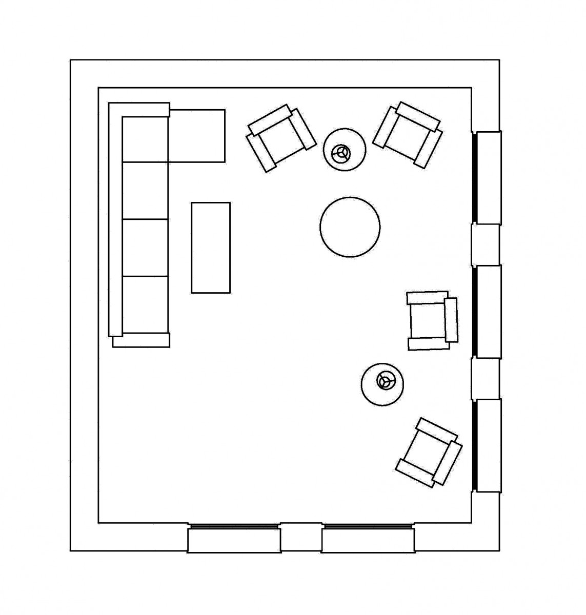
- Is a area where people can relax and sit down. In addition people can enjoy the view depending on the areas orientations along with their being some type of natural light accompanying the scenario/setting. When room furniture comes to play, it should be placed depending on a persons self security or comfort.
Eating Space:
- Eating room is were sitting occurs along with a big table were people can interact with others and even enjoy family fun board games, etc. Also in this space there has to be some type of cabinets or storage type of function in which people when coming to this area can pull out things they need when being around the space. The combination of light with the table setting is an important role when trying to manipulate natural light to your advantage.
Cooking Space:
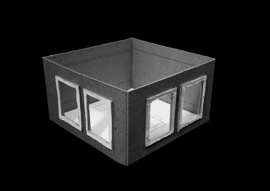
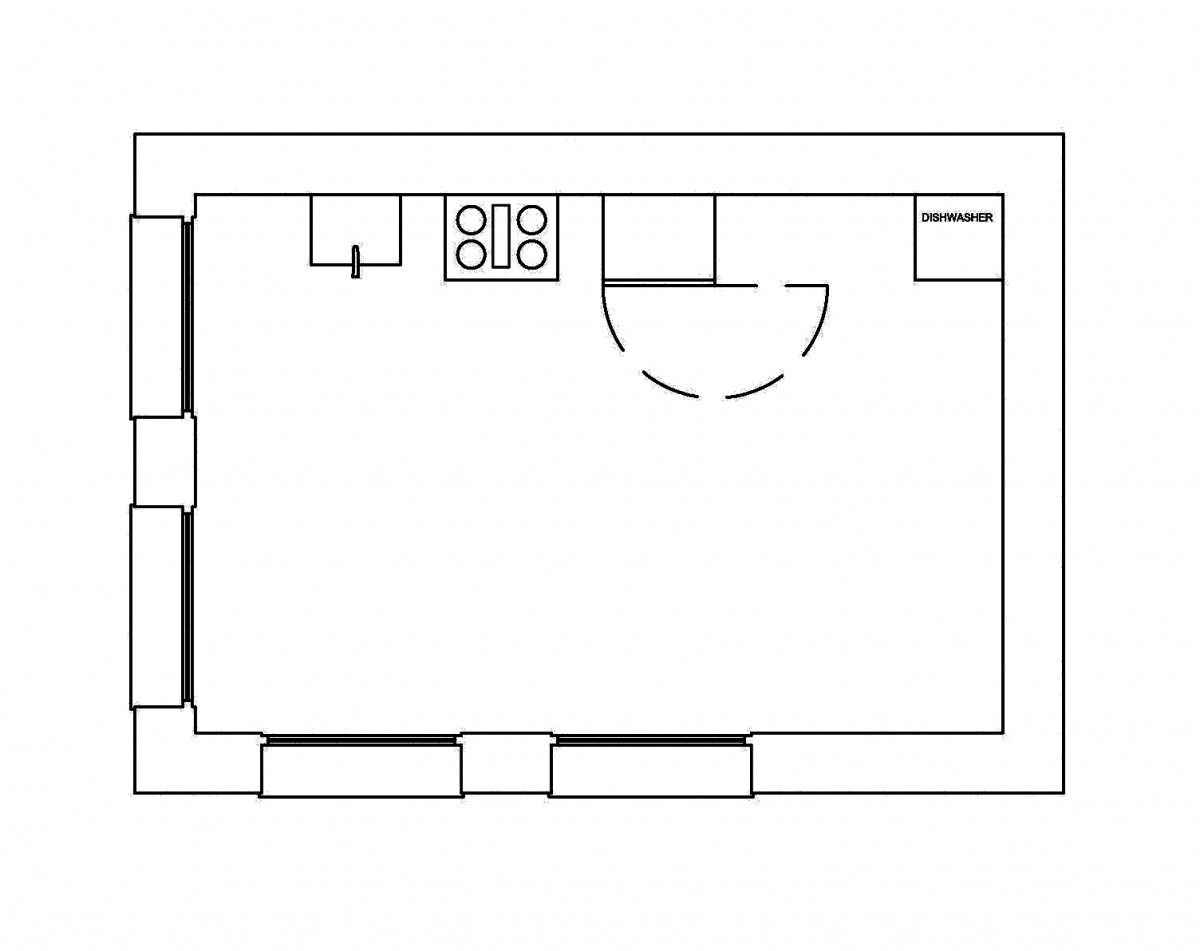
- An area in which a multiple people can navigate around without being to crowded when cooking. Mostly playing around with space when it comes to the cooking area because circulation is key in the kitchen. Plus adding a counter top to a person comfort is a necessity when it comes to the placement of furniture in this area.
Grooming Space:
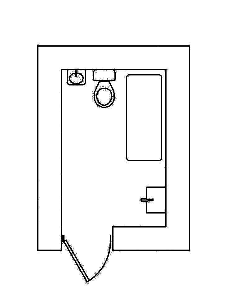
- Grooming spaces for me is defined as a spot were a person can achieve total security of themselves by having full privacy of there position throughout the whole structure. Along with their being a moderate amount of space this area can be also seen as an area of relief in way.
Sleeping Space (Smaller):
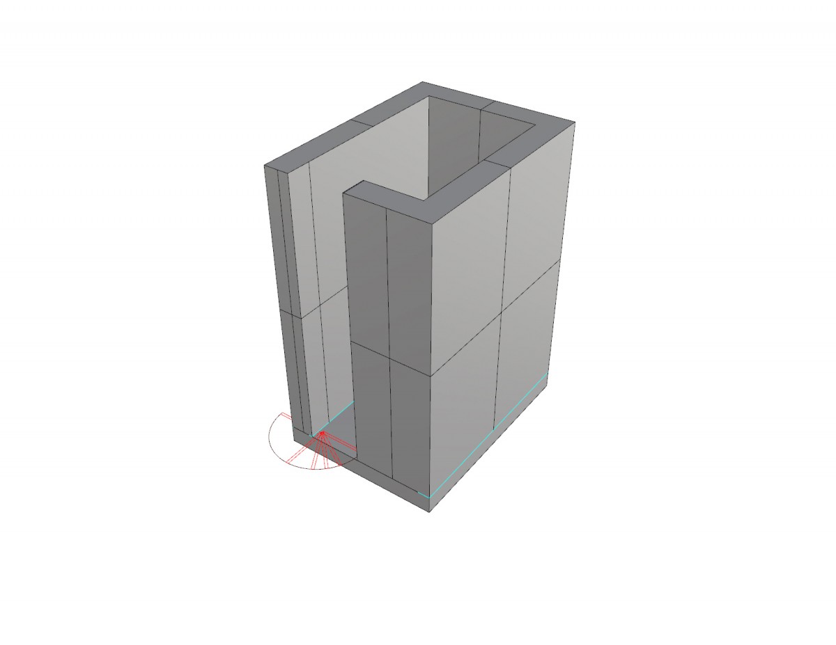
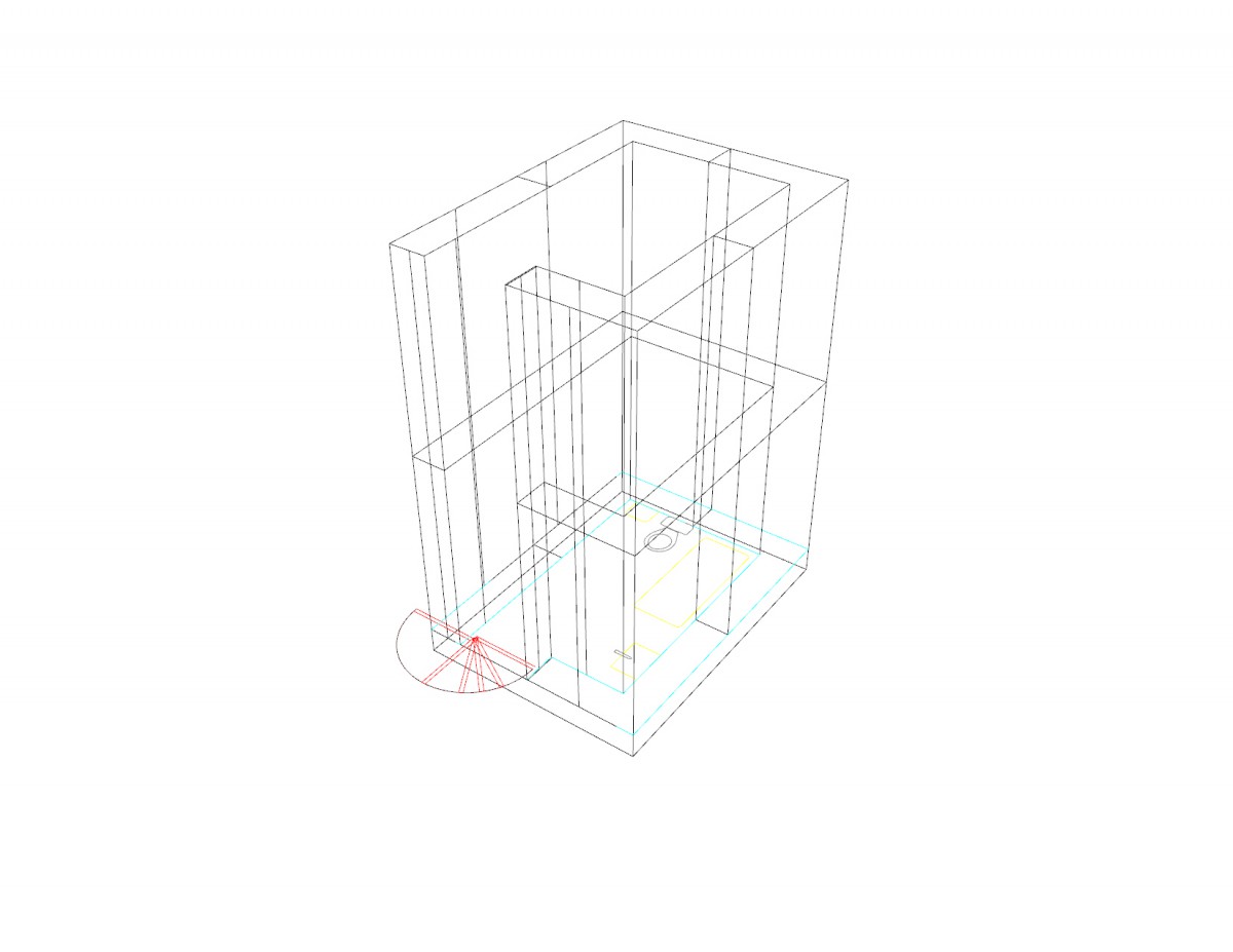
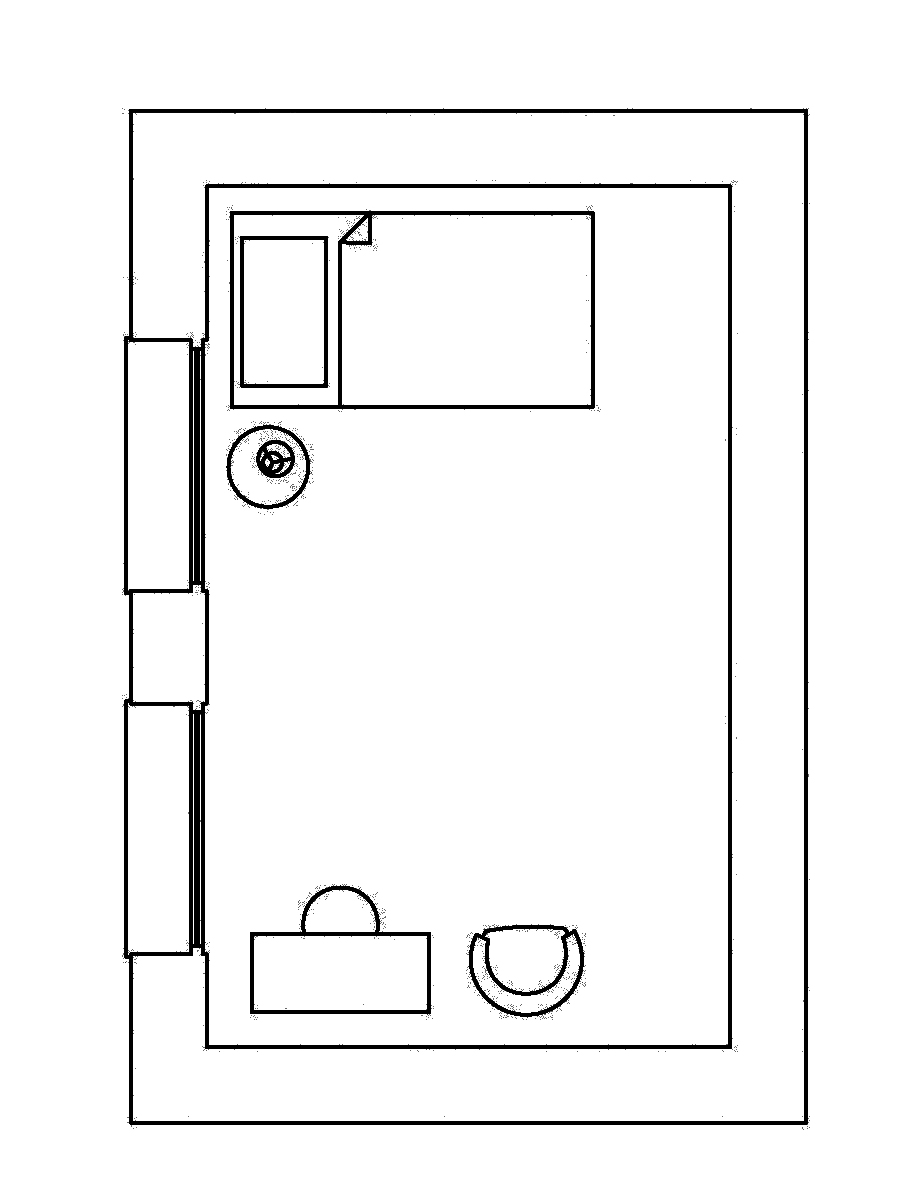
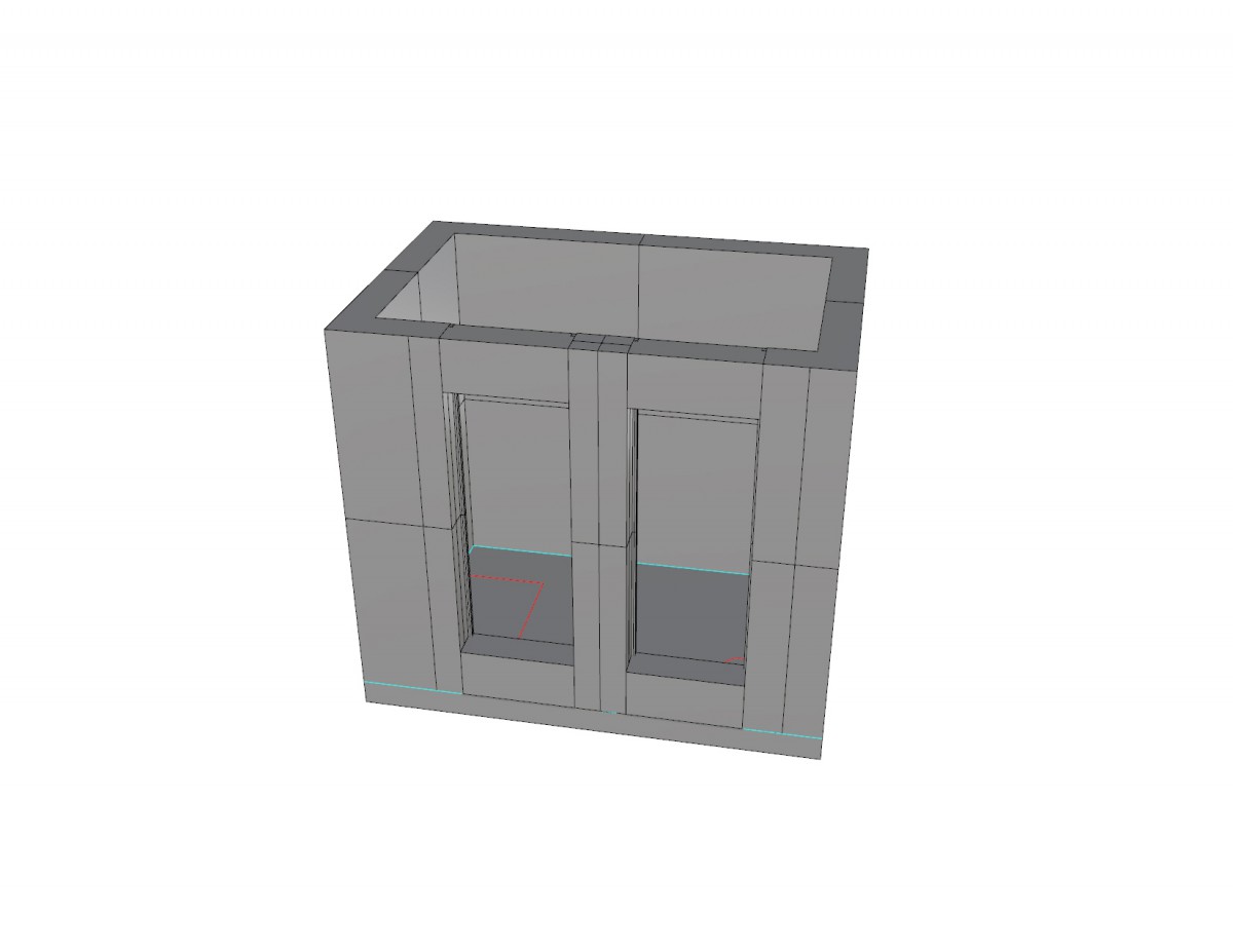
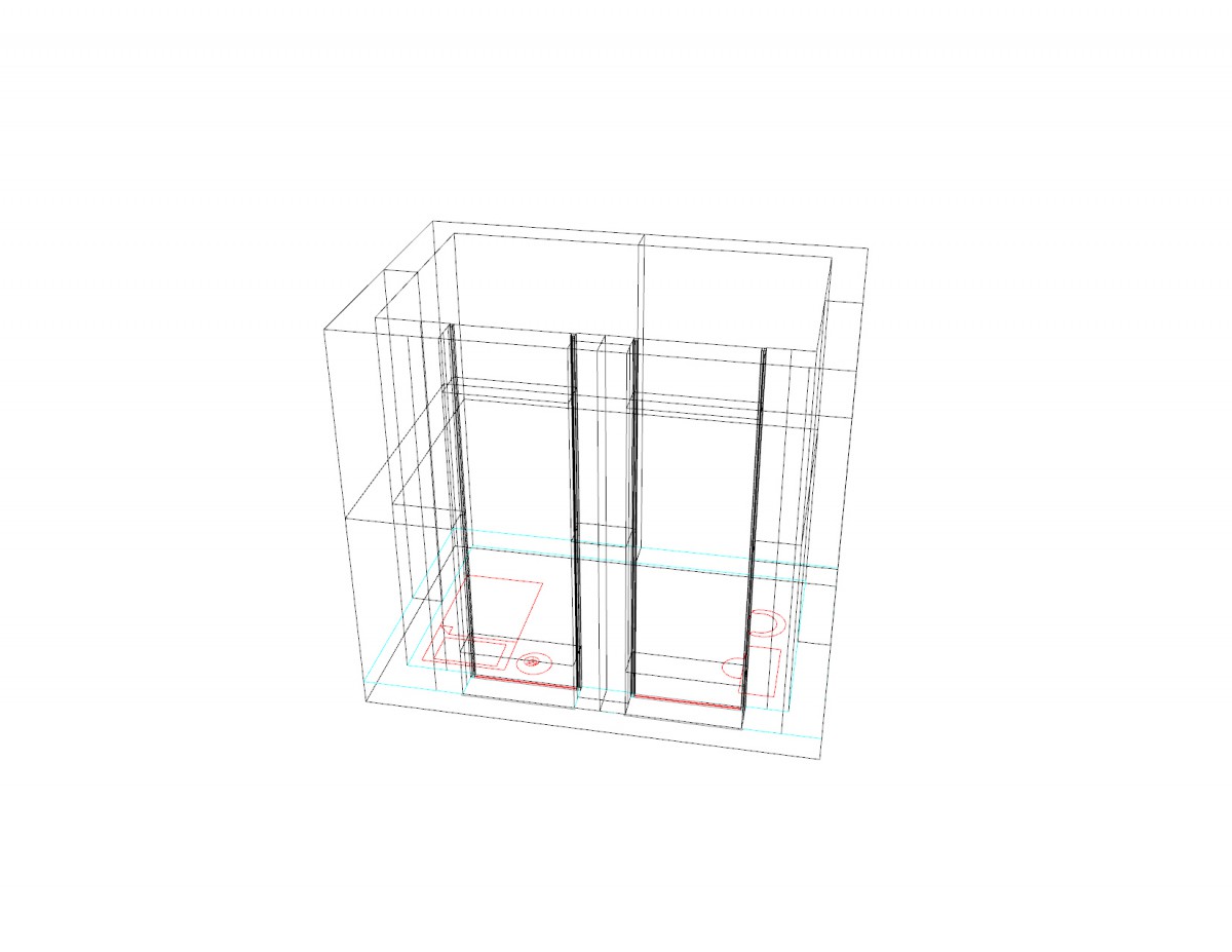
- Furniture and the amount placed through this room this room gives it a well relaxed area. This smaller area compared to the bigger suite is very important in the way it provides a area to sleep combining to factor of comfort. Having a good view is important here as well with sufficient lighting.
Sleeping Space (Larger):
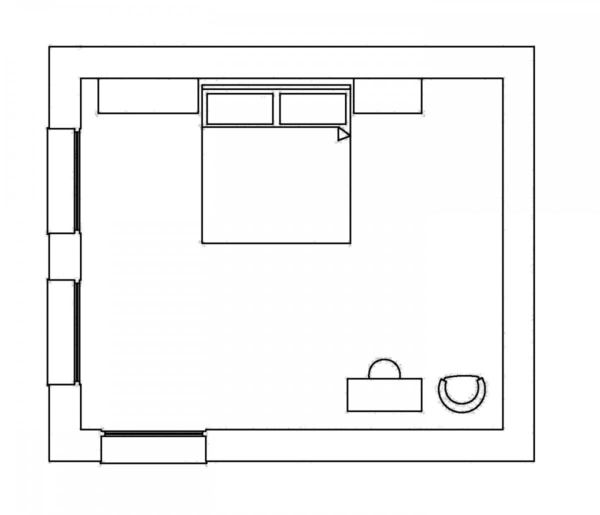
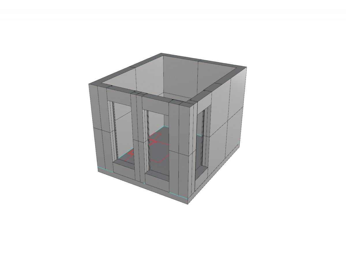
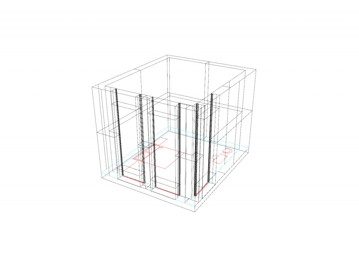
- This area being the most relax-able private spacious area has to contain a well organized layout depending on the furniture used to plan this room. As mentioned with the previous one the windows have to be oriented depending on the site and depending on where the windows go this will position the furniture. The bed facing the window for a persons self security to feel good.

