Assignment 1 (Part B) Personal Branding Moodboard
I’ve selected these images based on what I like and feel. For my mood board I decided to stick with my go to colors black, white, and blue. Why these colors? I feel like I always see these colors outside especially when its cloudy and rainy and I just love the feel of it. Visually I personally really like geometric patterns, empty wide spaces, and photography

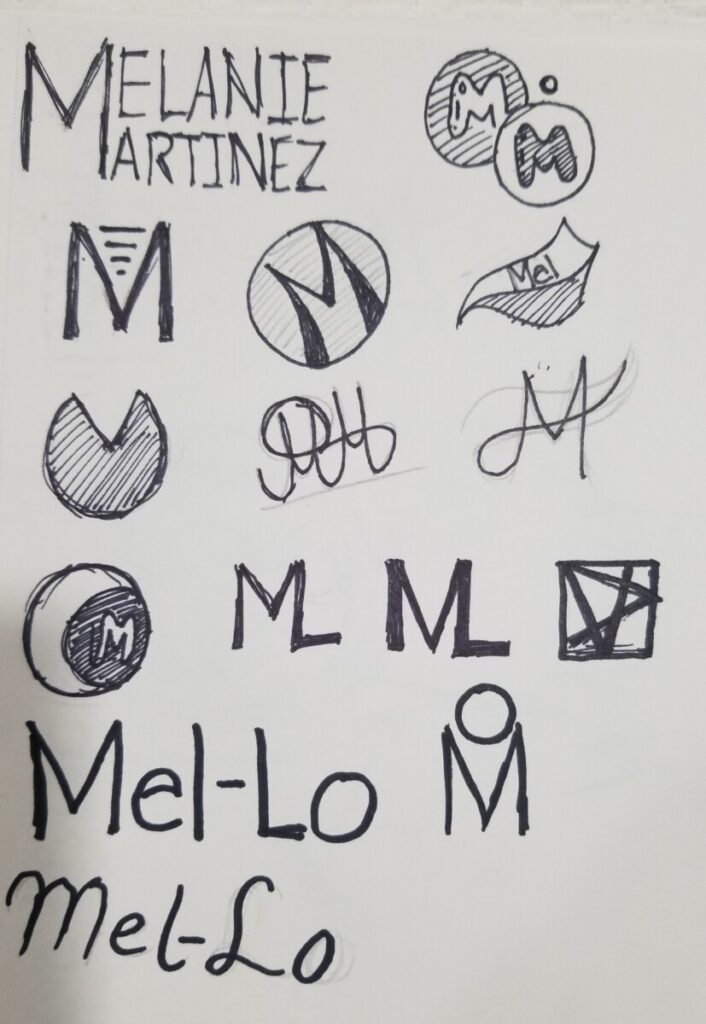
Assignment 1 (Part C) Personal Logo Sketching and Brainstorming
When making these logos I noticed that my logos differed than what my mood board had and what I intentionally wanted. In the making of these logos I noticed how much I really enjoyed doing curves and circles, when my original intent was to have geometric symmetric shapes. When doing these logos I noticed how hard it actually is to make logos. Honestly I still am wondering the name and design for this when designing a logo. At first I was gonna go for my initials M & M but all that came to my head was the m&m’s logo, so then I decided to go with Mel-Lo. Why Mel-Lo? Well I wanted the M to stay and found out that mellow means pleasantly smooth or soft which sounded great to me. Since Mellow and Melanie have Mel I used that and used Lo at the end. Mel-Lo didn’t sound and look like a bad brand name. Im still figuring these out so its not all my sketches!
Assignment 1 (Part D) Personal Logo Black and White Exploration
In the making of doing these logos digitally I noticed how different my logos came out compared to the logo sketches I made by hand. I didn’t use majority of the logos i’ve made for the sketches because I see them as ugly and i’m glad I did because my ideas have evolved. I noticed how I really liked curves and circles compared to my original intent based on my mood board, which was a more symmetrical cube/square like feeling. Personally I really like the logos that have the dripping effects because it kinda looks like paint or graffiti. I like it because it gives it a bit of street vibe. It blends well with NY since graffiti is something I see in my everyday life. The top middle one also reminds me of the subway trains. It’s simple but it works. In the beginning of doing these logos I was honestly very lost I wanted them simple but I didn’t know how to make something simple and look good. So I started to play around with the typography and shapes and ended up with these results.
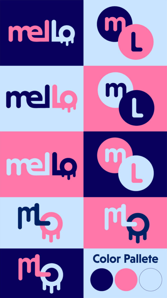
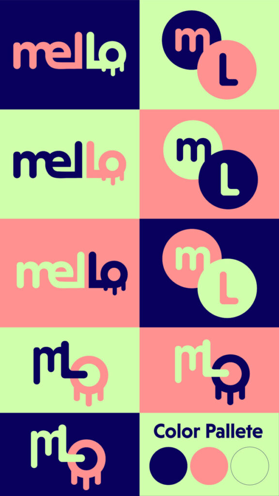
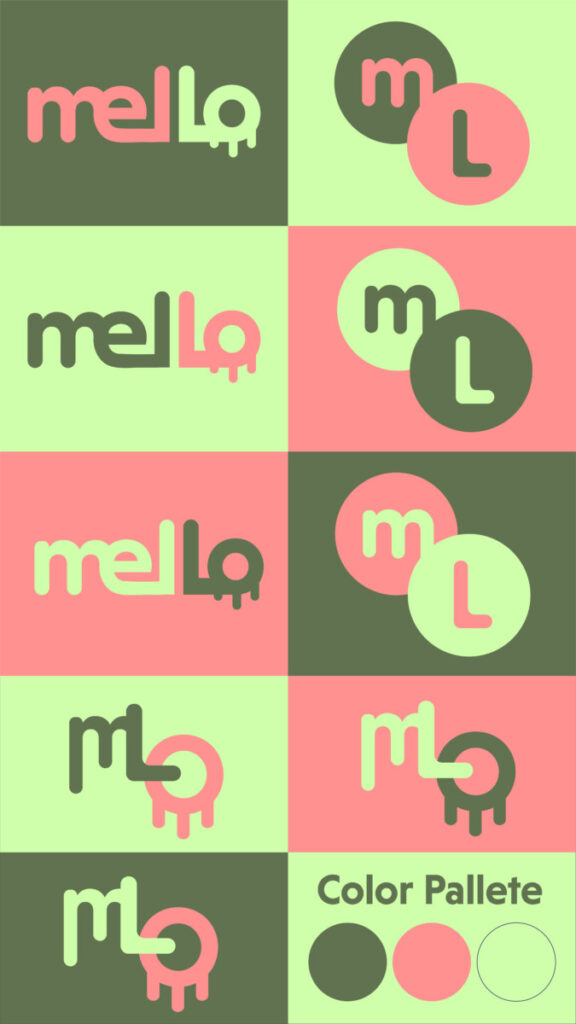
Assignment 1 (part E) Applying color and typography to your B+W logo
In the making of the colored logo versions I decided to go with 3 different kinds of logos. The logos I choose seem to go very well with each other having curves, circles and letters m, L & o. When picking these colors I definitely wanted navy blue. Navy blue is my favorite color so it’s a must for this project! At first I went for only blue’s but the result was disappointing. It was hard deciding what colors would go well with navy blue since I did end up playing with many different colors. There were many colors that I loved so this was VERY HARD. The 2nd color I choose was light blue. Light blue and navy blue blends so well so I immediately used it. Also it is said that blue represents trust, loyalty, sincerity, imagination and freedom. The 3rd color was the hardest however when I tested out pink I immediately fell in love with it. Pink is associated with love, sweetness, childhood and femininity. I feel that the color pink goes very well with the logos & vibe. I immediately knew that all 3 colors used in V1 were the colors.
Assignment 1 Final
Behance Link