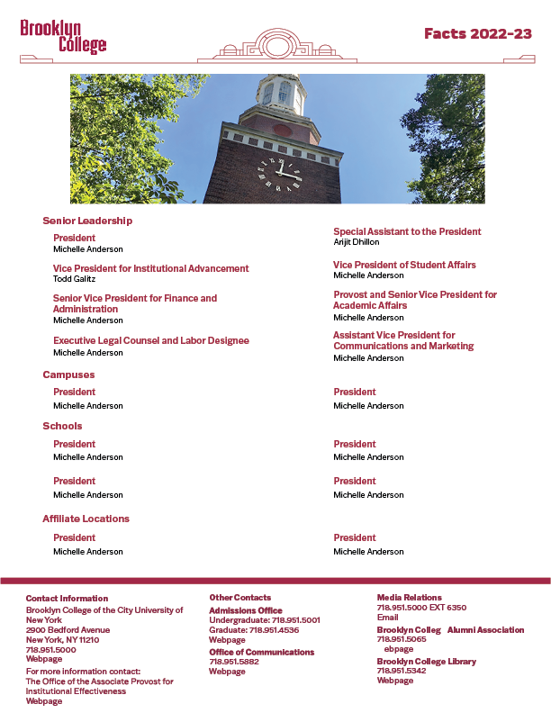
This week, we focused on revamping the facts sheet for our educational institution. The sheet contained crucial details about enrollment, diversity, fundraisers, and more. Our task was to completely redesign the layout and incorporate vibrant graphs and charts. With a total of four pages, we interns decided to divide the workload equally among ourselves. Fortunately, I got the opportunity to work on the final page, which showcased the institution’s references. It turned out to be a relatively straightforward task since there weren’t many aspects that required modification. Our supervisor provided us with the necessary tools to update the text, charts, and graphs. After implementing the required changes, I decided to add a picture and switch the font to match the guidelines. During a meeting with our supervisor, I explained my rationale behind including the picture. I believed it would infuse the page with more personality, making it stand out rather than being easily overlooked. To my delight, they responded positively, appreciating the newly added picture and even suggesting that I offer design suggestions to the other interns for their respective pages.
Facts Sheet made by: Matthew De Souza

