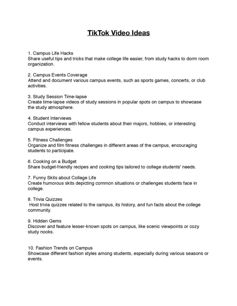
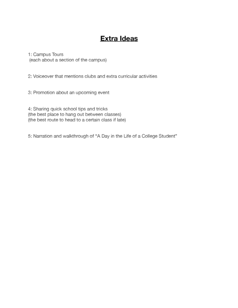
During my internship, there has been a decrease in workload, allowing me to allocate more time towards projects for my other classes. Recently, there have been discussions regarding a video project that has spanned a couple of weeks. Last week, my fellow intern and I brainstormed and generated 15 ideas for potential videos. Additionally, we delved into the process of filming these ideas. These efforts culminated in a meeting that took place yesterday. During this meeting, we received feedback on the video concepts and were instructed to narrow them down to four, ultimately selecting two for filming. Some ideas were rejected due to restrictions on interacting with certain elements within the educational institution.
Our supervisor informed us that filming would not be necessary and instead assigned us smaller graphic projects. These projects involved creating Zoom backgrounds and menus for the institution. Despite their smaller scale, we were instructed to approach these tasks with utmost seriousness, as they were requested by the head of the department. To provide my supervisor with a range of options, I developed multiple backgrounds, exceeding the required amount. Throughout this process, I prioritized the concept of simplicity, ensuring that the backgrounds were not overly busy or distracting for potential users. Initially, I had planned to utilize Adobe InDesign for this task, but ultimately opted for Illustrator due to its superior color swatches, gradient tools, and blurs. I incorporated light blues and yellows, overlaying them with objects of low opacity. Lastly, I included multiple institutions within the backgrounds to demonstrate their placement and functionality within the landscape space.


Suggestion Sheet made by: Matthew De Souza


