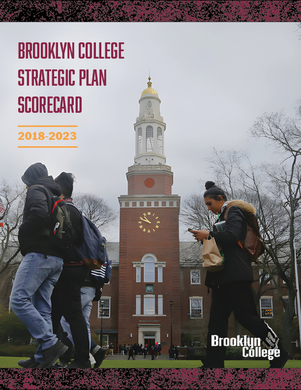
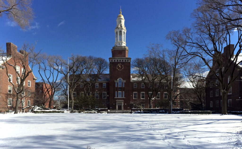
The first few weeks have been slow but productive. Within a team of 3, our first assignment was to redesign and remodel the educational institution’s cover report. We were given the company’s guidelines and rulebook and were made to study them. Only certain colors and fonts were allowed, and all pictures had to be related to the company or the people associated with it. Upon redesigning and distributing my first cover reports, I was met with feedback that was very concerning. The photos were blurry upon closer inspection. This was something that caught me off-guard because I had gotten the photos from google images and even edited some of them to have higher sharpness and definition. However, this wasn’t enough, as my supervisor can still spot sections in the picture that weren’t clear or readable. My work was acceptable and the supervisor even said that she loved them, but the pictures were the only thing that was holding it back from submission.
After doing some research, I found an online high definition picture tool that can help my situation. By inserting my photos, I could change the picture’s quality to 4K high definition, which made them readable and removed all blurry effects attached to them. After some changes to color contrast and font choices, I submitted my cover reports. A day later, I was met with a happy reaction from my supervisor. She was very excited that I overcame these issues with the photos and was satisfied with the final product. Once giving it some thought, I decided to make extra cover reports just to give my supervisor more options to choose from. She appreciated the extra effort and gladly accepted them. Here are the cover reports:


Covers made by: Matthew De Souza


