Background
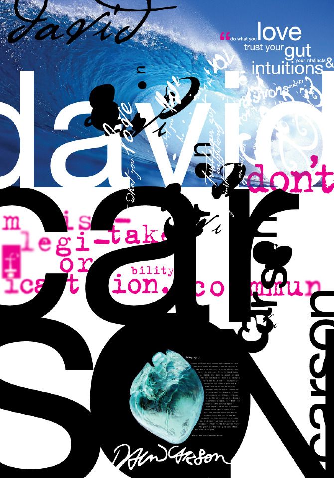
David Carson is an American graphic designer and art director whose unconventional style of work was revolutionary in the 1990’s. Born September 8th, 1955, in Corpus Christi, Texas. Before arriving to the graphic arts scene, Carson was a competitive professional surfer and a high school teacher in California. Upon self evaluation and discovering a new calling, in 1981, he briefly enrolled at a commercial art school before working at a small surfer magazine called Self and Musician. He also began working for Transworld Skateboarding magazine as an art director which helped pave the way for his experimental designing work.
After experimenting this new interest for four years as a part designer he began to develop his style of art which involves chaotic spreads with overlapped photos and altered/mixed type fonts. Developing his signature style, Carson published six issues before the magazine folded but it was enough time as his designs were recognized for their unique style and typography. Because of this he had obtained many design awards, only further establishing his dominance in that career choice and the impact each of his notorious designs held in the hearts of people.
Early Designs/ Artworks
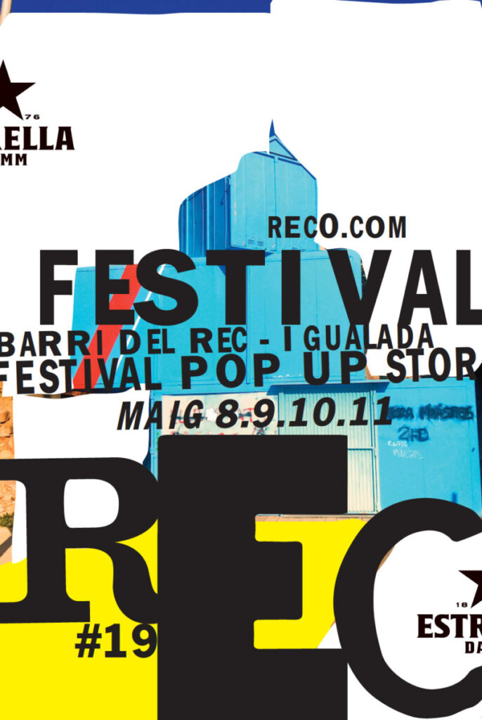
Davids 2019 street poster for Spain REC festival
This piece of work is promotional art for one of the world’s largest pop up festival in Spain. The poster has a collage style to it, utilizing various sizes of fonts and multiple different colors. The building is cropped in the back not aligning properly only adding the collage aesthetic. The most important thing about this work has to be the typeface fonts and how/where they are placed on the poster. The words that are smaller are considered to be less of importance than the ones that are much larger. It gives a sense of organization, telling your eyes where to look to first. The typeface that your eyes will most likely drop to is the name of the festival being “REC”. After that the rest of the information becomes smaller as they become less important. The black coloring of the words also work well with the background, making them pop out.
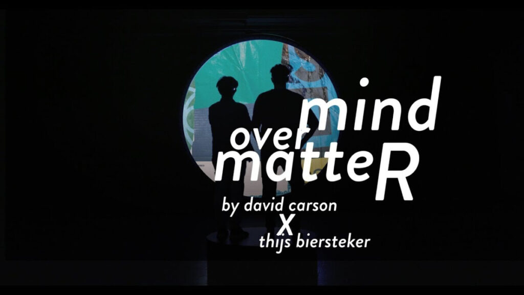
Mind over Matter
Carson working alongside Thijs Biersteker presents “Mind over Matter” a step up for Carson’s collage art style being put into motion using randomized algorithms. This piece of work explores how we as people can overcome any obstacle and challenges by focusing on one thing at a time. When asked about it David Carson gave a good description about what this piece of work means to him stating, “The combination of some of my new work, done hand, takes on a refreshingly new dimension and meaning when combines with this state of the art technology skills. Where both makers enjoy to work with our hands. I think our passion for what we do comes thru in this collaboration. While it’s fascinating to watch other brain waves on the screen in front of you, nothing I know of is quite like the experience of actually putting on the head set and seeing the results of your own brain waves.” (David Carson) The artwork has a black background that takes most of the screen except for the middle which consists of light green and blue also having two black figures standing in the middle. The cherry on top is the main words “mind over matteR”. Whats so interesting about the typeface is how mind is quite literally placed over matter, providing a literal sense to the phrase. The “R” in “matteR” is also capitalized while the other letters are lowercase. Finally they utilize a white color on the phrase to make it stand out from the black background and dark color scheme.
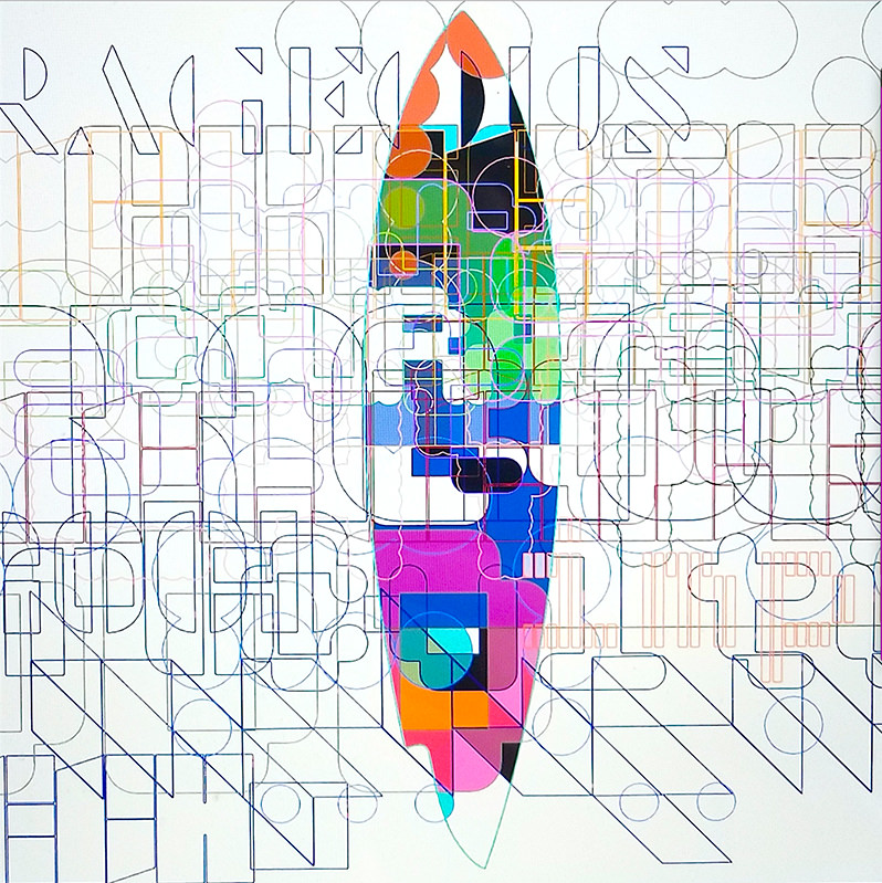
Nu surfboard collaboration
Carson presented an array of interesting color choices and fonts in this piece. A thing to notice is the use of outlined words constantly overlapping one another with each one having different sets of colors, making them very distinctive and separate despite them overlapping. The white background only enhances the coloring making things less confusing. However the most important inclusion in this work is the Muti-colored surfboard in the middle of the white background and seems to be behind the many outlined words. The surfboard itself is a call back to David Carson’s roots as a competitive surfer, using the two things that he loves doing, surfing and designing, creating something new out of both. The many filled colors along with symmetry helps the surfboard stand out from everything else showcasing its importance in the photo and to ignore the confusing outlined words that is trying to distract you.
References
http://www.davidcarsondesign.com
https://thijsbiersteker.com/mind-over-matter
http://historiadesigneteoria.blogspot.com/2013/04/david-carson.html
https://www.britannica.com/biography/David-Carson
https://www.famousgraphicdesigners.org/david-carson
https://www.behance.net/gallery/69106945/Analysing-Designer-Aspects-and-Techniques-Level-3
http://www.trippinguptrump.co.uk/docs/2a69ab-david-carson-work-analysis