Author Archives: Suman Ganguli

Example: Life Expectancy vs Household Income in the US

A major study of income and life expectancy in the United States was just published last week in the Journal of the American Medical Association, titled “The Association Between Income and Life Expectancy in the United States, 2001-2014.”  You can read the entire paper online (or download a pdf–see below), but the results were also reported on by various news sources, including The New York Times, which titled its post: “The Rich Live Longer Everywhere. For the Poor, Geography Matters.”  (There’s also a related interactive map that lets you look at life expectancies in your area: “Where the Poor Live Longer: How Your Area Compares“. Note that this is county-by-county data.

The NYT page has a number of graphs and tables, including this scatterplot of life expectancy vs household income for men and women:

Life Expectancy vs Household Income

Below is the full paper, whose lead authors are two Harvard economists (Raj Chetty and David Cutler). Note the “Design and Setting” paragraph, which describes where the data was obtained:

Income data for the US population were obtained from 1.4 billion deidentified tax records between 1999 and 2014. Mortality data were obtained from Social Security Administration death records. These data were used to estimate race- and ethnicity-adjusted life expectancy at 40 years of age by household income percentile, sex, and geographic area, and to evaluate factors associated with differences in life expectancy.

Download (PDF, 2.16MB)

Example/Project Ideas: GapMinder’s “Wealth & Health of Nations”

GapMinder is a website I showed earlier in the semester when we discussed scatterplots.   GapMinder has a wealth of data that is available for download, and so is a very good source for project topics and datasets.  They provide datasets for 519 (!) different “indicators” listed alphabetically–everything from “Adults with HIV (%, age 15-49)”) to “Yearly CO2 emissions (1000 tonnes)”!

Browse through the list to get some project ideas (clicking under the “Download” column downloads the data in an Excel file; clicking under “View” opens a Google spreadsheet with the dataset.)

The scatterplot I showed in class earlier in the semester showed the “Wealth & Health of Nations“, as measured by life expectancy (a measure of a country’s health) vs. GDP per capita (a measure of its wealth):

gapminder

Recall that GapMinder shows a time-lapse movie of such scatterplots, showing how this paired data set evolved over the past 200 years.

(In fact, they produced a video called “200 years that changed the world” in which Hans Rosling, the medical doctor and statistician who created GapMinder, provides commentary on this time-lapse data.  Rosling became widely known through his TED talks. His first one, from 2006, is titled “The best stats you’ve ever seen“–it’s worth watching!)

Probabilistic Weather Forecasts

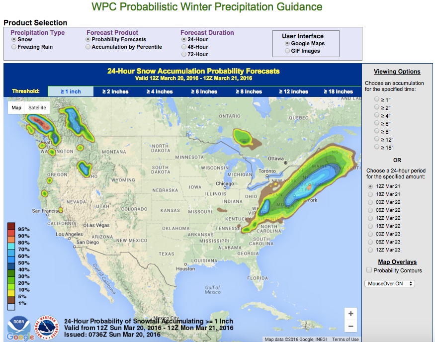
As you might have heard, we’re probably going to get some snow today. In fact, weather forecasts are given these days in terms of probabilities. I just went to the National Weather Service’s Weather Prediction Center, which gives a Probabilistic Winter Precipitation Guidance.

Here is the current map (as of 12pm Sunday March 20), showing “24-Hour Probability of Snow Accumulating ≥ 1″:

24-Hour Probability of Snow Accumulating ≥ 1"

We can discuss in class how they compute these probabilities. But if you’d like to read more about probabilities and weather forecasting, I recommend reading Nate Silver’s book The Signal and the Noise at some point (I have a copy you can borrow, and there are multiple copies in the CUNY library system).  Each chapter of the book discusses a different of application of statistics and probability for making predictions.

I wrote up a guide to the various chapters of The Signal and the Noise for a previous section of 1372–here is what I wrote about Chapter 4 of the book:

  • Chapter 4 discusses advances in weather forecasting, and includes a little bit about the philosophical debate about “determinism vs. probabilism” and “Laplace’s demon“, before discussing some aspects of chaos theory (namely, sensitivity to initial conditions) and why it means weather forecasts are probabilistic. Silver also presents statistics showing that weather forecasting has been getting steadily better over the past few decades.One project idea would be to look at how probability is used in weather forecasting; there is an article by two meteorologists from the National Oceanic & Atmospheric Administration’s National Severe Storms Laboratory on “Probability Forecasting“. You could also look at the technique of “ensemble forecasting,” which is alluded to in Silver’s chapter.


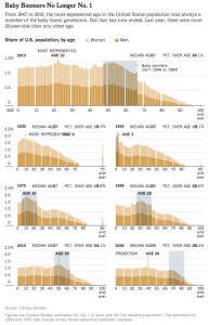
Frequency Histograms Showing “The Aging of America”

Here is the example I showed in class when we discussed frequency distributions and histograms at the beginning of the semester–frequency histograms showing the age distributions of the US population over time:

A similar post appeared on WashingtonPost’s Wonkblog:

  • “This is a mesmerizing little animation created by Bill McBride of Calculated Risk. It shows the distribution of the U.S. population by age over time, starting at 1900 and ending with Census Bureau forecasts between now and 2060.”

What do you notice about how the distributions evolve over time? Click thru to either the CalculatedRisk blog post on which this animation first appeared or to the WashingtonPost link to read some discussion.

Also here is a related set of histograms that were featured in the NYT Business section in May 2014, as part of an article titled “Younger Turn for a Graying Nation“:

NYT-graying

That was an installment of a weekly column in the NYT Business section titled “Off the Charts,” which discusses a graph and the underlying data every Saturday.