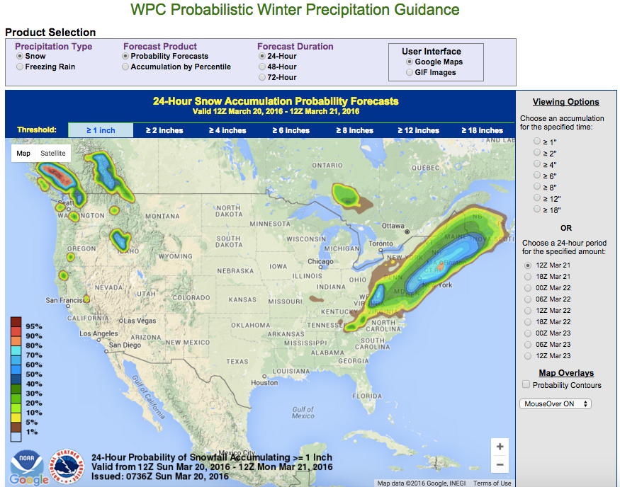
As you might have heard, we’re probably going to get some snow today. In fact, weather forecasts are given these days in terms of probabilities. I just went to the National Weather Service’s Weather Prediction Center, which gives a Probabilistic Winter Precipitation Guidance.
Here is the current map (as of 12pm Sunday March 20), showing “24-Hour Probability of Snow Accumulating ≥ 1″:
We can discuss in class how they compute these probabilities. But if you’d like to read more about probabilities and weather forecasting, I recommend reading Nate Silver’s book The Signal and the Noise at some point (I have a copy you can borrow, and there are multiple copies in the CUNY library system). Each chapter of the book discusses a different of application of statistics and probability for making predictions.
I wrote up a guide to the various chapters of The Signal and the Noise for a previous section of 1372–here is what I wrote about Chapter 4 of the book:
- Chapter 4 discusses advances in weather forecasting, and includes a little bit about the philosophical debate about “determinism vs. probabilism” and “Laplace’s demon“, before discussing some aspects of chaos theory (namely, sensitivity to initial conditions) and why it means weather forecasts are probabilistic. Silver also presents statistics showing that weather forecasting has been getting steadily better over the past few decades.One project idea would be to look at how probability is used in weather forecasting; there is an article by two meteorologists from the National Oceanic & Atmospheric Administration’s National Severe Storms Laboratory on “Probability Forecasting“. You could also look at the technique of “ensemble forecasting,” which is alluded to in Silver’s chapter.