Academics
Museum Report
Logo History Report
The History of the Orange Bolt
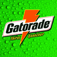
Gatorade. The most recognizable sports drink brand on the market. What’s the first thing that comes to mind when you think about Gatorade? Is it the old style green background, for those that grew up in that era, or is it the big G that’s been recently used as its new logo, or is it the accent orange bolt?
That bolt is known everywhere where sports drinks are sold, at big games, and other athletic fields of performance. The big G and orange bolt weren’t always the way you recognize them today. Way back in the late ‘60s, a scientist by the name of James Robert Cade.
Robert Cade was an American physician, professor, research scientist, and inventor. Cade became a professor of medicine at the University of Florida after graduating from the University of Texas with medical degrees. In 1965, Cade was approached by assistant coach, Dewayne Douglas of the University’s football team, the Florida Gators. The assistant coach had a problem with his team’s extreme dehydration issue, and so Douglas asked Cade to come up with a solution to the lack of hydration and over exertion of perspiration.
Together with his team, from 1965 to 1966, Cade conducted experiments researching what would replenish a football player’s fluids and keep them hydrated during practice and games.
The original solution wasn’t as tasteful as it is today, and at the suggestion of Cade’s wife, the researchers added lemon juice to the drink. The sports drink was originally recognized as “Cade’s Ade,” and then later on as “Gatorade.” After its successful first run, used on the field against the LSU Tigers, the sports drink was patented by Cade and offered the rights to the beverage to the University of Florida for an exchange of backing from the University in production and marketing, but the offer was turned down.
Cade unaccepted offer led him to produce Gatorade on his own, but later agreed on a contract with Stokely-Van Camp, Inc. to produce and sell the drink. Stokely-Van Camp, Inc. was originally a successful commercial cold storage warehouse, where they preserved fruits and vegetables in cans. In 1970, Cade sold the rights to his sports drink to the company, and then, they went on to sell their own brand to the Quaker Oats Company, and the ownership of Gatorade passed onto them. In 2000, PepsiCo acquired the rights to Gatorade, through the acquisition of the Quaker Oats Company, and remains in its possession to this day.
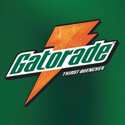
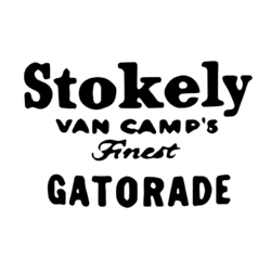
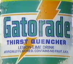
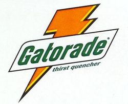
The juggle of ownership also came with a change in logos. In 1965, Gatorade’s first logo was developed. It featured Stokely-Van Camp’s name and the first variation of the famous Gatorade typeface. This logo lasted until 1970, with its change to a more colorful logo, featuring the colors of the University of Florida’s football team colors—orange, white, green, and yellow. With this newly developed logo enters the famous orange bolt featured on all Gatorade products to date. In 1991, the brand changed its logo to feature simply the orange bolt, the name in its typeface, and its “thirst quencher” slogan. The face of Gatorade was tweaked a few times and remained the same until 2008, with its change to the big G and little orange bolt. For its 50th Anniversary, Gatorade reverted to an adaptation of its original logo for a short time.

Visually Enhanced Quote
My visual quote is based on a nostalgia of mine; waking up early for Saturday morning cartoons. I’d always be up early for the Teenage Mutant Ninja Turtles, and also because of the inspiration from a vinyl collectible sitting on my desk at home, I decided to work with the famous quote by the goof of the turtle brothers, Michelangelo, who says, “Cowabunga Dude!”
I wasn’t sure if I wanted to draw out figures or use type in order to create a representation of the quote said by the cartoon character. I started thinking about the colors that would be used in the piece and started playing with greens and oranges until I started seeing a picture of what I could draw, in my head.


My first concept was based off of the turtles’ shells and the silly nature of the way the characters speak, so I thought of the shell representing Michelangelo the turtle and his quote as a banner for his shell.


Another idea that came to mind is the fact that the characters are New York based and live in the sewers of the city. When I was younger, I used to believe they—the turtles—actually existed and would call out to me to join their squad. I created a classic NYC manhole cover and imagined Michelangelo calling out his famous phrase from the sewers.
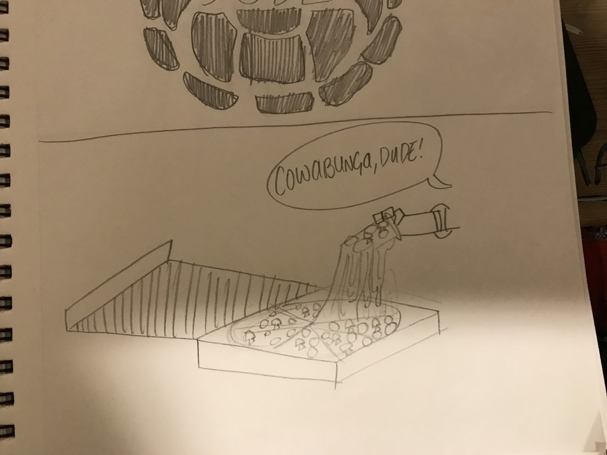
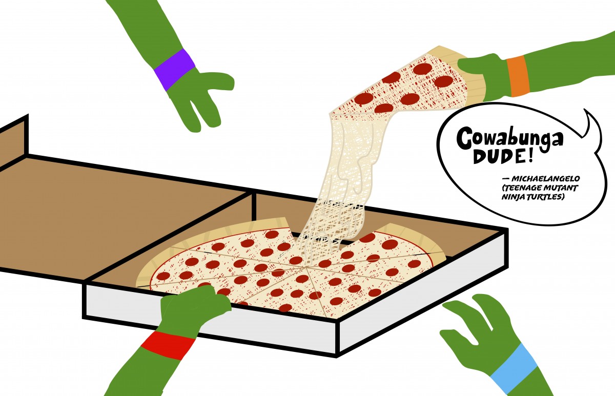
Finally, in this piece, I couldn’t help but include the classic love of pizza the characters share and now I’m getting hungry, but Michelangelo already picked out the best slice!!

