https://drive.google.com/file/d/1k5T8ygmJJv9gjOHdhxF9kcKqbtcSDBTW/view?usp=sharing
Author: Edwin Fernandez
Paula Scher hates Helvetica. Right away I like her style since she wants to get away from what she calls “solemn” work. She wanted to create her own style by doing everything in her power to avoid using Helvetica, and in her pursuit of that goal she was doing things that she had fun with. I feel as though this notion of wanting to do something that is different from what is the norm is a great driving force behind innovation, since she was seen as a postmodernist after she had already established her style with designing album covers. Her words of “serious play” is kind of motivating, since most people are always focused on getting the job done and don’t mess around to try new ideas or techniques.
One of her instructors told her to illustrate with type, which I think is great advice. Her use of typography to create the design shows that by stepping away from the traditions and accepted views on design, someone is able to create captivating designs and maybe even influence others to follow the style created. However I do think that she is a little contradictory in some ways. She doesn’t/didn’t see the computer as a good way to design, even saying that “you don’t type design” when in reality I feel as though that idea is antiquated. Computers allow for some insane new creativity to come through, and just looking at Photoshop and the capabilities it has is enough to prove her wrong.
Paula Scher says that young designers gain a lot of experience since everything they do offer a learning experience, since they don’t really know anything. It’s a somewhat scary thought to have, since there is so much to learn about the world of design outside of school, but it’s good to know that there is a good amount of experience we as young designers can get and just how much we can achieve as we learn and do some serious play


“You didn’t have to shout to capture someones attention”
Louise Fili, INDABA talk
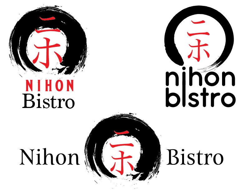
That phrase from Louise Fili speaks volumes as to how I want to approach how I design. There is something special about a simple design that can captivate anyone walking by. She also wanted to have unique type by drawing inspiration from multiple photos she took, altering existing fonts, or by using letters from old type books to create her own letterforms. Creating your own typeface is a brutal process, and I respect that drive to be unique among the many different sorts of type out there. She goes into great detail about how she came up with many branding identities for a number of restaurants, and its amazing how much problem solving she had to go through, as well as the final products that are very smartly considered. She made a sign for a restaurant called 92, and she used the outline of the logo to create a kids. She also gives a funny anecdote where she used sardine cans as a way to present the check to the customers, and how she would have to create many of these every two weeks as the customers would play with the pull tabs too much and ruin them. It was a very smart way of creating a brand with something as simple as a check presenter, and it worked very well, yet there were still some issues that were out of the designers hand.
Louise Fili has a long and prosperous career, and her decisions regarding type and identity shape how she approaches problems. One big takeaway from this talk is that having a large library of photos, type books, or other such media can be extremely helpful as a way to get inspiration for our own work. And of course, the copyright page, where she goes the extra mile to create something reflective of the book itself and allow it to stand out among other book designs.
Will Leben’s study of how sounds could convey physical properties was very interesting and it made me think about how true it is. One question that was asked to students in the study is which word was faster: “fip” or “fop”. I immediately thought that “fip” was the faster one and the consensus that Leben found was the same. Just the way that the sound is created in the mouth gave it a physical weight, and that way of thinking led to the creation of many names that used sounds to convey ideas. The “S” in Swiffer is another example, where the fast sound conveys speed and ease. When I stop to think about it a little, it’s something that’s so simple and very effective and it’s one aspect of design that I never thought about that holds so much power. Coming up with a good name is hard, as Margaret Wolfson states, and it really is a process that can take up lots of time and energy. I read that Anthony Shore would come up with roughly 1,200 names for one project. That’s insane, and he’s just one person. Larger companies probably have a tremendous amount of names on standby, and that’s amazing.
Hello there everyone. My name is Edwin Fernandez. I’m currently in my senior year of study here in City Tech. I am working towards a degree in graphic design, and am aiming to work in photo editing as well. I am comfortable using Indesign, although I haven’t used the program in a long time. I’m also comfortable in Illustrator, but the main program I use is Photoshop. I’m a big fan of music in general, but I do have my favorites. I learned how to play the guitar in order to create my own music as well. I look forward to learning a lot and gaining more experience, as well as building my portfolio.

