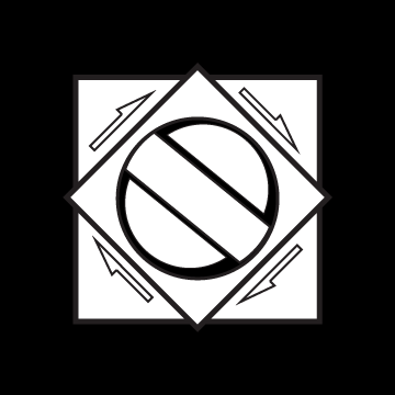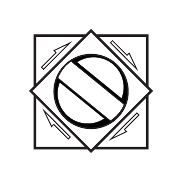


For the icons I made, I mainly focused on the word “gacha” or japanese for gambling pretty much. I’ve always been really into gacha games, or lootbox games, and that really reflects who I am in real life as I love collecting cards and many other things.
So for the logos, I tried to replicate the turn knob for those games/lotto machines where you put a quarter in and turn the knob to see what you will get out of it. I mainly used squares, rectangles, and squares for the shapes and turned them black and white to have the contrast. For reference, the first one is the black, the middle is transparent, and the third one is the white one.


