Time travel
https://drive.google.com/file/d/1zO0GbJDSFVNhQo294-qFswuxS4Emy-Fb/view?usp=sharing

A City Tech OpenLab ePortfolio
Edited the Ready Player One movie trailer with a bunch of other movies and shows like SAO, Edgerunners, Roblox trailers and some other things here and there.
https://drive.google.com/file/d/1E4QtGz4hwtCQwUxcSrKvfwECoRBKSf9K/view?usp=sharing
My mashup is the opening of a current anime that is airing, Oshi no Ko, by YOASOBI called Idol and the hit song Industry Baby by Lil Nas X. It was done by overlaying the beat of Industry Baby with the full song by YOASOBI on top. The full song is slowed down to better fit the beat along with some bass drum sounds to start the song off.
Sticking with the spooky theme, I made a sound track with the theme of running into a abandoned house to take cover from the rain. As you explore the house, you don’t realize as something ominous is creeping up behind you….

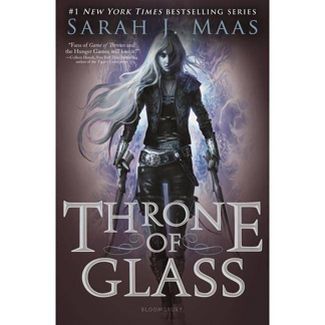
This was the book I chose to do, the stairs were rectangles I made gradually smaller and added a gradient to match the background. After that the text was done, I just found a nice fantasy-like text and added it to the name and book title, and arranged it with the stairs. Afterward, I added a bunch of nutcrackers to fill the space and added the snow texture on the cover. Lastly, I added the two banners on the wall behind the throne. I mostly used the object selection tool along with the quick selection tool to properly crop out the image I wanted.
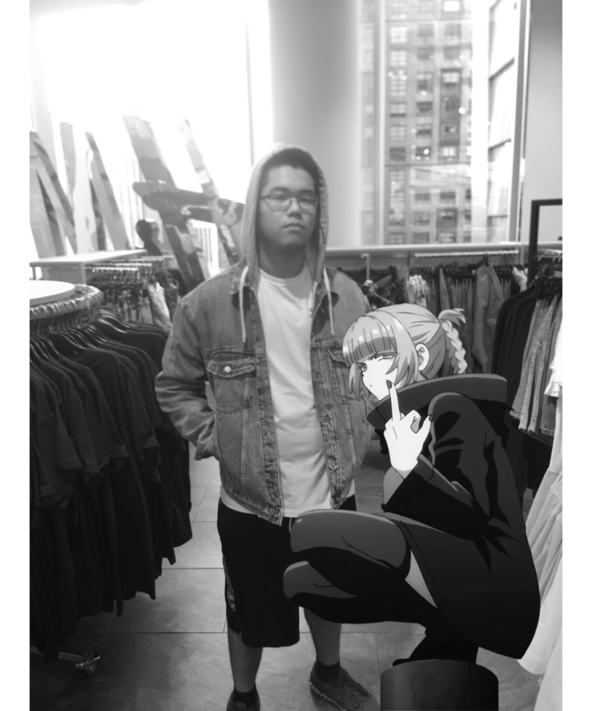
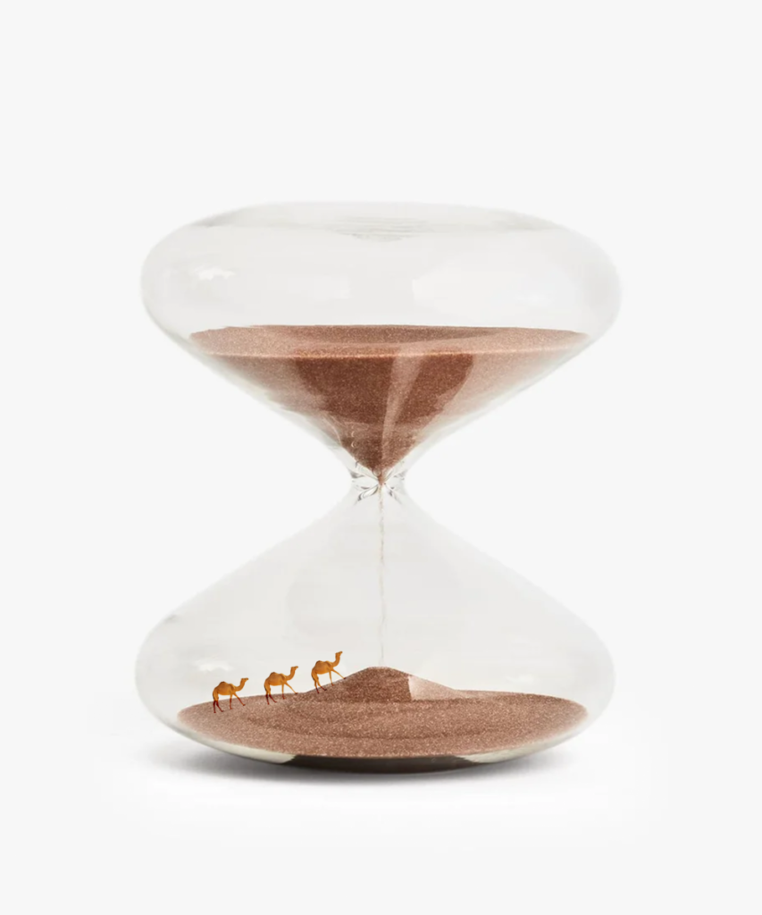
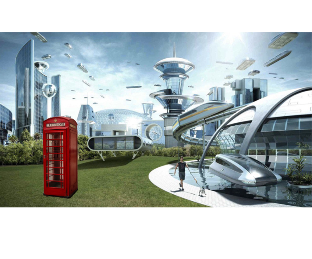
Starting from the left I did an anime edit to make it seem like the character was there with me, that was the realistic image, then the hourglass with the small camels inside it was for the scale image. And lastly, the futuristic city with the really old telephone box was literally a time machine.
For all three images, I used mainly the quick-selection tool to crop the part of the images that I need and put them into separate layers/sub-layers. Then blurred and added a blend where it was needed to make the image slightly better.
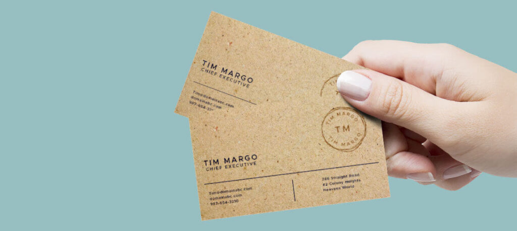
So the business card that I chose was this one. It was during my search, that I found kraft business cards, which is like brown wrapping paper and I really like the rough texture it gives off, like a really rustic vibe. And so I wanted to capture that feeling and made the prototype on the right. I then followed by the one that I refined more to fit what I liked and wanted on the left.
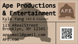

EDIT:
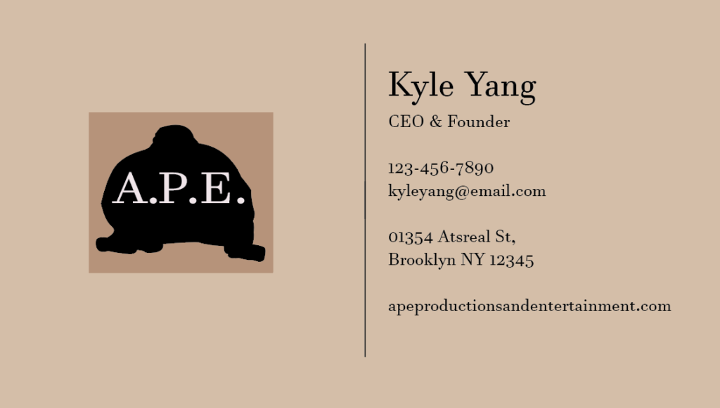
Now that I copied the example roughly I wanted, I went ahead and made the final version of the card. It was hard designing the front of the card since the logo needs a bit of a redesign, but the layout and ideas are there.



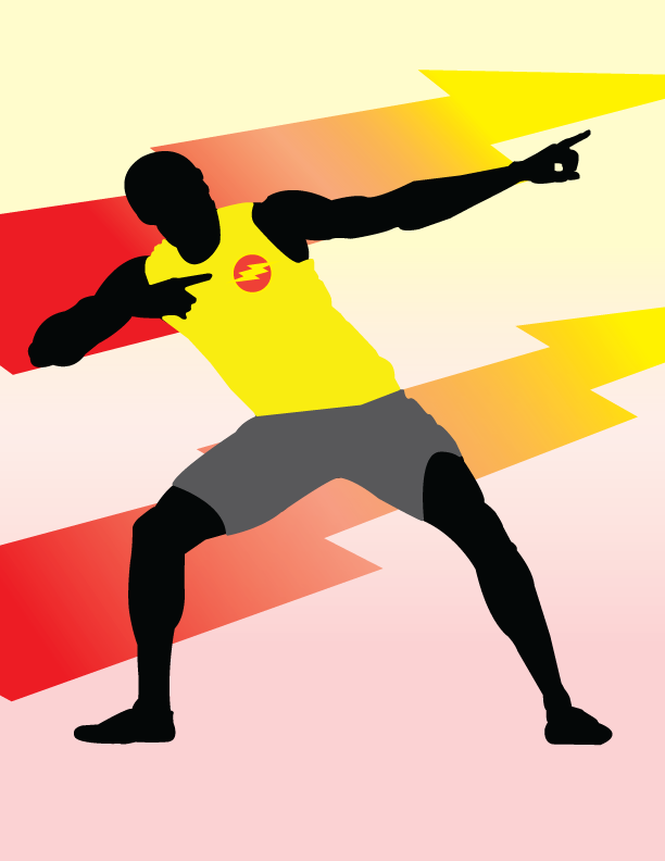
The person I chose to do a silhouette of was Usain Bolt, I still remember when he broke the record and how monumental it was, and how iconic his pose was, so that was the reason why I had chosen to do it.
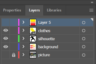
From the illustrator, I made 5 layers, one for the original photo that I was tracing from, the background which includes the lightning bolts and the gradient along with it. The silhouette, and finally his clothes on top of that. I also traced a flash symbol on his shirt to match with the background and colors.
EDIT:
I had just fixed some parts of the paths for the clothes as you can see the outline of it sticking out in certain places, so I just edited his clothes so that it was over the outline.
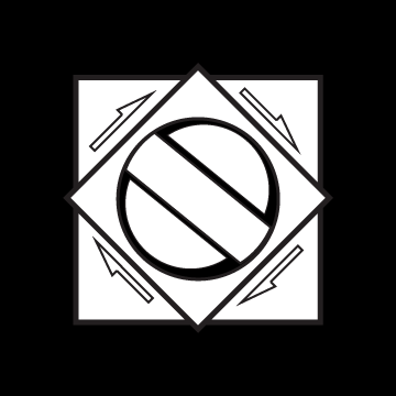

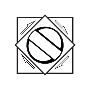
For the icons I made, I mainly focused on the word “gacha” or japanese for gambling pretty much. I’ve always been really into gacha games, or lootbox games, and that really reflects who I am in real life as I love collecting cards and many other things.
So for the logos, I tried to replicate the turn knob for those games/lotto machines where you put a quarter in and turn the knob to see what you will get out of it. I mainly used squares, rectangles, and squares for the shapes and turned them black and white to have the contrast. For reference, the first one is the black, the middle is transparent, and the third one is the white one.