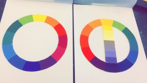
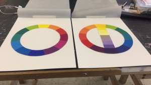
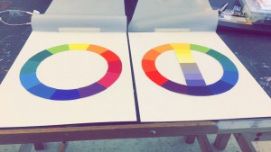
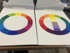
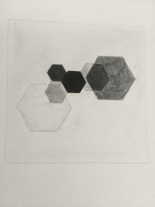
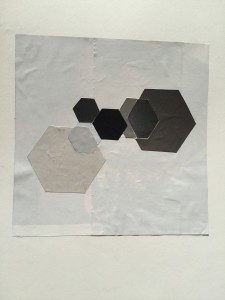
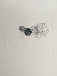
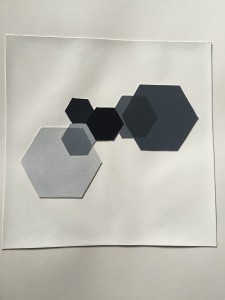
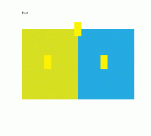
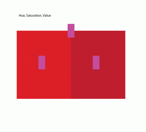
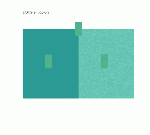
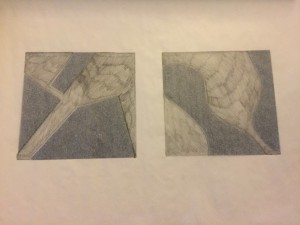
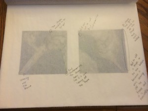
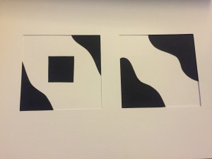
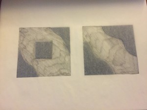
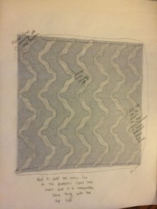
CMY & RGB Color Wheels:
Project # 3
5 Color Interactions
Open Lab Workshop
-one on one sessions
Type & Media
Foundation Drawing
Raster & Vector class
Project #1
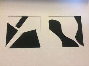
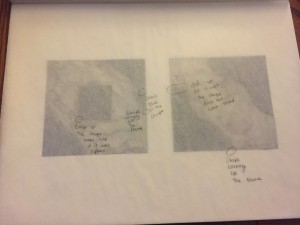
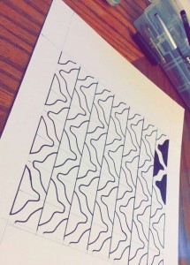
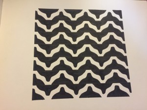
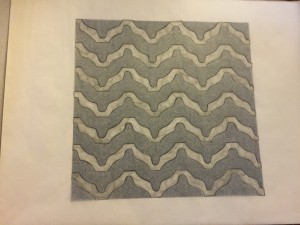
This first project helped me a lot not only with my craftsmanship but also with figure ground, negative and positive space. Although it was a challenge to have good craftsmanship, and keep all the compositions clean at the end I liked the out come since the final is very clean and the positive and negative space works well. I did change one of the compositions in order for me to get a better pattern for the final.
Composition #1:
Composition #2:
Final:
What is the difference between art and design?
art Vs. design
I have read so many books and articles on design and on art, what it is and how it should be executed. I must admit that since becoming a producer my designing days have taken a backseat to management. I enjoyed being a designer and now I enjoy working with designers in addition to every other aspect of production. I was at home contemplating what the difference between design and art is, and I think I have come up with some pretty clear lines between the two and have also identified where those lines have become blurred.
Now, it is my understanding that design in the commercial sense is a very calculated and defined process; it is discussed amongst a group and implemented taking careful steps to make sure the objectives of the project are met. A designer is similar to an engineer in that respect and must not only have an eye for color and style but must adhere to very intricate functional details that will meet the objectives of the project. The word “design” lends itself to a hint that someone or something has carefully created this “thing” and much planning and thought has been executed to produce the imagery or materials used for the project.
On the other hand, art is something completely separate—any good artist should convey a message or inspire an emotion it doesn’t have to adhere to any specific rules, the artist is creating his own rules. Art is something that can elicit a single thought or feeling such as simplicity or strength, love or pain and the composition simply flows from the hand of the artist. The artist is free to express themselves in any medium and color scheme, using any number of methods to convey their message. No artist ever has to explain why they did something a certain way other than that this is what they felt would best portray the feeling or emotion or message.
Many designers are artists and many artists are designers, the line between the two is complex and intriguing. I was perusing some art books and something strange caught my eye, I had noticed that many of the artists were not creating a unique, almost chaotic portrait of their innermost selves or inspirations rather they were clearly using popular trends to capture the attention of the viewer. I noticed that many of the pieces being shown were “throwbacks” of past artists styles or color and simply refreshed for public consumption. The very fact that older artists inspire newer artists seems to contradict the whole definition of art. These artists are following a method, a pattern or a standard that has already been established by another artist and therefore they are not creating something completely new rather following instructions laid down by a previous artist rendering that piece to be more design than art.
I can completely appreciate the paths laid down by past artists who establish a style or method but at this point it seems that when that style or method is used the art then turns into design. I looked through some older books and saw a rather obvious occurrence in the art being displayed, many of the newer artists were simply copying things from the past. I admire a person’s talent for picking up a brush and creating an image that has an impact on its viewer but when I see it over and over again by different people who are all claiming to be “of the school of…,” and that this is legitimate, unique art, I find that a bit hard to swallow. If the artist said, “I have designed something in the standard of Picasso,” and this is simply a design based on his style but a new twist has been added, then I would feel more comfortable accepting it for what it is, a design. But when an artist’s style and methods are completely the same as someone else’s and even if the message is different I feel that this cannot be passed off as art because the newness and the chaotic nature of it simply flowing from the source seems to be absent and it becomes more like a paint by numbers project than a creation that has never been seen before.
I do not claim to be an expert on defining what art is and what it is not, but I do know that if we look at the differences between art and design we will see a very clear line drawn between the two. An engineer, if given the exact coordinates to place different colored pixels in specific places, could render a beautiful website or ad simply by following instructions; most design projects have a detailed set of instructions and most design is based on current trends and influences. An artist, on the other hand, could never be given any specific instructions in creating a new chaotic and unique masterpiece because his emotions and soul is dictating the movement of his hands and the impulses for the usage of the medium. No art director is going to yell at an artist for producing something completely unique because that is what makes an artist an artist and not a designer.
I feel that designers who are passionate about their work should try and dedicate time to create “art” for art’s sake and train themselves to express emotion and feeling through their designs. Uniqueness comes from passion and not adhering to any rules that may force the artist to make even one stroke that was unintended. Commercialism has been dictating the course of design and has made a clear and thick line between the artist and the designer. Following trends and applying imagery based on specific needs and goals is the easy part, allowing yourself to express a message or emotion free of any specifications is where true beauty is born. Designers who are looking for the next big trend or who want to be the one to create that trend must create chaotic and truly original pieces to display their artistic prowess and then apply those unique methods to their design at work, and I think this will create a truly harmonious balance between art and design.
New York Times Article
http://www.nytimes.com/2011/05/09/arts/09iht-DESIGN09.html
In this article Alice talks about a forgotten genre of design as she calls it “quietly good design” which it is not innovative. Alice explains that although a quietly good design is not innovative, but it fulfills its function bringing pleasure to others. As examples of this genre she has:
1. Penguin Great Food books, by the designer Coralie Bickford-Smith.
2. Wasara eco-friendly dinnerware. (They are biodegradable and chic).
3. Domus magazine. (a detail from the new issue of Domus magazine, which accentuates the tactile qualities of print).
4. Jaime Hayon’s tableware for Maruwakaya. (Elegant porcelain tableware, designed with Kamide Choemon-gama for Maruwakaya).

