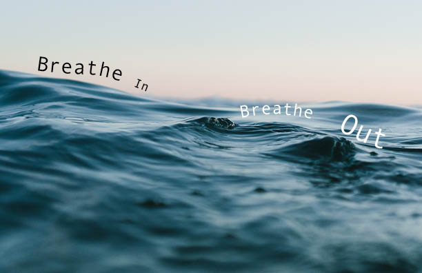
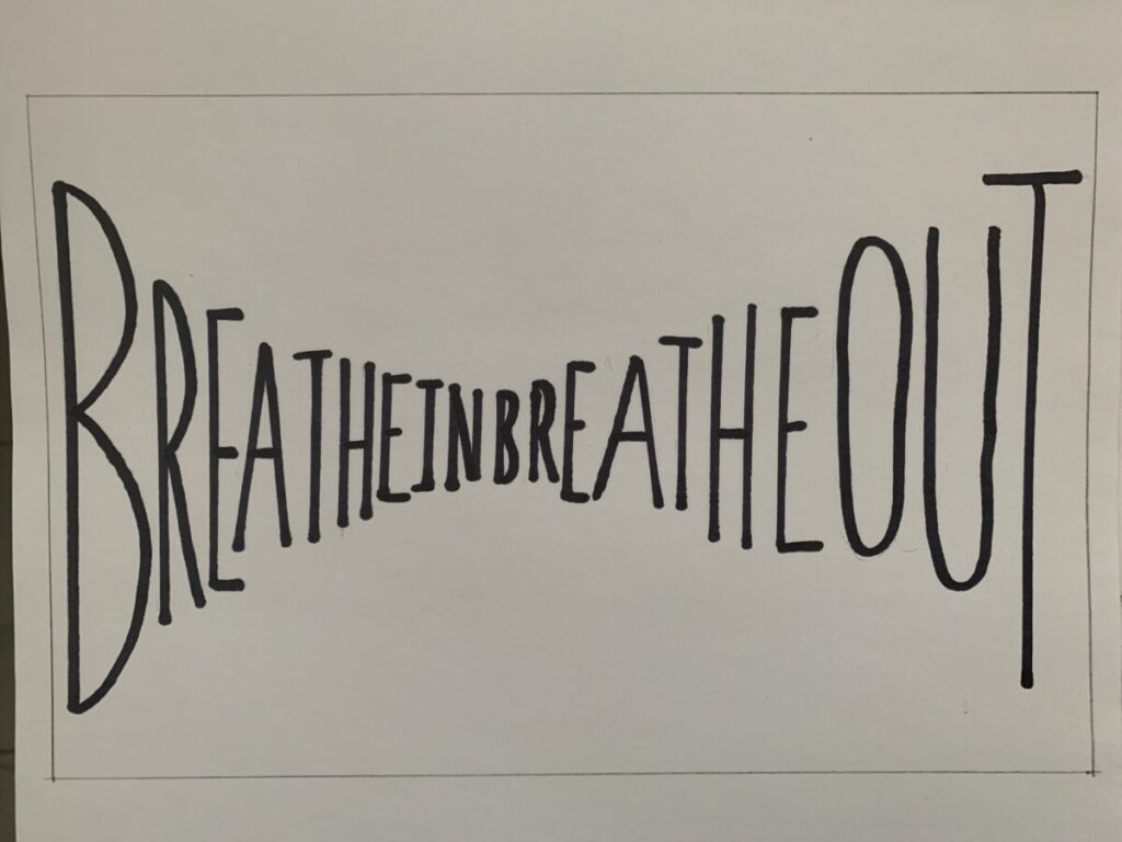
In this version of my visual quote, I wanted to create a sense of calmness so I included an image of soft ocean waves for the background. The text is warped so it flows with the motion of the water, and it descends so the eyes move with the waves.
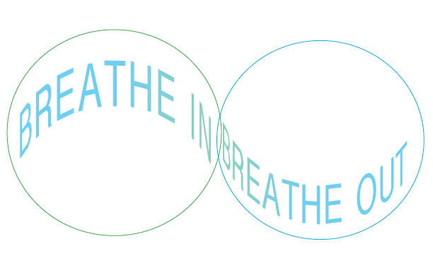
The second version features two overlapping circles, kind of like bubbles of air and again, the text is warped so it follows the the curvature of the bubble and helps the eyes move comfortably from left to right. I was trying to evoke a sense of inhaling and exhaling with the way the text is bent.

The third version of my Visual Quote Project is what I imagine the words would look like if they were on a window and there was fog or condensation building up. Think back to when you were a child and you would breathe onto a cold window to create a patch of fog and then take your finger to scribble a word or a maybe small image of a heart or a sun, only to have it disappear a few seconds later.

These are some drafts that I originally planned on using for my final version. I wanted to use a mouth for one of my final versions, but an open mouth felt too aggressive, like it was shouting and did not evoke a sense of calmness that I wanted to portray.

The second one is sort of how I wanted the text to be bendy and curvy, but it was better executed in my final version with the ocean waves. The text by itself looked lonely.
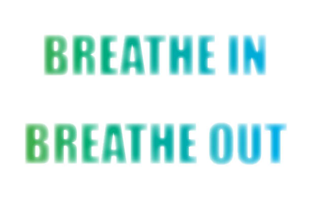
This next version is one that I ended up modifying slightly. In my final version, I changed the background color to a navy blue to bring out the text a bit more. This white version looked very plain and the text looks like it is fading too much into the background.
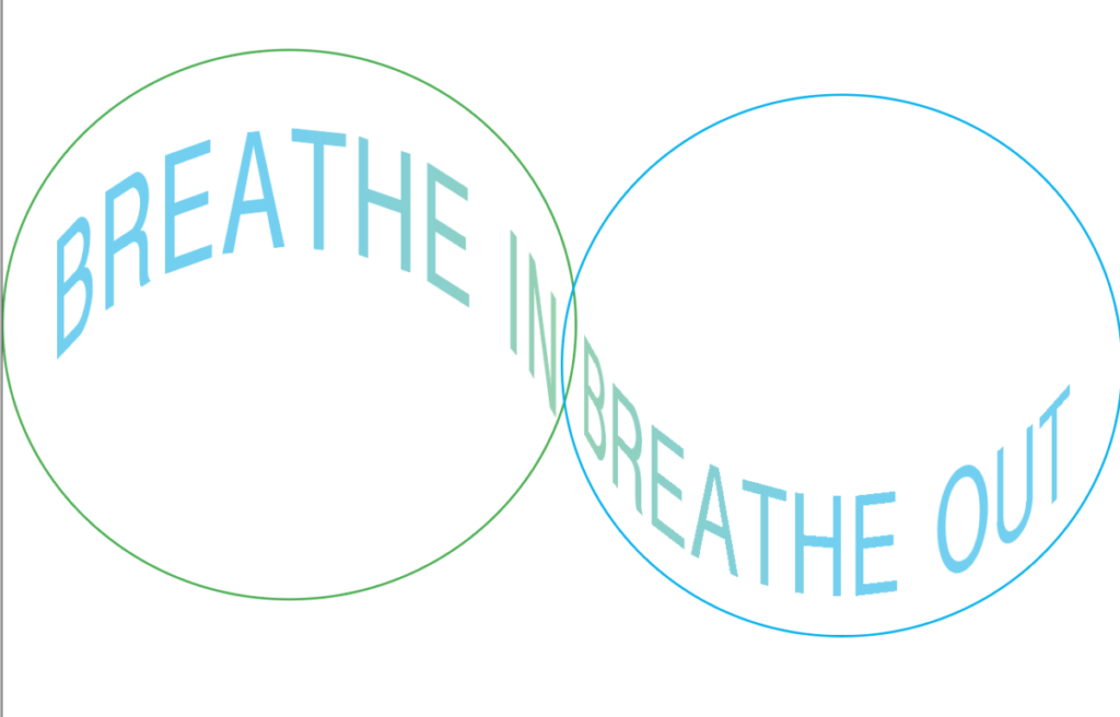
The last one with the two circles and curved text was kept, but I made some minor adjustments to the alignment of the circles in my final version.
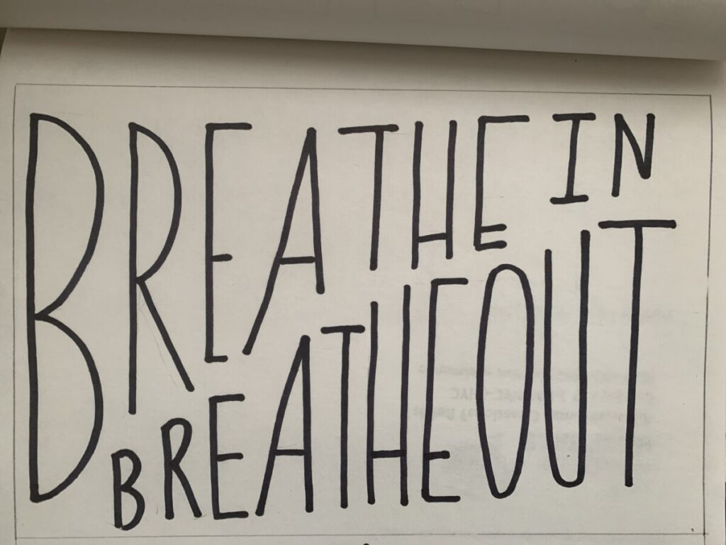
These are my sketches for the Visual Quote Project. I wanted the final project to have text warping in some form, to demonstrate the physical action of breathing in and breathing out. I eliminated the first sketch because it felt too similar to Michael Bierut’s UCLA cover design in the images we looked at in class.
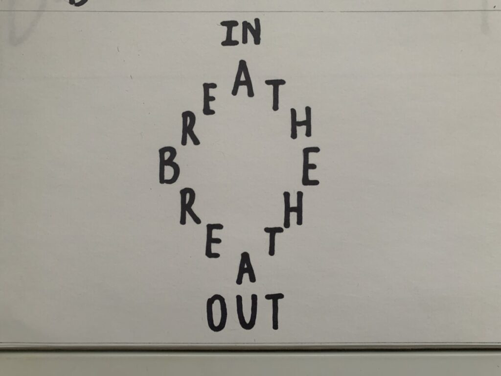
The second one has no hierarchy and is difficult to read because the eyes don’t have a path to travel on. Overall this was better as an idea in my head and did not work out well once on paper.
This third sketch looked too tightly spaced for the dimensions of this specific postcard size, so I scrapped it. In my final versions, I was able to play with colors and images, specifically blue & green gradients which I think are soothing colors to complement the meaning behind the quote.