Graphic Communications Class
In Grahpic Communications class, we were assigned a project, where we had choose a quotation and create three designs that would describe and enhance the quote. After brainstorming and researching different quotes that i found intresting I decided to use the quote, ” Show me the money ” from the movie Jerry Maguire. I chose it because I thought the quote was very popular and it has a straight forward meaning and is easy to visualize. I did twelve sketches at first, then took my ideas and incorporated them to create six final concepts in Photoshop. I then chose three that I thought visually enhanced the quote the most.
The clip below is the scene from the movie “Jerry Maguire” .
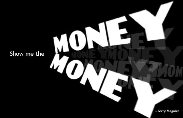
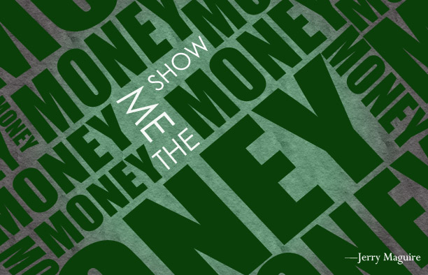 For my first concept of the quote, I decided to relate the design of to the scene in the movie “Jerry Maguire”, when Jerry (played by Tom Cruise) says the line. He first says it very softly, then gradually started shouting it louder. I tried to show this by using the word “MONEY” repetitively and in different angles and sizes. I used serif fonts for the quote to create a sense of seriousness in relation to the movie. I used regular Impact font so it would be bold. The words “show me the” I wanted to stand out and the focal point for the reader so i made the color white and the font thinner than the sorrounding words “MONEY”, so I used regular Century Gothic. For the main color, I decided to use green simply because it’s the color of money (US currency). I also used a paper texture background and a black and green gradient.
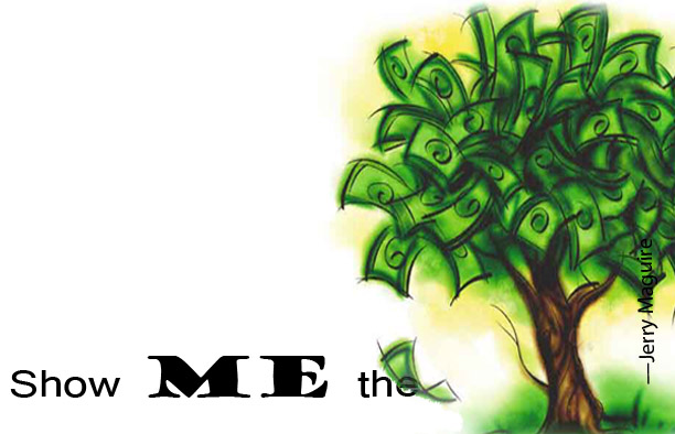
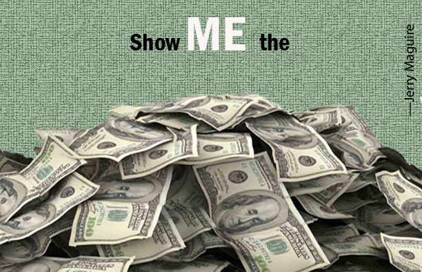 In my second concept I incorporated an image into into the quote. I used an image of money to replace the word “Money” because the image ittself is self-explanatory. I also used the the same color sceme as my first design, but a different texure pattern. I used this texture to give the reader the feeling of paper. I made the word “ME” a larger size and capitalized it in relation to the scene in the movie. Jerry first said “show YOU the money” and was then corrected by his client to say “show ME the money” which is why i chose to make it a larger size so I could stress that word to show it’s importance.
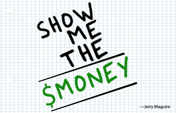 For my third deisign, I decided to create the quote as a math problem to relate it to money. I wanted it to be simple but also conveying the quotes meaning. I used green for the word “money” because its the color of money. I used a math graph paper pattern as the background. For the words, I decided to use a felt marker font to give it the feeling that it was written.
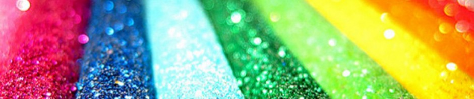
Below are the other concepts I did before for the quote:
Graphic Principles 2 Class
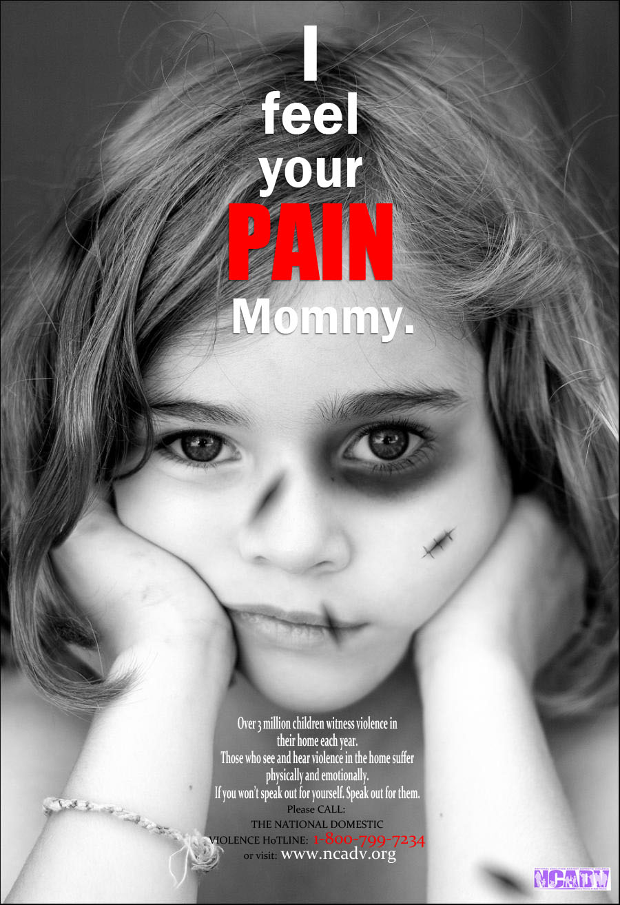
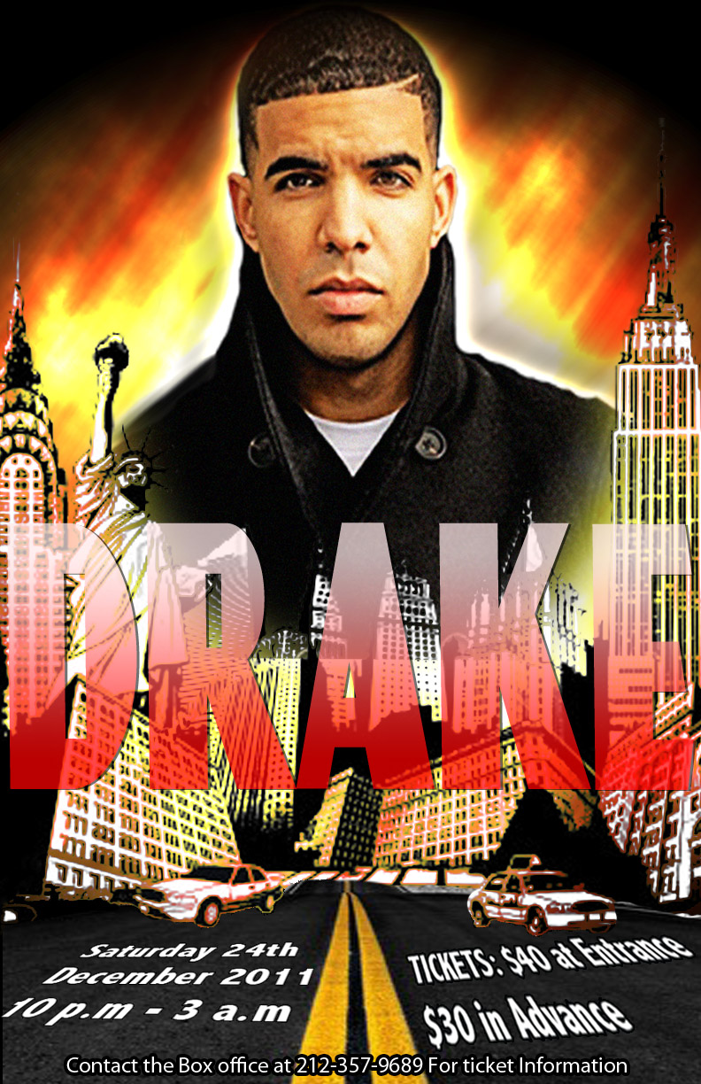
In my graphic Principles 2 class, we were asked to create two posters; one of a social issue and a Music Concert.
The social Issue I chose was domestic violence, and the artist I chose for my music concert poster was the rapper Drake.