Welcome!

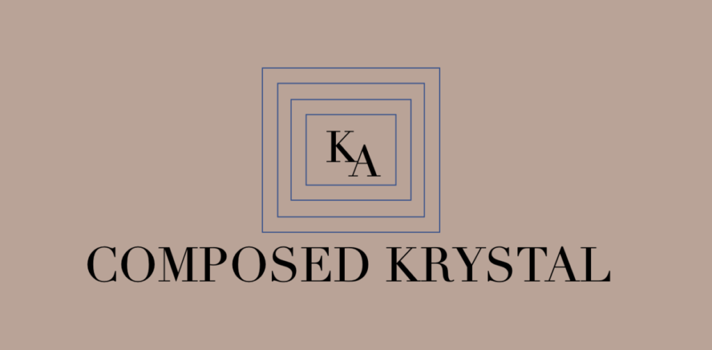
Krystal Aponte’s brand is known as “Composed Krystal”. Krystal chose the French font Didot, which was a popular typeface during the 18th and 19th centuries (Harvey, 2016). The colors of “Composed Krystal” are steel blue and tan brown. Chapman (2010) explains that light blues signify responsibility, calmness, friendly and refreshing; while brown means reliability and dependability.  Since Krystal sees herself as someone who is mature, reliable, and easygoing, it is understandable why she decided to used tan brown and steel blue.

Mission Statement

Krystal has a strong desire to continue to change and evolve as an individual. She inspires to become a better person than she was yesterday and leave a positive impact on every person she encounters. She hopes to work her way up to the career she has been working hard for, a buyer for a well-known department store. After her internship in sales for a baby clothing manufacturing company, she hopes to network and maintain her relationships with buyers to gain more knowledge of the industry. With this knowledge, she can move forward in beginning her career as an assistant buyer and with time, work towards her goal of becoming a buyer. Her sales experiences will be an asset when negotiating with vendors and her ability to stay calm under pressure will be extremely beneficial during stressful situations. Her appreciation for learning by absorbing fashion content through different channels of media like social media, magazines, and YouTube channels, will provide her with knowledge of current and future trends.