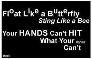
My 1st visual quote is text only. Float like a butterfly has letters physically floating through out the words and sting like a bee is in italic so it feels as if its stinging. Hands and hit are in caps and a higher point size to be emphasized. Eyes and see are all black with a white outline so they can be a little bit more difficult to see.
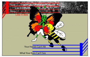
My 2nd visual quote is a butterfly and a bee fighting. I put the letters in the ropes of the ring. I focused a lot more on the image then the type, i wanted the viewer to think of the quote as soon as they seen the image.
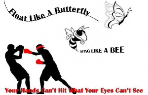
I think my 3rd visual quote is the most simple of the three. I put float like butterfly floating behind the butterfly, sting like a bee shooting out of the bee stinger, and your hands cant hit what your eyes cant see in the bottom in red next to a man with a red blindfold on and red gloves missing his punches.


