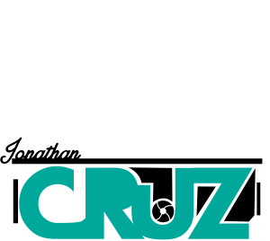
The reason why I chose this design is because of how simple it is. This design gets my message across very easily, it has my first name in a signature font at the top left corner. In turquoise you can see my last name, and turquoise is my favorite color. The “U” is cut short to show a camera lens to show how much I love photography. The bars on the top take the form of a camera aswell.


