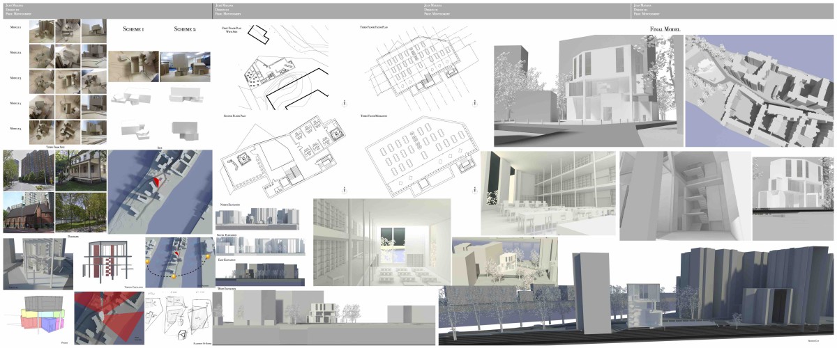
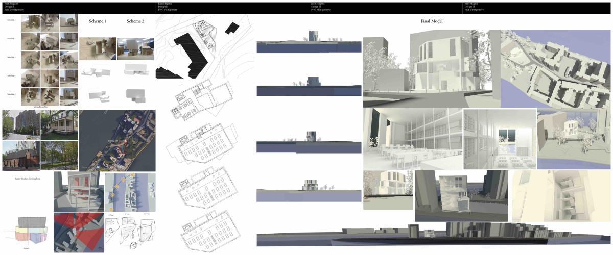
Applications Used
- AutoCAD
- Rhino
- InDesign
- Vray
Assignment Z: Final Presentation Development
Assignment Y: Final Presentation Development And Mock-Up
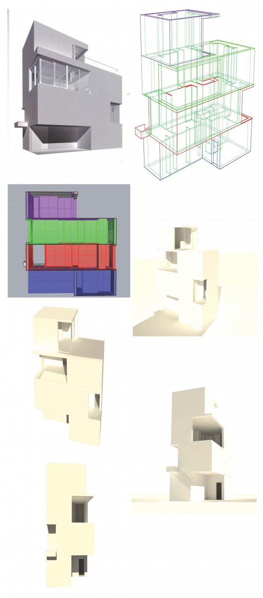
Assignment V: 3D View Development of Final Parti Selection
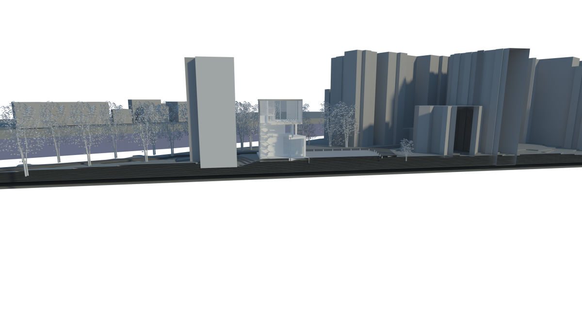
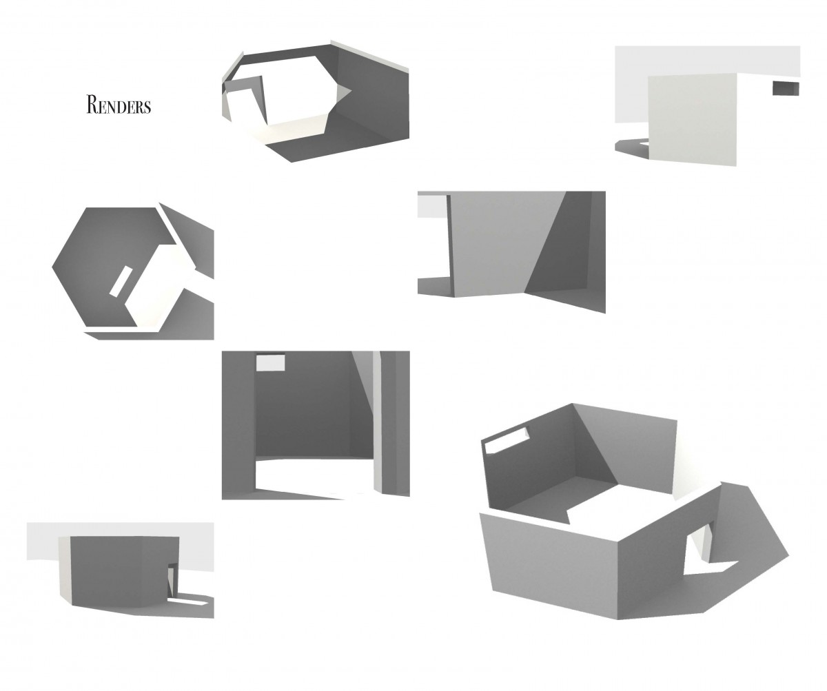
Renders
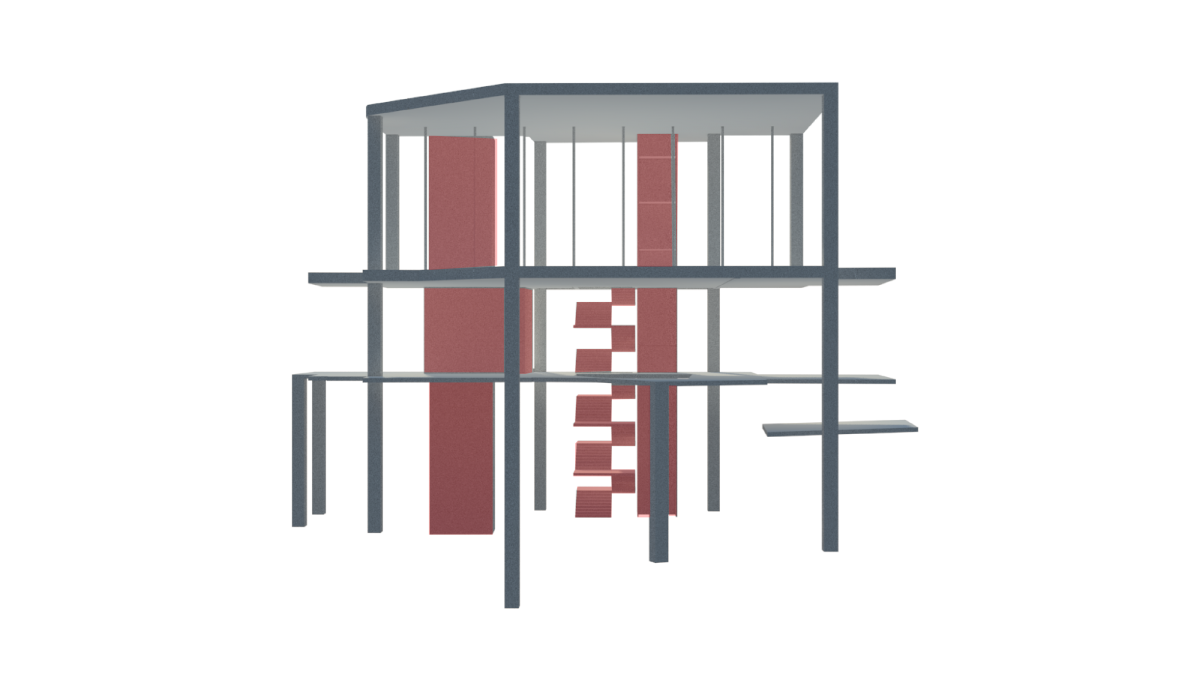
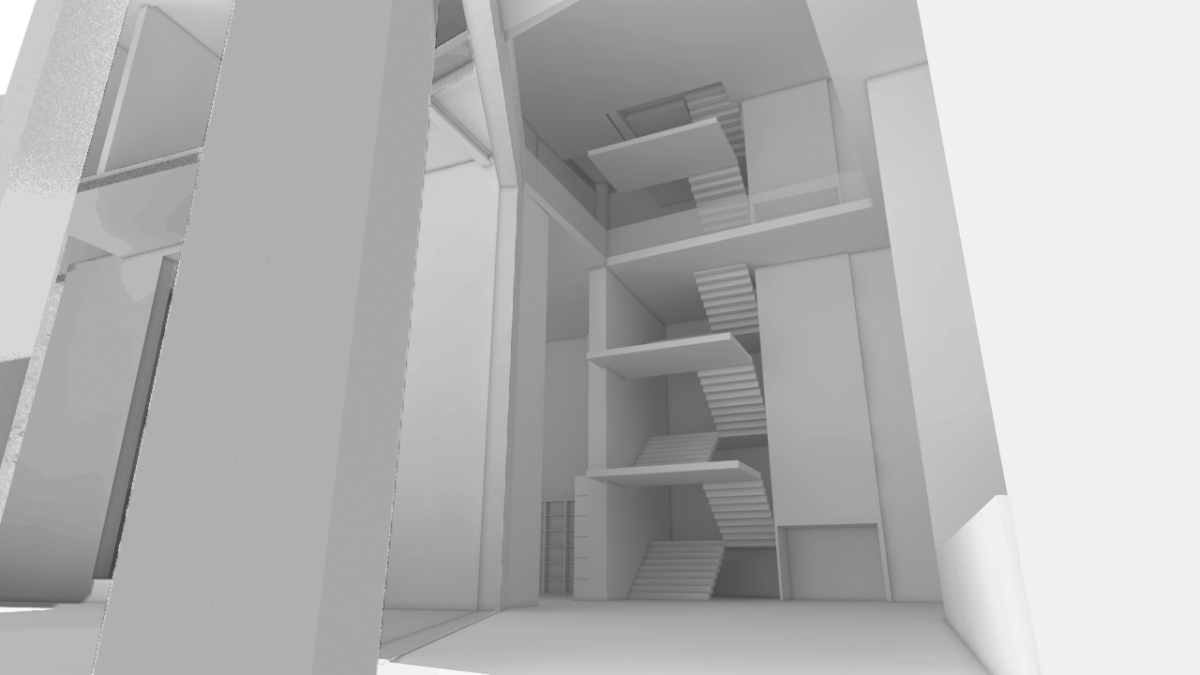
Vertical Circulation Diagram
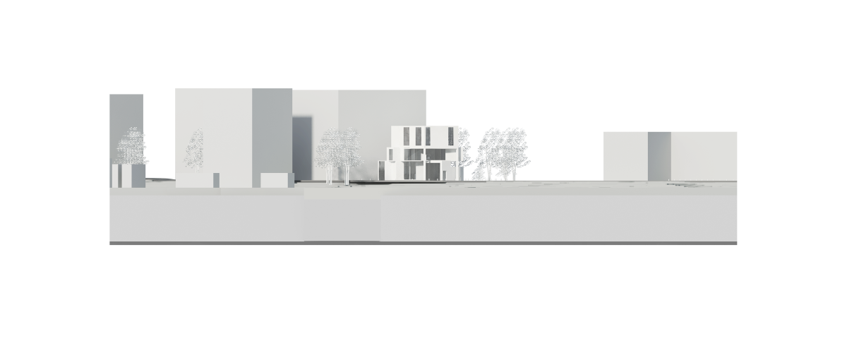
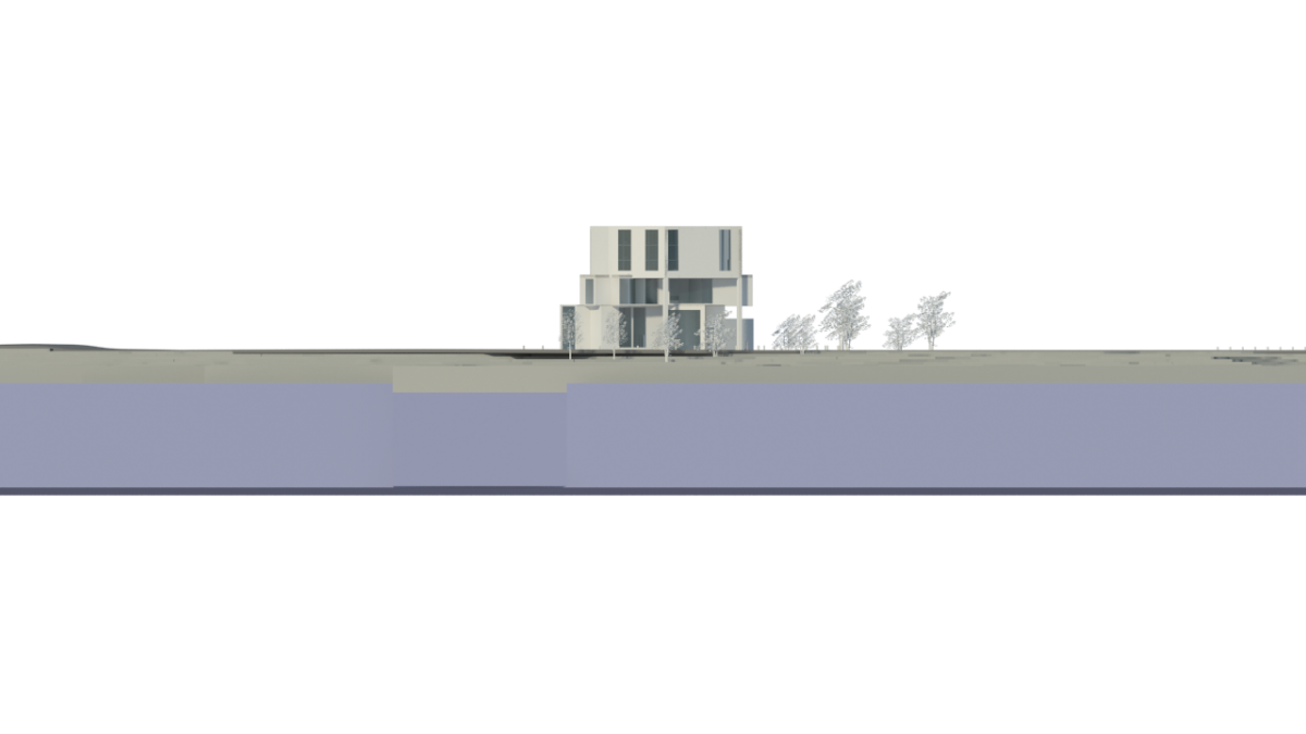
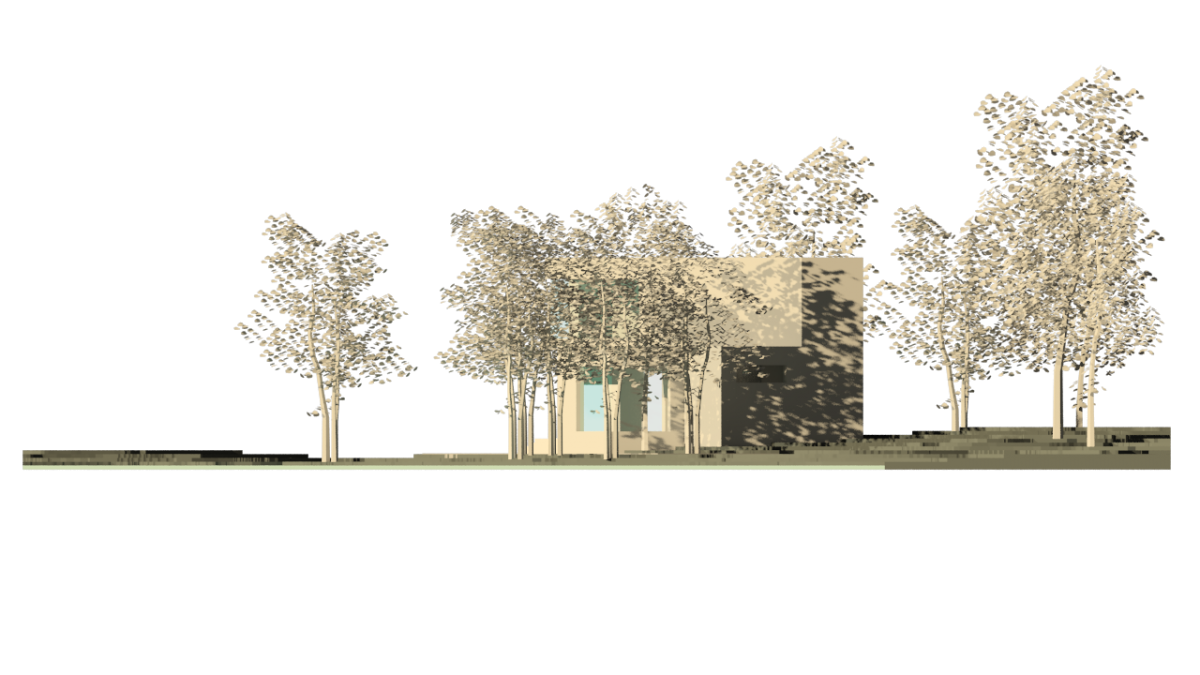
West Elevation
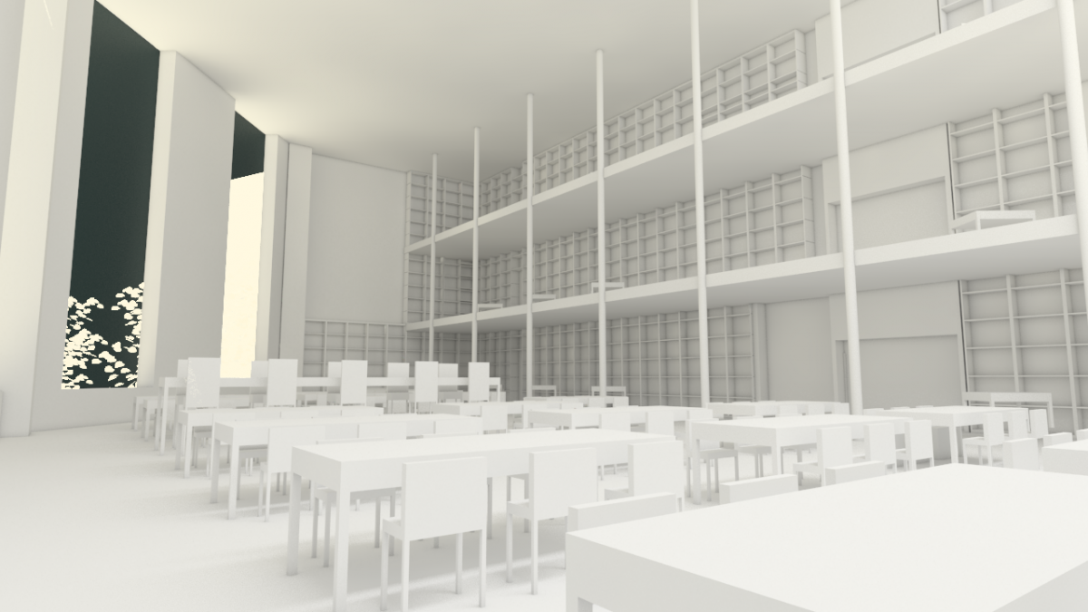
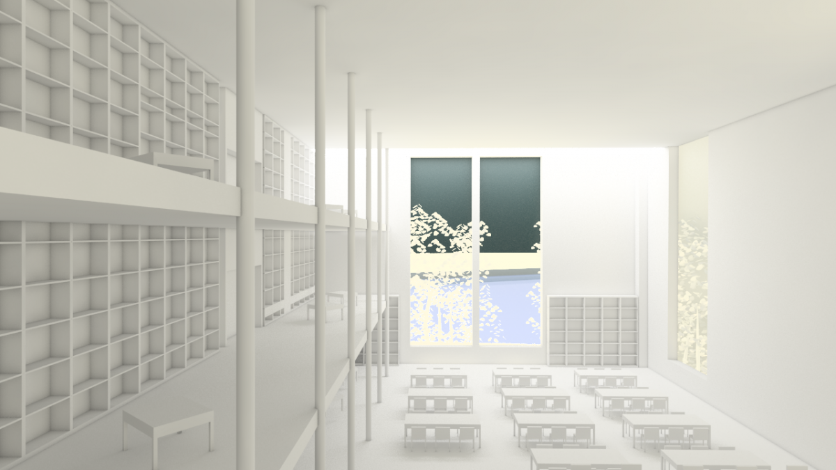
Interior Of Third Floor
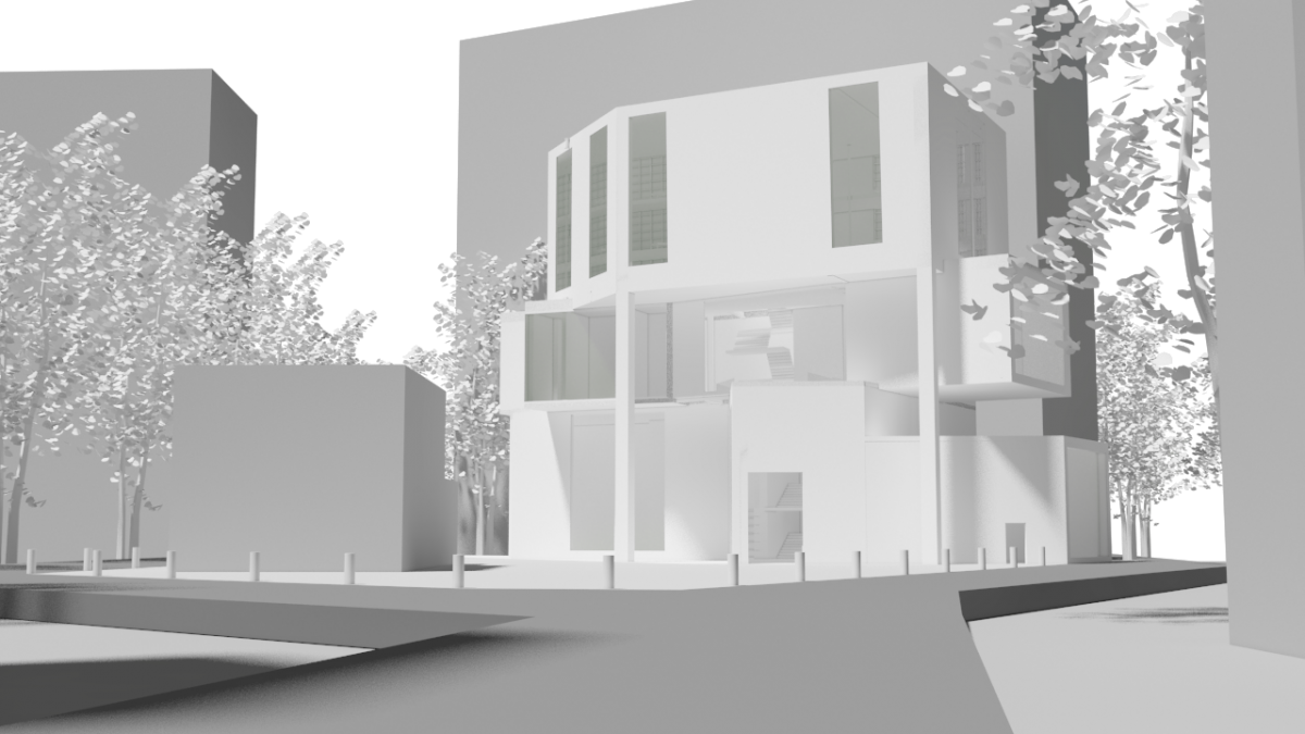
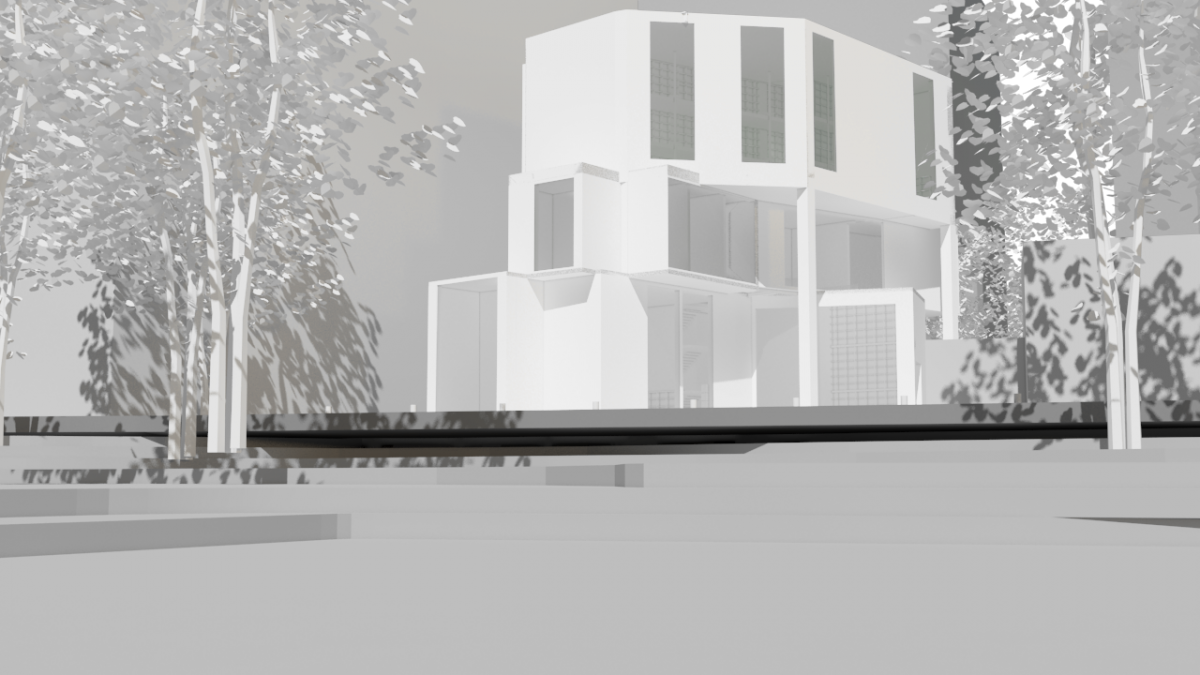
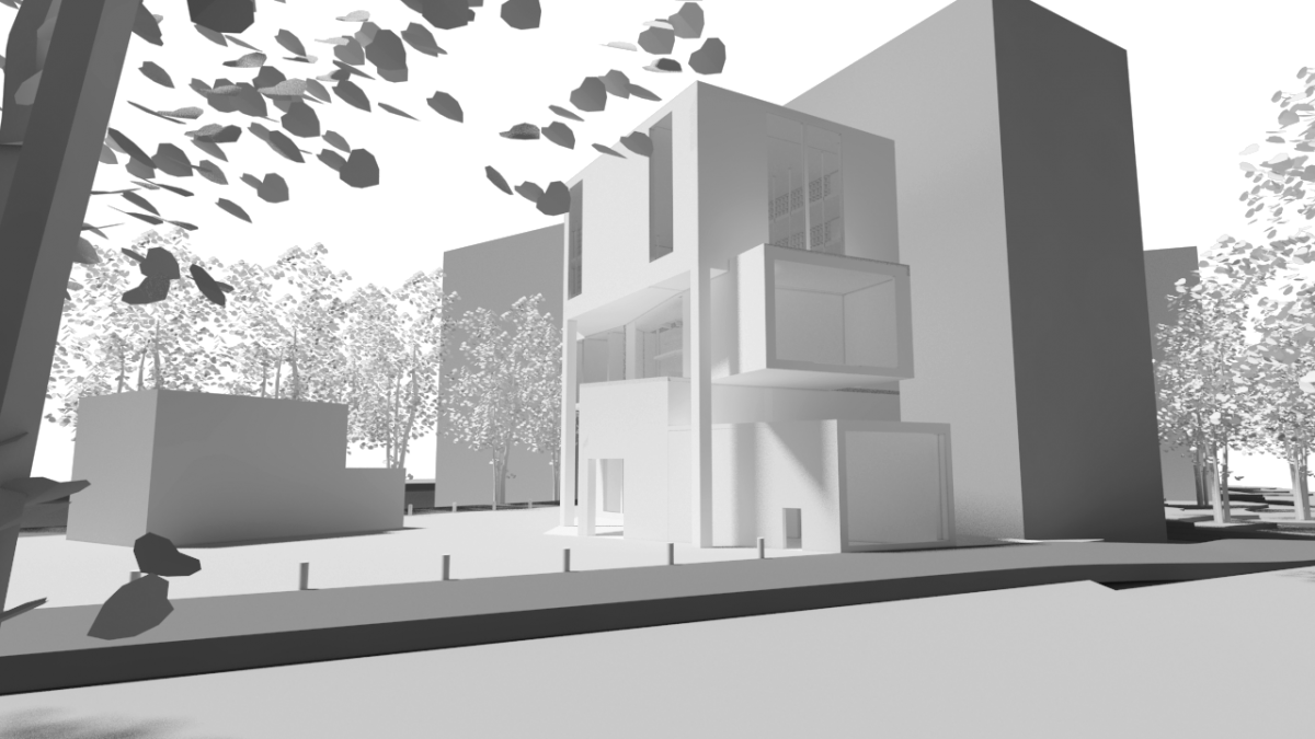
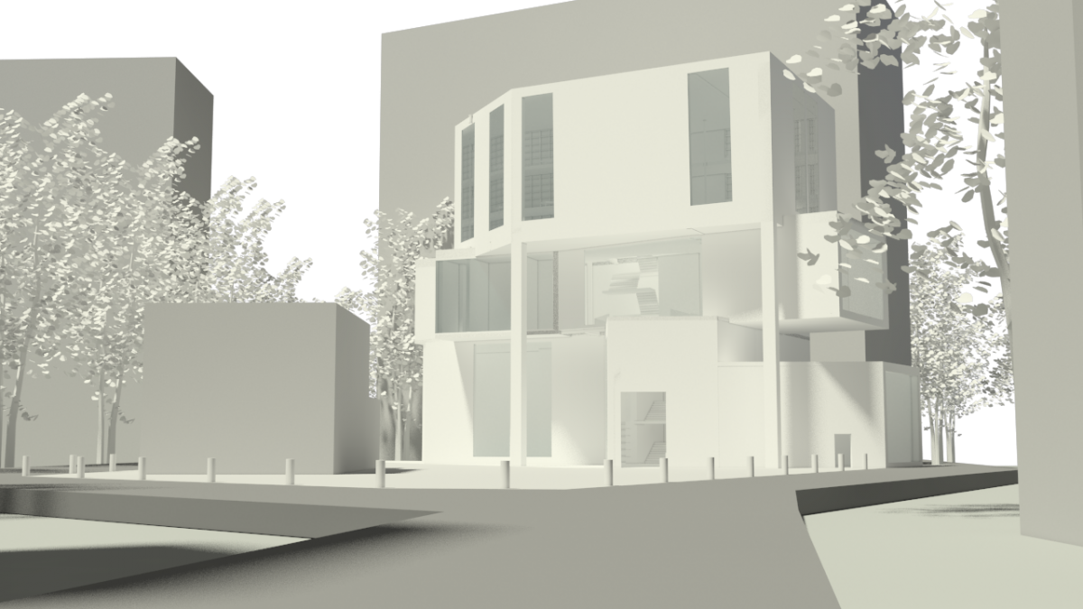
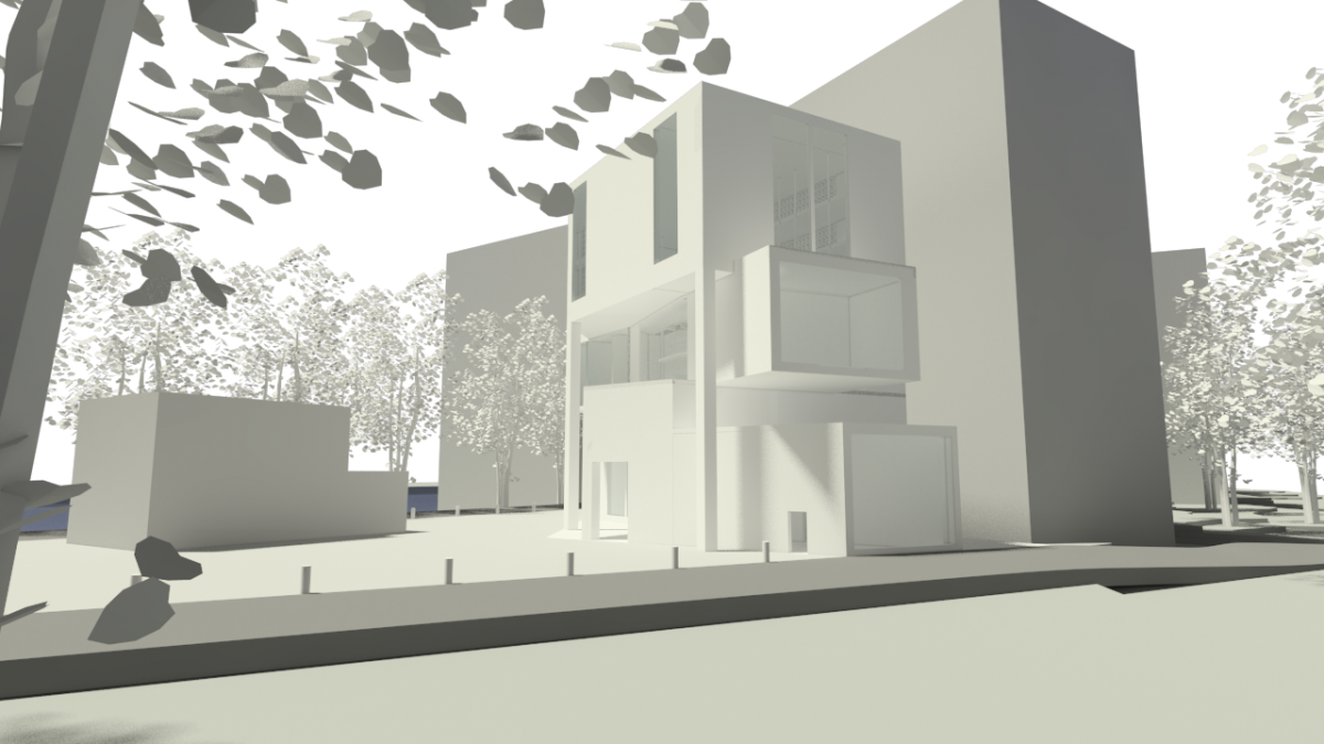
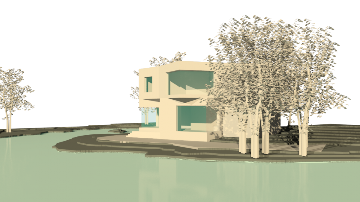
Entrance View
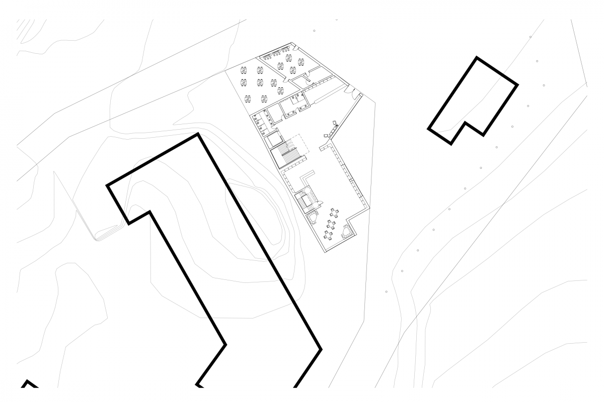
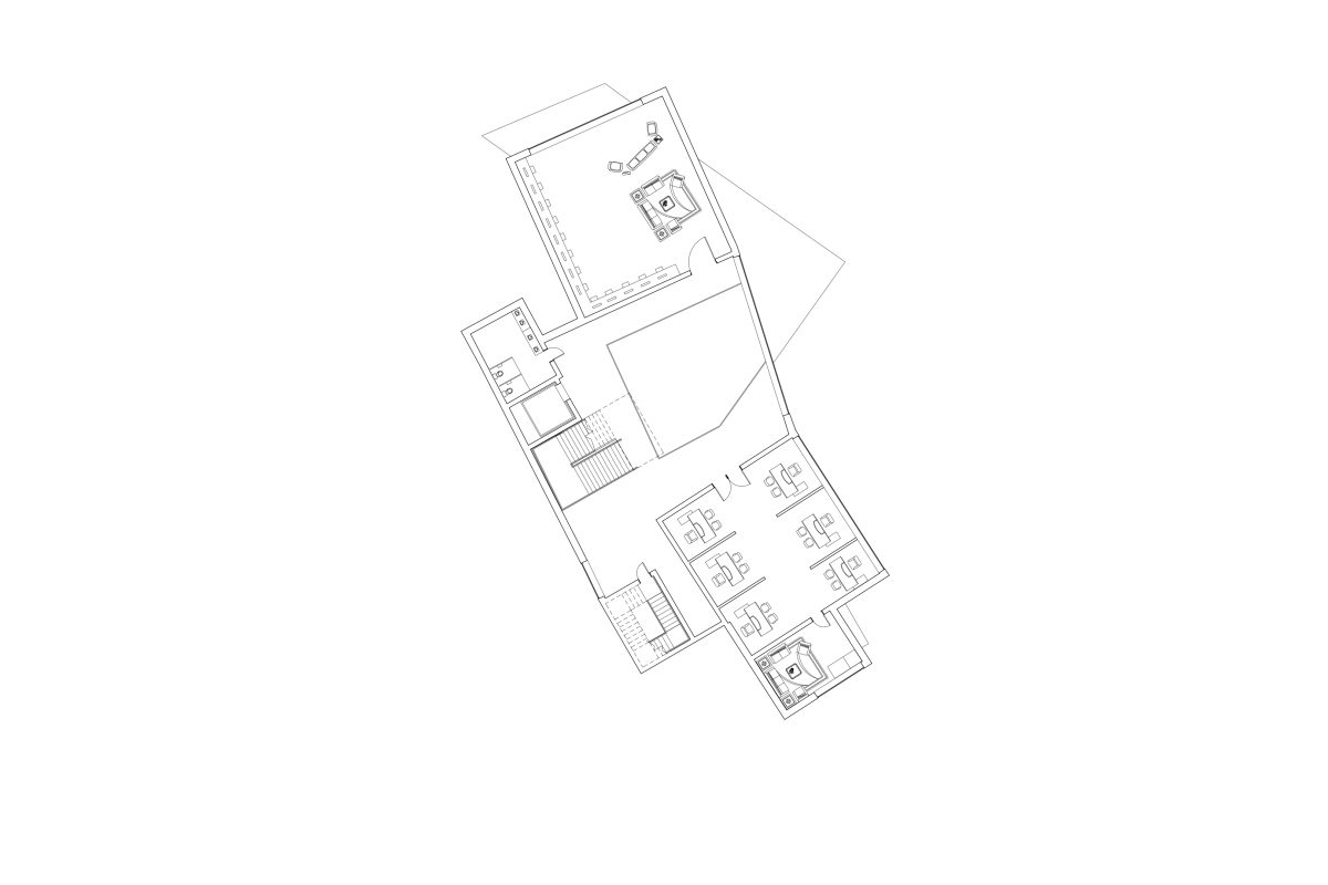
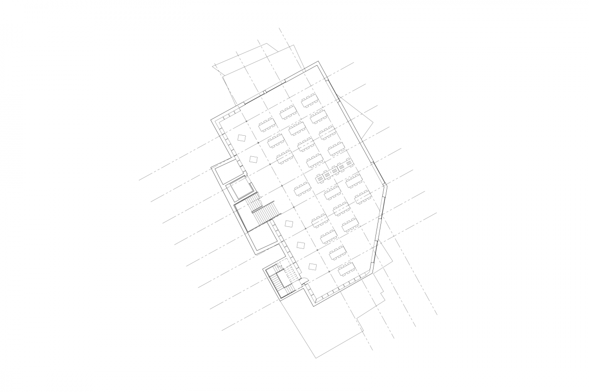
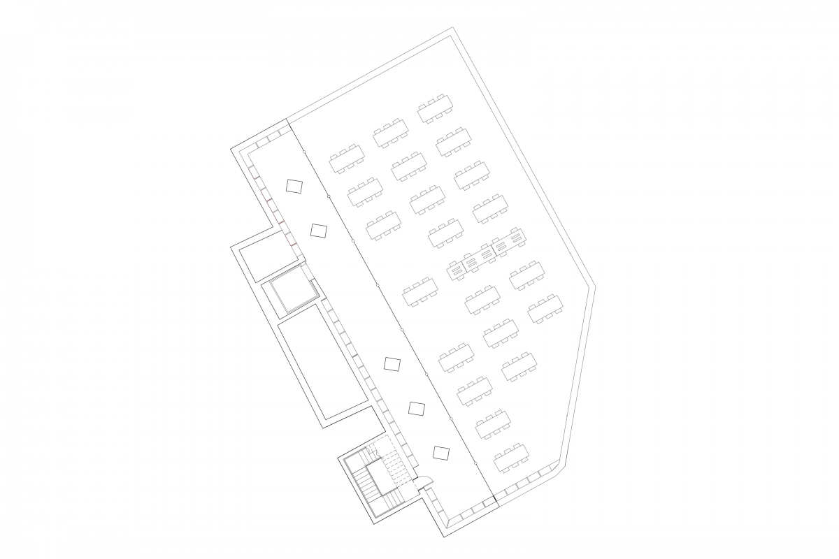
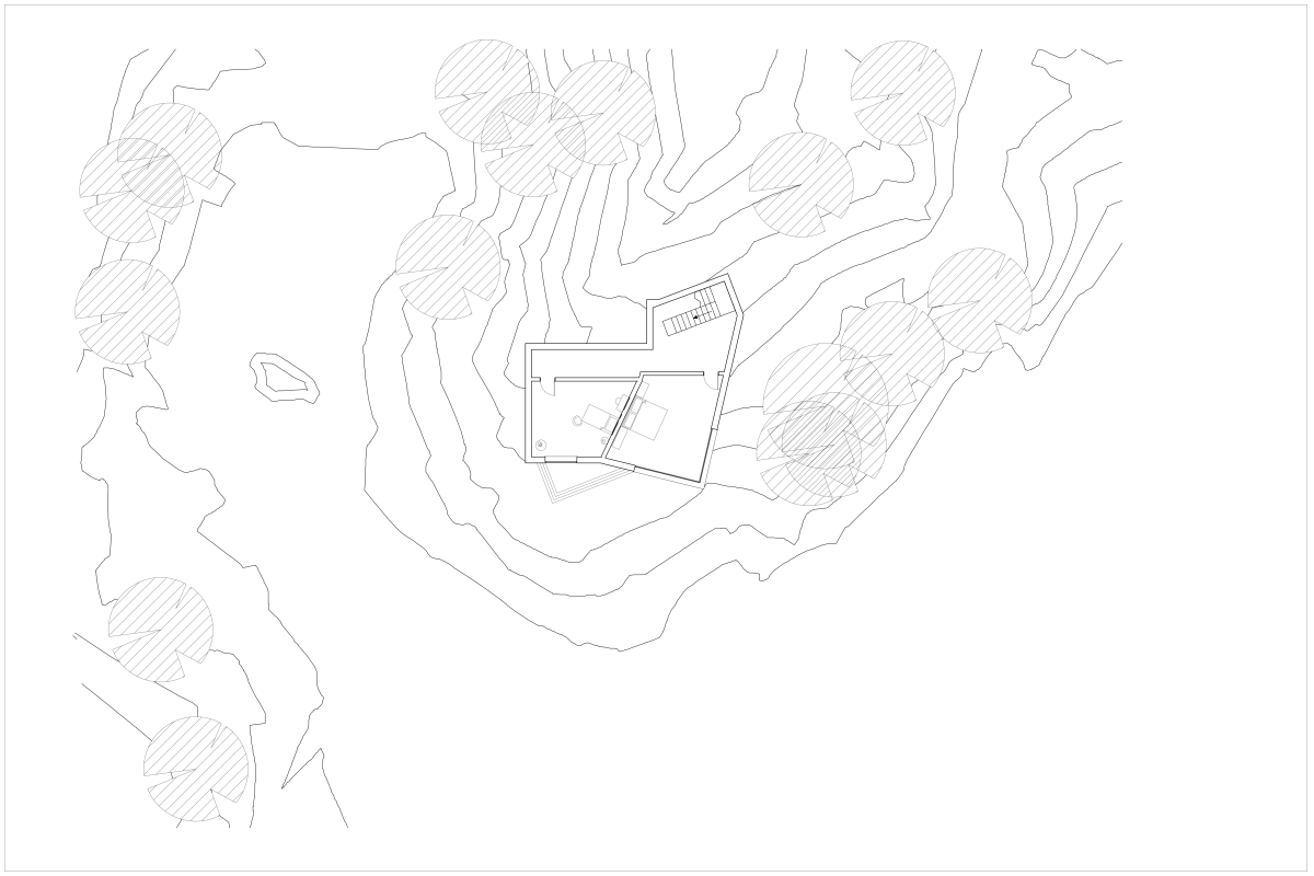
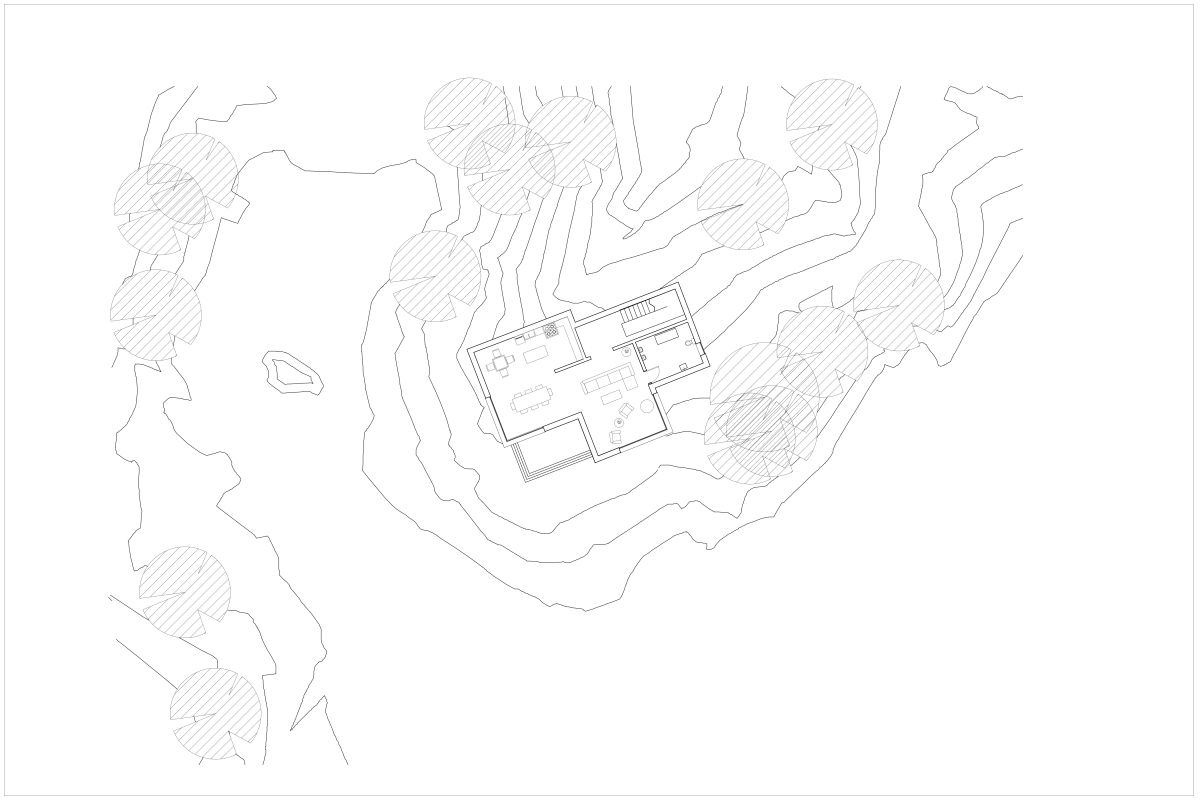
Assignment U: Plan Drawings
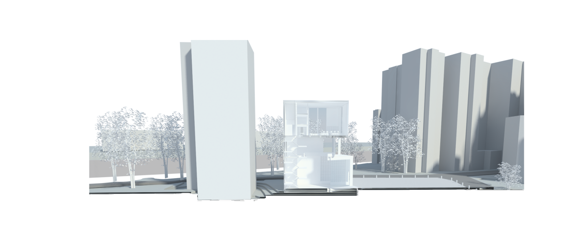
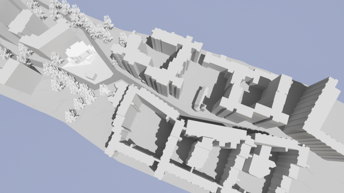
Assignment T: Site Axon and 3D Site Section Development of Final Parti Selection
Assignment S:
Program
Assignment R: Parti Concept Refinement
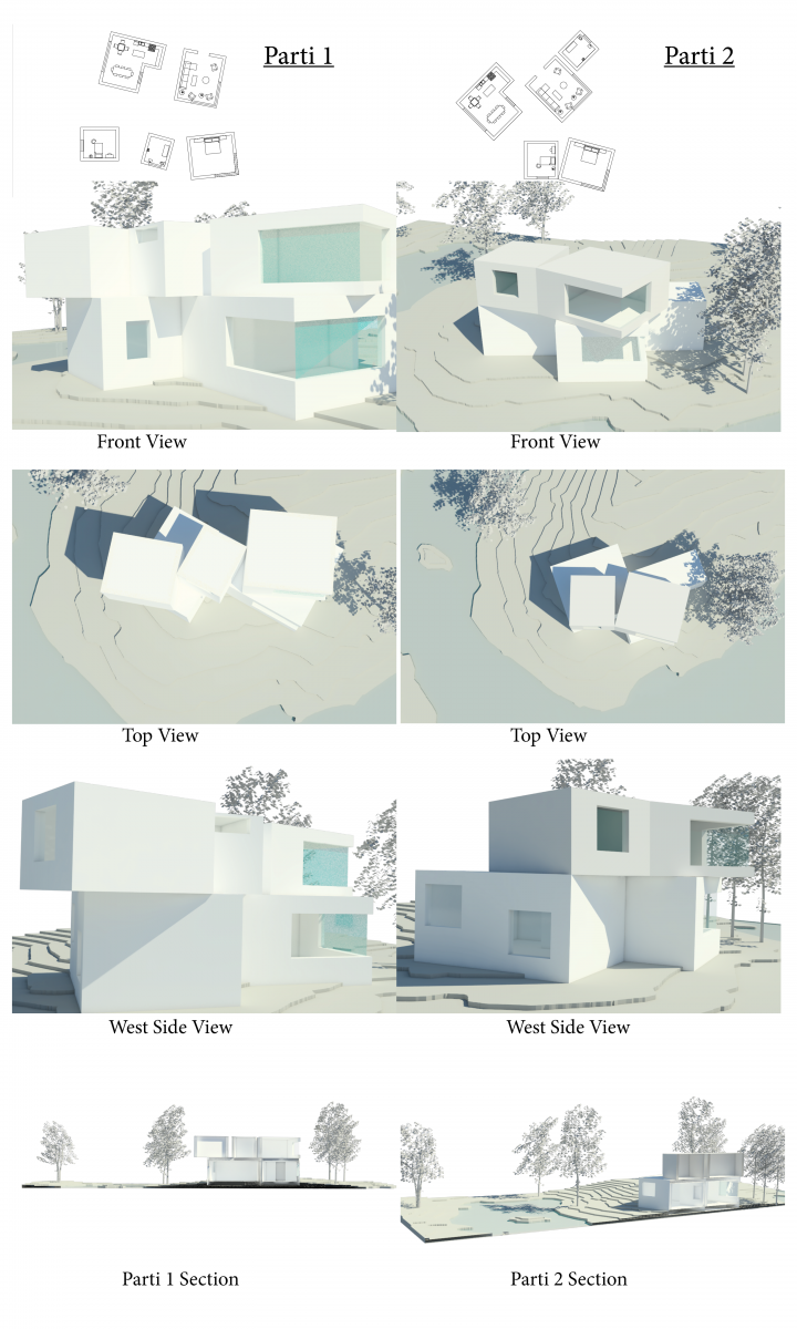
parti 1
Parti 2
Assignment Q: Parti Development
Assignment P: Library Pogram And Modules
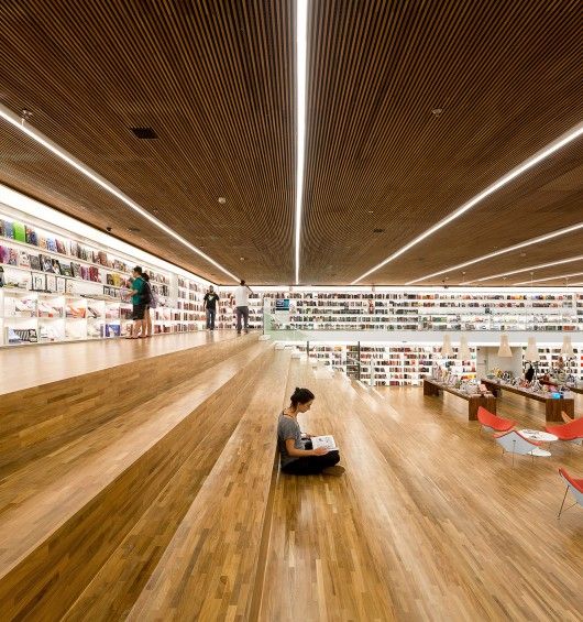
This library looks to be very modern. It seems to have more artificial lighting rather than natural light coming through. The book shelves are within the walls which helps create more space throughout the room. It also seems that the book shelves are filled with artificial light as well which helps the place illuminate. the room is around 2 stories tall and has a spacial feeling, makes a person feeling conferrable. The room looks to be made out of pure wood and glass as railings. The stairs are big so that one can sit down and relax/ read and seem to go through the whole left side of the room.
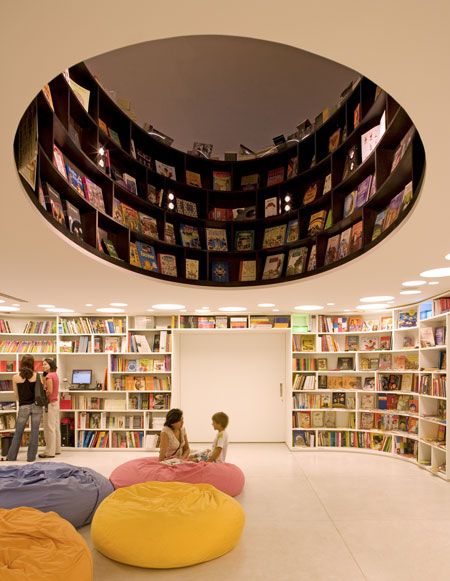
this seems to be the children’s section of library. The first thing that caught my eye was the circle void that in the middle of the of the room. it seems that the adult reading room is right on top of the children’s room because the void doesn’t stop. The circle void also has shelves inserted in the walls. The rooms seem to just have artificial lights rather than natural light, there are only two colors painted in the walls which is white and black but the books are colorful and joyful which helps a person tell that the room is a children’s room
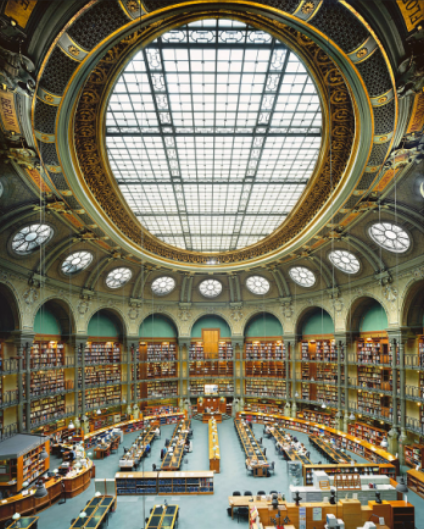
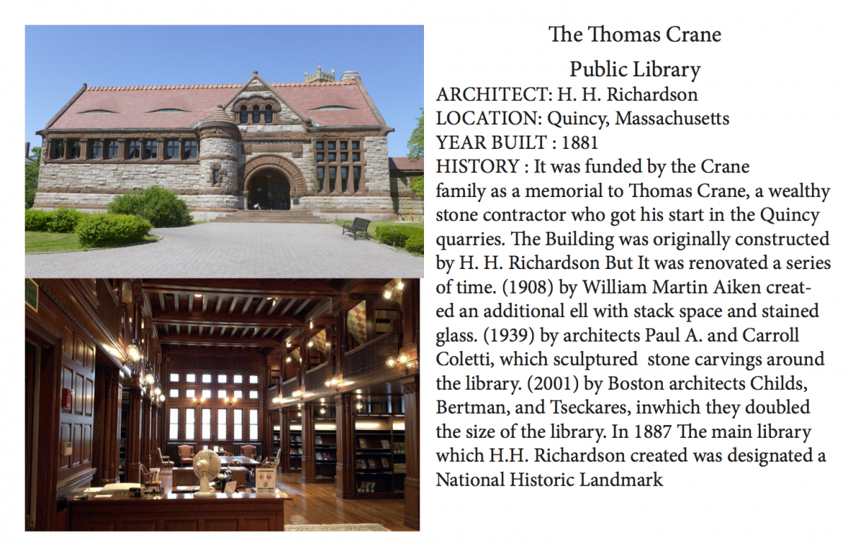
This library is around 5-6 stories tall. It has an amazingly huge circular skylight in the middle of the ceiling with a few small skylights surrounding it so that there can be plenty natural lighting in the room. It is a very symmetrical. Everything seems to be organized and straight forward. In the middle is the reading space, on the very left is the checkout space, and the book shelves are within the wall which helps create more spacing throughout the room. the book shelves are also multi stories high on the walls with floors to get to each shelves as well. the texture has this old fashioned feeling / comfortable feeling like if you were at home and has some arches at the very top pf the book shelves
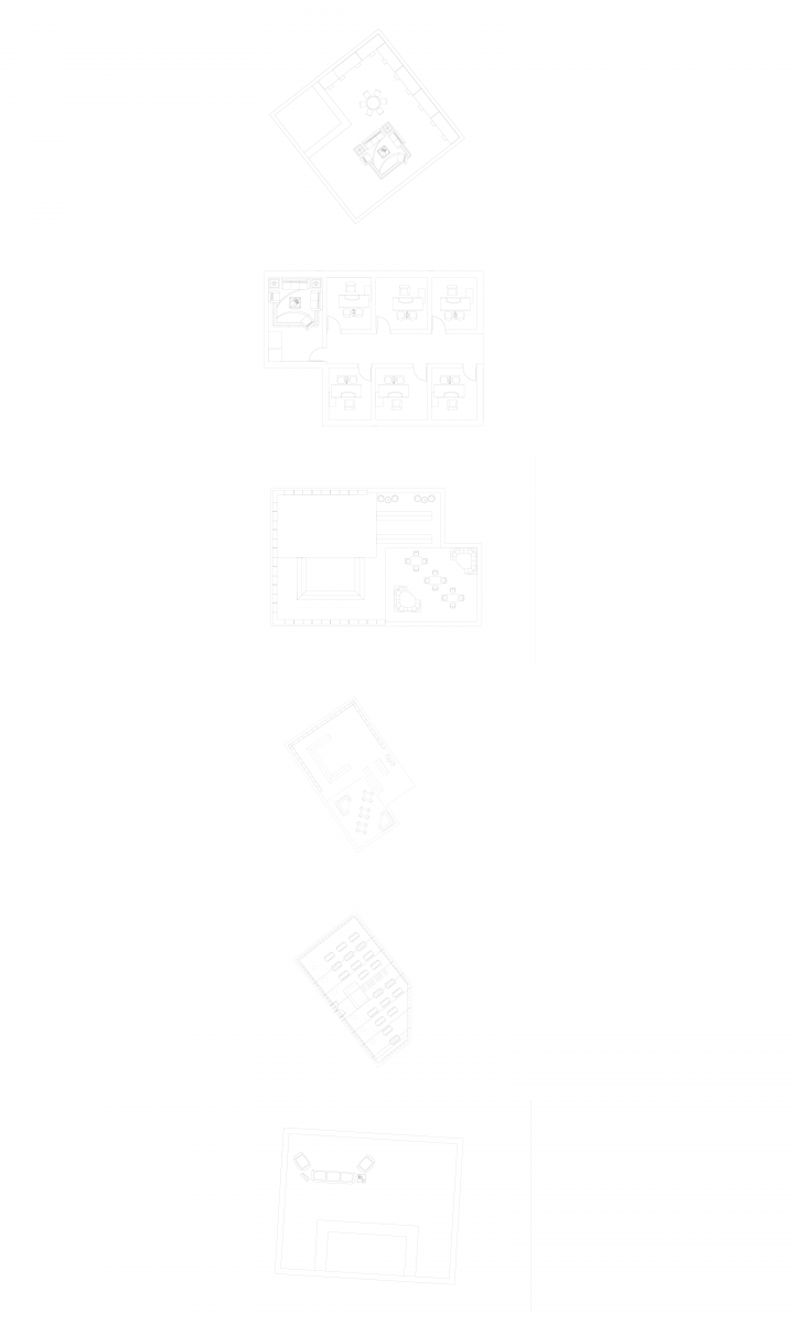
Using the the 6’x6′ grid i created these module plans to help create my library. the rooms i created were the Lobby, Research Area, Offices, Children Area, And The Main Reading Room, These Rooms helped me decide how to lay out my library to create My Final Floor Plan
Proof Of Going To New York City Public Library
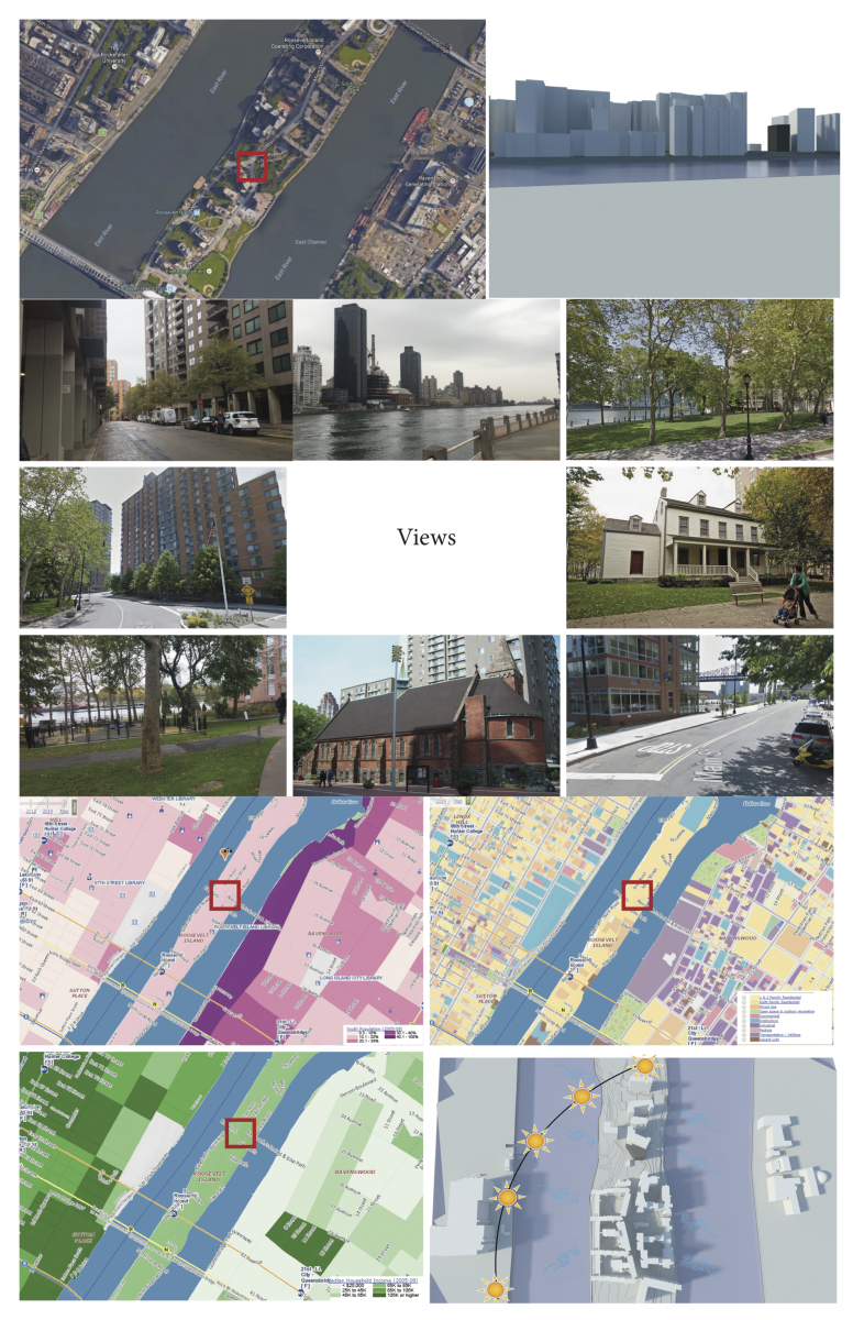
Assignment O: Site Analysis
Assignment N: Site Analysis
Assignment M: Final Presentation
Assignment L:
Assignment K: Final House Development
Assignment J: Digital Model Development
Right View
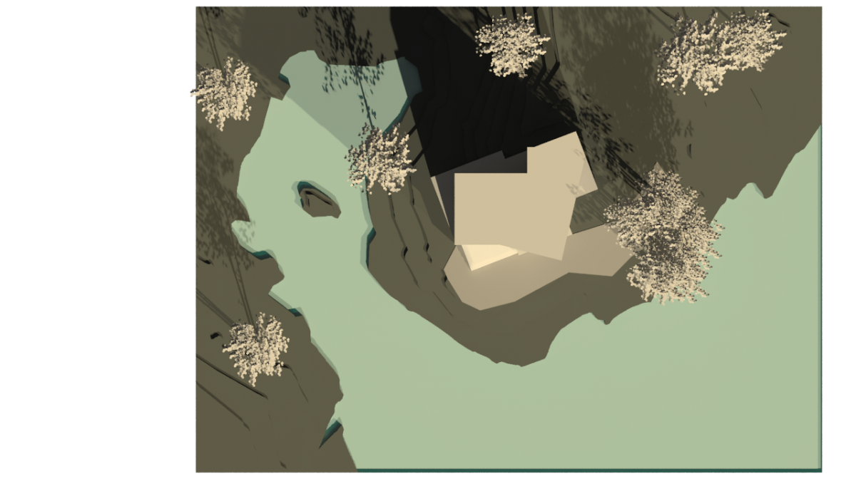
Top View
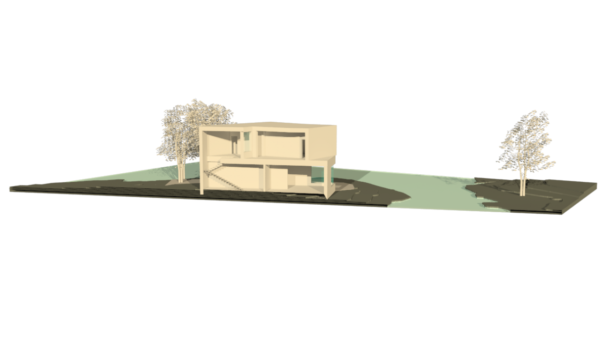
Section Cut
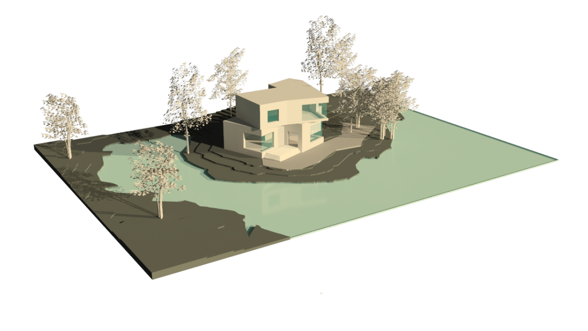
Perspective View 1
Path Way Going To Site
Perspective View 2
Assignment I: Parti Concept Refinement
Assignment H: Configurations
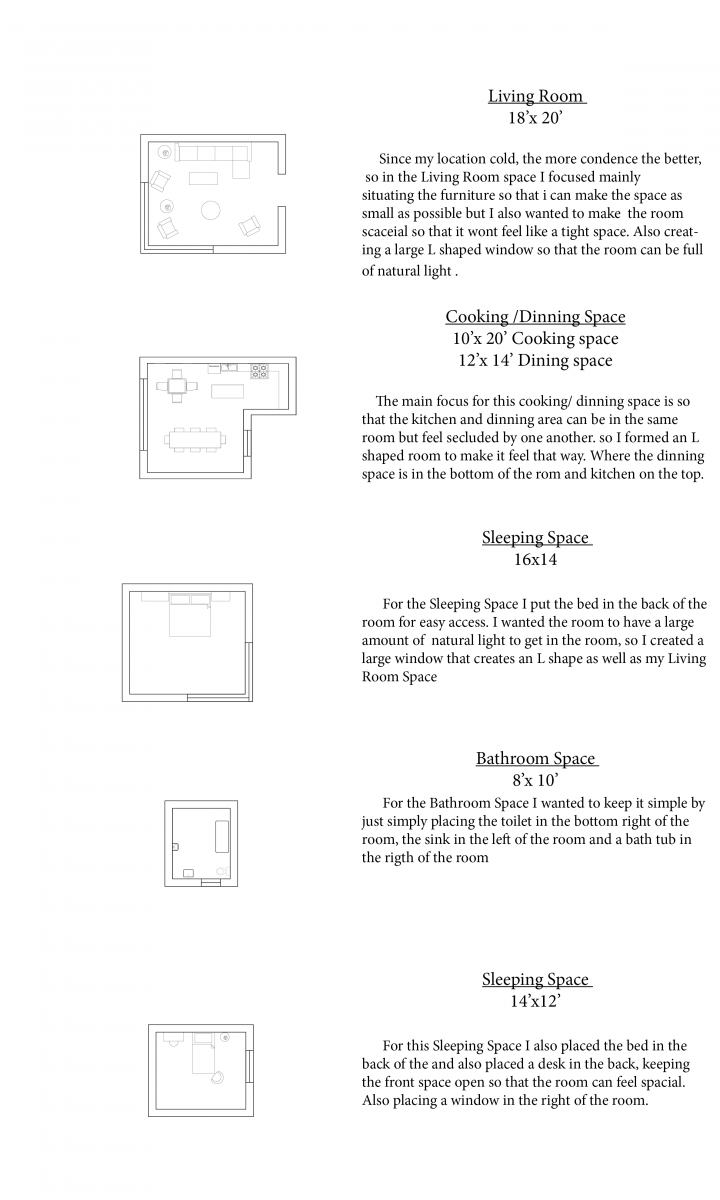
Modules For Living Configurations
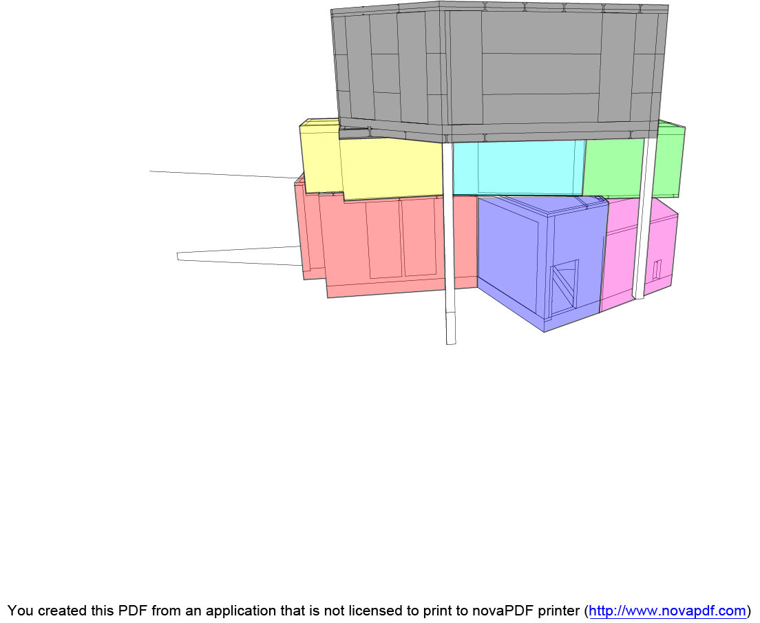
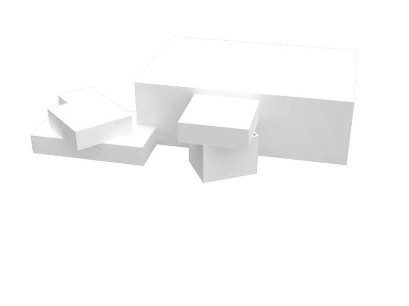
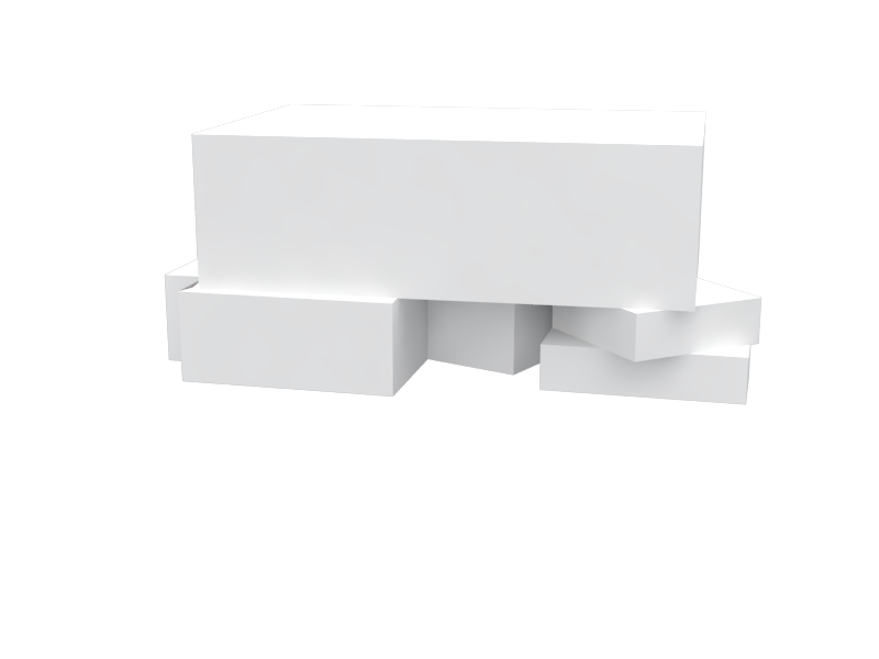
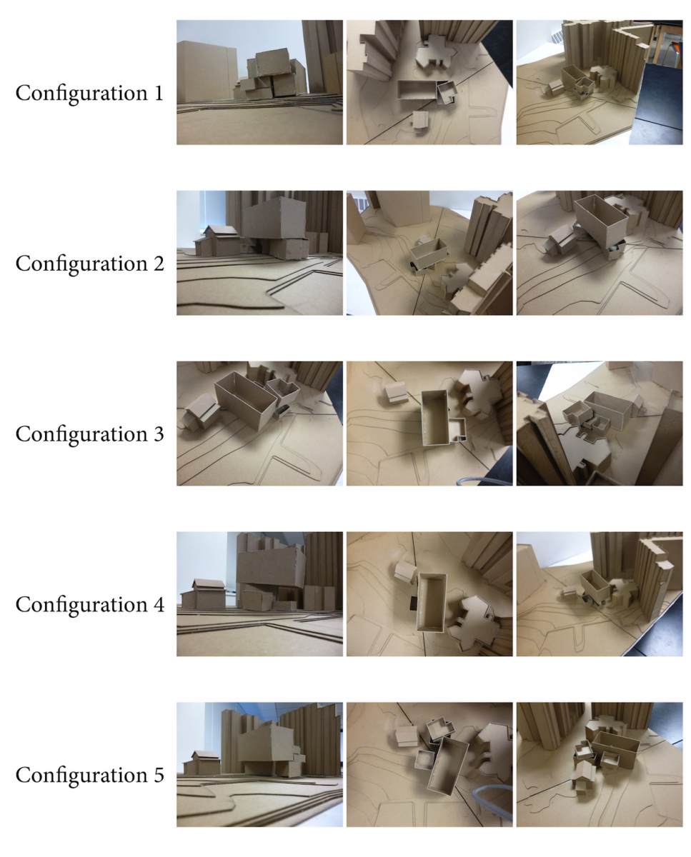
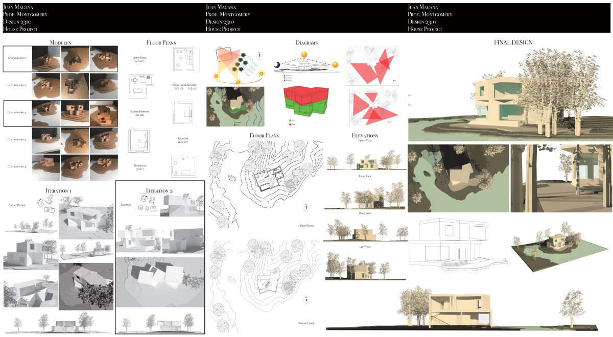
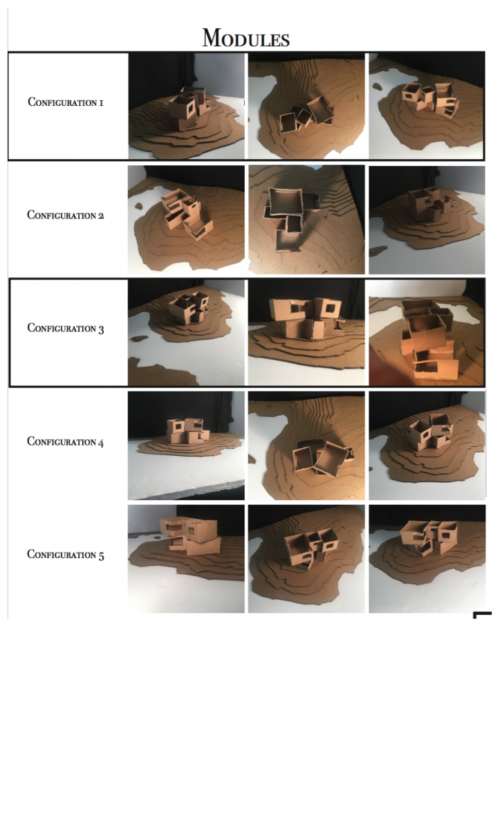
For this Assignment we focused on creating five different configurations using the rooms we constructed in the assignment G. Out of the 5 configurations, I decided that Configuration 1 and 3 going to help me build my final house to the full extent. For the First configuration I focused on the lighting by placing every room a certain way. For example, by placing the living room and the bedroom on the east side of the site so that their can be plenty of lighting in the morning coming in the rooms. Also by tilting the bathroom and the kitchen/ bathroom space in a certain way so the rooms can be filled with natural light all the time. For the Third Configuration, I wanted the house to a have a Public/Private flow by placing the living room Space, Kitchen/dinning Space, and Bathroom Space n the first floor and and then having sleeping space 1 and 2 in the second floor. I also tried to tilt the room so that they can have as much lighting coming in as possible.
Assignment G: Modules For Living And Parti
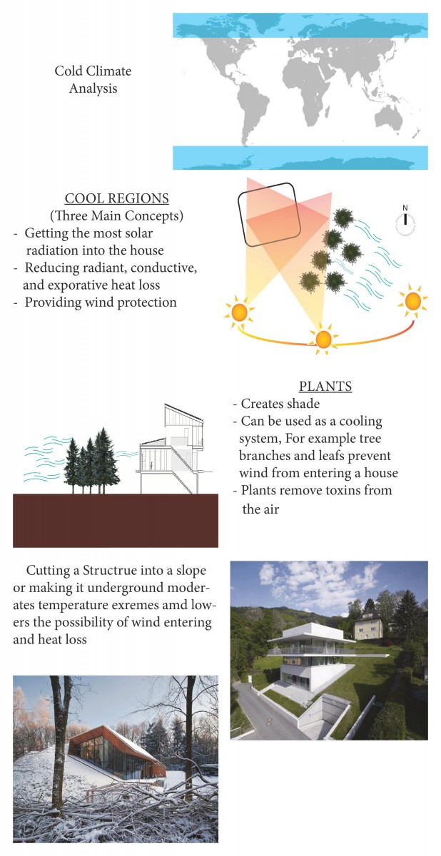
Assignment F: Weather Analysis
Assignment E : Renders of House
Assignment D
Assignment B
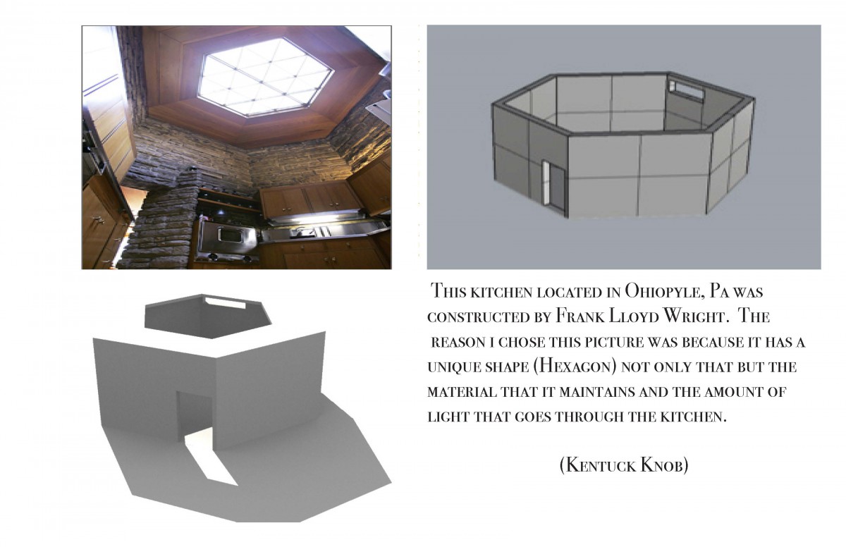
Pintrest Residential Interior space analysis
Assignment A

