Author Archives: Akina Jiao
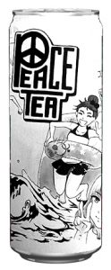
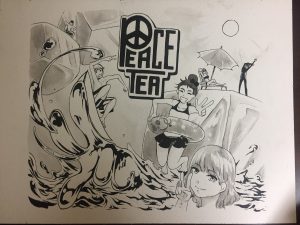
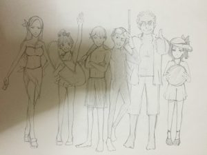
Project 1 Final for Illustration I (Jingyi)
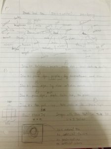
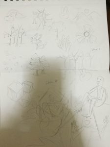
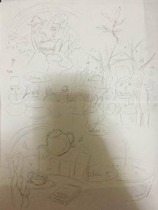
Project 1- Process
Digital media: Video project
https://drive.google.com/file/d/0B474A4HPGfi6bzdOcVZzV1NyTEk/view
digital media hw
Logo history report (revision)
Cooper Hewitt (field trip assignment)
Cooper Hewitt, Smithsonian Design Museum is located in the Upper East Side’s Museum Mile in Manhattan, New York City. It is a museum that exhibits arts of diverse genre and from multiple different times, creating a mix sense of modern freshness and historic nostalgia. It is exhibit include architecture, sculpture, painted architecture, decorative arts, woodwork, metalwork, pottery, costume, musical instruments and furniture. It constantly changes its exhibits to inspire us, the up coming generation of new designers with novel ideas, by gathering the designs from designers all over the world.
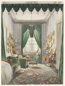
Drawing, An Interior with a Curtained Bed Alcove, ca. 1853
This drawing was created by Unknown and Austrian School in 1853 and the museum acquired it in 2007. It painted by using brush and watercolor, gouache with touches of gum arabic over graphite. I chose this painting because of its special color scheme. Using chromatic colors to make the green and gold color look more transverse and elegant, to give a Victoria era sensation. It has a cartoonish feeling for a portrait of a such realistic setting, making it looks more intriguing compared to other art works of its kind. And since I’m particularly drawn to cartoon and I have a career goal in such cartoon style. It feels inspiring me.
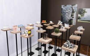
Scale Models, Architecture is Everywhere, 2015
This Scale models were designed by Sou Fujimoto Architects, using wood, aluminum, ceramic, dried flowers, fabric, paper, plastic, sponge, stainless steel, and acquired in 2015. This object is not part of the Cooper Hewitt’s permanent collection. It has been able to displayed to spend time at the museum on loan from Sou Fujimoto Architects. Everyone is attracted to the design works of miniature scale, sometimes the solution is not to go big but to go small. Like everybody else I was attracted to this art work because of its miniature humanoid. For the lack of better word at the only describe this exhibit to be very cute. Especially because most people think its difficult to make things big but we already have enough grand structures, and in contrast the smaller things have taken attention. When I look at this art work, I can feel the concentration, the patience, and the time it took the designer to perfect its life like action. It make me feel like its a reflection on our daily life, because in the universe that we live in, we are nothing but a grain of sand.
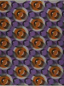
Waxblock Textile, from the Tell collection, 2015
This textile was designed by Michiel Schuurman and manufactured by Vlisco. It is dated 2015. And Its medium is wax resist printed on plain weave cotton. The fabric is made by Vlisco, a Dutch textile company specializing in Dutch wax prints. These brightly colored, elaborately patterned cotton textiles are popular in West and Central Africa. Made using an industrialized version of the Indonesian batik process, Vlisco’s prints represent an ongoing dialogue between Dutch designers and local African traders, who often suggest colorways or themes to Vlisco. It stands out to me because it instead of the traditional repeating patterns, it used 3D patterns, making it unique to common eyes.
quotation project (revision)
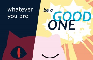
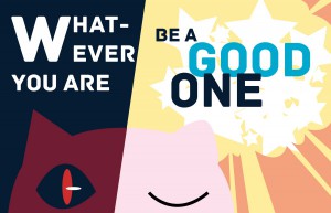
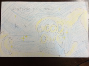
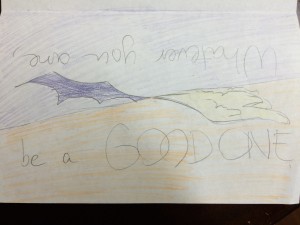
The concept for this composition are two inner appearance of a cat. Left side represents night, and day is right. Cats’ motivation is anticipated at night, darker color reflects cat’s unknown inner, and red shiny eye ball balances everything in the left piece composition. Right piece composition brings more positive energy effect. Two words place in the center of the light side “GOOD ONE” tells the specific message of this quotation. And surrounding with the orange and yellow, which are the best color choices of energy.
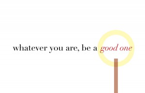
The overall image is plain and bright. It uses color of light to symbolize a sensation of positiveness. And the yellow circle high lights the words in red which is already stress by its color that is different from the rest of the words which put a focus on the most important part of the sentence, the part that is suppose to be imprinted in the mind of whoever sees it.
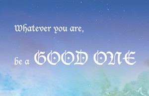
This last composition has the simplest design from the other two but the only one designed with a photographic image. The whole compositions creates a fantasy mood recalls the early childhood mind and leaves message of “be a GOOD ONE”.
quotation project
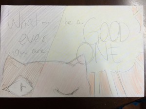
The concept for this composition are two inner appearance of cat. Left side represents night, and day is right. Cats’ motivation is anticipated at night, darker color reflects cat’s unknown inner, and red shiny eye ball balances everything in the left piece composition. Right piece composition brings more positive energy effect. Two words place in the center “GOOD ONE” tells the specific message of this quotation. And surrounding with the orange and yellow, which are the best color choices of energy.
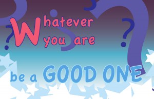
Two colors in the gradient refers to the main idea of this composition. Violet is the color of mystery combines with question marks to create a feeling of hard to understand. And below violet is blue, the color of calmness with the pieces of icy crystal stars. It tells a message to be a thoughtful good one whatever you are.
This last composition has the simplest design from the other two but the only one designed with the photographic image. The whole compositions creates a fantasy mood recalls the early childhood mind and leaves message of “be a GOOD ONE”.

