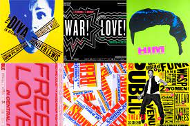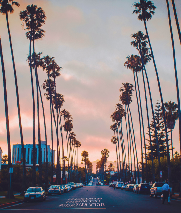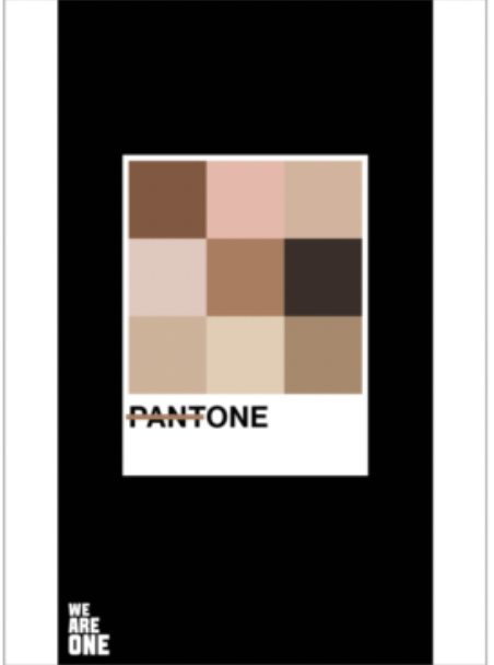
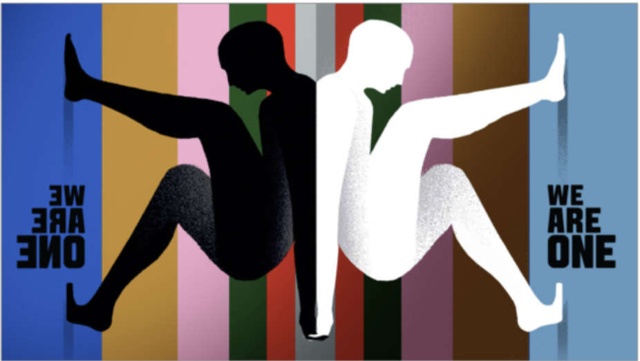
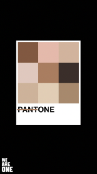
These 3 images were the ones that stood out to me. I love the balance in the first two images, the symmetry is so pleasing to look at. In the first image it is really colorful and they work nicely together. The second image has a good contrast and the colors behind them in the background don’t interfere with the contrast happening. The Pantone image is very inclusive and I love it. Considering in my other class we spoke about Pantone colors and saw the swatches, taking the idea of Pantones and changing it to tone and having a range of inclusive colors, it really represents people of color.
Images from We Are One gallery