My field trip to the American Institute for Graphic Arts was filled with floors, doorways, and bridges depicting beautiful eye-catching illustrations of graphic art. Works from various different artists and genres were displayed throughout the gallery. While exploring the AIGA archives, I learned that some original pieces were dated from as far back as 1914. Some of these pieces included books and posters. The books included large elaborate drop caps like those in Gutenberg’s bible. The art changed as I explored the pieces through the 1950’s. Design changed and became a lot more colorful after an influx of many European designers. Some of the more recent works were bizarre posters by Stefan Sagmeister, classic logos by Milton Glaser, and floor designs by Jim Beaver. The main exhibit, “We Are the Designers: Reframing Political Issues in the Obama Era,” encapsulated the entire first floor using strong pieces that made a statement about the issue each artist tried to portray.

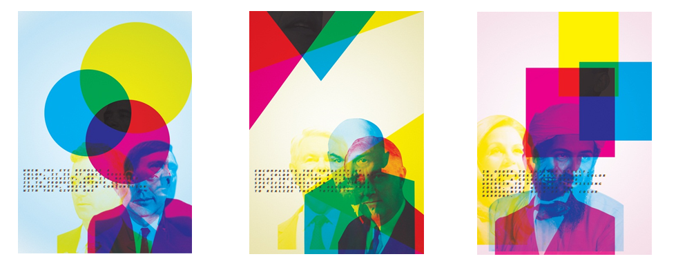
Lucinda Hitchcock “Making Black”
Ink jet prints on archival paper
33 x 46 in. ea.
This piece particularly stood out to me because of its use of the CMYK color code. These bright, bold, contrasting colors are able to steal the glances of any visitor straight from the door. Hitchcock employed this color tactic to depict the piece’s bigger meaning. She uses a quote from Johann Wolfgang von Goethe that explains color harmony and how human beings react to such color. The type is also set in the CMYK color code, giving it a blurry effect and sometimes getting lost within the background pictures. The type is set in a sans serif typeface to provide a bit of ease for the reader however. Amongst the colors, the piece is so strong because of the contrasting political figures buried within the picture. John F Kennedy shares a board with Adolf Hitler and Abraham Lincoln shares a board with Osama Bin Laden. The pictures of these figures alone give this piece very powerful meaning. Throughout each board however, one picture remains consistent; Barack Obama. After his election, the public was split. They compared him to such figures because of his heritage, religion, and views. Obama remains in the joint color combination of Cyan, Magenta, and Yellow that makes black.
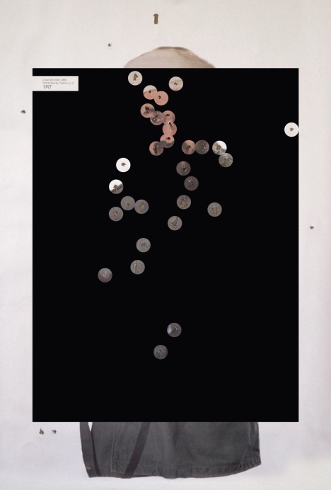
This is an extremely strong piece. I was immediately drawn to this because of its uniqueness. It is pretty unusual to find a work of art made with bullet perforations. The main background is an image of Osama Bin Laden. The bullet holes are magnified by circular holes surrounding them in order for the viewer to see each shot clearly. It is clear that most of the holes are concentrated at the head region, showing that the shooter was looking not only to harm Bin Laden. The solid red background further intensifies this piece as it symbolizes blood, making the image even more gruesome and striking. A stand-out piece in an exhibit capturing political issues during our current era, this work of art displays the constant target America has on particular groups, people, and even ideals.
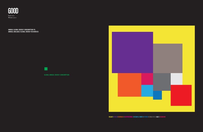
This piece is a statement in itself because of its large size and depicts an issue all too familiar to Americans today. Lathrop implements a solid black backdrop and uses different colors to signify different sources of energy such as wind, solar, and gas. His chart can be compared to a pie chart that compares various parts of one category, except this pieces uses rectangular blocks to bring a more artistic view to the political issue of energy resources. A sans serif typeface is used appropriately here because the text is small and uses different colors against a black background, so the constant weight of the strokes increases legibility. Among the amount of available resources we have, Lathrop’s main comparison is the amount the resources available to the amount we actually consume. The left side of this board displays a very miniscule green diagram while the right side compares a large eye-catching diagram with a lot of information. This split between the two further contrasts the energy uses in American today.


