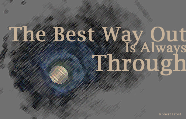
I chose the quote “The Best Way Out is Always Through” from the famous American poet, Robert Frost. My first design was created around a picture of a cave. I used the cave to depict the word “Through” while setting it in the largest size relative to the rest of the quote. I edited the image so it does not appear, immediately, to be a tunnel and so the opening is the most important aspect of the image. I chose a neutral serif typeface for the quote as this is a serious grungy design. The color of the typeface further emphasizes the tunnel opening and contrasts with the color of the typeface the quote is set in. The blue color surrounding the tunnel opening adds color to the grey background of this design.
Image Borrowed From: http://t3.gstatic.com/images?q=tbn:ANd9GcSGf6Bw9bFcmHAoGysOPVQR9w_C9wgXJxskwcq7mWdTsQoHLee7
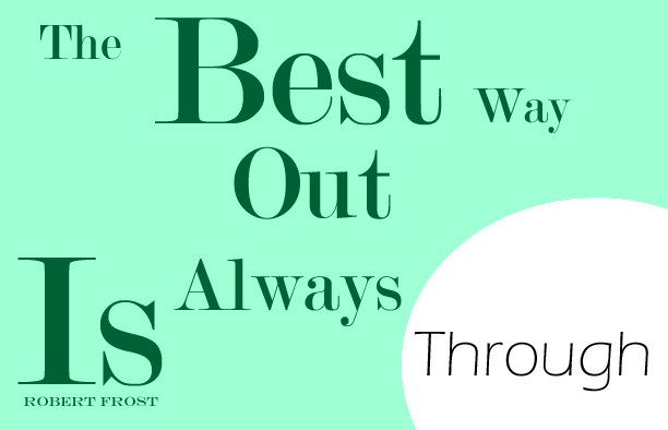
This text-only design brings out the quote purely. I chose different sizes and alignments of the same serif modern typeface when setting the first part of the quote. I used a teal transparent layer over the text with a circular cutout where I housed the word “through.” Through is written in a sans serif typeface, contrasting with the rest of the type, with a much lighter weight. This word appears through the corner peep hole to further bring out the meaning of the quote.
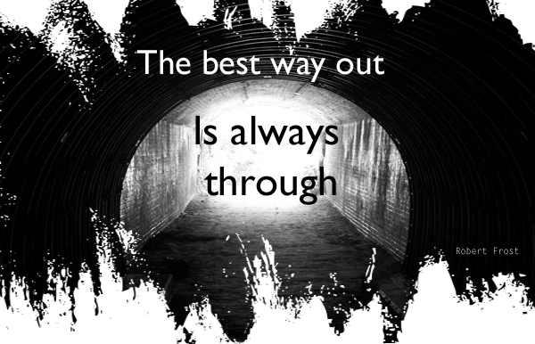
My third design, similar to the first, was built around the concept of a tunnel to connect with the quote’s meaning. This tunnel is more apparent and black and white. There is a strong contrast between the inside and outside of the cave in order to emphasize the quote’s meaning. The second part of the quote, this time, is literally coming through the tunnel. The cutout around the image gives the design a grungy feel.
Image Borrowed From:
https://eyeonimedia.files.wordpress.com/2012/04/the-light-at-the-end-of-the-tunnel.jpeg


