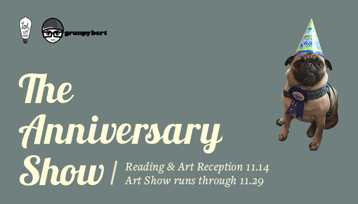
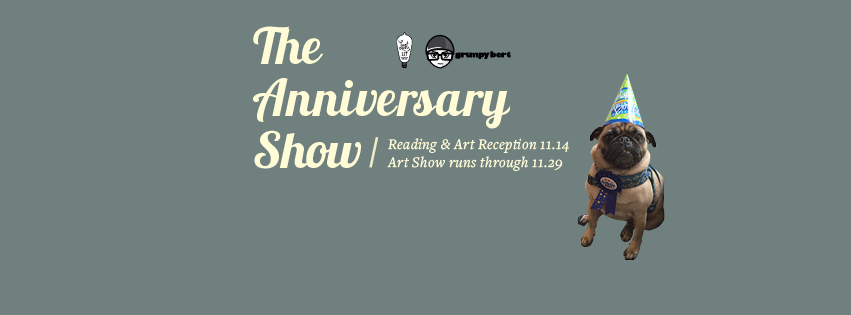
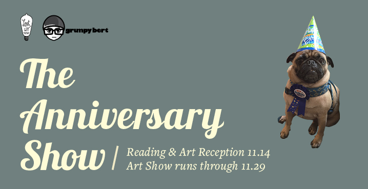
I’m very excited that this project is finally over. I’m extremely happy with the outcome. A lot has changed since last week. I decided to stick with the decorative font and replace the illustration with a photo of Remy, Albert and Lynne’s pug. The photo was provided by Lynne and I took it to photoshop, cropped the background, and placed on the front of the flyer. The picture was taken on Remy’s birthday, hence the birthday hat on his head. We felt like it would pretty cool to display this here for Grumpy Bert’s anniversary. He’s an essential part of the shop and he’s very well known in the neighborhood so that’s we decided to use him. We also decided to add a little more information on the front of the flyer. Essential information that the viewer needed without turning the flyer to the back. The back of the flyer goes in depth with information like giving the viewer artist names, time, place, and etc. The last three flyers are the same except they have different dimensions for different platforms. They are Web banner for the Grumpy Bert website, Facebook header, and finally specific dimension flyer for the Downtown Brooklyn website.


