Concept

This quote is the lyrics to a song from Tyler, The creator’s song EARTHQUAKE.
The whole song is very straightforward, with each line of the lyrics expressing its most direct feelings. The first half of the song keeps repeating “You make my earthquake” and “Don’t leave it’s my fault”. The straightforward disorderly state of mind declares a dissection of the heart of lost love in all its details.
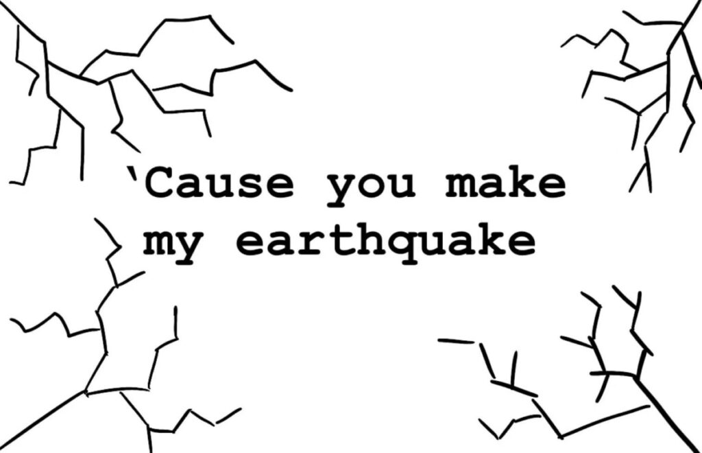
Since the expression of the song itself is so straightforward, my design concept also directly put the lyrics in the middle of the position, surrounded by a line to create the visual effect of cracks, like the cracks after an earthquake.
I think I would have used pink for the color theme of the whole design because I think pink represents love and it is unforgettable. It is because of this unforgettable love that brings the most heartbreaking pain, like having experienced an earthquake, the heart has been covered with cracks.
3 Designs
Design 1
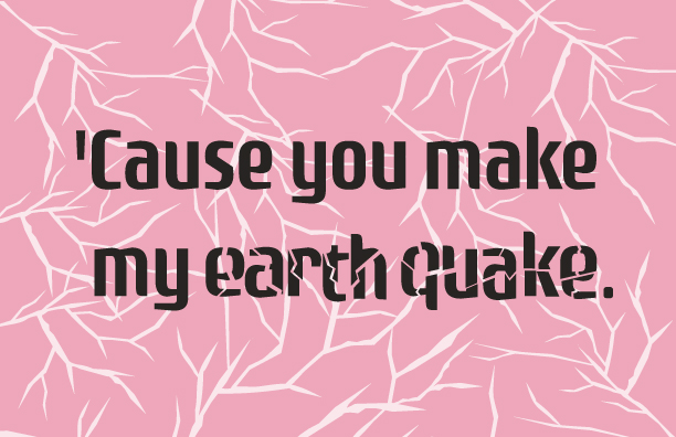
This is the first postcard made according to my idea, this design only uses simple lines to create the visual effect of cracks, The earthquake in the lyrics I have added a font broken design, and the background fill color of the postcard is pink because I think this pink is very consistent with my idea of the representative color of love. I put the lyrics in the middle of the postcard, and the white cracks spread from all around to the middle, just like the inner change of a relationship after a problem occurs, from a whole heart gradually covered with cracks, will it finally be broken or will it recover as before? No matter what the outcome, these cracks will always remain.

Design 2
The design of this postcard is a modification of my first design. The design concept is similar to the first one. But I changed the lines representing the cracks to a more realistic crack design. And I put the cracks all over the background. The lyrics were also enlarged. I feel that the visual impact of this design will be enhanced. This design also represents that the relationship is already full of cracks as if it really experienced an earthquake, and has reached a point where there is no way to pretend not to see, or there is no way to be able to fix a situation.

Design 3
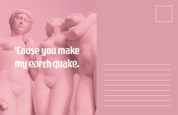
For the third postcard design, I used the standard postcard typography. The color theme for this postcard is still the pink I chose. On the left side of this postcard, I used a photo of a statue of people, and I placed the lyrics I chose in the middle of the photo, letting the photo serve as a background to highlight the lyrics I chose. The statues fit the concept of the lyrics I chose. Statues are usually carved in stone and appear to be solid, but even the most solid statues can crack after time or outside influences.


