
Introduction
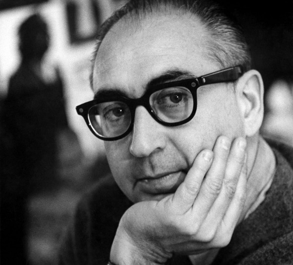
Saul Bass was an American graphic designer and Oscar-winning filmmaker. So he is not only famous for his graphic design but also for some great poster designs for movies or documentaries. He is famous for his use of simple, geometric shapes and symbolism. He transformed film posters from commercial advertising to visual art. He used the most basic but also the most important design elements such as basic shapes, colors, and compositions to create, using his understanding of the movie to create one impressive piece after another. He proved that the most common basic designs can become something magical in the hands of experienced artists. His works can just stand alone and deliver a powerful message. Saul Bass had some sort of inspiration from his parents but the person who inspired him very much is Gyorgy Kepes. Gyorgy Kepes was a Hungarian-born painter, graphic designer, photographer, and educator who taught Saul Bass and inspired him.
Brief biography
Saul Bass was born in the East Bronx in 1920 to Russian immigrant parents. After leaving school, he worked in a commercial art studio. He was very good with his time and became a subway scholar, reading a lot of books on his hour-long commute. One of his favorite books is Language of Vision by photographer and designer György Kepes. When he found out that this author taught at Brooklyn College, he immediately went ahead and signed up for a class. Under György Kepes’ inspiring tutelage, Saul Bass developed a constructive and groundbreaking theory of visual imagery that would influence his future work.
In the late 1940s, Saul Bass worked in Los Angeles, primarily on film promotions, where he opened his own design studio in 1952. He had ambitious ideas for film design, and his 1954 poster for Otto Preminger’s Carmen Jones was so admired by the independent director and producer that Saul Bass began to make a name for himself; he designed the poster for his next film, The Man with the Golden Arm, which also revolutionized the aesthetic of film posters. His next film, The Man with the Golden Arm, was also designed by him and revolutionized the aesthetic style of film posters.
Artist impact and Achievement
In his 40 years as a designer, he has designed logos for many world-class companies, as well as artwork for more than 60 films and title ideas for more than 40 films.

This logo was made in 1969, this is how Saul Bass pitched AT&T on a new visual identity. He won, and the logo remained in place until 1983 when Bass designed a follow-up logo that became affectionately known as the Death Star.
Saul Bass designed many movie titles between 1954 and 1995. His designs were bold and innovative, and his use of animated characters added liveliness and vividness, breaking the boringness of previous movie titles and end credits. His avant-garde design style is still favored by Hollywood today and has left a deep impact on later graphic designers.
Saul bass has many influential works, among which the movie posters of “The Man with the Golden Arm” and “Broken Heart” are my favorite. “The Man with the Golden Arm” tells the story of a jazz musician played by Frank Sinatra who overcomes his drug addiction, which was not a mainstream topic at the time. So, instead of using Sinatra’s head as the poster’s theme, Solbas used a graphic design – a strong, twisted black arm, a typical symbolic image of the struggle against drugs, stands out against a white background, and amber-gold lettering suggests the talent and potential of the protagonist. The three-dimensional colors and abstract shapes are the visual languages of modern art. The three main characters of the film, whose names are arranged at the top of the poster in varying fonts but without the use of their photographic images, revolutionized the cinematic vision of the time.

In conclusion, I really like this artist because I think he is very good at using simple designs and his own unique vision to create meaningful work. That’s what I think designers need to do, to send a message through their work.
Although it may seem simple to us today, it took Saul bass’ years of experience to concentrate his ideas into such a pure style, and he didn’t mess it up with anything he didn’t need: no colors, no jumps, no tricks. There is only the nakedness of the concept, which makes it pure. You can see the same approach, the same design philosophy, over and over again in his work.
sources: https://www.britannica.com/biography/Saul-Bass
https://www.theguardian.com/artanddesign/2011/oct/30/saul-bass-life-film-review