Week 13: Bumper Ad

For the final assignment I created a 10 second bumper ad for a pharmaceutical company that creates a pill that supposedly extends your lifespan. This add was made with two videos 8 images and 6 pieces of text. The effects used are blending modes, masking, rotoscoping, and time remapping.

Disclaimer:

*Has been known to cause instant death, heart attack, stroke, blood clots, cancer, diabetes, covid, flu, and other deadly maladies. Please consult a doctor before taking.
Week 11: Music Video!

For this weeks assignment we were tasked with either making a movie trailer or a music video. Since for the previous assignment I made a song medley I decided to create a music video using the music that I hade amalgamated. The theme for my video was dancing animals since animals always make people happy especially when they do funny things.

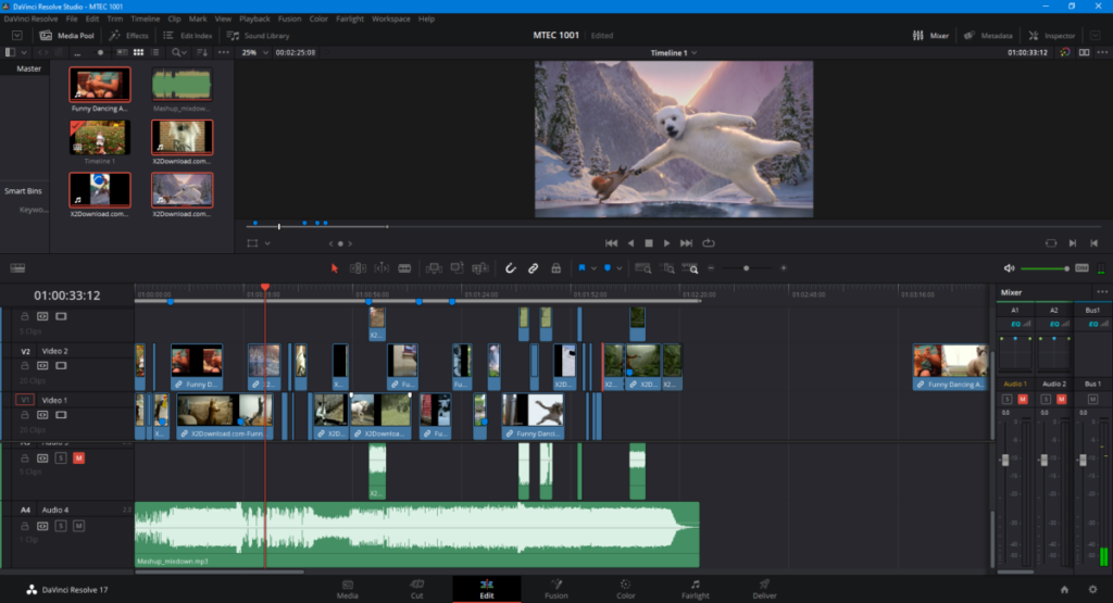
Here is a screenshot of my video editor showing how the timeline looks like for my music video.

Week 10: Medley Mash-Ups

For this weeks homework I created a mash-up of some of my favorite songs by The Fat Rat who is an edm artist.

The songs I used were:
TheFatRat – Fire
TheFatRat – Monody
TheFatRat – Unity
TheFatRat & Everen Maxwell – Warbringer (feat. Lindsey Stirling)

Midterm: Week 8

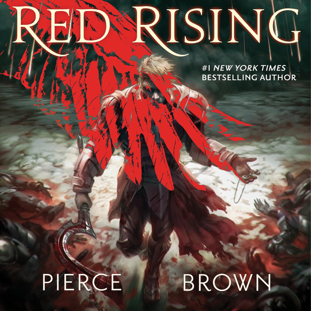
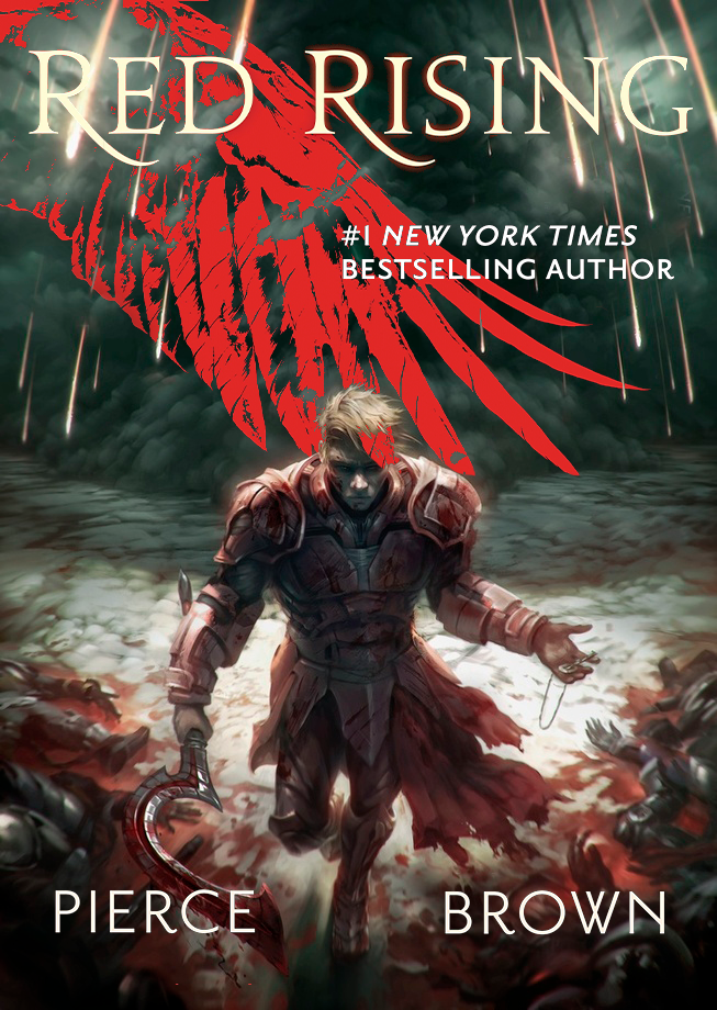
This week we created book covers. I chose my favorite book Red Rising by Peirce Brown and made a cover for it. I used a fan art in the background and added text to it.

Book Cover for “Red Rising”

To create this book cover I first thought how to reflect the book the best in one image with it being visually appealing enough so that a customer would want to buy it. This book is about a bloody revolution of the people of mars who bleed red hence the overall red aesthetic . Red is an important color in the book since it is one of its biggest motifs. Next I added the wing as an overlay since the wing represents the main character “Darrow” in his god-like form. The storm in the background, the corpses on the ground, and the overlay give it a very chaotic look that correctly reflects how the events in the book are also very chaotic with much war and bloodshed. I then put the title big and bold at the top so it is clearly visible and added a small red glow to it. Adding the “#1 New York Times Bestselling Author” adds credibility to the Author whose name I put clearly visible on the bottom. Making this cover was quite enjoyable and hope to make many more.

Red Rising: Rectangle format

Week 6: Photo-montages.

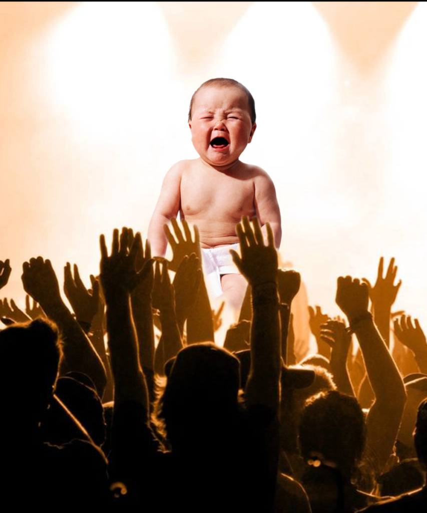
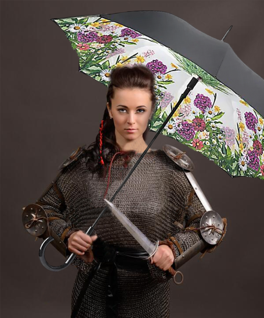
This week we learned photoshop and for homework we created three images by combining images. For the first one I combined a picture of a horse and a squirrel together. The second one I put a picture of a baby in the background of a crowd as if the crowd is worshipping it. The last one is a combination of a knight and an umbrella.

“Squirrel Horse”
“We worship thee…”
“Is it Raining?”

Project for Week 4: Business Cards

For this week I created a front and back of a business card. This was done using the five visual design principles of UX. I really like it and may even use it in the future.

Business card made using the 5 Visual Design Principles of UX