Discussion:
You must be logged in to reply to this topic.
- Font Identification and History
-
February 10, 2017 at 10:17 am #41609
Johanna GoldfeldParticipantSubmit your font description here.
February 14, 2017 at 3:11 pm #41719
Nicole M.ParticipantAdriel Caraballo
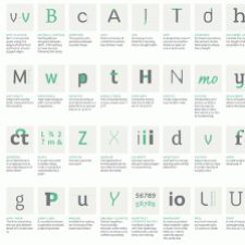
Nicole MooreHelvetica is one of the most popular type faces in the world. It was created in 1957 by Max Meidinger with the help of Edward Hofmann. During this time period in the early 20th century, in post-war Europe many companies were looking for a change. Helvetica was the opposite of all the fancy, decorative typography that covered corporate materials and advertisements. Helvetica’s sleek lines and modern sensibilities were just what companies were looking for to remake their identities and set themselves apart from the past. Helvetica is classified as a Sans Serif. It had medium to thick strokes that sits upright on a straight axis. There is no brackets or serif shape. It is among the most widely used san-serif typefaces. It is widely used for logos, government publications, signs, and it has become associated with corporate culture and business.
February 14, 2017 at 3:19 pm #41721
Eddie WhiteParticipantThe Clarendon font was created by Robert Besley in 1845. This font was created for posters printed with wood types. This font is best use for magazines, logos, and traffic signs. As for the clarification of this font, it has strokes that are uniform, with a slab serif shape. Furthermore, the Clarendon font contains thin brackets with an axis of upright O’s.
February 14, 2017 at 3:39 pm #41728
ChelciaParticipantThe name of our font is Bodoni. Bodoni was designed by Giambattista Bodoni, often revered as the King of Printers, in 1790. Bodoni drew inspiration from John Baskerville as seen from the Baskerville font, but Bodoni’s characteristics set it apart. It includes a centered tail on the uppercase “Q”, a curved tail on the uppercase “R”, unbracketed thin serifs, and a vertical axis. Bodoni is essentially a series of serif typefaces that alternate between thick and thin strokes which give it an elegant look. Because of this elegant look, Bodoni is often used in fashion labels such as Elizabeth Arden or Calvin Klein.
-
This reply was modified 8 years ago by Chelcia.
February 14, 2017 at 3:47 pm #41731
JoycieParticipantMy group had found that the typeface was called Bodoni. The Bodoni font was designed by Giamattista Bodoni and Morris Fuller Benton in the late 18th century. Bodoni followed the ideas of John Baskerville, as found in the printing type Baskerville—increased stroke contrast reflecting developing printing technology and a more vertical axis—but he took them to a more extreme conclusion. This font is a classical design. It has thick and thin strokes, and the think strokes are very thin at small point sizes, which made some digital versions of Bodoni said to be hard to read. The capital “Q’s” tail is centered under the figure, and the uppercase “J” has a slight hook. Bodoni is modern style, and a popular choice among fashion labels, and it’s usually used in fashion magazine spreads, magazine covers and posters, due to its pleasant aesthetics when set in bigger sizes. For example, Elizabeth Arden used Bodoni in their logo.
-
This reply was modified 8 years ago by
You must be logged in to reply to this topic.

