Creative Commons (by Mick https://openlab.citytech.cuny.edu/graphicarttimeline/files/2013/12/442px-SqueezeSponge-221x300.jpgStephenson)

Creative Commons (by Mick Stephenson)

Before photoshop and other means of digitally manipulating elements of an images, certain components would be physically grouped together. Paintings or hand drawing would be used as a way to seamlessly blends images together. This worked as a way of adding elements that may have seemed unrealistic, placing charaters or subjects in situations that was unusual. Color can also be used as a tool to blend images, combining black and white images eliminates working with complicating color combinations caused by surface textures and lighting. Distorting photos can also be a way of changing characteristics with out adding any extra elements. Advertisements, posters or any form of media often manipulate images with photoshop, compositions can include any interesting mixture of graphical elements.

Creative Commons

Creative Commons

Overlapping images on top of images can brighten a dull photo, adding an element of abstraction. More examples. 


Faking it: manipulated photography before Photoshop, is an art exhibition hosted at the met museum in Manhattan, NY. The illustration showcased are a collection of images belonging to the 20th century. The imagery shown creates an illusions with cut outs and various photo angles. The gallery was well organized, creating a time line from the oldest to the most current. The allows viewers to follow and observe the various evolutionary steps that were made to recreate a realistic event. Earlier work incorporated photos placed on a drawn image and eventually combined two or more separate photos together. Doing this allowed for a more realistic illusion that is much more effective  than drawings. The addition of photo effects semlessly ties in separate images It’s entertaining watching various techniques being used to accomplish the same goal the same goal and it allows you to grasp a greater understanding for the art of manipulation.

My interest in the field wasn’t encouraged by a particular individual or event but by my ability to create abstract work. During my senior year of high school. I join various art clubs so that i could work with photoshop and illustrator. Creating illustrations with restrictions became my biggest difficulty, limiting my self to avoid mistakes and revisions. During my time there I worked within a groups, putting together self made drawings that would later be imported into photoshop or illustrator. Work was dictated by season and events which left me with a total of eight projects completed. I never recieved much experience with the software available, primarily because all my work was drawn. However, after high school I spent some personal time on linda.com reviewing as much as I can, without the software it was difficult to follow along.

Even though i didn’t fully understand the vocabulary the vast amount of tools got my attention, it was then I felt that  I wanted to be professionally involved with any field that correlated with these software. Majoring in graphic design at New York City College of Technology, has given me the ability to work comfortably with required tools. I also had the opportunity to visit some exibitions which reflected upon past techniques and work. After seeing work that was done during the 20th century, I gained an interest in past compositions which is reflected on the theme of my blog. I believe that work done during the early 20th century shares a great deal of personality, custom images with an unusual layouts appeals to rather than a rigid san serif composition.

I currently have an interest is applying my personality is every visual project or task, with on going projects I believe that unique ideas attract attention as well as opportunity.

Ease Style by Shu Lin is a well organized blog that provides useful information regarding healthy lifestyle choices. While reading through her post, I can came across a relatable topic concerning eating before sleep. Feel free to read.

Creative Commons

Creative Commons

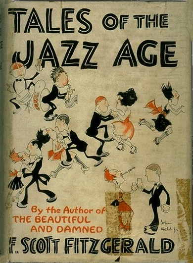
When I came across Alex’s blog post, “Composition Evolution (Introduction)”. I agreed that certain components has been commonly used in many designs, and color is one of them.

As time moves on, the element of color upgrades to a higher, more widespread selections in the advertising field. This colorpencil
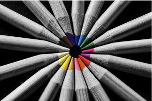
particular element was not put to use until the late 1950’s where everything was pretty much black and white only. How did the black and white world turn into an infinite amount of colors? Today, color is a very important element in our world. Take for example, the advertisement world revolves around the principles of attraction. Color is used as the key to attract consumers. Each color represents different meanings. Let’s start out with the basic RGB concept.

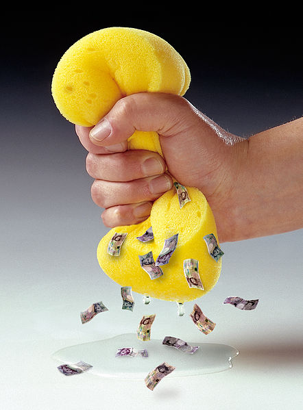
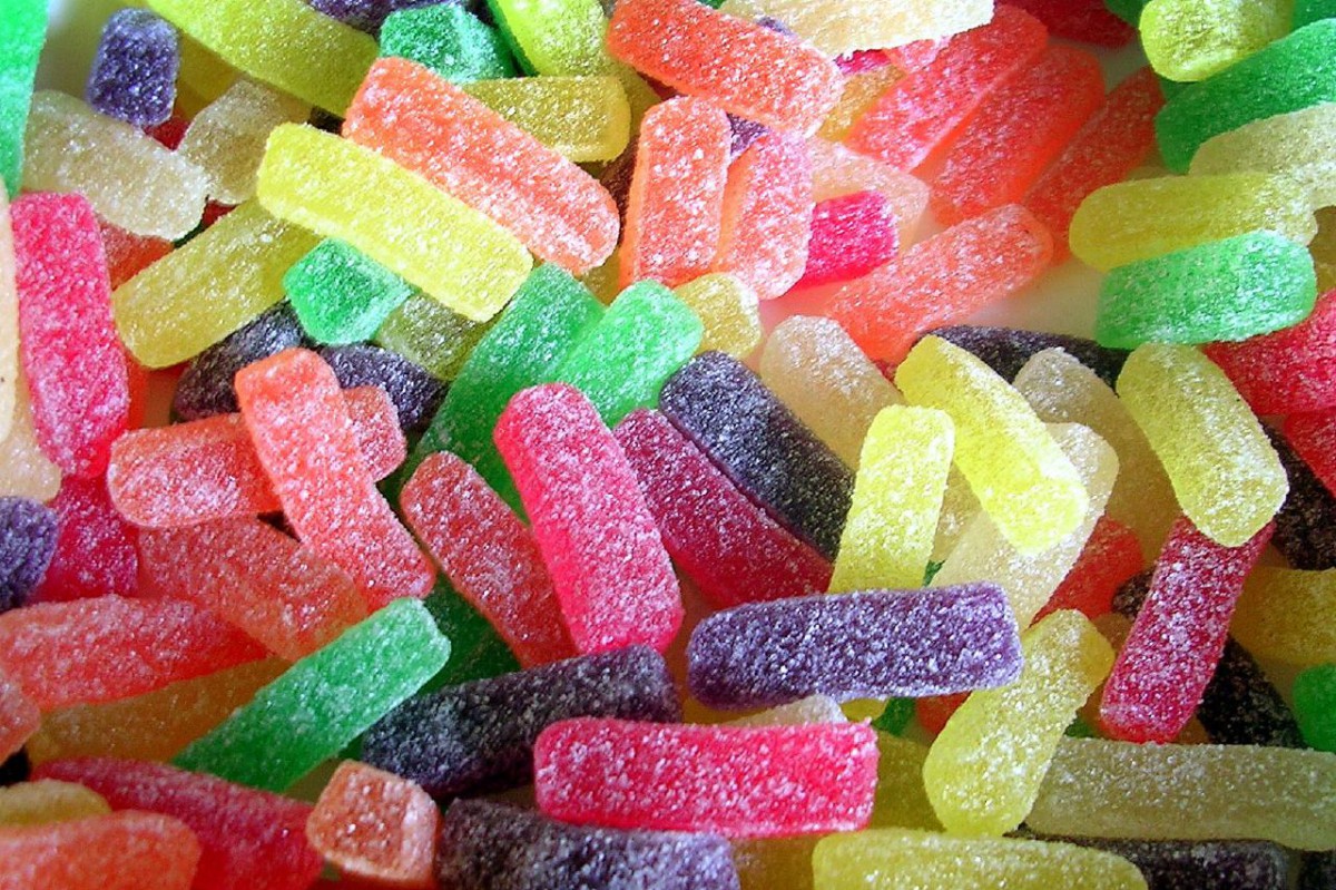
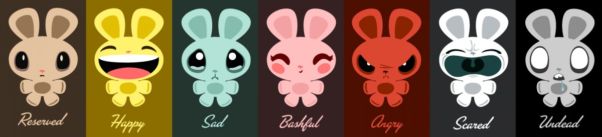
  • Red is known for as a powerful color. It symbolizes energy, vigor, intensity and power. It is generally used for anything that is exciting or active. It is also a stimulus for arousal towards men and women. The color red is associated with both love and hate, and is the only color that can portray dynamic actions. A hot red chili will excite your taste buds as well encourage hyperactivity.
  • Green is known for as a tranquil color. It symbolizes health and mostly nature. It happens to be the easiest color for the eye to see. Often of the times, green is used to represent the “right” choice. Recycling, helping the environment, and saving the planet, “Go Green!”.
  • Blue is associated with purity as well as serenity. Deep shades of blue also signifies elegance and formality. It helps individuals concentrate, therefore it is often used to highlight the effectiveness of a product in terms of its ability to function smoothly. It is a refreshing cold color, hence the reason why most liquid products are adorned with blue.

ColorColor can sway thinking, change actions, and cause reactions. It can irritate or soothe our eyes, raise our blood pressure or suppress our appetite.

As a powerful form of communication, color is irreplaceable.

This is Shu Lin and thanks for reading.

Like previous decades, the 1980’s influenced many ideas within posters, advertisement and other forms of media. However, images iconic to this period are byproducts of pop culture. Movies, music, and popular books had a great deal of impact on the decade and is now become symbolic references and objects. Science fiction was elavated by the space race of past decades, and has spawned creative images that encourages thoughts without being restricted by the limitations of reality. In the late 1970’s, the star wars series was introduced and gave an interruption of a world much bigger that what currently exist.  Vibrant colors were common, which best illustrated themes on the decade. Contrast among page elaments made compositions attractive. Font size also played a role grabbing attentions. These are elements that can be found in pervious work from past decades, but themes of the 80’s reflected upon work done during that time.

Untitled-1

Like the 80’s future decades incoparated elaments of pop-culture into illustrations, which made them relevant. There are various forms of designs that can be used to express a theme or share a message. However, several periods during the last century favored different methods of getting the message across.

The use of photos in certain compositions can have a profound effect. The combination of specific colors can also add an emotional impact. After the 1920s, the great drpression was remembered as a period of turmoil, and the images produced repersented this well. An image without out any text draws the viewers attentiion to the subject rather than having competing elements on the same page. Different colors can add layers of mood to any composition, during the 1930s black and white images became symbloic with a depressed mood or state.

Creative Commons  (by Dorothea Lange)

Creative Commons (by Dorothea Lange)

While images alone had a great impact, hand drawn cartoons gathered a lot of interest from it’s abstract ways of tell a story. These were common during the early 20th century and consisted of political, economical, and other global themes. Within these drawing subjects were often represented by a human character or any object that can display emotion.

 by Winsor McCay

by Winsor McCay

JohnHeld_Tales_of_the_Jazz_Age_1922

Creative Commons

Photos and compositions during the 1920’s incorparated themes that became symbolic of that time period. A changing life style along with trends were inspiration to various posters and related illustrations. Colors of high contrast and saturation are common and gradually changed with time. figures and charaters appear vibrant due to their expression of movement which relates to popular music of the time, jazz. A growing middle class provided a platform where new products and services were sold, this influenced themes of change and a new age. Besides color, most charaters and objects seem to be drawn rather than the use of photos. Today hand drawn images seem to be intensionally done and not out of necessity or the lack of technology.

I believe that most posters of this era expresses an organic feel which seems to have gradually disappeared. Some drawing in these images represent the personality of the artist. Type is also an area were a lot of personailty can be drawn from, today it seems most compositions are restricted or aim for a professional san serif look. While i prefer san serif type, i think experimentation can be more attractive. Personality within a composition can be achieved with unique hand done work, but i also believe good use of photos can capture the same feeling.

Posters and other illustrations along with various forms of art has reflected trends and standards of the period in which they were made. The manner in which compositions were put together has generally remained the same during the past century, but certain elements has become unique to their era. Composition Evolution is a 4 part series that examines the way numerous images has been used to capture historic themes. Throughout this series I will give my opinion on certain components that has been commonly used in many illustrations during a specific time or era. Type, color and subject-matter are all elements that will be looked at and compared to relatable events of their time.


light bulbI often don’t plan ahead, but i’m able to gather inspiration from various sources. The topics I will evently  post do reflect my personal opinion which makes writing uninterrupted by a lack of ideas. However, most topics posted will be choosen from my personal interest and educational back ground. The theme of my blog will dictate most subjects but i will be flexiable with some post, as long as they share some relevance towards graphic design. I intend to include some focus on historical content in the form of images, such as posters and  advertisements. Certain images or compositions may become my main source of inspiration.

The idea for the post is credited to Credit Brogan