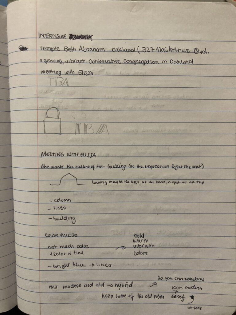
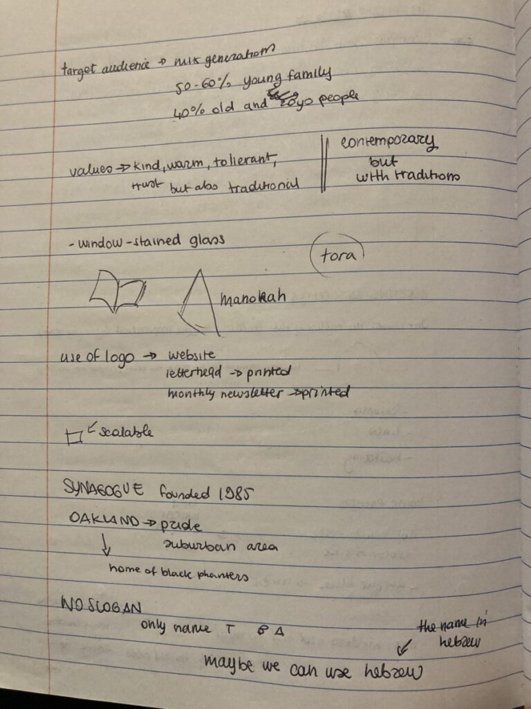
I think the most challenging part of designing a logo and a brand identity is to truly understand what the client wants. One of my last projects before completing the 120 hours of internship, was the design of a logo for a synagogue in Oakland, California. It was my first time designing a logo for such a big institution. I was honored and intrigued at the same time. I participated in the first Zoom meeting between the client and prof Goldfeld, so I could ask questions to the client directly, but also hear firsthand what the client had in mind or would like the new logo to convey. The design of this logo ended up being the most difficult to work on. The client had already a strong idea in mind, and I tried my best to design what the client wanted. However, thanks to the help and support of Prof Goldfeld we were able to provide a couple of interesting design choices for the logo that helped the client to lead to choose something that in our opinion really could represent the principles of the entire community. From my handwritten notes below, you will see that the client wanted a minimal logo with a simple line that defined the silhouette of the building, which would combine the old vibes with modern ones. The second idea that emerged during the meeting was to use the beautiful design of the stained glasses to be used in the logo. The client seemed enthusiastic about this idea.
I worked for more than two weeks on the logo design because I really wanted to make the client happy. I traced the building contours from different perspectives trying to catch the entire building shape first and then just a corner of it. First from the front, then from the bottom, then from the side. The face of the temple building has a circular structure connected to the rest of the building, which is also the entrance to the building. The building’s shape was actually interesting and particular to design, but having the building as the main element of the logo wasn’t really communicating the opening of the institution to the community. After the first 3 logos choices we presented to the client, we were asked to combine the idea of the colored glasses with the shape of the building. The logo inspirations the client was presenting were well done but the building had a very nice pointing roof (very similar to a dome), which the temple building doesn’t have. I worked on it for another week, but what I came up with was a logo that contained too much information and it didn’t look right.
To conclude, in my small opinion the logo that was finally chosen better represents the warm and intercultural community where the building is located. With a rounded shape and a vivid color palette, the new logo delivers a young and trustworthy vibe and at the same time includes the traditional symbol of Judaism. The client, the priest, and the other members of the community who were able to help in the choice of the logo were captivated by that specific logo because it was speaking their same values.