
As stated in previous posts, the main project was designing the assessment handbook. The handbook needed a consistent look and infographics that looked “modern”. After the visuals were completed, the PDF also needed to be adjusted for accessibility.
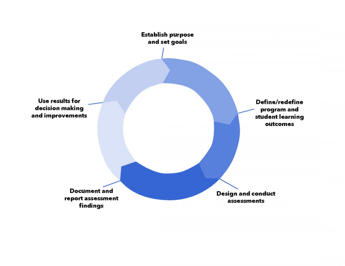
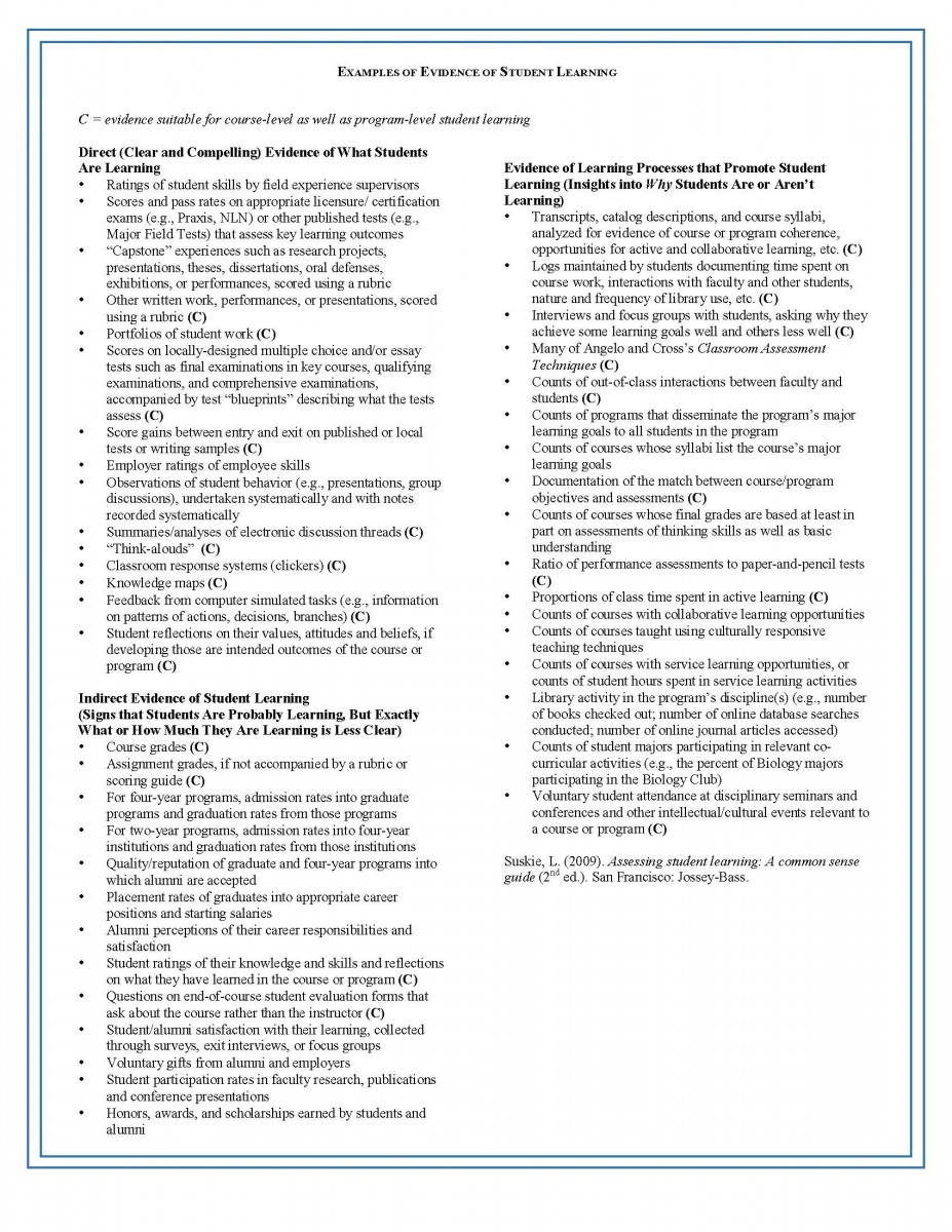
Infographics were made and needed to look consistent. Specifically in colors and types of fonts used. An exception was only made for infographics from other departments. Because we couldn’t claim ownership of them, making any adjustments to them was forbidden.
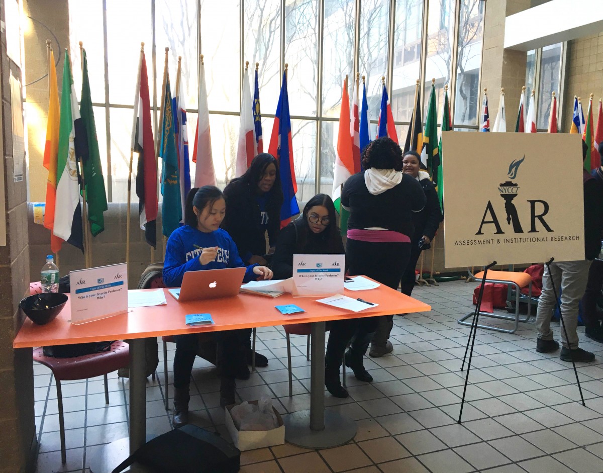
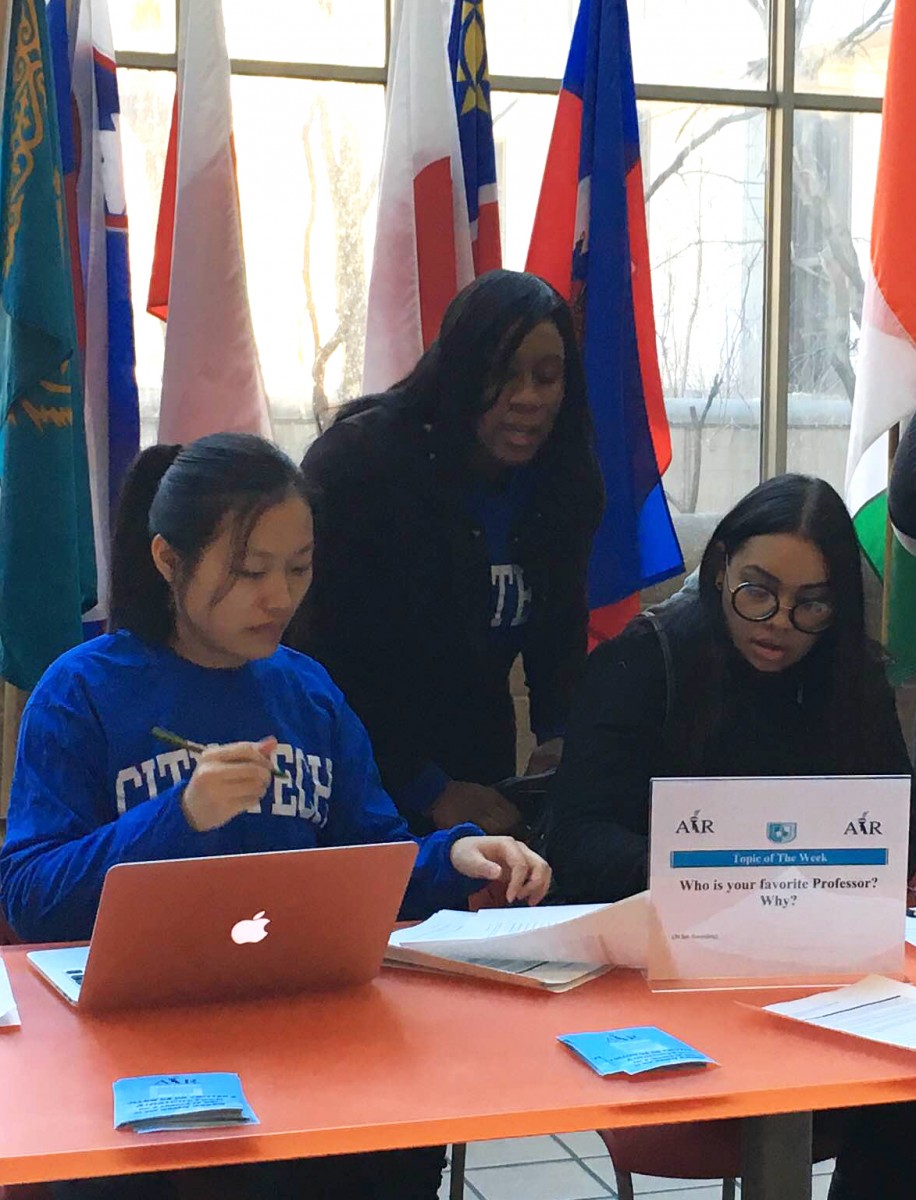
Photos were also to be included. Not all of them looked nice, so there was a lot of retouching to be made. I only retouched one photo for this project, and didn’t need to make much adjustments, aside from cropping and giving more brightness and contrast.
The handbook needed a nice layout. As detailed in an earlier post, this plan didn’t fall through, and we ended up relying on the layout given by the college assistant.
Paragraph styles were made to make everything easier. This also helped with accessibility, as paragraph styles assists screen readers in detecting information hierarchies. InDesign’s spellcheck was used to check for errors, but we were instructed to look for them manually as well. I plan to write more on accessibility in my next post, as I have a lot of notes from the department’s workshop on the topic.

