COMD 4900 Internship
Updates on the Sweeps for a Cause Project
For this week we discussed increasing the numbers of donations given to the sweepstakes and how we can continue reaching out to influencers. One option that was discussed during the meeting was to have some video element that could be created and sent out to the influencers. One other volunteer responded saying that he was working on an introductory video that could help any influencer that was willing to work with us navigate the Good Buzz platform that the organization had, as it was a little difficult to navigate through at first.
From that project I volunteered to create a video for Instagram that could also be used to send to influencers as well that detailed how the prize of $4,000 could be merchandized as well as how to enter and how to donate.
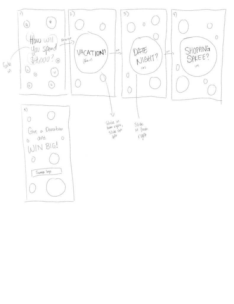
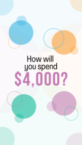
For the video I want to have the options for spending the $4,000 prize in a few different ways. I use a vacation, date night, and a shopping spree are what I want to use for the video. I also want to have the circles and rings that are found on the logo of Sweeps for a Cause in the design in the background.
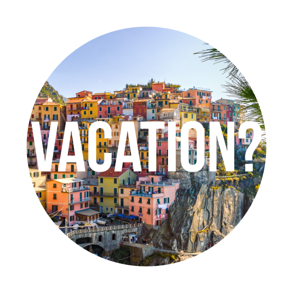
For the first version of the design I used a circular crop of a picture that was provided by the organization. I added the word vacation to it but it felt like it wasn’t interesting enough to use. So I decided to use another picture and another approach to adding the word vacation.
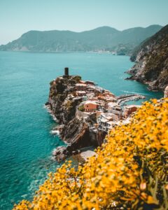
As mentioned before, this was the picture that I planned on using for the video and for other social media graphics. I chose this picture because it has strong contrast with the yellow of the trees and the blue ocean, and also because it has a strong diagonal moving across the image that I want to use as part of the final piece.
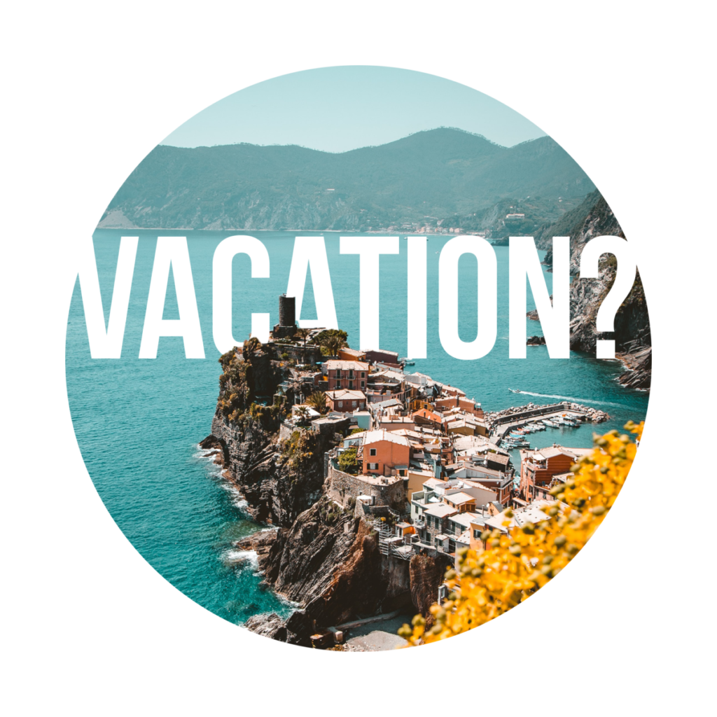
For the newer version of the design I had the text behind the landmarks in the picture, creating a feeling of a diegetic design. I also had the text reach all the way across the circle, blending into the background to create a more dynamic and interesting type treatment. I had to be careful with placing the text since I still wanted the word vacation to be legible, but there were some sacrifices that needed to be made with the letter “A”, since I had to have it partially hidden but have there be enough of it visible to be recognizable as an “A”.
From this design I continued on to the other two designs for “Date Night” and “Shopping Spree” using a similar method.
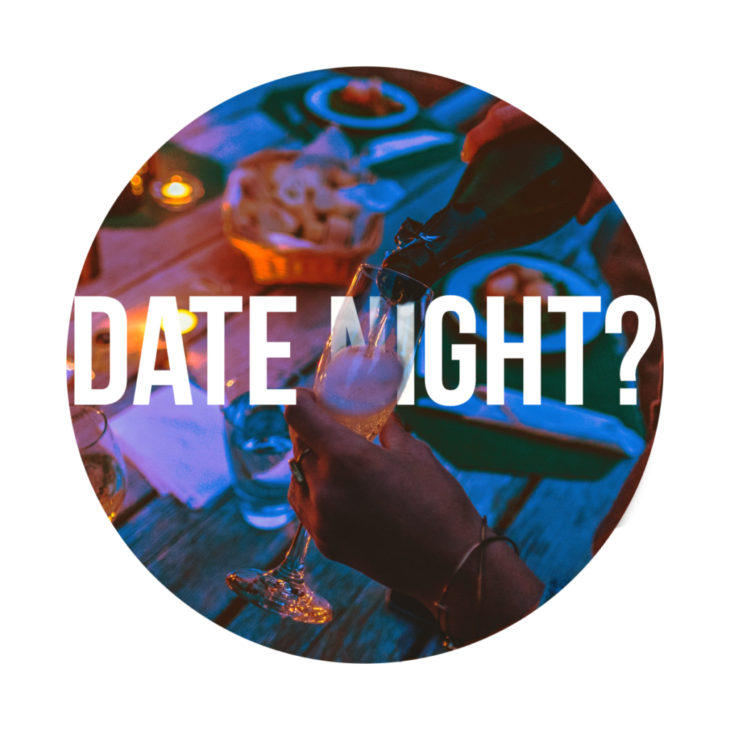
The image here was provided by the organization in the assets we were given for design. For this version I had a similar type treatment where parts of the word are covered by the image of the champagne glass and the stream of champagne. However there were some changes here with the type. Instead of having the word be completely covered by the image, I reduced the opacity of the letters that were being covered by the image, such as the glass over the letters creating a sort of opaqueness to the text.
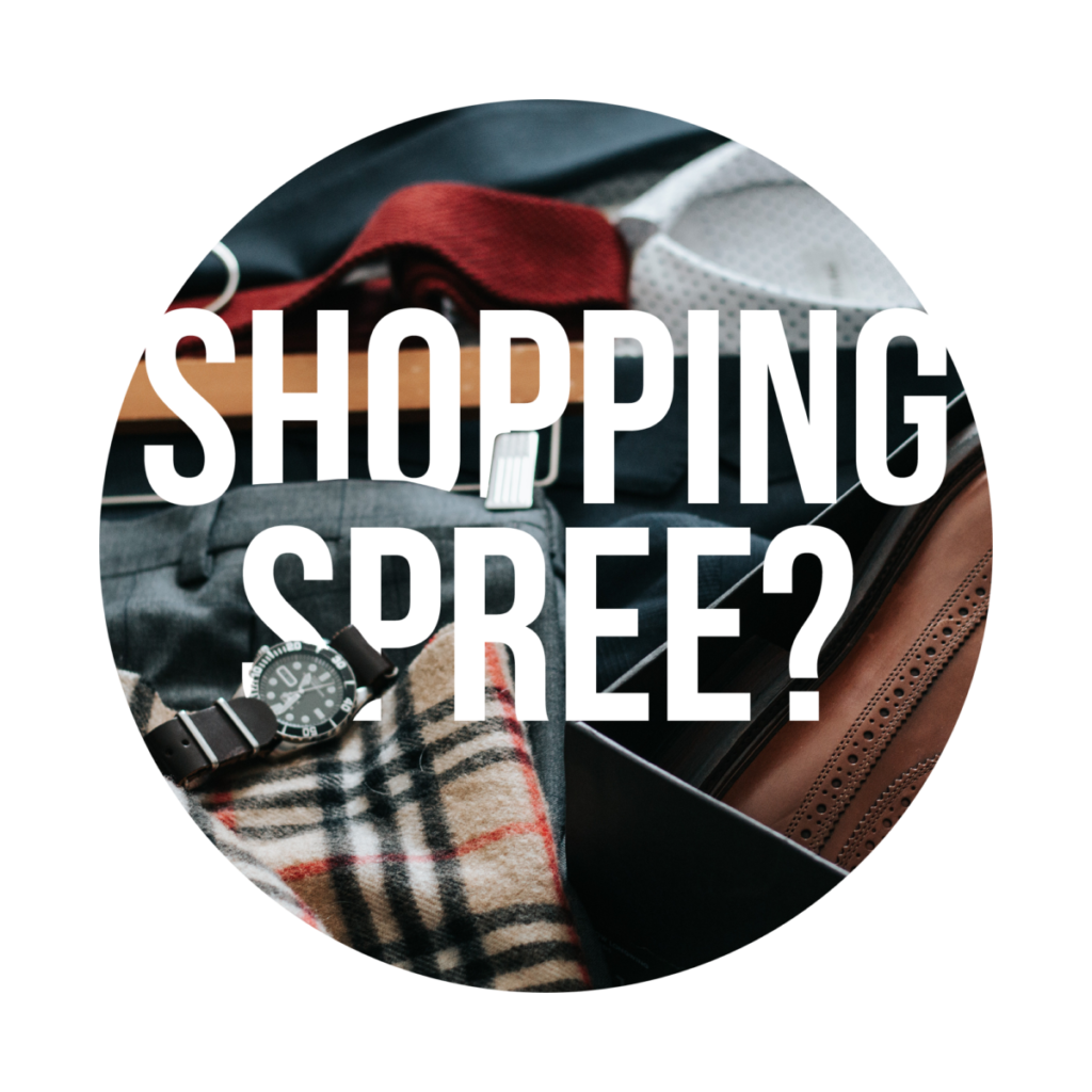
And the final part of the video, the shopping spree. Much like the others it has the same type treatment to it, this time having the watch and the pants covering the text. This picture was also provided by the organization for us to use.
Now to bring it all together. The video was to be created using Canva in order to have other volunteers provide feedback and make any changes if needed. By using the built in mobile video templates for the size it made it easier to have the correct dimensions for an Instagram reel. I wanted to leave the background white with the colors of the logo used for the circles and rings that would fade in and out along with the text to create movement. The first shot will show the tagline of “How will you spend $4,000?”.


