COMD 4900 Internship
Weekly Meetings, Teamwork, and Time Management
For this week there were a few hiccups with the structures of meetings. My supervisor had contracted COVID and so he was out of commission for a while, unable to attend meetings with the group of volunteers and individual meetings with us as well. But he gave us a look into the work being done for other projects that are running concurrently with the sweepstakes as well as informing us of what the next project might be.
One of the options that was discussed was increasing the prize money from $4,000 to $10,000 for the next sweepstakes. Our supervisor gave us some insight into how that would need to happen, including how he needed to have the proper paperwork in order to send it to a bond broker. It was interesting to learn about that since I had no idea about how a sweepstakes worked behind the scenes, and it’s interesting to learn about the legal requirements that need to be met in order to have a prize of that quantity.
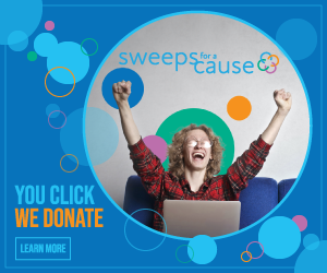
As for the project and assignments I’ve been given, there has been some work done on the animated gif for one of the banners. The banner that I wanted to animate is this one:

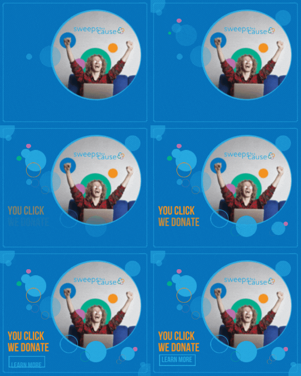
I wanted to keep it simple in the animation since a bigger effect could mean a larger file size, so I wanted to have a simple fade in to the elements in the design. The text would fade in first, and the other circles and rings would follow soon after. My plan was to use Adobe Animate, but I didn’t have much experience with the software and the learning curve could prove to be steep. But I gave it a try with the help of the Creative Cloud tutorials as well as some YouTube videos on how to navigate the software and how to create simple animations. What I completed was the following:
There were some small issues with this though. The logo for the organization is barely noticeable and the text is much too small to be legible at a quick glance. The size of the banner also plays a part in making things harder to see, and having an image scaled down to that size doesn’t work too well. Some changes had to be made.
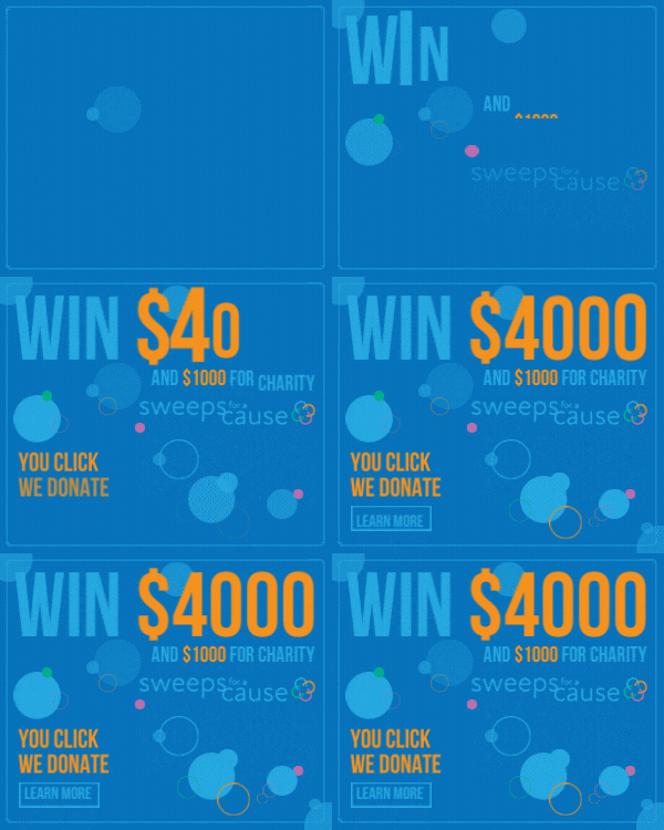
First, I needed to get rid of the image and rely on type hierarchy and the circles and rings to create an impactful design. I also want to add something other than a picture to draw people in. Using the prize money of $4,000 would be better in this situation as I can easily have that be a larger part of the design and also have something that people can look at and be curious about. I also want to include the charity donation of $1,000 as well to create a sense of goodwill and make it seem less like a scam website or something along those lines. So I made some changes:
This new version incorporates the money prize, the logo and the tagline all together in a more engaging way. The animation done here is more dramatic in order to bring more attention to the prize money, and the contrast in colors helps to show the most important parts of the campaign. This was submitted to my supervisor for review but he will most likely get back to me once he recovers from COVID.
The work that was done so has been very productive. All of my projects are coming along well, with edits now being made by my supervisors. There have been suggestions made in the staff chat that also contribute to what something looks like, and many other members of the organization offer feedback. The video I am working on, for example, has been viewed by a lot of other people and there have been comments made on it.
I like that there is this group feedback because it gives me a lot more options to consider when I need to make any edits. For example, the banner here had the changes made after showing it to the rest of the team. That’s when my supervisor wanted to use the Win $4,000 and the $1,000 charity donation on the banners as well. The communication between all of us is very good and we keep up with the conversations we are having with regards to progress and updates.


