COMD 4900 Internship
Projects For the Organization
After a few meetings with my supervisors I have taken on some projects in order to help promote the sweepstakes taking place. I decided to create some banner ads that promote the sweepstakes, an animated gif, and also a short video for Instagram as well.
For the banners I wanted to create 3 sizes. One would be 300×250 pixels, one would be 120×600 pixels, and one would be 278×90 pixels. These 3 sizes I feel give great coverage across multiple applications on the web. However my supervisors wanted the banners to be animated in some way, so there would be an additional requirement to be met with the ads.

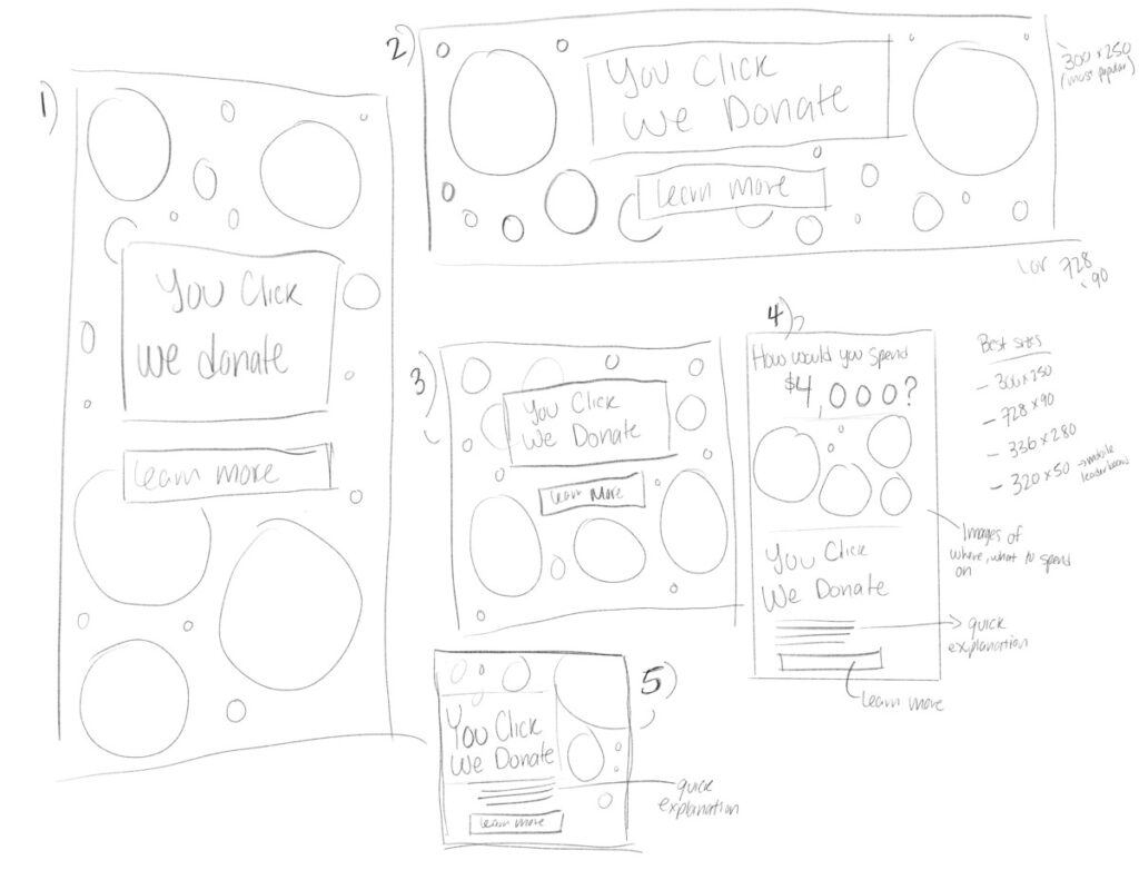
For the banners I wanted to use the circles and rings that are present throughout the branding of the organization and the sweepstakes platform. The main draw is the tagline of “You Click, We Donate” that my supervisors wanted to be used. Alongside that I also wanted to include the $4,000 prize as well in order to offer a reason for clicking on the banner. But upon consideration I instead opted not to use it as some people might feel as though it is a scam if they come across the banner. The tagline itself will create interest in the sweepstakes and I will instead have that be the main center of attention.
Among those sketches above I settle on the bottom design for the 300x250px size as it lets me show the tagline taking up the majority of the space and the remainder can have the circles and rings to create a sense of movement when I decide to animate it into a gif.
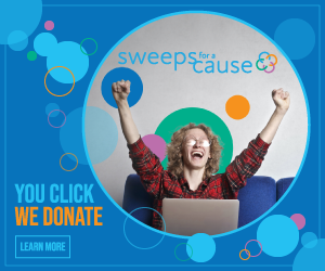
For the final work I kept the colors of the organization in mind when creating the circles and rings. The image of the man with his arms up in celebration was added into the design as well to add another element that wasn’t just the text and circles. I had the “We Donate” part of the work be a bold orange color thats used in the organization branding and I chose it for the strong contrast with the blue background. The reason for this was to have the onus on the organization of donating money, while all the user has to do is click. I wanted to make the tagline that was given stand out within the design and help to drive more traffic to the website and the sweepstakes.
After this project was handed in for review I needed to begin to work on an animated version of this in gif form, but that may take a little longer as I haven’t had much experience in creating gifs and will need to learn how to do so properly. But for the gif I have the idea of having them be simple, with minimal moving elements, possibly only having parts of the design fade in and end with the call to action of “Learn More”, but I will have to develop that as I move forward with the project.
Having this internship be completely remote is both a blessing and a curse. It tests my commitment to the hours I work for the internship everyday. Since I only have to attend meetings every week, there is a lot of pressure to make sure that my time management is on point. I chose to work for 6 hours a day, from 12pm to 6pm, Monday to Thursday and then 5 hours on Friday (10am to 3pm) since I have to work on Friday nights. The responsibility I have to stay committed to delivering work on time will be tested, but I’m confident that I will stick to it.


