Supreme
Many establishments during 1940s to the 2000s century in New York City, have certain focus point when trying to sale there clothing for the youth culture, as well a certain brand logo. But not many have, had many breaks throughs except for skateboarding brands and hip-hop brands. However, during those time towards now have changed. Now when you ask anyone from New York “What Logo comes in mind when you are in New York”. There answer would most likely be “Supreme”, because of product being high quality and its Unique fashion choices that they have over the youth community, as well as its simple logo brand and iconic name brand. Which is the reason why the products name and logo is “Supreme” which stands for high quality, fresh, and superior towards other brands which is why it’s very known. But you might wonder, who created this logo brand? Well the original brand was created by “James Jabbia”, who created the Brand for “Supreme.” To find more Information and history of supreme this link shows the background and the history (https://www.supremenewyork.com/about). Anyways the Brand Logo red box with supreme in Futura Heavy Oblique was inspired by Barbara Kruger’s who is a conceptual artist and a collagist designer, here is a link to her work for you to see the resemblance for supreme logo from Barbra Kruger work (http://barbarakruger.com/art.shtml). But anyways the logo in the “Supreme” brand websites is always found in the front page of their website page (https://www.supremenewyork.com/). As well as their Products of their clothing logo that they sell within the store (https://www.supremenewyork.com/shop).
The logo is quite memorizing, to say the least because it not only shows a bold one single word in a Futura font but because the word and font go very well together to show a powerful and succeeding brand that other brands like Vans and Nike try to go for and don’t succeed as much as Supreme.
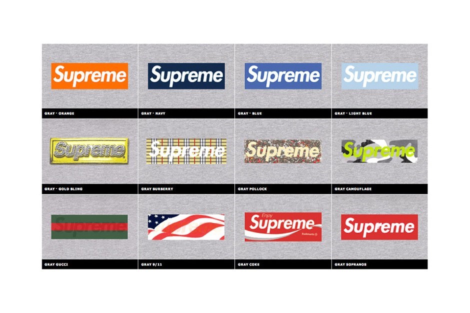
The Logo “Supreme” are really known for having red box and having white Futura but it should be noted that even though this is there going to style for everything they actually use different styles for the background and sometimes for the fore ground of the style of letters but they never change the word supreme unlike other brands that change their style and most of the times their logo within their names. These are one of many examples that supreme has changed their background and one of many designs they use to design for their logo. (https://sneakhype.com/more/clothing/2014/04/20-years-supreme-box-logo.html)
As well also the brand makes T-shirts with modified versions of its logo for some occasions. For instance, it produced a BOGO benefit tee in 2011 after the earthquake in Japan and donated all the sale proceeds to the country’s Red Cross.
Another note is that the Brand supreme has a lot of influencers that wear the supreme logo and many photographers and artist that have help push out the supreme logo towards people to see their brands representation. One that is known for younger kids and most adult was the Kermit the frog with a supreme logo on a white T-shirt, which was taken by Terrance Richardson, who is an American fashion photographer who has taken many photos and helped a lot of brands from his pictures. This is one of many photos with supreme brands that many fashion and youth culture communities have seen supreme grow as it expands towards different such as Japan, London, Los Angles, and etc. But one point still remains on how respected the brand is towards people and towards the generations that supreme is still a home for those who are new towards fashion industry and for those who grew up with supreme throughout its time.

Resources Used:
- Logo From supreme have used or are in use “By Ty Sechler | April 28, 2014 10:42 am” (https://sneakhype.com/more/clothing/2014/04/20-years-supreme-box-logo.html)
- “Supreme” Website (https://www.supremenewyork.com/)
- “Supreme Clothes” (https://www.supremenewyork.com/shop)
- “Barbra Kruger Art” (http://barbarakruger.com/art.shtml)
- “Design Barbra Kruger” (http://barbarakruger.com/art/love_sale.gif)
- “About Supreme” (https://www.supremenewyork.com/about)

