Video Project
Art Trip

Yves Klein
Venus Bleue, 1962/1982
I found it interesting that the color blue he saw or did for this art piece wasn’t painted but Conceited in a scientific way, by using chemicals. “The darkened ultramarine, technically Rhodopas M60A thinned with ethanol and ethyl acetate to preserve luminescence, was concocted by the scientifically advanced artist with a Parisian color merchant and chemists at Rhone-Poulenc.”
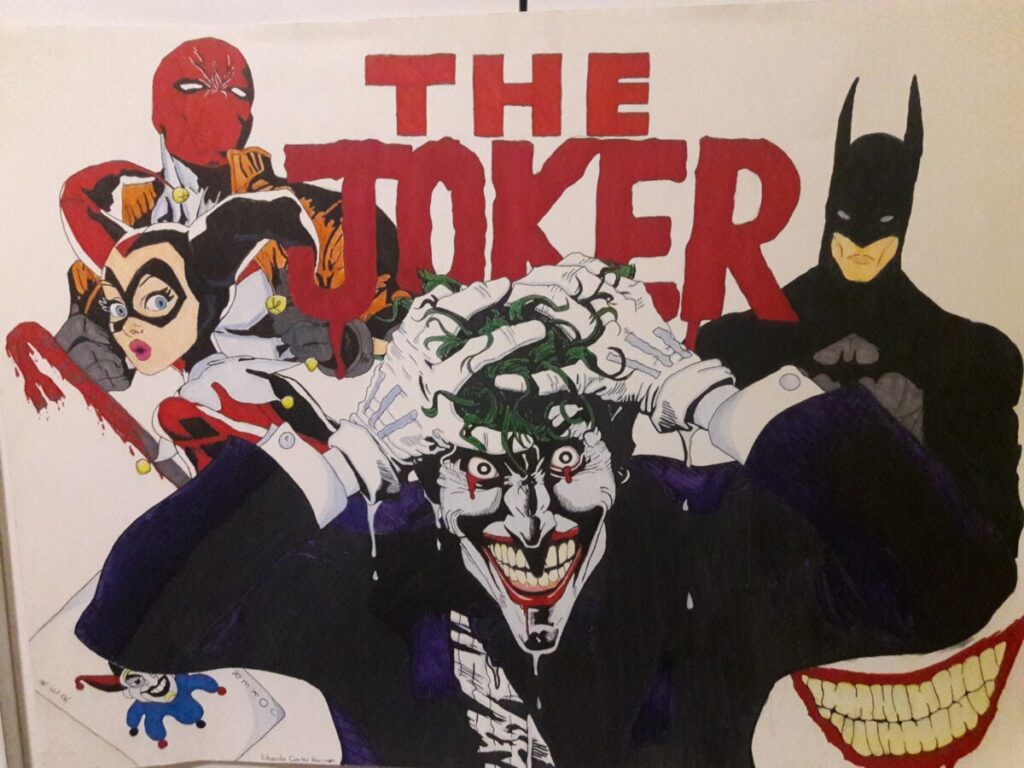
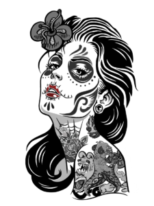
The Joker
This was a Painting/ Drawing I designed when I was 18 in high school for my Dean wanted to hang on his wall when I graduate, as a memorable piece of my class completion. This took me roughly a month because of the amount of exams, I was taking before and other stuff.
Margaret Bourke-White
Design Research Paper for Margaret Bourke-White
You might say in your mind who is Margaret Bourke-White, and why should I care. Well Margaret Bourke-White is photographer and not only that she was the first Female War journalist and the first foreign photographer permitted to take pictures of Soviet industry under the Soviet’s Five-year plan (The Russian Five-year plan was to turn the Soviet Union into a modern industrial power.)
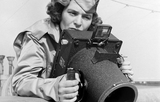
Anyways Margaret Bourke-White was born on June 14th, 1904 in the Bronx, New York. However, she started to grow up in Bond Brook, in New Jersey, with her three siblings. Which is her younger brother Roger Bourke White, her Ruth White. Her parents are Joseph White who was her Father who came from Poland, who was an engineer who worked with printing presses and the development of offset lithography and the rotary press, and her mother was Minnie Bourke, her mother was educated at Pratt Institute in stenography and was a dedicated homemaker who encouraged her children to become educated. This Information was found in (Margaret Bourke-White | International Photography Hall of Fame (iphf.org)) where it shows how she was inspired by her father the most by his enthusiasm for cameras, and how Margaret did not pick up a camera until after her father’s passed away. During this time, she was studying in Columbia University in New York to study art. Throughout her life education, she attends 5 in total, including Cornell University, Case Western Reserve University, Purdue University, and University of Michigan. It wasn’t until Her mother bought Margaret her first camera that year. It was a 3 ¼ x 4 ¼ Ica Reflex. The camera had cost her mother $20 and it had a cracked lens. She took a one-week course under Clarence H. White. Where she eventually met Everett “Chappie” Chapman who would later become her husband.
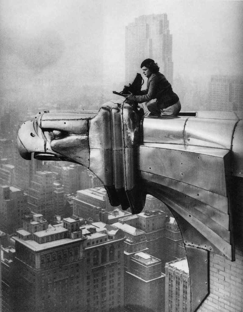
However, her carrier started to take off when after making arrangements with a commercial photographer to use his darkroom, Bourke-White made her first step to become a photographer. It wasn’t until her photographs were a huge success. Calls began to come in from architects wondering if she was studying to become a photographer, which had never crossed her mind until that point. But her marriage to Chappie had ended just after a few years, and now Margaret had the freedom to “embark on my new life”. And she did by Margert Bourke-White’s first studio was in one of Cleveland’s latest skyscrapers. Not only did Margaret continued with her company she had vowed to never fall in love again after her horrible marriage with Chappie, until Erskine Caldwell somehow caught her off guard and the two fell in love while on their trip to the South, and they finally were married in February 1939. It wasn’t until in 1941, Caldwell and Bourke-White went to the Soviet Union, to be the first women who interviewed the soviet unit for Life. She was the only photographer in Moscow during the German raid on the Kremlin and she photographed Josef Stalin. One of Margaret Bourke-White’s most famous images was taken of Gandhi with his spinning wheel in 1946.
This was one of many of Margaret Bourke-White’s famous photography photos that she has done. However; it soon was cut short when one day when she was photographing the Korean war in 1963, started to realize stiffness in her arms and had difficulty walking. She had soon realized that she had Parkinson’s disease (A chronic and progressive movement disorder). This did not stop Margaret Bourke-White from taking photograph photos until she took an untested surgery, and by writing her publications for her disease in life by Lizabeth Ronk from Life/ Time photo editor writing about Margaret how “Her struggles with Parkinson’s disease cut her career and her life short to me this represents her largest conflict.” However, this was one battle she could not win, losing this battle at age 67, on August 27, 1971, in Stamford Connecticut, Us. But here legend still lives on by representing that women are able to do more than at the time they were supposed to do. Such as being a house mom and being an accounting, she should that all women can do what men can do with the same or more racial preference that is being judged. Such as what Margaret Bourke-White’s had to face with which was gender bias, and blacklisting, but this never stopped her and she passed representing that any women can do what they love without worrying about what others comment have about them.
Research Project
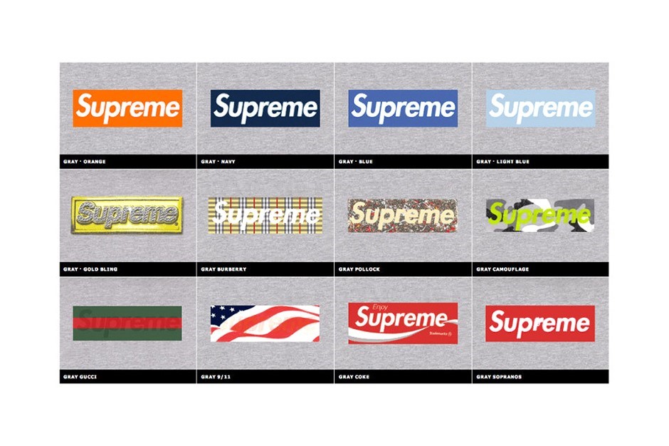
Supreme
Many establishments during 1940s to the 2000s century in New York City, have certain focus point when trying to sale there clothing for the youth culture, as well a certain brand logo. But not many have, had many breaks throughs except for skateboarding brands and hip-hop brands. However, during those time towards now have changed. Now when you ask anyone from New York “What Logo comes in mind when you are in New York”. There answer would most likely be “Supreme”, because of product being high quality and its Unique fashion choices that they have over the youth community, as well as its simple logo brand and iconic name brand. Which is the reason why the products name and logo is “Supreme” which stands for high quality, fresh, and superior towards other brands which is why it’s very known. But you might wonder, who created this logo brand? Well the original brand was created by “James Jabbia”, who created the Brand for “Supreme.” To find more Information and history of supreme this link shows the background and the history (https://www.supremenewyork.com/about). Anyways the Brand Logo red box with supreme in Futura Heavy Oblique was inspired by Barbara Kruger’s who is a conceptual artist and a collagist designer, here is a link to her work for you to see the resemblance for supreme logo from Barbra Kruger work (http://barbarakruger.com/art.shtml). But anyways the logo in the “Supreme” brand websites is always found in the front page of their website page (https://www.supremenewyork.com/). As well as their Products of their clothing logo that they sell within the store (https://www.supremenewyork.com/shop).
The logo is quite memorizing, to say the least because it not only shows a bold one single word in a Futura font but because the word and font go very well together to show a powerful and succeeding brand that other brands like Vans and Nike try to go for and don’t succeed as much as Supreme.
The Logo “Supreme” are really known for having red box and having white Futura but it should be noted that even though this is there going to style for everything they actually use different styles for the background and sometimes for the fore ground of the style of letters but they never change the word supreme unlike other brands that change their style and most of the times their logo within their names. These are one of many examples that supreme has changed their background and one of many designs they use to design for their logo. (https://sneakhype.com/more/clothing/2014/04/20-years-supreme-box-logo.html)
As well also the brand makes T-shirts with modified versions of its logo for some occasions. For instance, it produced a BOGO benefit tee in 2011 after the earthquake in Japan and donated all the sale proceeds to the country’s Red Cross.
Another note is that the Brand supreme has a lot of influencers that wear the supreme logo and many photographers and artist that have help push out the supreme logo towards people to see their brands representation. One that is known for younger kids and most adult was the Kermit the frog with a supreme logo on a white T-shirt, which was taken by Terrance Richardson, who is an American fashion photographer who has taken many photos and helped a lot of brands from his pictures. This is one of many photos with supreme brands that many fashion and youth culture communities have seen supreme grow as it expands towards different such as Japan, London, Los Angles, and etc. But one point still remains on how respected the brand is towards people and towards the generations that supreme is still a home for those who are new towards fashion industry and for those who grew up with supreme throughout its time.

Resources Used:
- Logo From supreme have used or are in use “By Ty Sechler | April 28, 2014 10:42 am” (https://sneakhype.com/more/clothing/2014/04/20-years-supreme-box-logo.html)
- “Supreme” Website (https://www.supremenewyork.com/)
- “Supreme Clothes” (https://www.supremenewyork.com/shop)
- “Barbra Kruger Art” (http://barbarakruger.com/art.shtml)
- “Design Barbra Kruger” (http://barbarakruger.com/art/love_sale.gif)
- “About Supreme” (https://www.supremenewyork.com/about)
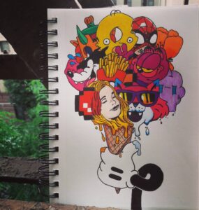
Imagination
Description:
This is all my art so far that I call my “Imagination” because I like putting two or more creations into one design. However, most of my art has a deeper meaning or no meaning because its what I usually do for these creations, and by letting my viewers figure out what there point of view and meaning is towards them.
The No ID:
La Vida Y La Rosa:
The One:
Sunday Ice Cream:

Raster and Vector Graphics Project
Project Description
Nulla quis lorem ut libero malesuada feugiat. Curabitur non nulla sit amet nisl tempus convallis quis ac lectus. Quisque velit nisi, pretium ut lacinia in, elementum id enim. Nulla porttitor accumsan tincidunt.
Reflection
Donec rutrum congue leo eget malesuada. Curabitur non nulla sit amet nisl tempus convallis quis ac lectus. Curabitur aliquet quam id dui posuere blandit. Quisque velit nisi, pretium ut lacinia in, elementum id enim. Quisque velit nisi, pretium ut lacinia in, elementum id enim. Nulla porttitor accumsan tincidunt. Vivamus magna justo, lacinia eget consectetur sed, convallis at tellus. Vivamus suscipit tortor eget felis porttitor volutpat. Mauris blandit aliquet elit, eget tincidunt nibh pulvinar a. Vestibulum ac diam sit amet quam vehicula elementum sed sit amet dui.
Additional Images

Placeholder 
Placeholder 
Placeholder
Foundation Drawing Project
Project Description
Nulla quis lorem ut libero malesuada feugiat. Curabitur non nulla sit amet nisl tempus convallis quis ac lectus. Quisque velit nisi, pretium ut lacinia in, elementum id enim. Nulla porttitor accumsan tincidunt.
Reflection
Donec rutrum congue leo eget malesuada. Curabitur non nulla sit amet nisl tempus convallis quis ac lectus. Curabitur aliquet quam id dui posuere blandit. Quisque velit nisi, pretium ut lacinia in, elementum id enim. Quisque velit nisi, pretium ut lacinia in, elementum id enim. Nulla porttitor accumsan tincidunt. Vivamus magna justo, lacinia eget consectetur sed, convallis at tellus. Vivamus suscipit tortor eget felis porttitor volutpat. Mauris blandit aliquet elit, eget tincidunt nibh pulvinar a. Vestibulum ac diam sit amet quam vehicula elementum sed sit amet dui.
Additional Images
Placeholder Placeholder Placeholder
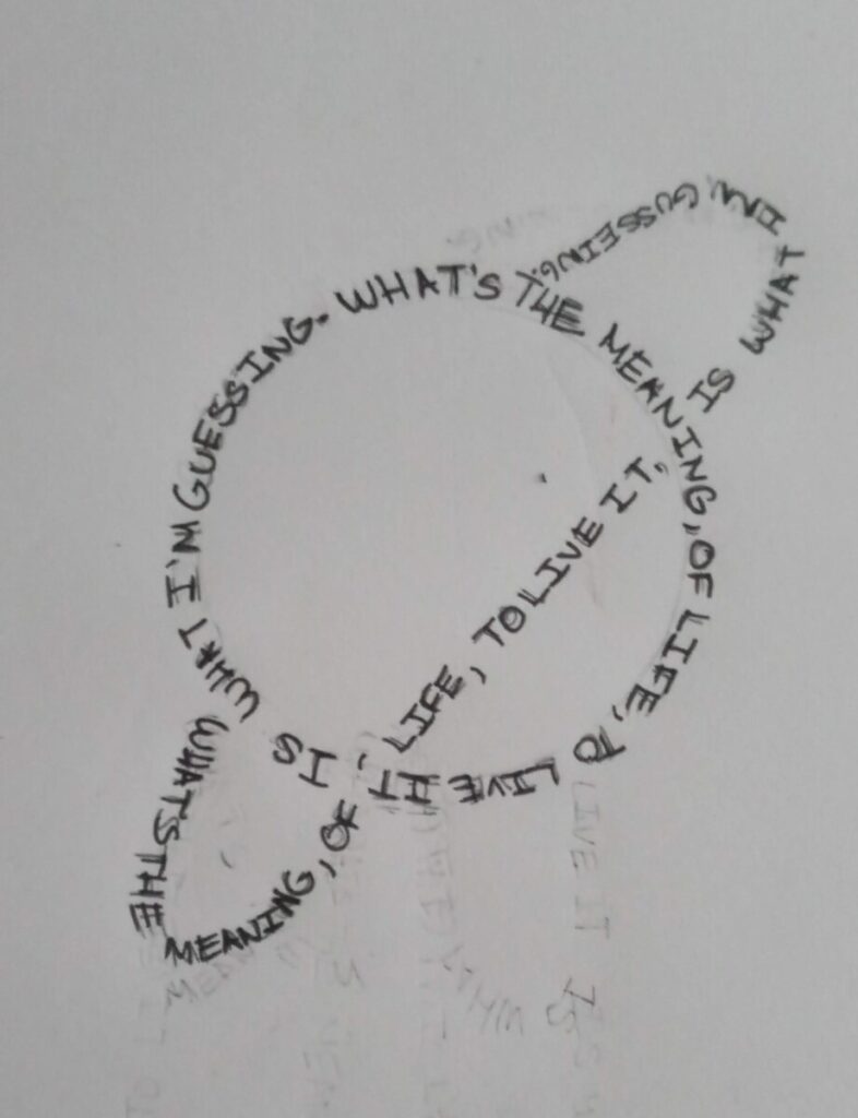
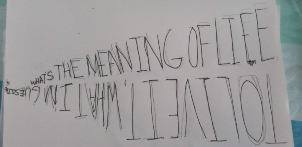
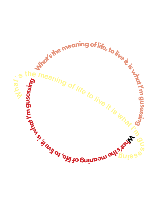
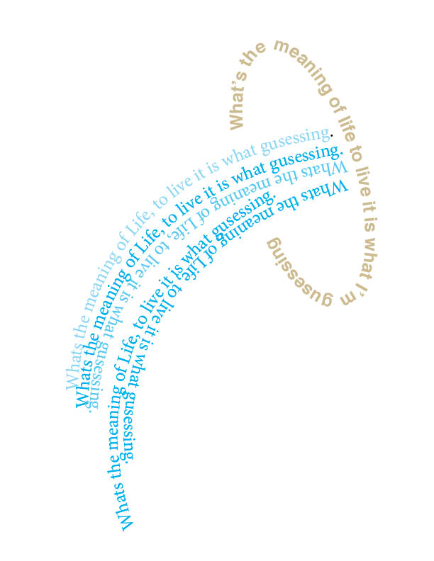
Type and Media Project
Project Description
Nulla quis lorem ut libero malesuada feugiat. Curabitur non nulla sit amet nisl tempus convallis quis ac lectus. Quisque velit nisi, pretium ut lacinia in, elementum id enim. Nulla porttitor accumsan tincidunt.
Reflection
Donec rutrum congue leo eget malesuada. Curabitur non nulla sit amet nisl tempus convallis quis ac lectus. Curabitur aliquet quam id dui posuere blandit. Quisque velit nisi, pretium ut lacinia in, elementum id enim. Quisque velit nisi, pretium ut lacinia in, elementum id enim. Nulla porttitor accumsan tincidunt. Vivamus magna justo, lacinia eget consectetur sed, convallis at tellus. Vivamus suscipit tortor eget felis porttitor volutpat. Mauris blandit aliquet elit, eget tincidunt nibh pulvinar a. Vestibulum ac diam sit amet quam vehicula elementum sed sit amet dui.
Additional Images
Placeholder Placeholder Placeholder

