If it wasn’t already obvious, March has been a busy month for us here at the intern team! Phew! Okay, so priority first: Educational Video. We decided to put that on the back-burner for now, since generating it and its content was taking a bit too long. So what took priority was the website, again. As Director of Operations, Isaac reiterated this point of how important recreating the site was, he and Ikey, Chief Marketing Director, would visit our section of the studio for the nest couple weeks to help and direct us on what might be a great way to recreate the site. After plenty of time spent, we landed on a certain theme and color scheme. The theme was very environmental! Here is a snippet.
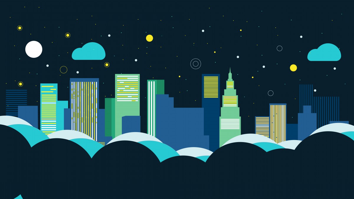
Home page background, part of a much lengthier animated image.
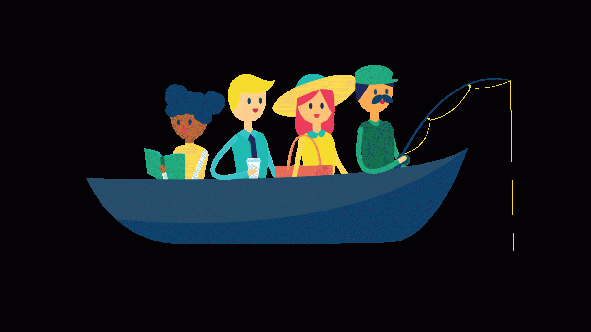
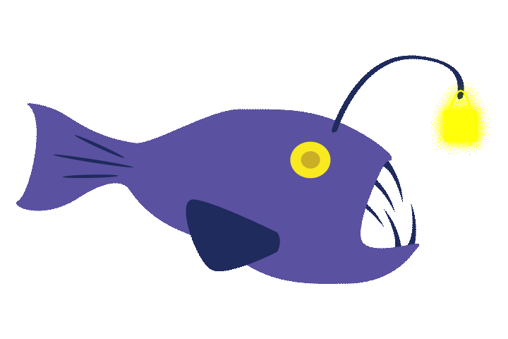
In the Contact Us tab, there’s a beautifully drawn water theme there, with some content created by me and a couple other illustrators! Here are some snippets:


Otherwise, there’s been talk and simple redesigning of the company logo. Co-worker threw the thought to the rest of us at the office, but it turns out recreating the logo has been talked about and attempted for a while now. Still, the Director feel it definitely was a good time to redesign the logo, since we were redesigning other things. Here were some first concepts from a coworker:
![]()
There was a lot of nice ideas when I finally saw this. When I was out sick for two days, there was another concept being worked on. So, this was the final choice! It looks very clean and neat. i loved the colors, too, but I feel like the logo with an S bag emblem was strongest. Not only was the font brilliant, but there’s an incorporation of a bag in the logo. In the new one, the emblem doesn’t really resemble a bag without some sort of handle.Something that shows what we’re about. But, eh…
![]()

