For our field trip we went to the Society of Illustrators and i found it quite interesting. As a person who doesn’t enjoy looking at museums, this one caught my attention. Even though it was hard to find it at first at the end of the day it was a good trip. As soon as i walked in there, i thought i wasn’t going to enjoy it but i was wrong. Each pieces of art i saw had its own unique design and could tell its own story. You can feel what the artist was trying to say by looking at them. These are the 3 pieces that i enjoyed looking at the most.
The first piece that caught my attention was “Bounce Cats” by Jason Raish. This piece was very interesting to watch because for starters it is a funny illustration. The illustration 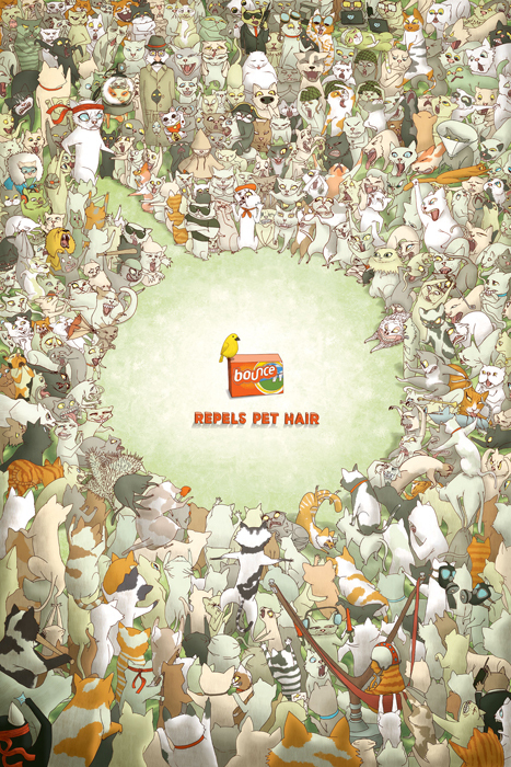 is telling you how powerful the product is because there’s hundreds of cats trying to eat the bird but the Bounce is so strong they can’t go near it. The product Bounce is used to clean clothes and to leave them smelling good and clean any hairs and dirt on it. The use of the colors and imagery the author put on the illustrator really goes well with the product. This piece was used in mainly in Canada and appeared in magazines, newspapers, inserts, posters and more.
The second piece that i thought was also very interesting was “Summer on Saturn” by Maritsa Patrinos. The design was made for an album cover and it goes perfect with it. The use of the bold letters really emphasizes that, that’s how summer is in Saturn. By looking at the picture you will be amazed because for our summer it is very hot and warm but in Saturn it’s snowing and very cold. In which maybe the artist is trying to picture that in 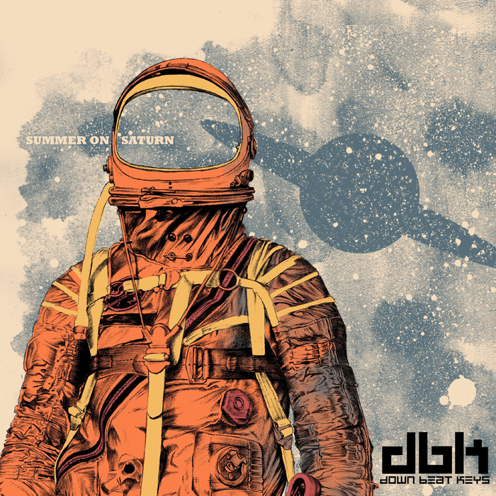 Saturn it is the opposite as in our planet. The use of the colors and the background really stands out from the title.
The last piece that i choose was “Deconstruction of Ground Zero” by Jody Hewgill. This art design caught my attention because on the whole memory of ground zero. As you can see in the art all the fire fighters and the workers have their heads down for a moment of silence for all who were lost that day. The use of no letters in the picture really emphasizes this very sad moment that will be in our memories forever. The use of the dark and cool colors go well with this sad 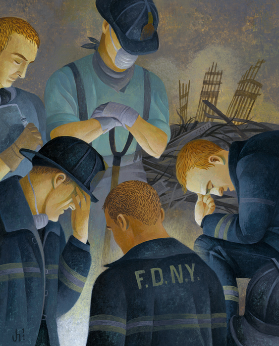 moment.

