On our class trip to Printed Matter, my eyes were opened to new forms of illustration that I’d never have imagined existed. Printed Matter is a bookstore in Brooklyn which specializes in selling books that are designed to be art. Before this trip, my idea of a book was a novel, textbook, or a how-to. Simply a device used to carry information, be it for education or for leisure. I figured that besides the cover, the art in a book was a form of fixed art, its expression restrained to its images, its typography and of course its written story or informative text. However It never even occurred to me that the design of the book itself could be a form of abstract art within its own design.
On our class trip to Printed Matter, my eyes were opened to new forms of illustration that I’d never have imagined existed. Printed Matter is a bookstore in Brooklyn which specializes in selling books that are designed to be art. Before this trip, my idea of a book was a novel, textbook, or a how-to. Simply a device used to carry information, be it for education or for leisure. I figured that besides the cover, the art in a book was a form of fixed art, its expression restrained to its images, its typography and of course its written story or informative text. However It never even occurred to me that the design of the book itself could be a form of abstract art within its own design.
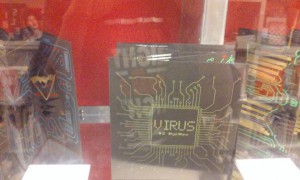
The first book that caught my eye was Virus by Claire Andlauer. I wouldn’t have ever referred to this piece as a book had I not seen it in this bookstore. Its accordion-folded style and three dimension images strike me as a children’s pop-up book. It is one in a series of books completely devoid of text and styled to look like circuits. The color schemes are simple, consisting of black, green, yellow, and blue. Each book in the series has the circuits converging into a single image of what anyone would picture an electrical monster to look like, creating an overall feeling of fear. I feel that the fear she’s conveying could be fear of technology, and how it lures you in with its simple appearance and ensnares you in its complexity if you get to its core. Or it could be the fear that technology is becoming too prominent in today’s society, that it might be a dormant virus, appearing harmless but in actuality is truly deadly.
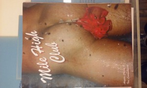
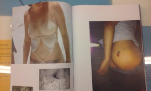
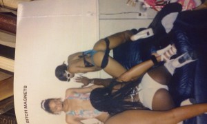
The next things to catch my attention did so not really due to their asthetic design, but their mature content and intriguing titles. These were Bitch Magnets by Kilroy Savage and Mile High Club by Ian Lewandowski and Angela Cherry, both books which seemed to be collages of pinup images. Both books were subtle-stitch, which I find ironic to the contents of the books, which weren’t subtle at all: sex and provocation. The models in bitch magnets seemed to be predominantly capturing the stereotypical sexual nature of colored women, where in contrast the Mile High Club features more caucasian/european models. However, both clearly illustrate the beauty of the human body.
I believe that all three books work as a form of visual communication. They were appealing, well laid out and got their points across very well. I find this to be quite the accomplishment since none of them possessed any form of text to tell their story. The most inspiring one in my opinion would be Virus, due to its unique nature in breaking the mold for what could be seen as a book.
This was my first trip to Chelsea Market/Printed Matter, and also to any form of art show/exhibit. To be honest; although I can appreciate the time and effort put into the pieces on display, I really don’t have much of a taste for exhibit based art. I didn’t really enjoy the experience enough to make it a pastime, but I can respect and appreciate its educational value.

