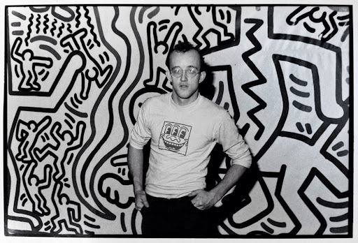
For our Virtual Tour, we saw the “You Won’t Bleed Me: How Blaxploitation Posters Defined Cool & Delivered Profits” exhibit at the Poster House. Our tour instructor Maya Jay Varadaraj went over a series of movie posters regarding blaxploitation, a subgenre of the exploitation film that appeared in the United States during the 70s. Where films were produced independently, mostly low budget, these films allowed the black community to be fearless, powerful, cool, sexy, and most importantly, win over the big screen after decades with little representation. However, the point of these movies was to reach the black audience. Some may proclaim that this time in cinema was heavily pessimistic towards racial stereotypes.
When I was at the virtual exhibit, three posters caught my attention. The first one has to be the movie poster for “Coffy.” This poster stood out because of how much is happening; your eye immediately goes everywhere except when you see Pam Grier, the main focus point. You can see that Grier is since she is very enlarged compared to the rest. Another detail that lets the audience know that she is the main character is the text next to her stating, “She’s the godmother… baddest one chick… ever hit town”. The creator of this poster, George Akimoto, did a great job of emphasizing these phrases with a sans serif typeface. By putting “godmother” in all caps in a nice bright red to then putting the description “baddest one chick.. ever hit town ” in lowercase in all black. And I can’t forget about the placement of the title. I liked how the type was placed at the bottom, emphasized with parentheses. The color of this typeface is entirely different from the rest, with a dark red. It makes the title pop on its own. Everything is perfectly spaced out and appealing, with the original poster being 27 X 41 inches.
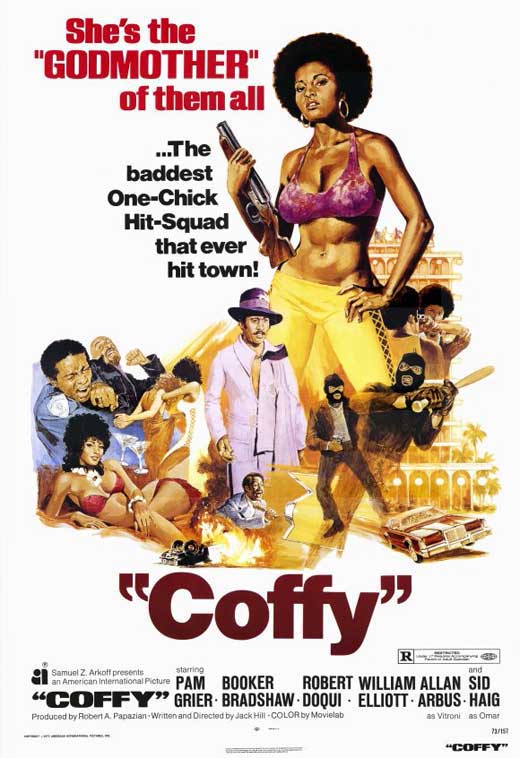
Directed by Jack Hill
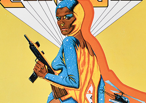
The second poster that also caught my attention has to be the movie poster for “Cleopatra Jones and the Casino of Gold.” This poster is beautiful to look at, and the reasoning is the variation of colors used. But not only do the colors make this poster very eye-catching, but the composition and layout overall are uniquely different. Tamara Dobson, who plays Cleopatra in the film, is the primary focus since she is perfectly centered in the middle. Dobson is also described as “6ft 2in of… action”, which goes very well since she is displayed as this tall, powerful woman with her gun. Now when it comes to the typography, it’s 3D. The creator of this poster, Designer Robert Tanenbaum, did a great job incorporating the bright lettering and what seems to be a serif typeface. Your eye immediately goes to the title, which is an excellent thing in advertising. You always want what’s being marketed to stand out, which is successfully done here. By the original poster size being 30 X 40 inches, you can see that this is a very lovely poster size. The poster emphasizes how tall Tamara Dobson is being described in the poster.
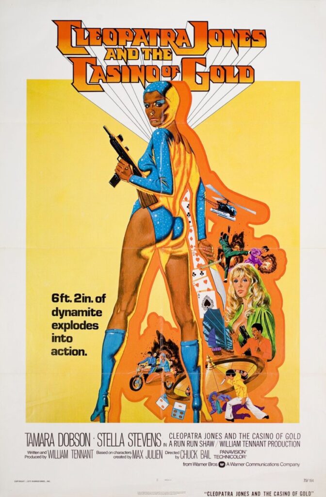
Directed by Charles Bail
The third poster that I enjoyed immensely was the movie poster for “Blacula.” When I initially saw it, what stood out to me was the word “bloodsucker.” I immediately knew that this poster would be a horror movie by the wording used and the choice of type color. The usage of a novelty typeface in all caps for “bloodsucker” and “Blacula” goes very well with this poster; it gives it a theatrical feeling. Even the background depicts a scary vibe with a white transitioning into a dark blue. This is great since this movie is intended to be a scary movie. Overall, the poster gives me a very campy look compared to the other two posters. Camp is “a sensibility that revels in artifice, stylization, theatricalization, irony, playfulness, and exaggeration rather than content.”(Susan Sontag) The poster, in general, is heavily exaggerated with William Marshall, who plays Dracula is covered in fake blood, which you can tell and the use of over the top facial expressions. But with it being campy, it still works. With the poster being 27×41 inches, the alignment of the poster is straightforward; you can immediately point out who is the main character and who isn’t.
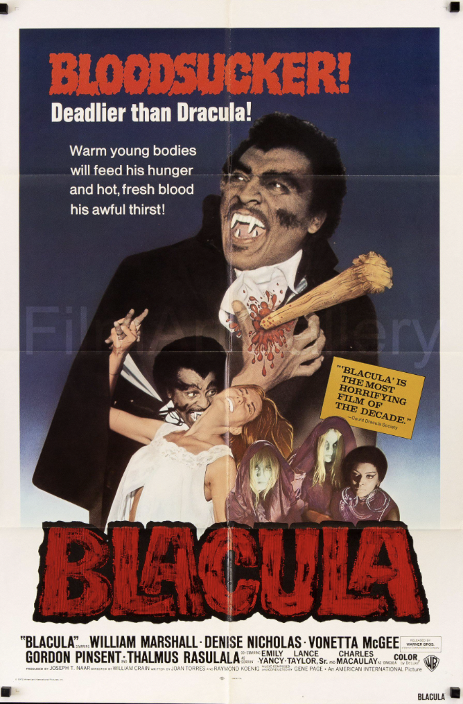
Directed by William Crain
Overall, My virtual experience at “The Poster House Exhibition” was a learning experience. I truly learned how valuable a poster is to the layout, design, text, and imagery. Our instructor Maya Jay Varadaraj went over the history of blaxploitation and how it impacted the cinema world. These posters were crucial in marketing these films because they were larger than life. They delivered excitement in their unique way and have since become collectibles of Black cinema. I’m delighted that I was able to experience and learn about this exhibit. I would do this again.